Benvenuto nelle Font Più Popolari — dove popolarità e qualità si incontrano. Qui trovi i font più scaricati e usati dell'anno. Se cerchi scelte sicure per logo, web o social, inizia da qui.
Ogni font top si distingue per equilibrio, leggibilità e versatilità. Troverai sans serif moderne, script eleganti, serif vintage e display minimalisti.
-
( Copyright (c) 2015 Ek Type (www.ektype.in) )
A playful, rounded font with smooth curves and a friendly appearance.
 Scaricare 449 Downloads@WebFont
 -
( Fonts by Rudhi Sasmito - Personal-use only. For commercial use please contact owner. )
A bold, playful script font with interconnected letters and dynamic flow.
![Palmore font caratteri gratis]() Scaricare 449 Downloads@WebFont
Scaricare 449 Downloads@WebFont -
( Fonts by Geronimo Fonts - Personal-use only. For commercial use please contact owner. )
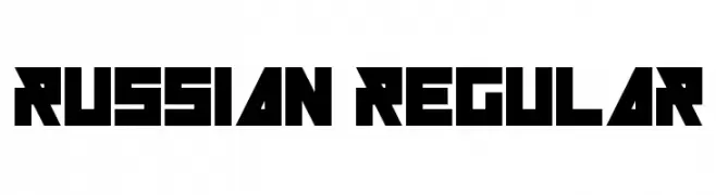
A bold, geometric font with sharp angles and a strong, modern presence.
![Russian Regular font caratteri gratis]() Scaricare 449 Downloads@WebFont
Scaricare 449 Downloads@WebFont -
( Fonts by Denny Subagja )
A playful, hand-drawn font with a whimsical and friendly appearance.
![Bajira font caratteri gratis]() Scaricare 449 Downloads@WebFont
Scaricare 449 Downloads@WebFont -
( Free for a personal use. For a commercial use please visit www.kevinandamanda.com )
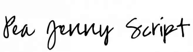
A playful, casual handwritten font with fluid strokes and a lively appearance.
![Pea Jenny Script font caratteri gratis]() Scaricare 449 Downloads@WebFont
Scaricare 449 Downloads@WebFont -
-
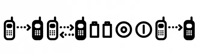
![cellpic font caratteri gratis]() Scaricare 449 Downloads@WebFont
Scaricare 449 Downloads@WebFont -
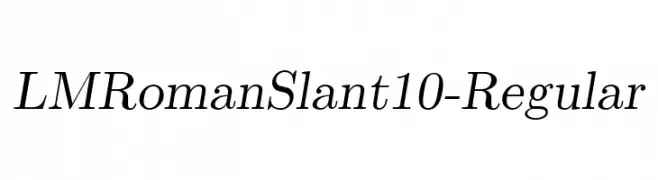
( Fonts by www.gust.org.pl )
Elegant serif font with a slant, featuring moderate contrast and classic styling.
![LMRomanSlant10-Regular font caratteri gratis]() Scaricare 449 Downloads@WebFont
Scaricare 449 Downloads@WebFont -
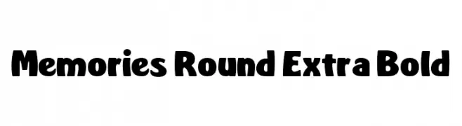
( Fonts by Dan P. Lyons - Personal-use only. For commercial use please contact owner. )
A bold, rounded font with a playful and friendly style.
![Memories Round Extra Bold font caratteri gratis]() Scaricare 449 Downloads@WebFont
Scaricare 449 Downloads@WebFont -
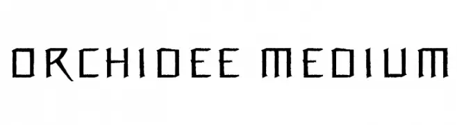
![Orchidee Medium font caratteri gratis]() Scaricare 449 Downloads@WebFont
Scaricare 449 Downloads@WebFont -
( Studiorazi - Muhammad Razi - creativemarket.com/StudioRz )
A stylish and elegant script typeface with graceful curves and fluid connections.
![Authentic font caratteri gratis]() Scaricare 449 Downloads@WebFont
Scaricare 449 Downloads@WebFont -
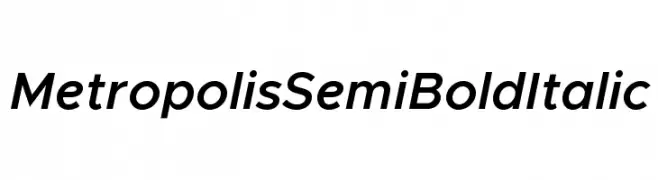
( Fonts by Chris Simpson - Personal-use only. For commercial use please contact owner. )
A modern, semi-bold italic sans-serif font with clean, geometric lines.
![Metropolis Semi Bold Italic font caratteri gratis]() Scaricare 449 Downloads@WebFont
Scaricare 449 Downloads@WebFont -
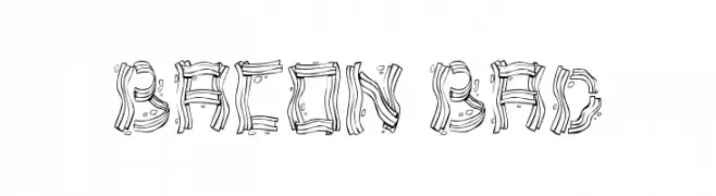
( Fonts by Bud White. Personal-use only. For commercial use please contact owner. )
A playful, bacon-themed decorative font with a hand-drawn style.
![Bacon Bad font caratteri gratis]() Scaricare 449 Downloads@WebFont
Scaricare 449 Downloads@WebFont -
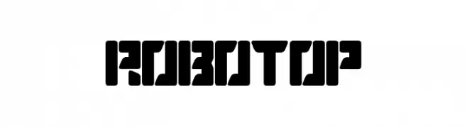
( Sembodo Studio )
A bold, geometric font with a futuristic and industrial design.
![ROBOTOP font caratteri gratis]() Scaricare 449 Downloads@WebFont
Scaricare 449 Downloads@WebFont -
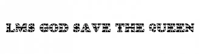
![LMS God Save The Queen font caratteri gratis]() Scaricare 449 Downloads@WebFont
Scaricare 449 Downloads@WebFont -
( Fonts by Scratchones )
A playful, bold font with rounded edges and a friendly appearance.
![Starhat font caratteri gratis]() Scaricare 449 Downloads@WebFont
Scaricare 449 Downloads@WebFont -
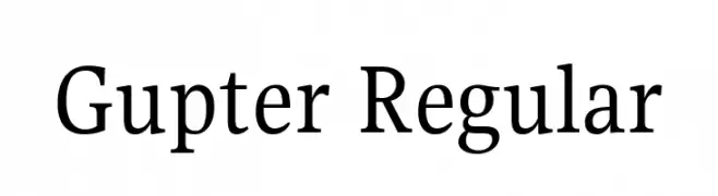
( Copyright 2019 The Gupter Project Authors (https://github.com/octaviopardo/GUPTER) )
A classic serif font with a modern touch, offering elegance and versatility.
![Gupter Regular font caratteri gratis]() Scaricare 449 Downloads@WebFont
Scaricare 449 Downloads@WebFont -
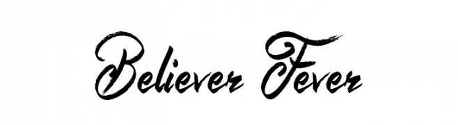
( Fonts by Jonathan S. Harris - www.tattoowoo.com. Personal-use only. For commercial use please contact owner. )
A bold, expressive script font with dynamic strokes and artistic flair.
![Believer Fever font caratteri gratis]() Scaricare 449 Downloads@WebFont
Scaricare 449 Downloads@WebFont -
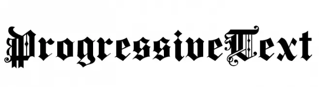
( Fonts by Dieter Steffmann )
An ornate Blackletter font with intricate detailing and bold strokes.
![ProgressiveText font caratteri gratis]() Scaricare 449 Downloads@WebFont
Scaricare 449 Downloads@WebFont -
![KurierCondMedium-Regular font caratteri gratis]() Scaricare 449 Downloads@WebFont
Scaricare 449 Downloads@WebFont -
( Fonts by Syaf Rizal - Khurasan - Personal-use only. For commercial use please contact owner. )
A lively, handwritten font with fluid strokes and a personal touch.
![Ranget font caratteri gratis]() Scaricare 449 Downloads@WebFont
Scaricare 449 Downloads@WebFont -
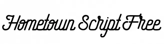
( fey design - Fey Design - www.creativemarket.com/feydesign )
A flowing, cursive script font with elegant, interconnected letters.
![Hometown Script Free font caratteri gratis]() Scaricare 449 Downloads@WebFont
Scaricare 449 Downloads@WebFont -
( Fonts by a Neale Davidson - www.pixelsagas.com. Personal-use only. For commercial use please contact owner. )
A sleek, modern, condensed italic font with consistent stroke thickness.
![Montalban Condensed Italic font caratteri gratis]() Scaricare 449 Downloads@WebFont
Scaricare 449 Downloads@WebFont -
( Fonts by Misti's Fonts )
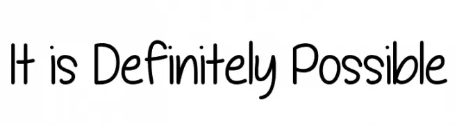
A playful, handwritten font with smooth, rounded strokes and a casual feel.
![It is Definitely Possible font caratteri gratis]() Scaricare 449 Downloads@WebFont
Scaricare 449 Downloads@WebFont -
( Fonts by Edric Studio www.creativefabrica.com/designer/edricstudio/ - Personal-use only. For commercial use please contact owner. )
A bold, modern stencil-like font with geometric cuts and angles.
![ALDITH font caratteri gratis]() Scaricare 449 Downloads@WebFont
Scaricare 449 Downloads@WebFont -
( Fonts by Alvaro Ariel - Personal-use only. For commercial use please contact owner. )
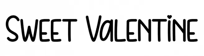
A playful handwritten font with heart-shaped dots and smooth, rounded letters.
![Sweet Valentine font caratteri gratis]() Scaricare 449 Downloads@WebFont
Scaricare 449 Downloads@WebFont -
( Fonts by Daniel Zadorozny - www.iconian.com - Free for personal use )
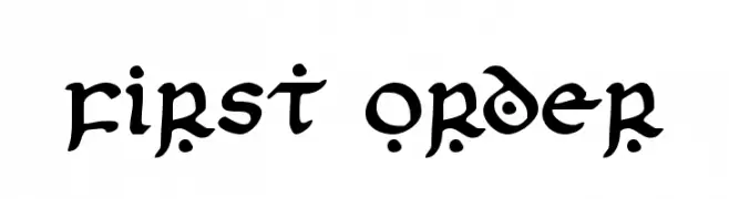
A bold, artistic font with flowing strokes and decorative elements.
![First Order font caratteri gratis]() Scaricare 449 Downloads@WebFont
Scaricare 449 Downloads@WebFont -
( Fonts by Daniel Zadorozny - www.iconian.com )
A sleek, modern font with a futuristic and italicized design.
![911 Porscha Leftalic font caratteri gratis]() Scaricare 449 Downloads@WebFont
Scaricare 449 Downloads@WebFont -
( Fonts by Daniel Zadorozny - www.iconian.com - Free for personal use )
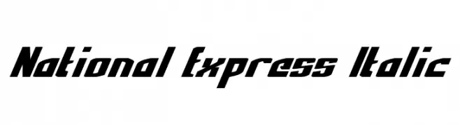
A bold, italic font with sharp angles and a modern, dynamic style.
![National Express Italic font caratteri gratis]() Scaricare 449 Downloads@WebFont
Scaricare 449 Downloads@WebFont -
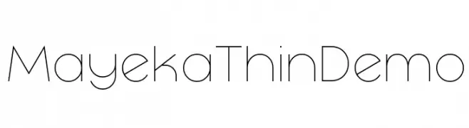
( Fonts by www.studiotypo.com - Personal-use only. For commercial use please contact owner. )
A thin, modern font with geometric influences and uniform strokes.
![Mayeka Thin Demo font caratteri gratis]() Scaricare 449 Downloads@WebFont
Scaricare 449 Downloads@WebFont -
( Fonts by Modestype Studio )
A bold, playful font with thick, rounded strokes and a whimsical style.
![Pong-Game font caratteri gratis]() Scaricare 449 Downloads@WebFont
Scaricare 449 Downloads@WebFont -
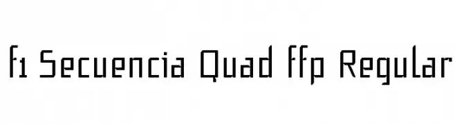
Caratteri di defharo. For commercial use please contact the owner.
![f1 Secuencia Quad ffp Regular font caratteri gratis]() Scaricare 449 Downloads@WebFont
Scaricare 449 Downloads@WebFont -
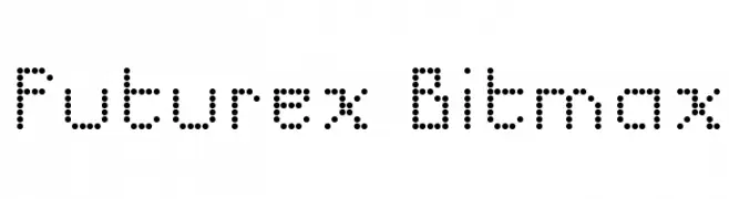
( Fonts by Apostrophic Lab )
A dot matrix style font with a retro-futuristic digital display look.
![Futurex Bitmax font caratteri gratis]() Scaricare 448 Downloads@WebFont
Scaricare 448 Downloads@WebFont -
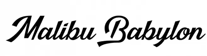
( Fonts by Octotype - www.foundmyfont.com - Personal-use only. For commercial use please contact owner. )
A bold, dynamic script font with elegant, flowing cursive letters.
![Malibu Babylon font caratteri gratis]() Scaricare 448 Downloads@WebFont
Scaricare 448 Downloads@WebFont -
( Fonts by Graham Meade - GemFonts )
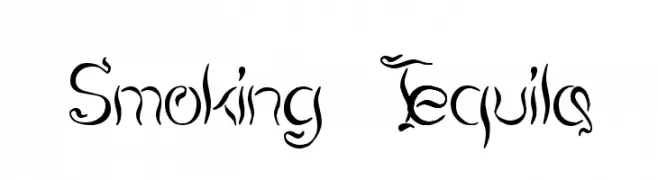
A decorative, calligraphic font with artistic, flowing strokes.
![Smoking Tequila font caratteri gratis]() Scaricare 448 Downloads@WebFont
Scaricare 448 Downloads@WebFont -
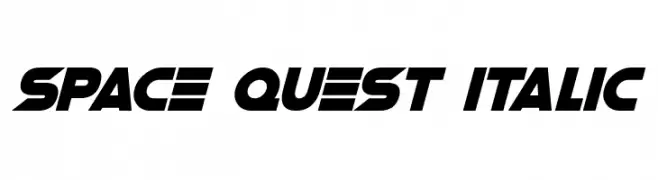
![Space Quest Italic font caratteri gratis]() Scaricare 448 Downloads@WebFont
Scaricare 448 Downloads@WebFont


Quali sono i font più popolari adesso?
Poppins, Roboto, Montserrat, Open Sans e Lato sono molto usati per le forme pulite e l'ampia applicabilità — dall'identità di marca alle landing page e ai poster.
Quali font si usano spesso nei loghi?
Le sans serif geometriche (es. Poppins, famiglie in stile Gotham) sono scelte comuni per un branding pulito e scalabile. Per un tocco personale restano valide script e stili manoscritti. Abbina un display deciso per i titoli a un corpo testo neutro per riconoscibilità ed equilibrio.
Ogni quanto si aggiorna la lista?
Con regolarità, in base ai download e all'attività reale. Torna spesso per scoprire in anticipo le nuove preferite.
💡 Consiglio: aggiungi ai preferiti — le tendenze cambiano in fretta e i font top di oggi possono ispirare il rebranding di domani.