Benvenuto nelle Font Più Popolari — dove popolarità e qualità si incontrano. Qui trovi i font più scaricati e usati dell'anno. Se cerchi scelte sicure per logo, web o social, inizia da qui.
Ogni font top si distingue per equilibrio, leggibilità e versatilità. Troverai sans serif moderne, script eleganti, serif vintage e display minimalisti.
-
 Scaricare 437 Downloads@WebFont
 -
![Ebony Demo font caratteri gratis]() Scaricare 437 Downloads@WebFont
Scaricare 437 Downloads@WebFont -
( Bastien Sozoo - sozoo.fr/ )
A bold, dynamic script font with smooth, flowing characters.
![Strato-Medium font caratteri gratis]() Scaricare 437 Downloads@WebFont
Scaricare 437 Downloads@WebFont -
( Fonts by Luke Owens - Personal-use only. For commercial use please contact owner. )
A bold, oblique font with a modern and dynamic style.
![Waukegan LDO Bold Oblique font caratteri gratis]() Scaricare 437 Downloads@WebFont
Scaricare 437 Downloads@WebFont -
![TCLescuelerascript font caratteri gratis]() Scaricare 437 Downloads@WebFont
Scaricare 437 Downloads@WebFont -
-
( Fonts by Castcraft Software - opti.netii.net - check the website before use )
A classic italic serif font with elegant, flowing characters.
![OPTICubaLibre-Italic font caratteri gratis]() Scaricare 436 Downloads@WebFont
Scaricare 436 Downloads@WebFont -
( Fonts by Astigmatic One Eye Typographic Institute - Brian J. Bonislawsky - astigmatic.com )
A bold, handwritten font with a dynamic and expressive style.
![PapaMano AOE font caratteri gratis]() Scaricare 436 Downloads@WebFont
Scaricare 436 Downloads@WebFont -
( Fonts by Castcraft Software - opti.netii.net - check the website before use )
A classic serif font with elegant strokes and balanced proportions.
![OPTICarveryLight font caratteri gratis]() Scaricare 436 Downloads@WebFont
Scaricare 436 Downloads@WebFont -
( Fonts by www.typodermicfonts.com - Ray Larabie )
An elegant italic font with smooth, flowing lines and moderate contrast.
![Effloresce-Italic font caratteri gratis]() Scaricare 436 Downloads@WebFont
Scaricare 436 Downloads@WebFont -
( Fonts by a Neale Davidson - www.pixelsagas.com. Personal-use only. For commercial use please contact owner. )
A modern, geometric font with sharp edges and a futuristic style.
![Chromia font caratteri gratis]() Scaricare 436 Downloads@WebFont
Scaricare 436 Downloads@WebFont -
( Fonts by a Max Infeld - XEROGRAPHER FONTS - xerographer.blogspot.com . Personal-use only. For commercial use please contact owner. )
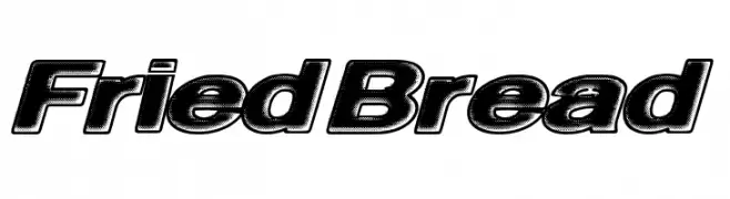
A bold, 3D-effect font with tight spacing and a strong visual impact.
![FriedBread font caratteri gratis]() Scaricare 436 Downloads@WebFont
Scaricare 436 Downloads@WebFont -
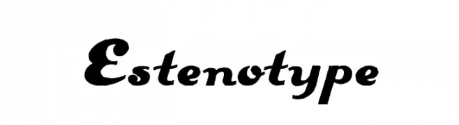
![Estenotype font caratteri gratis]() Scaricare 436 Downloads@WebFont
Scaricare 436 Downloads@WebFont -
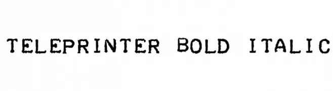
![Teleprinter Bold Italic font caratteri gratis]() Scaricare 436 Downloads@WebFont
Scaricare 436 Downloads@WebFont -
( Fonts by Woodcutter )
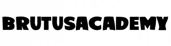
A bold, playful font with wide, heavy strokes and a friendly appearance.
![Brutus Academy font caratteri gratis]() Scaricare 436 Downloads@WebFont
Scaricare 436 Downloads@WebFont -
( Fonts by Krysten Tom )
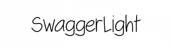
A playful, casual handwritten font with smooth, flowing lines.
![SwaggerLight font caratteri gratis]() Scaricare 436 Downloads@WebFont
Scaricare 436 Downloads@WebFont -
![Fast Money Regular font caratteri gratis]() Scaricare 436 Downloads@WebFont
Scaricare 436 Downloads@WebFont -
( Fonts by Sandylukee - Sandy Luke Nugroho - Personal-use only. For commercial use please contact owner. )
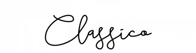
A playful, flowing script font with elegant, continuous strokes.
![Classico font caratteri gratis]() Scaricare 436 Downloads@WebFont
Scaricare 436 Downloads@WebFont -
( Fonts by Agathe M.Joyce - www.foundmyfont.com - Personal-use only. For commercial use please contact owner. )
A bold, calligraphic font with dynamic strokes and artistic flair.
![The Black Pearl font caratteri gratis]() Scaricare 436 Downloads@WebFont
Scaricare 436 Downloads@WebFont -
( Fonts by www.studiotypo.com - Personal-use only. For commercial use please contact owner. )
A bold, distressed font with a scratched texture for a rugged look.
![BLUEFISH BLACK SCRATCHED Demo font caratteri gratis]() Scaricare 436 Downloads@WebFont
Scaricare 436 Downloads@WebFont -
( Fonts by wep )
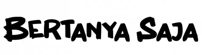
A bold, brush-like font with a playful and dynamic style.
![Bertanya Saja font caratteri gratis]() Scaricare 436 Downloads@WebFont
Scaricare 436 Downloads@WebFont -
![Conman font caratteri gratis]() Scaricare 436 Downloads@WebFont
Scaricare 436 Downloads@WebFont -
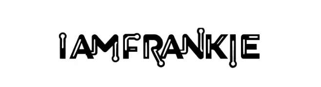
![I Am Frankie font caratteri gratis]() Scaricare 436 Downloads@WebFont
Scaricare 436 Downloads@WebFont -
( Fonts by Alex Slobzheninov - Personal-use only. For commercial use please contact owner. )
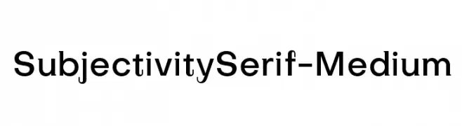
A modern sans-serif font with medium weight and rounded edges for a clean, professional look.
![SubjectivitySerif-Medium font caratteri gratis]() Scaricare 436 Downloads@WebFont
Scaricare 436 Downloads@WebFont -
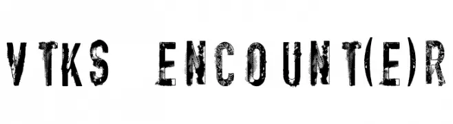
( Fonts by Douglas Vitkauskas - www.vtksdesign.com. Personal-use only. For commercial use please contact owner. )
A bold, distressed font with a rugged, textured appearance.
![vtks encount(e)r font caratteri gratis]() Scaricare 436 Downloads@WebFont
Scaricare 436 Downloads@WebFont -
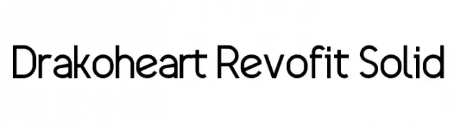
( Fonts by Yun Gonzalez - g3drakoheart-arts.deviantart.com - Personal-use only. For commercial use please contact owner. )
A modern, geometric sans-serif font with clean lines and balanced proportions.
![Drakoheart Revofit Solid font caratteri gratis]() Scaricare 436 Downloads@WebFont
Scaricare 436 Downloads@WebFont -
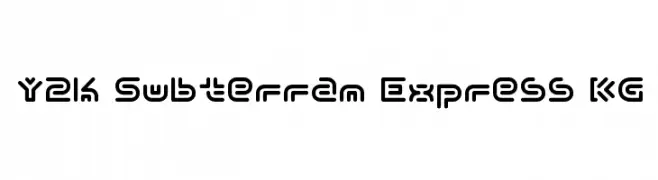
( Font by http://home.luna.nl/~xino/ )
A futuristic, geometric font with rounded edges and consistent line thickness.
![Y2k Subterran Express KG font caratteri gratis]() Scaricare 436 Downloads@WebFont
Scaricare 436 Downloads@WebFont -
( Fonts by Dieter Steffmann )
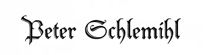
A classic blackletter font with ornate, angular letterforms and decorative flourishes.
![Peter Schlemihl font caratteri gratis]() Scaricare 436 Downloads@WebFont
Scaricare 436 Downloads@WebFont -
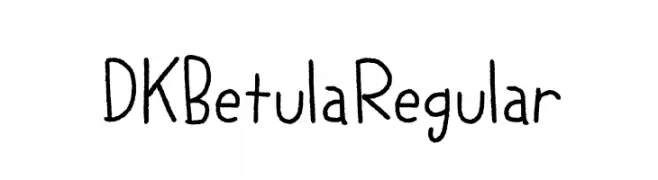
![DK Betula Regular font caratteri gratis]() Scaricare 436 Downloads@WebFont
Scaricare 436 Downloads@WebFont -
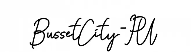
( Haksen Letters - Sarwo Edhi Prayitno )
A lively handwritten font with fluid strokes and a playful slant.
![Busset City - PU font caratteri gratis]() Scaricare 436 Downloads@WebFont
Scaricare 436 Downloads@WebFont -
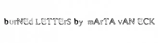
![Burned Letters by Marta van Eck font caratteri gratis]() Scaricare 436 Downloads@WebFont
Scaricare 436 Downloads@WebFont -
( Fonts by Goma Shin - www.geocities.jp/gomarice_font/ - Personal-use only. For commercial use please contact owner. )
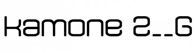
A modern, geometric font with rounded edges and uniform character width.
![kamone 2__G font caratteri gratis]() Scaricare 436 Downloads@WebFont
Scaricare 436 Downloads@WebFont -
( Fonts by dustBUST - Andreas Nylin )
A bold, italicized font with a futuristic and sleek design.
![Sci Fied BoldItalic font caratteri gratis]() Scaricare 436 Downloads@WebFont
Scaricare 436 Downloads@WebFont -
( Fonts by Noah Type - noahtype.com - Personal-use only. For commercial use please contact owner. )
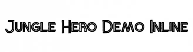
A bold, decorative font with a dynamic inline design, perfect for adventurous themes.
![Jungle Hero Demo Inline font caratteri gratis]() Scaricare 436 Downloads@WebFont
Scaricare 436 Downloads@WebFont -
( Fonts by www.omniglot.com )
A highly stylized, abstract font with angular, wedge-like shapes.
![Wedges font caratteri gratis]() Scaricare 436 Downloads@WebFont
Scaricare 436 Downloads@WebFont -
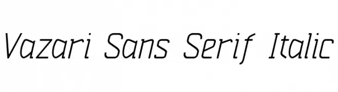
![Vazari Sans Serif Italic font caratteri gratis]() Scaricare 436 Downloads@WebFont
Scaricare 436 Downloads@WebFont


Quali sono i font più popolari adesso?
Poppins, Roboto, Montserrat, Open Sans e Lato sono molto usati per le forme pulite e l'ampia applicabilità — dall'identità di marca alle landing page e ai poster.
Quali font si usano spesso nei loghi?
Le sans serif geometriche (es. Poppins, famiglie in stile Gotham) sono scelte comuni per un branding pulito e scalabile. Per un tocco personale restano valide script e stili manoscritti. Abbina un display deciso per i titoli a un corpo testo neutro per riconoscibilità ed equilibrio.
Ogni quanto si aggiorna la lista?
Con regolarità, in base ai download e all'attività reale. Torna spesso per scoprire in anticipo le nuove preferite.
💡 Consiglio: aggiungi ai preferiti — le tendenze cambiano in fretta e i font top di oggi possono ispirare il rebranding di domani.