Benvenuto nelle Font Più Popolari — dove popolarità e qualità si incontrano. Qui trovi i font più scaricati e usati dell'anno. Se cerchi scelte sicure per logo, web o social, inizia da qui.
Ogni font top si distingue per equilibrio, leggibilità e versatilità. Troverai sans serif moderne, script eleganti, serif vintage e display minimalisti.
-
 Scaricare 402 Downloads@WebFont
 -
( Free for a personal use. For a commercial use please visit www.kevinandamanda.com )
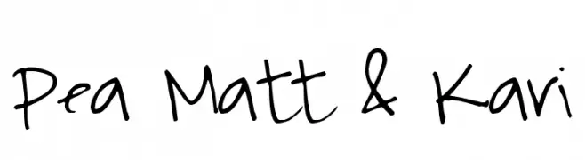
A playful, casual handwritten font with dynamic strokes.
![Pea Matt & Kari font caratteri gratis]() Scaricare 402 Downloads@WebFont
Scaricare 402 Downloads@WebFont -
( Fonts by Nick Curtis - www.nicksfonts.com )
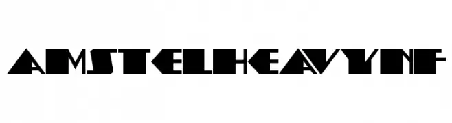
A bold, geometric font with sharp angles and a futuristic feel.
![AmstelHeavyNF font caratteri gratis]() Scaricare 402 Downloads@WebFont
Scaricare 402 Downloads@WebFont -
( Rogier van Dalen - home.kabelfoon.nl/~slam/fonts/fonts.html )
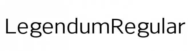
A modern, geometric sans-serif font with balanced proportions and high readability.
![Legendum Regular font caratteri gratis]() Scaricare 402 Downloads@WebFont
Scaricare 402 Downloads@WebFont -
( weknow - Wino S Kadir - www.creativefabrica.com/designer/weknow/ )
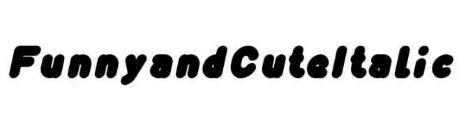
A playful, bold, and slightly italicized font with rounded, bubbly characters.
![Funny and Cute Italic font caratteri gratis]() Scaricare 402 Downloads@WebFont
Scaricare 402 Downloads@WebFont -
-
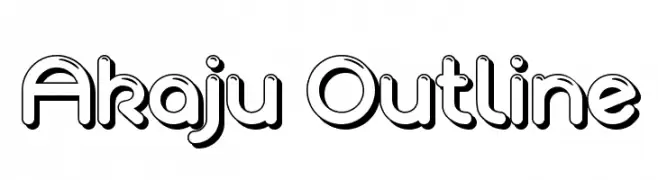
![Akaju Outline font caratteri gratis]() Scaricare 402 Downloads@WebFont
Scaricare 402 Downloads@WebFont -
( Fonts by HENRIavecunK. Personal-use only. For commercial use please contact owner. )
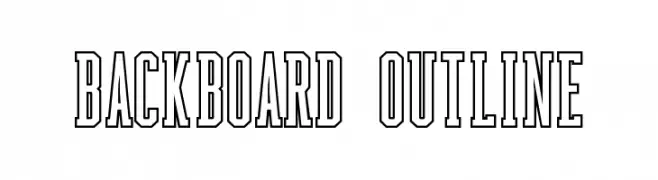
A bold, outlined, and condensed font with a strong visual impact.
![Backboard Outline font caratteri gratis]() Scaricare 402 Downloads@WebFont
Scaricare 402 Downloads@WebFont -
( Fonts by Graham Meade - GemFonts )
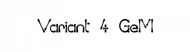
A playful, hand-drawn font with irregular, organic shapes and varying stroke thickness.
![Variant 4 GeM font caratteri gratis]() Scaricare 402 Downloads@WebFont
Scaricare 402 Downloads@WebFont -
( Fonts by Graham Meade - GemFonts )
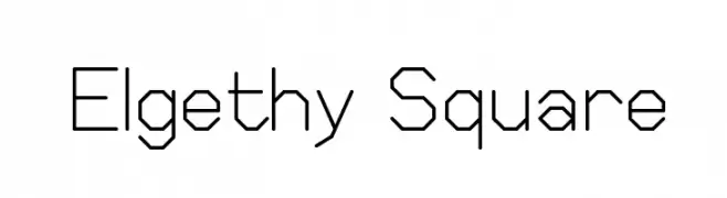
A geometric, angular font with consistent stroke width and a modern, technical aesthetic.
![Elgethy Square font caratteri gratis]() Scaricare 402 Downloads@WebFont
Scaricare 402 Downloads@WebFont -
![Gustavus font caratteri gratis]() Scaricare 402 Downloads@WebFont
Scaricare 402 Downloads@WebFont -
( Fonts by Daniel Zadorozny - www.iconian.com )
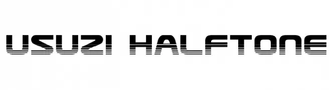
A bold, geometric font with a halftone effect, ideal for modern and tech-themed designs.
![Usuzi Halftone font caratteri gratis]() Scaricare 402 Downloads@WebFont
Scaricare 402 Downloads@WebFont -
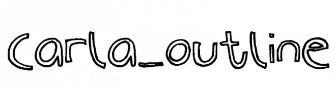
![Carla_outline font caratteri gratis]() Scaricare 402 Downloads@WebFont
Scaricare 402 Downloads@WebFont -
( Iconian Fonts - Daniel Zadorozny - www.iconian.com )
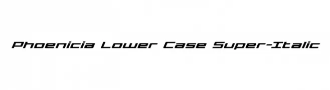
A modern, italicized font with a sleek, futuristic design.
![Phoenicia Lower Case Super-Italic font caratteri gratis]() Scaricare 402 Downloads@WebFont
Scaricare 402 Downloads@WebFont -
( Fonts by Apostrophic Lab )
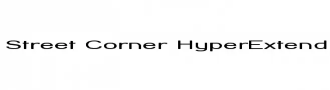
A modern, extended sans-serif font with smooth curves and clear readability.
![Street Corner HyperExtend font caratteri gratis]() Scaricare 402 Downloads@WebFont
Scaricare 402 Downloads@WebFont -
( Fonts by Manfred Klein. Free for private and charity use. Free for commercial with donation to organizations )
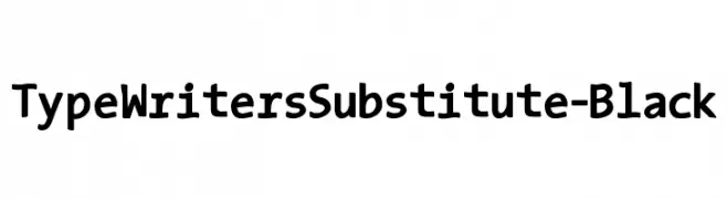
A bold, playful typewriter-inspired font with rounded, irregular characters.
![TypeWritersSubstitute-Black font caratteri gratis]() Scaricare 402 Downloads@WebFont
Scaricare 402 Downloads@WebFont -
( Fonts by Altsys Metamorphosis )
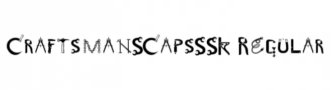
A decorative font with a mechanical and industrial theme, featuring tool-inspired elements.
![CraftsmanSCapsSSK Regular font caratteri gratis]() Scaricare 402 Downloads@WebFont
Scaricare 402 Downloads@WebFont -
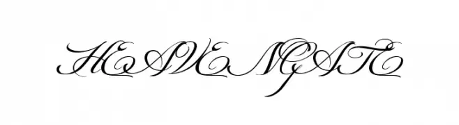
![HEAVENGATE font caratteri gratis]() Scaricare 402 Downloads@WebFont
Scaricare 402 Downloads@WebFont -
![Quizma Light Demo font caratteri gratis]() Scaricare 402 Downloads@WebFont
Scaricare 402 Downloads@WebFont -
( Fonts by Nenjo Studio - Personal-use only. For commercial use please contact owner. )
A bold, condensed font with uniform stroke thickness and strong vertical emphasis.
![Sigana font caratteri gratis]() Scaricare 402 Downloads@WebFont
Scaricare 402 Downloads@WebFont -
![Empress font caratteri gratis]() Scaricare 402 Downloads@WebFont
Scaricare 402 Downloads@WebFont -
( Fonts by www.gliphmaker.com. Personal-use only. For commercial use please contact owner. )
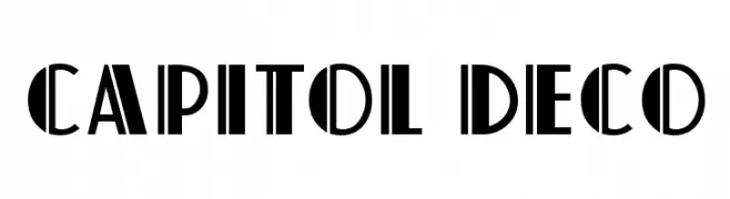
A bold Art Deco style font with geometric shapes and strong vertical lines.
![Capitol Deco font caratteri gratis]() Scaricare 402 Downloads@WebFont
Scaricare 402 Downloads@WebFont -
( Fonts by Daniel Zadorozny - www.iconian.com - Free for personal use )
A bold, geometric font with a futuristic and tech-inspired design.
![XPED font caratteri gratis]() Scaricare 402 Downloads
Scaricare 402 Downloads -
( Fonts by Din Studio - Donis Miftahudin - Personal-use only. For commercial use please contact owner. )
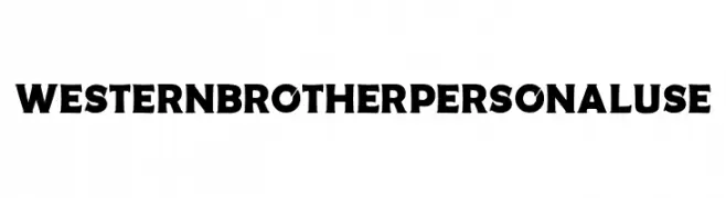
A bold, Western-inspired font with strong, thick strokes and subtle serifs.
![Western Brother Personal Use font caratteri gratis]() Scaricare 402 Downloads@WebFont
Scaricare 402 Downloads@WebFont -
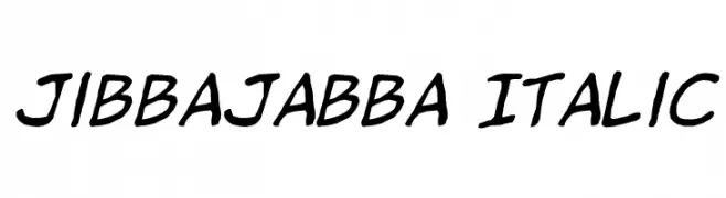
( Fonts by Jason Arthur - JibbaJabba Fonts - www.myspace.com/jasonarthurloaded )
A bold, italicized handwritten font with a dynamic and casual style.
![jibbajabba Italic font caratteri gratis]() Scaricare 402 Downloads@WebFont
Scaricare 402 Downloads@WebFont -
( Fonts by Galdino Otten )
A playful, hand-drawn font with bold, rounded letters and a sketchy outline.
![Christmas Cookies font caratteri gratis]() Scaricare 401 Downloads@WebFont
Scaricare 401 Downloads@WebFont -
( Fonts by CannotIntoSpaceFonts - KineticPlasma Fonts - Personal-use only. For commercial use please contact owner. )
A bold, extended, and oblique font with a modern and dynamic style.
![Warownia Black Extended Oblique font caratteri gratis]() Scaricare 401 Downloads@WebFont
Scaricare 401 Downloads@WebFont -
( Fonts by Din Studio - Donis Miftahudin - Personal-use only. For commercial use please contact owner. )
A modern serif font with elegant, slightly condensed letterforms and subtle serifs.
![Lovera Personal Use font caratteri gratis]() Scaricare 401 Downloads@WebFont
Scaricare 401 Downloads@WebFont -
![AntPoltSemiCond-Italic font caratteri gratis]() Scaricare 401 Downloads@WebFont
Scaricare 401 Downloads@WebFont -
( Fonts by Wahyu Eka Prasetya - wepfont.com - Personal-use only. For commercial use please contact owner. )
A bold, playful font with a distressed, hand-crafted look.
![Dengar font caratteri gratis]() Scaricare 401 Downloads@WebFont
Scaricare 401 Downloads@WebFont -
( Fonts by www.blambot.com )
A modern, italic, and condensed font with a sleek and dynamic style.
![CreatorCreditsBB-Italic font caratteri gratis]() Scaricare 401 Downloads@WebFont
Scaricare 401 Downloads@WebFont -
( Fonts by LyonsType - Daniel Lyons - Personal-use only. For commercial use please contact owner. )
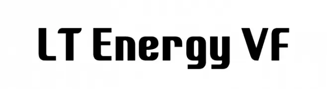
A bold, geometric font with a modern and impactful style.
![LT Energy VF font caratteri gratis]() Scaricare 401 Downloads@WebFont
Scaricare 401 Downloads@WebFont -
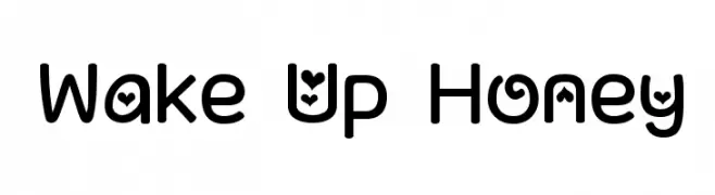
![Wake Up Honey font caratteri gratis]() Scaricare 401 Downloads@WebFont
Scaricare 401 Downloads@WebFont -
( Fonts by Castcraft Software - OPTI Fonts Archive - opti.netii.net - Personal-use only. For commercial use please contact owner. )
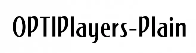
A modern vintage font with tall, narrow letterforms and art deco influences.
![OPTIPlayers-Plain font caratteri gratis]() Scaricare 401 Downloads@WebFont
Scaricare 401 Downloads@WebFont -
![KR Squished Mosquito font caratteri gratis]() Scaricare 401 Downloads@WebFont
Scaricare 401 Downloads@WebFont -
( Fonts by Iconian Fonts )
A bold, italicized font with a modern, three-dimensional style.
![Cruiser Fortress Punch Italic font caratteri gratis]() Scaricare 401 Downloads@WebFont
Scaricare 401 Downloads@WebFont


Quali sono i font più popolari adesso?
Poppins, Roboto, Montserrat, Open Sans e Lato sono molto usati per le forme pulite e l'ampia applicabilità — dall'identità di marca alle landing page e ai poster.
Quali font si usano spesso nei loghi?
Le sans serif geometriche (es. Poppins, famiglie in stile Gotham) sono scelte comuni per un branding pulito e scalabile. Per un tocco personale restano valide script e stili manoscritti. Abbina un display deciso per i titoli a un corpo testo neutro per riconoscibilità ed equilibrio.
Ogni quanto si aggiorna la lista?
Con regolarità, in base ai download e all'attività reale. Torna spesso per scoprire in anticipo le nuove preferite.
💡 Consiglio: aggiungi ai preferiti — le tendenze cambiano in fretta e i font top di oggi possono ispirare il rebranding di domani.