Benvenuto nelle Font Più Popolari — dove popolarità e qualità si incontrano. Qui trovi i font più scaricati e usati dell'anno. Se cerchi scelte sicure per logo, web o social, inizia da qui.
Ogni font top si distingue per equilibrio, leggibilità e versatilità. Troverai sans serif moderne, script eleganti, serif vintage e display minimalisti.
-
 Scaricare 380 Downloads@WebFont
 -
![Deranged 4 font caratteri gratis]() Scaricare 380 Downloads@WebFont
Scaricare 380 Downloads@WebFont -
( Fonts by Arkandis Digital Foundry )
A bold, italicized serif font with a dynamic and elegant appearance.
![VenturisSansADFNo2-BoldItalic font caratteri gratis]() Scaricare 380 Downloads@WebFont
Scaricare 380 Downloads@WebFont -
( Roch Art )
A dynamic and elegant script font with flowing, cursive letterforms.
![Yulia font caratteri gratis]() Scaricare 380 Downloads@WebFont
Scaricare 380 Downloads@WebFont -
![Surf Bat [Windsurfing Dingbats] font caratteri gratis]() Scaricare 380 Downloads
Scaricare 380 Downloads -
-
( Måns Grebäck - www.mansgreback.com )
A dynamic handwritten font with elongated, slanted characters.
![Xtreem Medium PERSONAL USE font caratteri gratis]() Scaricare 380 Downloads@WebFont
Scaricare 380 Downloads@WebFont -
![Eat More Chocolate font caratteri gratis]() Scaricare 380 Downloads@WebFont
Scaricare 380 Downloads@WebFont -
( Fonts by olexstudio - Firman Syah - Personal-use only. For commercial use please contact owner. )
A dynamic and elegant script font with flowing, cursive letterforms.
![PristyneDEMO font caratteri gratis]() Scaricare 380 Downloads@WebFont
Scaricare 380 Downloads@WebFont -
( Fonts by BNF Type Foundry / Dogu Kaya - bnftype.com - Personal-use only. For commercial use please contact owner. )
A modern, italic sans-serif font with clean lines and a versatile style.
![Kollektif Italic font caratteri gratis]() Scaricare 380 Downloads@WebFont
Scaricare 380 Downloads@WebFont -
![JeffreyPrint JL Condensed Italic font caratteri gratis]() Scaricare 380 Downloads@WebFont
Scaricare 380 Downloads@WebFont -
( Fonts by ndiscovered - Personal-use only. For commercial use please contact owner. )
A bold, modern font with a strong geometric structure and uniform stroke width.
![Exo Extra Bold font caratteri gratis]() Scaricare 380 Downloads@WebFont
Scaricare 380 Downloads@WebFont -
( Fonts by a Max Infeld - XEROGRAPHER FONTS - xerographer.blogspot.com . Personal-use only. For commercial use please contact owner. )
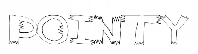
A bold, edgy font with jagged, pointy edges and a hand-drawn feel.
![pointy font caratteri gratis]() Scaricare 380 Downloads@WebFont
Scaricare 380 Downloads@WebFont -
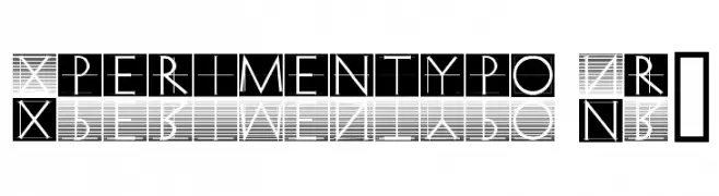
![Xperimentypo Nr1 font caratteri gratis]() Scaricare 380 Downloads@WebFont
Scaricare 380 Downloads@WebFont -
( Fonts by Kevin Christopher - www.kcfonts.com )
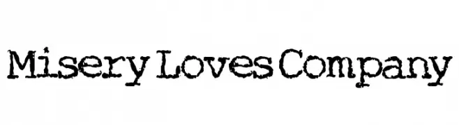
A bold, distressed font with a grungy, hand-crafted appearance.
![Misery Loves Company font caratteri gratis]() Scaricare 380 Downloads@WebFont
Scaricare 380 Downloads@WebFont -
( Lutz Baar - baar.se/aidfonts/ )
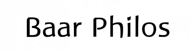
A modern sans-serif font with a clean, geometric style.
![Baar Philos font caratteri gratis]() Scaricare 380 Downloads@WebFont
Scaricare 380 Downloads@WebFont -
( Rometheme - Yahdi Kumala - creativemarket.com/Rometheme?u=Rometheme )
An elegant script font with flowing, ornate cursive letters and intricate swashes.
![Lovestrong font caratteri gratis]() Scaricare 380 Downloads@WebFont
Scaricare 380 Downloads@WebFont -
( Vlad Viperov )
A playful, rounded font with consistent stroke width and smooth curves.
![Argocksaz Bold_viper78 font caratteri gratis]() Scaricare 380 Downloads@WebFont
Scaricare 380 Downloads@WebFont -
( Fonts by Manfred Klein. Free for private and charity use. Free for commercial with donation to organizations )
A classic serif font with elegant strokes and a refined, timeless appearance.
![MKLatinLight font caratteri gratis]() Scaricare 380 Downloads@WebFont
Scaricare 380 Downloads@WebFont -
( Fonts by Woodcutter )
A bold, playful, hand-drawn font with a whimsical style.
![Almodóbar font caratteri gratis]() Scaricare 380 Downloads@WebFont
Scaricare 380 Downloads@WebFont -
![Sixes And Sevens font caratteri gratis]() Scaricare 380 Downloads@WebFont
Scaricare 380 Downloads@WebFont -
![BAND OF REALITY font caratteri gratis]() Scaricare 380 Downloads@WebFont
Scaricare 380 Downloads@WebFont -
( Fonts by RaffaSyad Studio - www.creativefabrica.com/designer/r-studio/ - Personal-use only. For commercial use please contact owner. )
A playful handwritten font with a casual and friendly style.
![Candylitee font caratteri gratis]() Scaricare 380 Downloads@WebFont
Scaricare 380 Downloads@WebFont -
( Fonts by Jonathan S. Harris - www.tattoowoo.com. Personal-use only. For commercial use please contact owner. )
A bold, expressive script font with a dynamic, brush-like texture.
![Love Rock font caratteri gratis]() Scaricare 380 Downloads@WebFont
Scaricare 380 Downloads@WebFont -
( Fonts by Iconian Fonts )
A bold, rounded font with a futuristic and geometric style.
![1st Enterprises Regular font caratteri gratis]() Scaricare 380 Downloads@WebFont
Scaricare 380 Downloads@WebFont -
( Fonts by Khurasan - Syaf Rizal - Personal-use only. For commercial use please contact owner. )
A bold, brush-style font with dynamic, edgy strokes.
![Gloomy Things font caratteri gratis]() Scaricare 380 Downloads@WebFont
Scaricare 380 Downloads@WebFont -
![Chinese Regular font caratteri gratis]() Scaricare 380 Downloads@WebFont
Scaricare 380 Downloads@WebFont -
( Vladimir Nikolic - www.coroflot.com/vladimirnikolic )
A bold, geometric font with a retro, arcade-inspired style.
![Maniac Regular font caratteri gratis]() Scaricare 380 Downloads@WebFont
Scaricare 380 Downloads@WebFont -
( Fonts by Nick Curtis - www.nicksfonts.com )
A bold, high-contrast font with sharp serifs and a vintage-modern appeal.
![RadioRanch font caratteri gratis]() Scaricare 380 Downloads
Scaricare 380 Downloads -
![Gadolinium Rounded font caratteri gratis]() Scaricare 380 Downloads@WebFont
Scaricare 380 Downloads@WebFont -
( imagex - www.imagex-fonts.com )
Bold, blocky font with thick outlines and geometric style.
![Powerful font caratteri gratis]() Scaricare 380 Downloads@WebFont
Scaricare 380 Downloads@WebFont -
( Fonts by Tokokoo Studio )
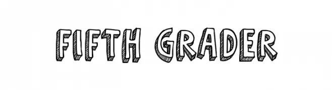
A bold, hand-drawn font with a playful, three-dimensional effect.
![Fifth Grader font caratteri gratis]() Scaricare 380 Downloads@WebFont
Scaricare 380 Downloads@WebFont -
( Fonts by a Neale Davidson - www.pixelsagas.com. Personal-use only. For commercial use please contact owner. )
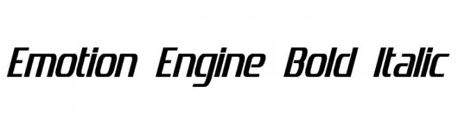
A bold, italicized font with a modern and dynamic style.
![Emotion Engine Bold Italic font caratteri gratis]() Scaricare 380 Downloads@WebFont
Scaricare 380 Downloads@WebFont -
( Fonts by Kreative Korporation - www.kreativekorp.com )
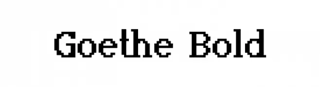
A bold serif font with strong vertical strokes and classic proportions.
![Goethe Bold font caratteri gratis]() Scaricare 380 Downloads@WebFont
Scaricare 380 Downloads@WebFont -
( Fonts by Billy Argel Fonts - www.billyargel.com - Personal-use only. For commercial use please contact owner. )
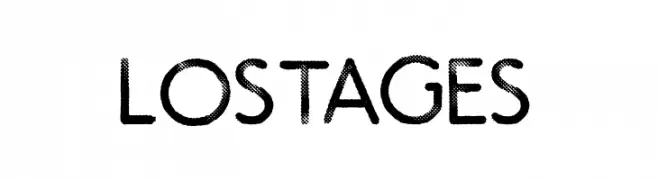
A bold, textured font with a retro, playful style.
![LOST AGES font caratteri gratis]() Scaricare 380 Downloads@WebFont
Scaricare 380 Downloads@WebFont -
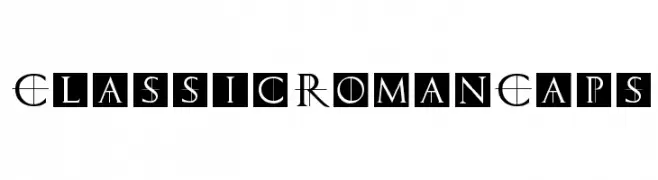
( Fonts by Manfred Klein. Free for private and charity use. Free for commercial with donation to organizations )
A classic, elegant font with intricate serifs and a Roman inscription style.
![ClassicRomanCaps font caratteri gratis]() Scaricare 380 Downloads@WebFont
Scaricare 380 Downloads@WebFont

![Surf Bat [Windsurfing Dingbats] font caratteri gratis](https://d144mzi0q5mijx.cloudfront.net/img/S/U/Surf-Bat-Windsurfing-Dingbats.webp)


Quali sono i font più popolari adesso?
Poppins, Roboto, Montserrat, Open Sans e Lato sono molto usati per le forme pulite e l'ampia applicabilità — dall'identità di marca alle landing page e ai poster.
Quali font si usano spesso nei loghi?
Le sans serif geometriche (es. Poppins, famiglie in stile Gotham) sono scelte comuni per un branding pulito e scalabile. Per un tocco personale restano valide script e stili manoscritti. Abbina un display deciso per i titoli a un corpo testo neutro per riconoscibilità ed equilibrio.
Ogni quanto si aggiorna la lista?
Con regolarità, in base ai download e all'attività reale. Torna spesso per scoprire in anticipo le nuove preferite.
💡 Consiglio: aggiungi ai preferiti — le tendenze cambiano in fretta e i font top di oggi possono ispirare il rebranding di domani.