Benvenuto nelle Font Più Popolari — dove popolarità e qualità si incontrano. Qui trovi i font più scaricati e usati dell'anno. Se cerchi scelte sicure per logo, web o social, inizia da qui.
Ogni font top si distingue per equilibrio, leggibilità e versatilità. Troverai sans serif moderne, script eleganti, serif vintage e display minimalisti.
-
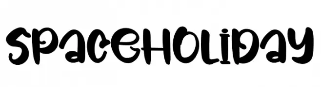
( Fonts by Inermedia Studio )
A playful, bold, and whimsical hand-drawn font with a festive feel.
 Scaricare 370 Downloads@WebFont
 -
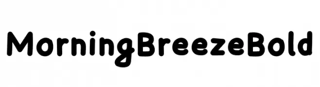
( Fonts by Szymon Furjan - Personal-use only. For commercial use please contact owner. )
A bold, playful font with rounded edges and a friendly appearance.
![Morning Breeze Bold font caratteri gratis]() Scaricare 370 Downloads@WebFont
Scaricare 370 Downloads@WebFont -
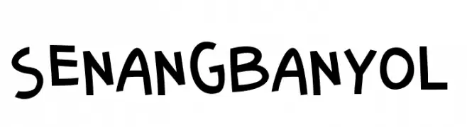
![SenangBanyol font caratteri gratis]() Scaricare 370 Downloads@WebFont
Scaricare 370 Downloads@WebFont -
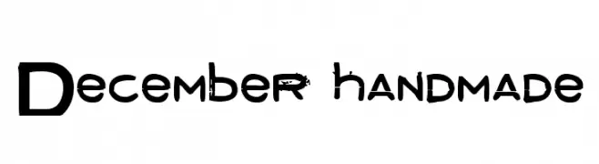
![December handmade font caratteri gratis]() Scaricare 370 Downloads@WebFont
Scaricare 370 Downloads@WebFont -
![Asteria font caratteri gratis]() Scaricare 370 Downloads@WebFont
Scaricare 370 Downloads@WebFont -
-
![Avaza Mtavruli font caratteri gratis]() Scaricare 370 Downloads
Scaricare 370 Downloads -
( Fonts by Levi Halmos )
A bold, geometric font with a futuristic, digital aesthetic.
![Face plant font caratteri gratis]() Scaricare 370 Downloads@WebFont
Scaricare 370 Downloads@WebFont -
![Salterio Shadow Two font caratteri gratis]() Scaricare 370 Downloads@WebFont
Scaricare 370 Downloads@WebFont -
![ScriptME New Bold font caratteri gratis]() Scaricare 370 Downloads@WebFont
Scaricare 370 Downloads@WebFont -
( Fonts by Vladimir Nikolic - https://www.creativefabrica.com/product/educated-deers/ref/144265/ - Personal-use only. For commercial use please contact owner. )
A modern, geometric font with rounded edges and uniform stroke width.
![Available Regular font caratteri gratis]() Scaricare 370 Downloads@WebFont
Scaricare 370 Downloads@WebFont -
Caratteri di antipixel. For commercial use please contact the owner.
![Iso 2.0 font caratteri gratis]() Scaricare 370 Downloads@WebFont
Scaricare 370 Downloads@WebFont -
( Fonts by www.haroldsfonts.com )
A heart-themed decorative font with glyphs made from clustered heart shapes.
![Heartland Hearts font caratteri gratis]() Scaricare 370 Downloads@WebFont
Scaricare 370 Downloads@WebFont -
( Fonts by Pablo Impallari, Rodrigo Fuenzalida (Modified by Dan O. Williams) - Personal-use only. For commercial use please contact owner. )
A modern, extra light sans-serif font with clean lines and low contrast.
![Morrison ExtraLight font caratteri gratis]() Scaricare 370 Downloads@WebFont
Scaricare 370 Downloads@WebFont -
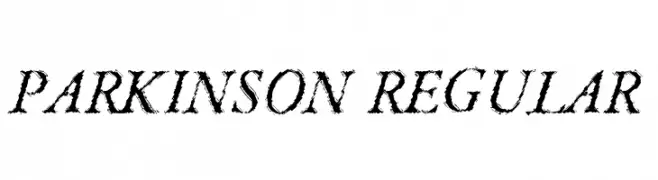
( Fonts by Steve Cloutier - www.cloutierfontes.ca )
A textured, italicized font with a brush stroke appearance.
![Parkinson Regular font caratteri gratis]() Scaricare 370 Downloads@WebFont
Scaricare 370 Downloads@WebFont -
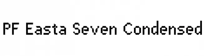
( Fonts by yusukekamiyamane.com )
A pixelated, geometric font with a condensed, retro digital style.
![PF Easta Seven Condensed font caratteri gratis]() Scaricare 370 Downloads@WebFont
Scaricare 370 Downloads@WebFont -
![petty1.0 font caratteri gratis]() Scaricare 370 Downloads@WebFont
Scaricare 370 Downloads@WebFont -
![LVDC Papicon font caratteri gratis]() Scaricare 370 Downloads@WebFont
Scaricare 370 Downloads@WebFont -
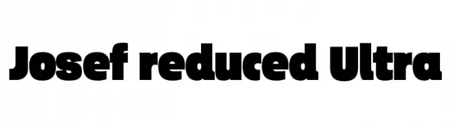
( ingoFonts - Ingo Zimmermann - www.ingofonts.com )
A bold, modern font with thick, uniform strokes and tight spacing.
![Josef reduced Ultra font caratteri gratis]() Scaricare 370 Downloads@WebFont
Scaricare 370 Downloads@WebFont -
( Fonts by Pablo Impallari, Andres Torresi, & Cristiano Sobral - Personal-use only. For commercial use please contact owner. )
A bold, italicized sans-serif font with a modern and dynamic style.
![Plata Sans Bold Italic font caratteri gratis]() Scaricare 370 Downloads@WebFont
Scaricare 370 Downloads@WebFont -
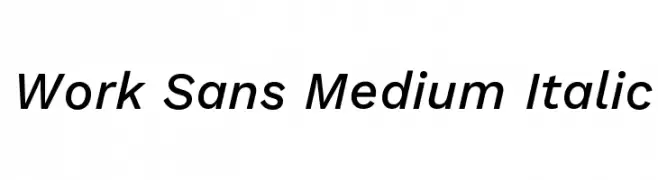
( Fonts by Wei Huang - Personal-use only. For commercial use please contact owner. )
A modern, italic sans-serif font with medium weight and excellent legibility.
![Work Sans Medium Italic font caratteri gratis]() Scaricare 370 Downloads@WebFont
Scaricare 370 Downloads@WebFont -
Caratteri di ZedFonts2334. For commercial use please contact the owner.
![ZF2334 Typography Love Bold font caratteri gratis]() Scaricare 370 Downloads@WebFont
Scaricare 370 Downloads@WebFont -
( Google Web Fonts )
A bold, modern sans-serif font with clean lines and Thai script support.
![Droid Sans Thai Bold font caratteri gratis]() Scaricare 370 Downloads@WebFont
Scaricare 370 Downloads@WebFont -
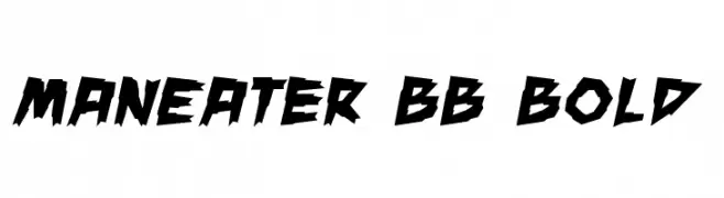
( Fonts by www.blambot.com )
A bold, jagged, and dynamic font with sharp, angular edges.
![ManEater BB Bold font caratteri gratis]() Scaricare 370 Downloads@WebFont
Scaricare 370 Downloads@WebFont -
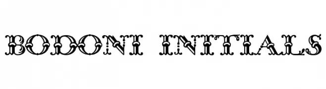
( Fonts by www.gliphmaker.com. Personal-use only. For commercial use please contact owner. )
An ornate, decorative font with intricate embellishments and a classic serif structure.
![Bodoni Initials font caratteri gratis]() Scaricare 370 Downloads@WebFont
Scaricare 370 Downloads@WebFont -
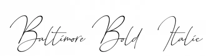
( Sronstudio - Yusron Billah )
An elegant, cursive font with flowing, interconnected letters and dynamic contrast.
![Baltimore Bold - Italic font caratteri gratis]() Scaricare 370 Downloads@WebFont
Scaricare 370 Downloads@WebFont -
( Fonts by backpacker.gr )
A modern, dotted font with a playful and bold appearance.
![BPdotsUnicase-Bold font caratteri gratis]() Scaricare 370 Downloads@WebFont
Scaricare 370 Downloads@WebFont -
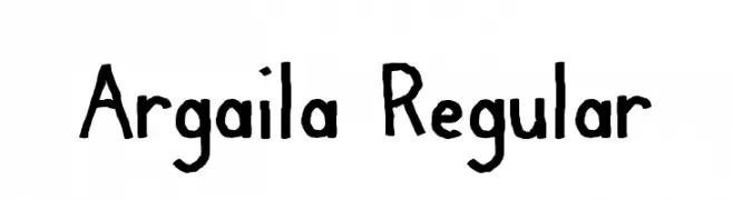
![Argaila Regular font caratteri gratis]() Scaricare 370 Downloads@WebFont
Scaricare 370 Downloads@WebFont -
( Fonts by www.fontalicious.com )
Hand-drawn dingbat font with garage sale item illustrations.
![Garage Sale font caratteri gratis]() Scaricare 370 Downloads@WebFont
Scaricare 370 Downloads@WebFont -
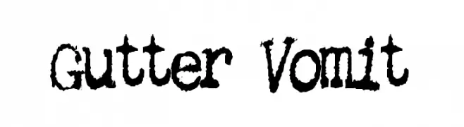
![Gutter Vomit font caratteri gratis]() Scaricare 370 Downloads@WebFont
Scaricare 370 Downloads@WebFont -
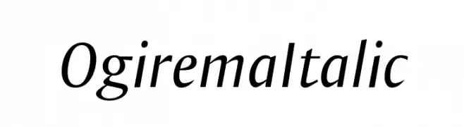
( Fonts by Manfred Klein - manfred-klein.ina-mar.com )
A sleek, elegant italic font with smooth curves and a modern aesthetic.
![OgiremaItalic font caratteri gratis]() Scaricare 370 Downloads@WebFont
Scaricare 370 Downloads@WebFont -
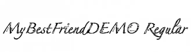
![MyBestFriendDEMO Regular font caratteri gratis]() Scaricare 370 Downloads@WebFont
Scaricare 370 Downloads@WebFont -
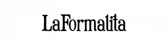
( Fonts by Woodcutter Manero - www.woodcutter.es - Personal-use only. For commercial use please contact owner. )
A classic serif font with an elegant and formal style.
![La Formalita font caratteri gratis]() Scaricare 370 Downloads@WebFont
Scaricare 370 Downloads@WebFont -
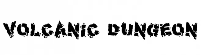
( Fonts by Darrell Flood )
A bold, distressed font with a rugged, volcanic texture.
![Volcanic Dungeon font caratteri gratis]() Scaricare 370 Downloads@WebFont
Scaricare 370 Downloads@WebFont -
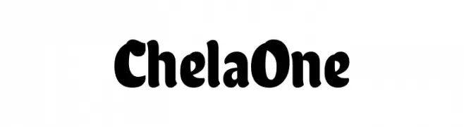
( Fonts by Latinotype )
A bold, playful font with rounded strokes and a friendly appearance.
![Chela One font caratteri gratis]() Scaricare 370 Downloads@WebFont
Scaricare 370 Downloads@WebFont -
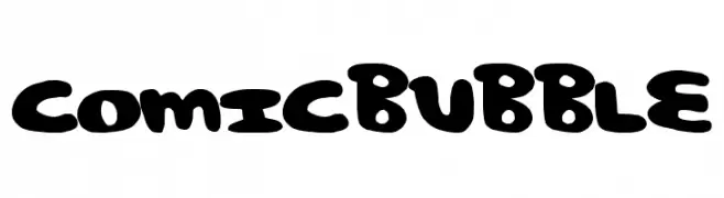
( Fonts by a Max Infeld - XEROGRAPHER FONTS - xerographer.blogspot.com . Personal-use only. For commercial use please contact owner. )
A playful, bold font with rounded, bubble-like characters ideal for fun designs.
![ComicBubble font caratteri gratis]() Scaricare 370 Downloads@WebFont
Scaricare 370 Downloads@WebFont


Quali sono i font più popolari adesso?
Poppins, Roboto, Montserrat, Open Sans e Lato sono molto usati per le forme pulite e l'ampia applicabilità — dall'identità di marca alle landing page e ai poster.
Quali font si usano spesso nei loghi?
Le sans serif geometriche (es. Poppins, famiglie in stile Gotham) sono scelte comuni per un branding pulito e scalabile. Per un tocco personale restano valide script e stili manoscritti. Abbina un display deciso per i titoli a un corpo testo neutro per riconoscibilità ed equilibrio.
Ogni quanto si aggiorna la lista?
Con regolarità, in base ai download e all'attività reale. Torna spesso per scoprire in anticipo le nuove preferite.
💡 Consiglio: aggiungi ai preferiti — le tendenze cambiano in fretta e i font top di oggi possono ispirare il rebranding di domani.