Benvenuto nelle Font Più Popolari — dove popolarità e qualità si incontrano. Qui trovi i font più scaricati e usati dell'anno. Se cerchi scelte sicure per logo, web o social, inizia da qui.
Ogni font top si distingue per equilibrio, leggibilità e versatilità. Troverai sans serif moderne, script eleganti, serif vintage e display minimalisti.
-
( Fonts by Craft Supply Co. )
A playful, bold, and whimsical font with a hand-drawn appearance.
 Scaricare 370 Downloads@WebFont
 -
( Fonts by Wino S Kadir - weknow - www.revolge.com/shop/weknow/ - Personal-use only. For commercial use please contact owner. )
A bold, dripping font with a spooky, wax-like appearance.
![candlelight font caratteri gratis]() Scaricare 369 Downloads@WebFont
Scaricare 369 Downloads@WebFont -
![LowerMetal font caratteri gratis]() Scaricare 369 Downloads@WebFont
Scaricare 369 Downloads@WebFont -
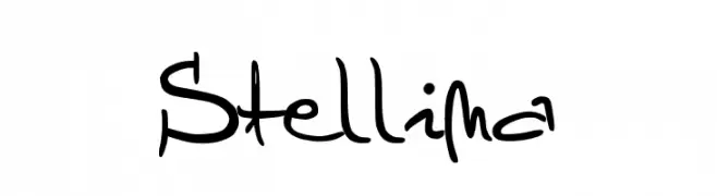
![Stellina font caratteri gratis]() Scaricare 369 Downloads@WebFont
Scaricare 369 Downloads@WebFont -
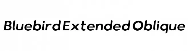
![Bluebird Extended Oblique font caratteri gratis]() Scaricare 369 Downloads@WebFont
Scaricare 369 Downloads@WebFont -
-
( Fonts by Bobistheowl - Personal-use only. For commercial use please contact owner. )
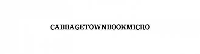
A bold, classic serif font with strong, prominent strokes.
![CabbagetownBookMicro font caratteri gratis]() Scaricare 369 Downloads@WebFont
Scaricare 369 Downloads@WebFont -
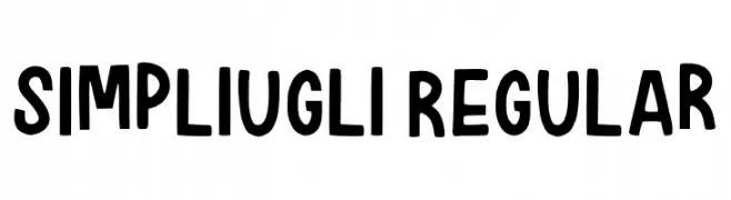
( Fonts by Pure Charles )
A playful, bold, hand-drawn font with a whimsical and informal style.
![Simpliugli Regular font caratteri gratis]() Scaricare 369 Downloads@WebFont
Scaricare 369 Downloads@WebFont -
( (C)1998-2007 Gray Graphics. http://www.orange.ne.jp/~den7/ )
A bold, rounded font with a futuristic and technological style.
![Technopolish font caratteri gratis]() Scaricare 369 Downloads@WebFont
Scaricare 369 Downloads@WebFont -
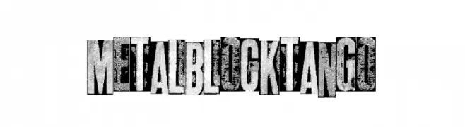
( Fonts by a Max Infeld - XEROGRAPHER FONTS - xerographer.blogspot.com . Personal-use only. For commercial use please contact owner. )
A bold, industrial font with a gritty, metallic texture.
![metalblocktango font caratteri gratis]() Scaricare 369 Downloads@WebFont
Scaricare 369 Downloads@WebFont -
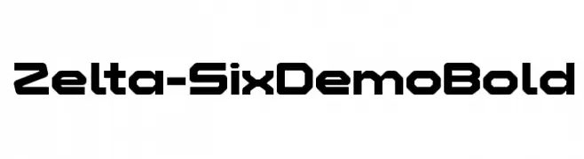
( Fonts by www.studiotypo.com - Personal-use only. For commercial use please contact owner. )
A bold, geometric font with a futuristic, digital aesthetic.
![Zelta-Six Demo Bold font caratteri gratis]() Scaricare 369 Downloads@WebFont
Scaricare 369 Downloads@WebFont -
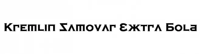
![Kremlin Samovar Extra Bold font caratteri gratis]() Scaricare 369 Downloads@WebFont
Scaricare 369 Downloads@WebFont -
( Fonts by Woodcutter Manero - http://www.woodcutter.es - Personal-use only. For commercial use please contact owner. )
A bold, textured font with a vintage, rugged style.
![European Denim Brand font caratteri gratis]() Scaricare 369 Downloads@WebFont
Scaricare 369 Downloads@WebFont -
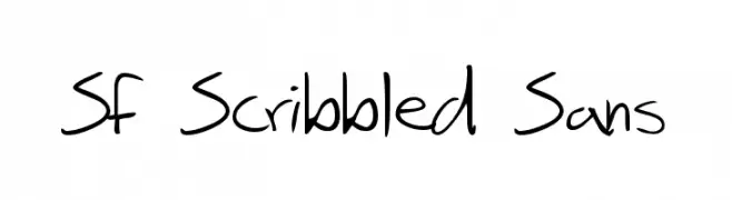
( Fonts by ShyFonts )
A casual, handwritten font with a playful, scribbled appearance.
![SF Scribbled Sans font caratteri gratis]() Scaricare 369 Downloads@WebFont
Scaricare 369 Downloads@WebFont -
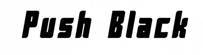
![Push Black font caratteri gratis]() Scaricare 369 Downloads@WebFont
Scaricare 369 Downloads@WebFont -
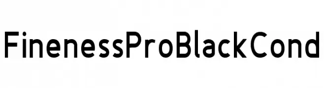
( Fonts by www.asleycruz.com - Asley Cruz - Personal-use only. For commercial use please contact owner. )
A bold, modern sans-serif font with a slightly condensed width and clean lines.
![Fineness Pro Black Cond font caratteri gratis]() Scaricare 369 Downloads@WebFont
Scaricare 369 Downloads@WebFont -
![Salmon White - Personal Use font caratteri gratis]() Scaricare 369 Downloads@WebFont
Scaricare 369 Downloads@WebFont -
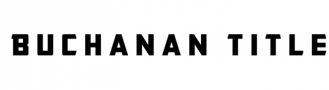
( Iconian Fonts - Daniel Zadorozny - www.iconian.com )
A bold, geometric font with an industrial and modern aesthetic.
![Buchanan Title font caratteri gratis]() Scaricare 369 Downloads@WebFont
Scaricare 369 Downloads@WebFont -
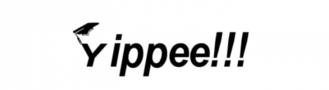
![Yippee!!! font caratteri gratis]() Scaricare 369 Downloads
Scaricare 369 Downloads -
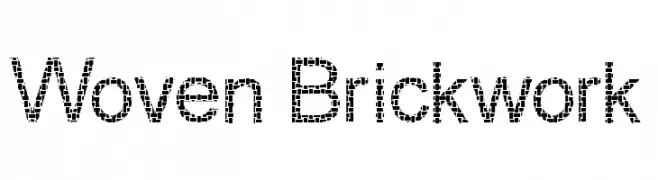
( Fonts by Graham Meade - GemFonts )
A decorative font with a woven, brick-like texture, ideal for impactful designs.
![Woven Brickwork font caratteri gratis]() Scaricare 369 Downloads@WebFont
Scaricare 369 Downloads@WebFont -
( Rick Mueller - moorstation.org/typoasis/designers/mueller/ )
A playful, rope-themed decorative font with a bold, textured design.
![Rope MF font caratteri gratis]() Scaricare 369 Downloads@WebFont
Scaricare 369 Downloads@WebFont -
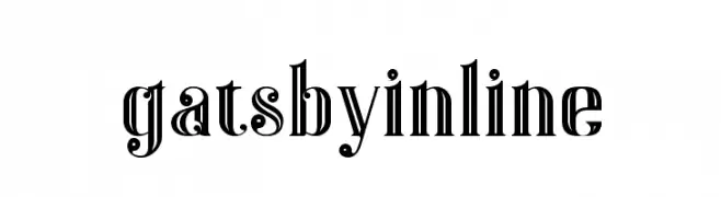
( Fonts by Peter Olexa - www.dealjumbo.com - Personal-use only. For commercial use please contact owner. )
A bold, decorative font with vintage Art Deco influences and inline detailing.
![Gatsby Inline font caratteri gratis]() Scaricare 369 Downloads@WebFont
Scaricare 369 Downloads@WebFont -
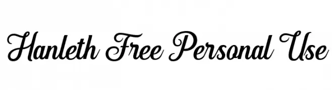
( Fonts by Andhi Yulianto - Personal-use only. For commercial use please contact owner. )
A stylish and elegant script font with flowing, connected letterforms.
![Hanleth Free Personal Use font caratteri gratis]() Scaricare 369 Downloads@WebFont
Scaricare 369 Downloads@WebFont -
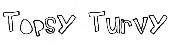
![Topsy Turvy font caratteri gratis]() Scaricare 369 Downloads@WebFont
Scaricare 369 Downloads@WebFont -
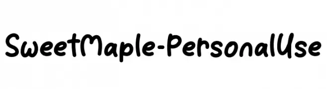
( Fonts by Attype Studio )
A playful, bold handwritten font with smooth, rounded edges.
![Sweet Maple - Personal Use font caratteri gratis]() Scaricare 369 Downloads@WebFont
Scaricare 369 Downloads@WebFont -
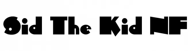
( Fonts by Nick Curtis - www.nicksfonts.com )
A bold, geometric font with playful and strong lines.
![Sid The Kid NF font caratteri gratis]() Scaricare 369 Downloads@WebFont
Scaricare 369 Downloads@WebFont -
![NIBIRU font caratteri gratis]() Scaricare 369 Downloads@WebFont
Scaricare 369 Downloads@WebFont -
( Fonts by Kevin Christopher - www.kcfonts.com )
A bold, geometric font with a playful and chunky style.
![FatCat font caratteri gratis]() Scaricare 369 Downloads@WebFont
Scaricare 369 Downloads@WebFont -
( Fonts by Fontysia - Fontysia - Personal-use only. For commercial use please contact owner. )
A playful, handwritten font with a modern and dynamic style.
![Goodly font caratteri gratis]() Scaricare 369 Downloads@WebFont
Scaricare 369 Downloads@WebFont -
( Fonts by Youssef Habchi - Personal-use only. For commercial use please contact owner. )
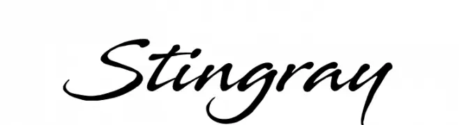
A dynamic, cursive script font with smooth, connected letters and varied stroke thickness.
![Stingray font caratteri gratis]() Scaricare 369 Downloads@WebFont
Scaricare 369 Downloads@WebFont -
( Måns Grebäck - www.mansgreback.com )
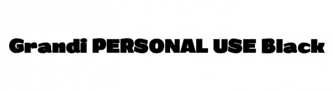
A bold, high-contrast font with thick strokes and slightly condensed characters.
![Grandi PERSONAL USE Black font caratteri gratis]() Scaricare 369 Downloads@WebFont
Scaricare 369 Downloads@WebFont -
( Fonts by Bree Gorton )
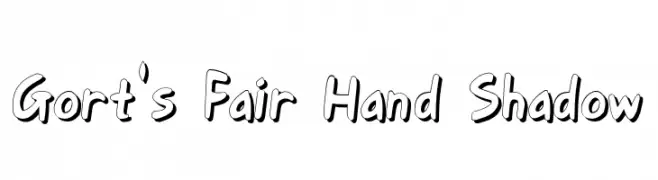
A bold, hand-drawn font with a playful shadow effect.
![Gort's Fair Hand Shadow font caratteri gratis]() Scaricare 369 Downloads@WebFont
Scaricare 369 Downloads@WebFont -
( Please visit www.pixilate.com before you use! )
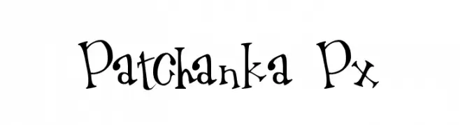
A playful and whimsical font with dynamic, irregular letterforms.
![Patchanka Px font caratteri gratis]() Scaricare 369 Downloads@WebFont
Scaricare 369 Downloads@WebFont -
( imagex - www.imagex-fonts.com )
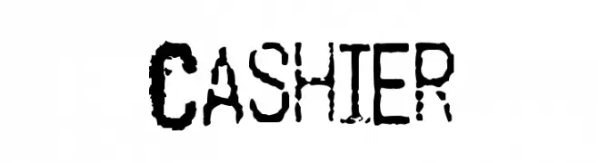
A distressed, grunge-style font with a rugged, stencil-like appearance.
![Cashier font caratteri gratis]() Scaricare 369 Downloads@WebFont
Scaricare 369 Downloads@WebFont -
( Fonts by Hanoded )
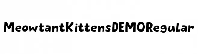
A playful, hand-drawn font with cat-themed characters and a whimsical style.
![Meowtant Kittens DEMO Regular font caratteri gratis]() Scaricare 369 Downloads@WebFont
Scaricare 369 Downloads@WebFont -
( Fonts by ShyFonts )
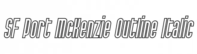
A bold, outlined, italic font with a modern and dynamic style.
![SF Port McKenzie Outline Italic font caratteri gratis]() Scaricare 369 Downloads@WebFont
Scaricare 369 Downloads@WebFont


Quali sono i font più popolari adesso?
Poppins, Roboto, Montserrat, Open Sans e Lato sono molto usati per le forme pulite e l'ampia applicabilità — dall'identità di marca alle landing page e ai poster.
Quali font si usano spesso nei loghi?
Le sans serif geometriche (es. Poppins, famiglie in stile Gotham) sono scelte comuni per un branding pulito e scalabile. Per un tocco personale restano valide script e stili manoscritti. Abbina un display deciso per i titoli a un corpo testo neutro per riconoscibilità ed equilibrio.
Ogni quanto si aggiorna la lista?
Con regolarità, in base ai download e all'attività reale. Torna spesso per scoprire in anticipo le nuove preferite.
💡 Consiglio: aggiungi ai preferiti — le tendenze cambiano in fretta e i font top di oggi possono ispirare il rebranding di domani.