Benvenuto nelle Font Più Popolari — dove popolarità e qualità si incontrano. Qui trovi i font più scaricati e usati dell'anno. Se cerchi scelte sicure per logo, web o social, inizia da qui.
Ogni font top si distingue per equilibrio, leggibilità e versatilità. Troverai sans serif moderne, script eleganti, serif vintage e display minimalisti.
-
( www.aidascrap.blogspot.com )
A playful, casual handwritten font with dynamic strokes and a friendly appearance.
 Scaricare 337 Downloads@WebFont
 -
( Fonts by Graham Meade - GemFonts )
A modern, geometric outline font with clean lines and consistent stroke width.
![Brave New Era [outline] G98 font caratteri gratis]() Scaricare 337 Downloads@WebFont
Scaricare 337 Downloads@WebFont -
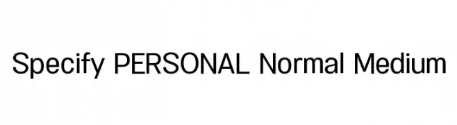
( Måns Grebäck - www.mansgreback.com )
A modern, clean sans-serif font with uniform strokes and excellent readability.
![Specify PERSONAL Normal Medium font caratteri gratis]() Scaricare 337 Downloads@WebFont
Scaricare 337 Downloads@WebFont -
![Biting My Nails Outline font caratteri gratis]() Scaricare 337 Downloads@WebFont
Scaricare 337 Downloads@WebFont -
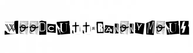
( www.woodcutter.es )
A bold, eclectic display typeface mimicking cut-out letters with unique styles.
![Woodcutter Anonymous font caratteri gratis]() Scaricare 337 Downloads@WebFont
Scaricare 337 Downloads@WebFont -
-
( www.styleseven.com/ )
A dot matrix style font with a digital, retro aesthetic.
![LED Counter 7 font caratteri gratis]() Scaricare 337 Downloads@WebFont
Scaricare 337 Downloads@WebFont -
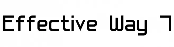
( Fonts by Style-7 - www.styleseven.com - Personal-use only. For commercial use please contact owner. )
A modern, geometric font with a clean, structured design.
![Effective Way 7 font caratteri gratis]() Scaricare 337 Downloads@WebFont
Scaricare 337 Downloads@WebFont -
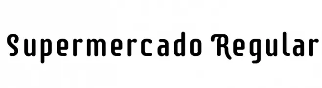
( Copyright (c) 2011-2012 by Sorkin Type Co (www.sorkintype.com) )
A bold, rounded font with a playful and structured style.
![Supermercado Regular font caratteri gratis]() Scaricare 337 Downloads@WebFont
Scaricare 337 Downloads@WebFont -
( Adam Wunn )
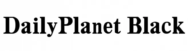
A bold, high-contrast serif font with a classic and authoritative style.
![DailyPlanet Black font caratteri gratis]() Scaricare 337 Downloads@WebFont
Scaricare 337 Downloads@WebFont -
( Fonts by The Docallisme )
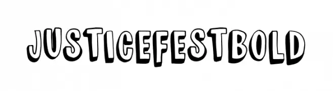
A bold, playful font with a three-dimensional effect and cartoonish style.
![JUSTICE FEST Bold font caratteri gratis]() Scaricare 337 Downloads@WebFont
Scaricare 337 Downloads@WebFont -
( Fonts by Scratchones )
Decorative script font with elegant, flowing lines.
![Olive Oil font caratteri gratis]() Scaricare 337 Downloads@WebFont
Scaricare 337 Downloads@WebFont -
( Fonts by Daniel Zadorozny - www.iconian.com - Free for personal use )
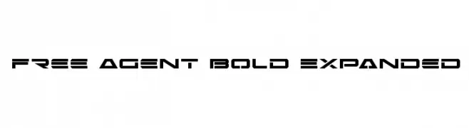
A bold, expanded, and futuristic font with geometric shapes and sharp angles.
![Free Agent Bold Expanded font caratteri gratis]() Scaricare 337 Downloads@WebFont
Scaricare 337 Downloads@WebFont -
( Fonts by Darrell Flood - Personal-use only. For commercial use please contact owner. )
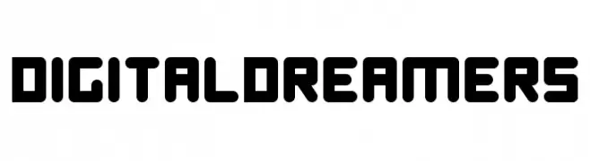
A bold, geometric font with rounded edges and a futuristic style.
![Digital Dreamers font caratteri gratis]() Scaricare 336 Downloads@WebFont
Scaricare 336 Downloads@WebFont -
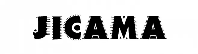
![JICAMA font caratteri gratis]() Scaricare 336 Downloads@WebFont
Scaricare 336 Downloads@WebFont -
( Fonts by Graham Meade - GemFonts )
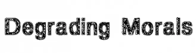
A bold, distressed font with a textured, grunge-like appearance.
![Degrading Morals font caratteri gratis]() Scaricare 336 Downloads@WebFont
Scaricare 336 Downloads@WebFont -
![GlyphBasic4 font caratteri gratis]() Scaricare 336 Downloads@WebFont
Scaricare 336 Downloads@WebFont -
( Tano Veron - www.be.net/tanoveron )
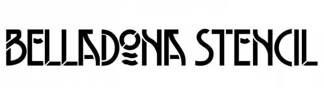
A bold, stencil-style font with geometric shapes and high contrast.
![Belladona Stencil font caratteri gratis]() Scaricare 336 Downloads@WebFont
Scaricare 336 Downloads@WebFont -
( Fonts by Graham Meade - GemFonts )
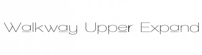
A modern, minimalist font with thin, elongated characters.
![Walkway Upper Expand font caratteri gratis]() Scaricare 336 Downloads@WebFont
Scaricare 336 Downloads@WebFont -
( www.cali-o-rama.com )
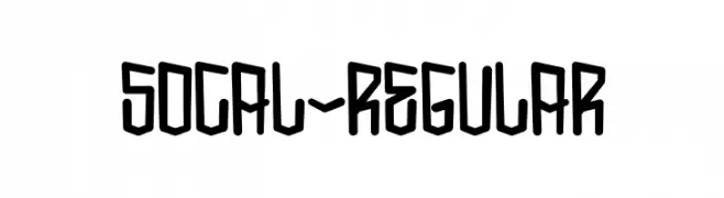
A bold, geometric font with an urban, edgy style.
![SoCal-Regular font caratteri gratis]() Scaricare 336 Downloads@WebFont
Scaricare 336 Downloads@WebFont -
( Fonts by Khurasan™ )
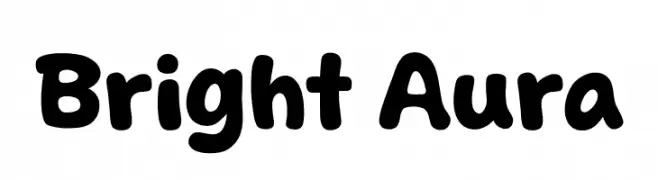
A playful, bold font with rounded, bubbly characters.
![Bright Aura font caratteri gratis]() Scaricare 336 Downloads@WebFont
Scaricare 336 Downloads@WebFont -
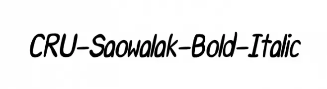
![CRU-Saowalak-Bold-Italic font caratteri gratis]() Scaricare 336 Downloads@WebFont
Scaricare 336 Downloads@WebFont -
( Fonts by Slava Krivonosov - Personal-use only. For commercial use please contact owner. )
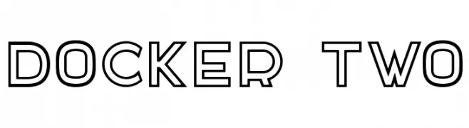
A bold, geometric sans-serif font with an outline style.
![DOCKER TWO font caratteri gratis]() Scaricare 336 Downloads@WebFont
Scaricare 336 Downloads@WebFont -
( Simón Saavedra )
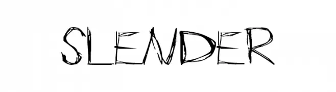
An edgy, hand-drawn font with jagged edges and dynamic style.
![Slender font caratteri gratis]() Scaricare 336 Downloads@WebFont
Scaricare 336 Downloads@WebFont -
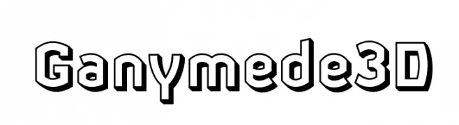
![Ganymede3D font caratteri gratis]() Scaricare 336 Downloads@WebFont
Scaricare 336 Downloads@WebFont -
( Fonts by Apostrophic Lab )
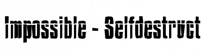
A bold, fragmented font with a dynamic and modern style.
![Impossible - Selfdestruct font caratteri gratis]() Scaricare 336 Downloads@WebFont
Scaricare 336 Downloads@WebFont -
( Fonts by a Situjuh Nazara - c7n1.wordpress.com. Personal-use only. For commercial use please contact owner. )
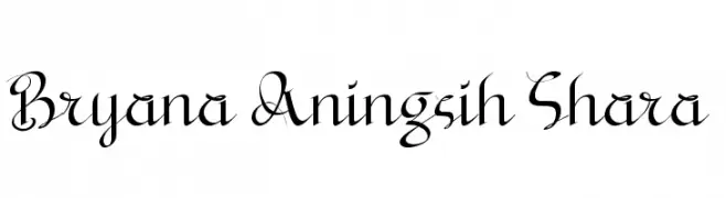
An elegant script font with flowing, decorative letterforms.
![Bryana Aningsih Shara font caratteri gratis]() Scaricare 336 Downloads@WebFont
Scaricare 336 Downloads@WebFont -
![Neko font caratteri gratis]() Scaricare 336 Downloads@WebFont
Scaricare 336 Downloads@WebFont -
( Fonts by Gyom Seguin - last-soundtrack.daportfolio.com )
A bold, distressed font with a rugged, grunge style.
![Rough linen font caratteri gratis]() Scaricare 336 Downloads@WebFont
Scaricare 336 Downloads@WebFont -
( Font by Berry Brooks - Fontocide )
A bold, decorative font with angular edges and a stencil-like appearance.
![BoinkoMatic font caratteri gratis]() Scaricare 336 Downloads@WebFont
Scaricare 336 Downloads@WebFont -
( Fonts by Daniel Zadorozny - www.iconian.com - Free for personal use )
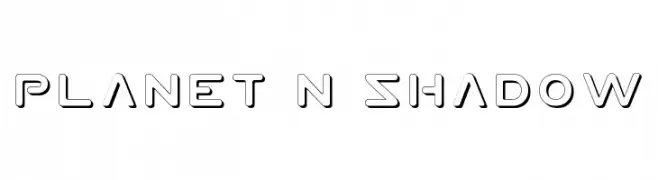
A futuristic, geometric font with bold, hollow letters and a shadow effect.
![Planet N Shadow font caratteri gratis]() Scaricare 336 Downloads@WebFont
Scaricare 336 Downloads@WebFont -
( Fonts by Miffies - mfs.jp.org - Personal-use only. For commercial use please contact owner. )
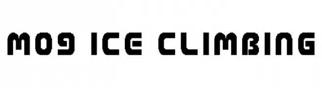
A bold, geometric font with a modern, industrial aesthetic.
![M09_ICE CLIMBING font caratteri gratis]() Scaricare 336 Downloads@WebFont
Scaricare 336 Downloads@WebFont -
( Fonts by Misti Hammers - mistifonts.com - Personal-use only. For commercial use please contact owner. )
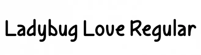
A playful, rounded font with smooth curves and a friendly vibe.
![Ladybug Love Regular font caratteri gratis]() Scaricare 336 Downloads@WebFont
Scaricare 336 Downloads@WebFont -
( Fonts by Pria Admaja )
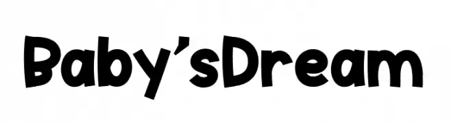
A playful, bold font with rounded, hand-drawn characters.
![Baby'sDream font caratteri gratis]() Scaricare 336 Downloads@WebFont
Scaricare 336 Downloads@WebFont -
( Fonts by Rvst )
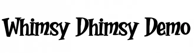
A playful and whimsical font with bold, curvy letterforms and exaggerated serifs.
![Whimsy Dhimsy Demo font caratteri gratis]() Scaricare 336 Downloads@WebFont
Scaricare 336 Downloads@WebFont -
![ProggyCleanTTSZBP font caratteri gratis]() Scaricare 336 Downloads@WebFont
Scaricare 336 Downloads@WebFont
![Brave New Era [outline] G98 font caratteri gratis](https://d144mzi0q5mijx.cloudfront.net/img/B/R/Brave-New-Era-outline-G98.webp)


Quali sono i font più popolari adesso?
Poppins, Roboto, Montserrat, Open Sans e Lato sono molto usati per le forme pulite e l'ampia applicabilità — dall'identità di marca alle landing page e ai poster.
Quali font si usano spesso nei loghi?
Le sans serif geometriche (es. Poppins, famiglie in stile Gotham) sono scelte comuni per un branding pulito e scalabile. Per un tocco personale restano valide script e stili manoscritti. Abbina un display deciso per i titoli a un corpo testo neutro per riconoscibilità ed equilibrio.
Ogni quanto si aggiorna la lista?
Con regolarità, in base ai download e all'attività reale. Torna spesso per scoprire in anticipo le nuove preferite.
💡 Consiglio: aggiungi ai preferiti — le tendenze cambiano in fretta e i font top di oggi possono ispirare il rebranding di domani.