Benvenuto nelle Font Più Popolari — dove popolarità e qualità si incontrano. Qui trovi i font più scaricati e usati dell'anno. Se cerchi scelte sicure per logo, web o social, inizia da qui.
Ogni font top si distingue per equilibrio, leggibilità e versatilità. Troverai sans serif moderne, script eleganti, serif vintage e display minimalisti.
-
( Lauren Harrison - gumroad.com/lrnrh )
A bold, angular font with electrifying motifs and a modern, edgy style.
 Scaricare 328 Downloads@WebFont
 -
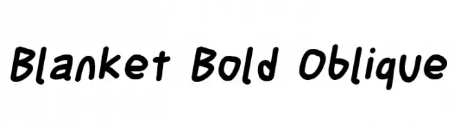
![Blanket Bold Oblique font caratteri gratis]() Scaricare 328 Downloads@WebFont
Scaricare 328 Downloads@WebFont -
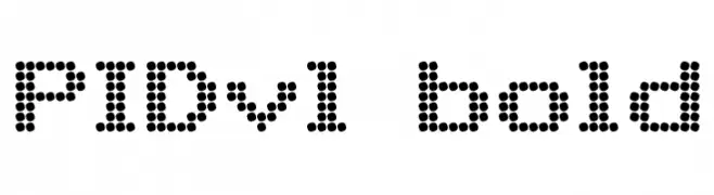
![PIDvl bold font caratteri gratis]() Scaricare 328 Downloads@WebFont
Scaricare 328 Downloads@WebFont -
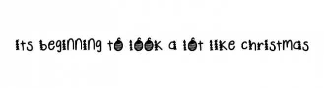
![its beginning to look a lot like christmas font caratteri gratis]() Scaricare 328 Downloads@WebFont
Scaricare 328 Downloads@WebFont -
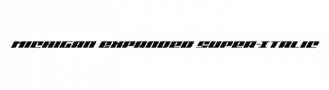
( Iconian Fonts - Daniel Zadorozny - www.iconian.com )
A bold, expanded italic font with a modern and dynamic style.
![Classic Cobra Expanded Italic font caratteri gratis]() Scaricare 328 Downloads@WebFont
Scaricare 328 Downloads@WebFont -
-
![Michigan Expanded Super-Italic font caratteri gratis]() Scaricare 328 Downloads@WebFont
Scaricare 328 Downloads@WebFont -
( Khoe Roni )
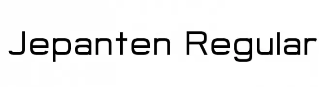
A modern, geometric sans-serif font with a clean and professional look.
![Jepanten Regular font caratteri gratis]() Scaricare 328 Downloads@WebFont
Scaricare 328 Downloads@WebFont -
( Fonts by www.studiotypo.com - Personal-use only. For commercial use please contact owner. )
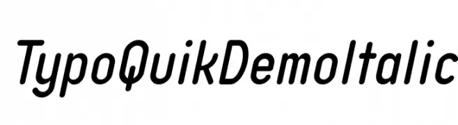
A modern, italicized font with a sleek and dynamic style.
![Typo Quik Demo Italic font caratteri gratis]() Scaricare 328 Downloads@WebFont
Scaricare 328 Downloads@WebFont -
( Fonts by Rizky Andyno Ramadhan - Dichi. Personal-use only. For commercial use please contact owner. )
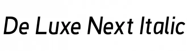
A modern, italic sans-serif font with clean lines and a professional appearance.
![De Luxe Next Italic font caratteri gratis]() Scaricare 328 Downloads@WebFont
Scaricare 328 Downloads@WebFont -
( Fonts by Pizzadude )
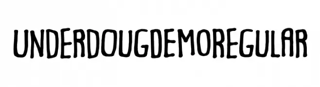
A playful, hand-drawn font with a whimsical and informal style.
![Underdoug DEMO Regular font caratteri gratis]() Scaricare 328 Downloads@WebFont
Scaricare 328 Downloads@WebFont -
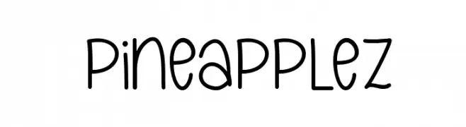
( Fonts by Emylia Maratta )
A playful, handwritten font with rounded edges and a casual style.
![Pineapplez font caratteri gratis]() Scaricare 328 Downloads@WebFont
Scaricare 328 Downloads@WebFont -
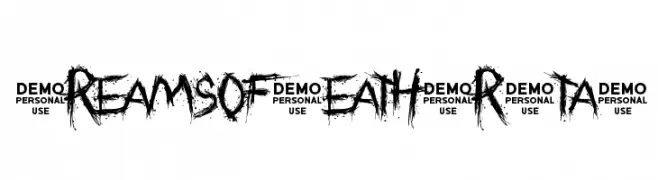
![Dreams of Death Brutal font caratteri gratis]() Scaricare 328 Downloads@WebFont
Scaricare 328 Downloads@WebFont -
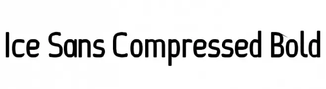
![Ice Sans Compressed Bold font caratteri gratis]() Scaricare 328 Downloads@WebFont
Scaricare 328 Downloads@WebFont -
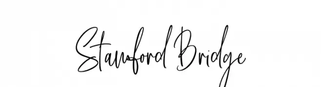
( Fonts by Thirtypath - Personal-use only. For commercial use please contact owner. )
A lively handwritten font with flowing, interconnected letterforms.
![Stamford Bridge font caratteri gratis]() Scaricare 328 Downloads@WebFont
Scaricare 328 Downloads@WebFont -
![Bit Daylong11 [sRB] font caratteri gratis]() Scaricare 328 Downloads@WebFont
Scaricare 328 Downloads@WebFont -
( Fonts by weknow - Wino S Kadir )
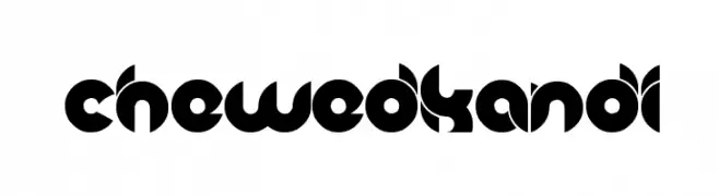
A bold, geometric font with a futuristic and decorative style.
![chewedkandi font caratteri gratis]() Scaricare 328 Downloads@WebFont
Scaricare 328 Downloads@WebFont -
( Fonts by Khrys Bosland )
A playful handwritten font with rounded edges and a casual, friendly style.
![KBGobbleDay font caratteri gratis]() Scaricare 328 Downloads@WebFont
Scaricare 328 Downloads@WebFont -
![GoSheep font caratteri gratis]() Scaricare 328 Downloads@WebFont
Scaricare 328 Downloads@WebFont -
( Fonts by Miss Tiina at www.misstiina.com (please check the website before use) )
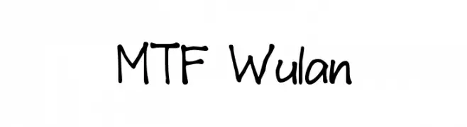
A playful, handwritten font with a casual and friendly style.
![MTF Wulan font caratteri gratis]() Scaricare 328 Downloads@WebFont
Scaricare 328 Downloads@WebFont -
( Fonts by The Font Emporium )
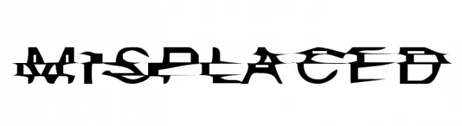
A fragmented, glitch-style font with sharp, angular cuts and overlapping segments.
![Misplaced font caratteri gratis]() Scaricare 328 Downloads@WebFont
Scaricare 328 Downloads@WebFont -
( Fonts by www.typodermicfonts.com - Ray Larabie )
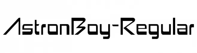
A futuristic, geometric font with sharp angles and clean lines.
![AstronBoy-Regular font caratteri gratis]() Scaricare 328 Downloads@WebFont
Scaricare 328 Downloads@WebFont -
( Fonts by www.fontalicious.com )
A futuristic, geometric font with a bold, digital aesthetic.
![Digit Cube font caratteri gratis]() Scaricare 328 Downloads@WebFont
Scaricare 328 Downloads@WebFont -
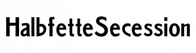
( Fonts by Peter Wiegel - www.peter-wiegel.de - Personal-use only. For commercial use please contact owner. )
A bold, geometric font with strong, angular lines and a modern aesthetic.
![HalbfetteSecession font caratteri gratis]() Scaricare 328 Downloads@WebFont
Scaricare 328 Downloads@WebFont -
![Springtime in April font caratteri gratis]() Scaricare 328 Downloads@WebFont
Scaricare 328 Downloads@WebFont -
![The Sickmen font caratteri gratis]() Scaricare 328 Downloads@WebFont
Scaricare 328 Downloads@WebFont -
![Paper Punch font caratteri gratis]() Scaricare 328 Downloads@WebFont
Scaricare 328 Downloads@WebFont -
![Kotak font caratteri gratis]() Scaricare 328 Downloads@WebFont
Scaricare 328 Downloads@WebFont -
( Fonts by www.legacyofdefeat.com )
A bold, three-dimensional font with a vintage, geometric style and strong shadow effects.
![H74 The Nomad Heavy font caratteri gratis]() Scaricare 328 Downloads@WebFont
Scaricare 328 Downloads@WebFont -
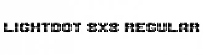
( melpc.blogspot.com )
A dot matrix font with a retro digital display aesthetic.
![Lightdot 8x8 Regular font caratteri gratis]() Scaricare 327 Downloads@WebFont
Scaricare 327 Downloads@WebFont -
( Fonts by Daniel Gauthier )
A playful, handwritten font with tall, narrow letters and bold strokes.
![Jenna font caratteri gratis]() Scaricare 327 Downloads@WebFont
Scaricare 327 Downloads@WebFont -
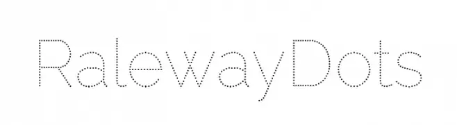
( Fonts by Impallari Type )
A modern dotted font with geometric shapes and consistent spacing.
![Raleway Dots font caratteri gratis]() Scaricare 327 Downloads@WebFont
Scaricare 327 Downloads@WebFont -
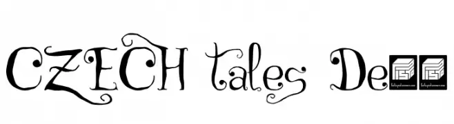
( fonts.pistocasero.com )
A whimsical and elegant calligraphic font with decorative flourishes.
![CZECH tales Demo font caratteri gratis]() Scaricare 327 Downloads@WebFont
Scaricare 327 Downloads@WebFont -
( Fonts by www.lars-manenschijn.nl )
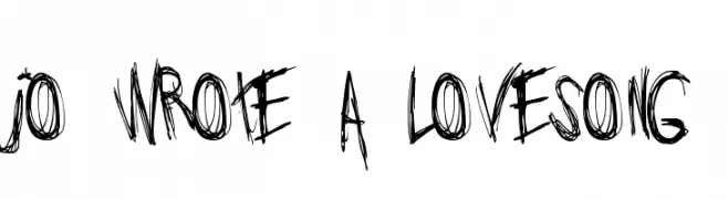
A bold, chaotic, hand-drawn font with irregular strokes and a dynamic appearance.
![Jo_wrote_a_lovesong font caratteri gratis]() Scaricare 327 Downloads@WebFont
Scaricare 327 Downloads@WebFont -
( Fonts by Vladimir Nikolic - www.creativefabrica.com/designer/vladimirnikolic/ - Personal-use only. For commercial use please contact owner. )
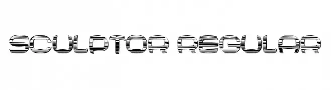
A bold, futuristic font with a three-dimensional effect and geometric design.
![Sculptor Regular font caratteri gratis]() Scaricare 327 Downloads@WebFont
Scaricare 327 Downloads@WebFont -
( Billy Argel - billyargel.com/ )
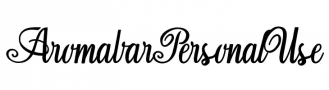
An elegant and decorative script font with flowing, ornate characters.
![Aromabar Personal Use font caratteri gratis]() Scaricare 327 Downloads@WebFont
Scaricare 327 Downloads@WebFont

![Bit Daylong11 [sRB] font caratteri gratis](https://d144mzi0q5mijx.cloudfront.net/img/B/I/Bit-Daylong11-sRB.webp)


Quali sono i font più popolari adesso?
Poppins, Roboto, Montserrat, Open Sans e Lato sono molto usati per le forme pulite e l'ampia applicabilità — dall'identità di marca alle landing page e ai poster.
Quali font si usano spesso nei loghi?
Le sans serif geometriche (es. Poppins, famiglie in stile Gotham) sono scelte comuni per un branding pulito e scalabile. Per un tocco personale restano valide script e stili manoscritti. Abbina un display deciso per i titoli a un corpo testo neutro per riconoscibilità ed equilibrio.
Ogni quanto si aggiorna la lista?
Con regolarità, in base ai download e all'attività reale. Torna spesso per scoprire in anticipo le nuove preferite.
💡 Consiglio: aggiungi ai preferiti — le tendenze cambiano in fretta e i font top di oggi possono ispirare il rebranding di domani.