Benvenuto nelle Font Più Popolari — dove popolarità e qualità si incontrano. Qui trovi i font più scaricati e usati dell'anno. Se cerchi scelte sicure per logo, web o social, inizia da qui.
Ogni font top si distingue per equilibrio, leggibilità e versatilità. Troverai sans serif moderne, script eleganti, serif vintage e display minimalisti.
-
( Fonts by typies.blogspot.com.es )
A bold, shadowed font with a strong, dynamic presence.
 Scaricare 1464 Downloads@WebFont
 -
( Vladimir Nikolic - www.coroflot.com/vladimirnikolic )
A bold, modern font with geometric shapes and clean lines.
![New Amsterdam Regular font caratteri gratis]() Scaricare 1463 Downloads@WebFont
Scaricare 1463 Downloads@WebFont -
( Craft Supply Co. - creativemarket.com/craftsupplyco )
A rugged, textured serif font with a vintage, hand-crafted feel.
![RoadRaceFree-Rough font caratteri gratis]() Scaricare 1463 Downloads@WebFont
Scaricare 1463 Downloads@WebFont -
( Fonts by Castcraft Software - opti.netii.net - check the website before use )
A bold, serif font with thick strokes and a strong presence.
![OPTIAsterAd-BlackExtraCond font caratteri gratis]() Scaricare 1463 Downloads@WebFont
Scaricare 1463 Downloads@WebFont -
( Fonts by Castcraft Software - opti.netii.net - check the website before use )
A bold, modern serif font with sharp, angular serifs and a strong visual impact.
![OPTIBenjieModern-Bold font caratteri gratis]() Scaricare 1463 Downloads@WebFont
Scaricare 1463 Downloads@WebFont -
-
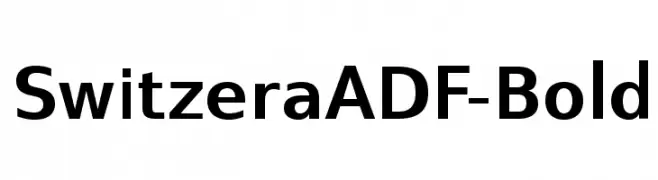
( Fonts by Arkandis Digital Foundry )
A bold, modern sans-serif typeface with clean lines and excellent readability.
![SwitzeraADF-Bold font caratteri gratis]() Scaricare 1463 Downloads@WebFont
Scaricare 1463 Downloads@WebFont -
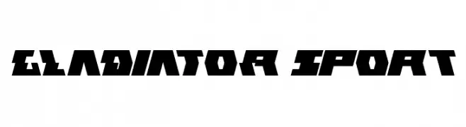
( Fonts by weknow - Wino S Kadir )
A bold, angular font with a futuristic and sporty aesthetic.
![GLADIATOR sport font caratteri gratis]() Scaricare 1463 Downloads@WebFont
Scaricare 1463 Downloads@WebFont -
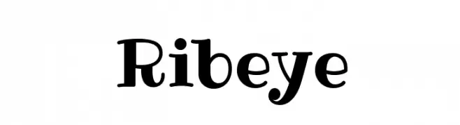
( Copyright (c) 2011 by Brian J. Bonislawsky DBA Astigmatic (AOETI) )
A playful, bold font with high contrast and unique curves.
![Ribeye font caratteri gratis]() Scaricare 1463 Downloads@WebFont
Scaricare 1463 Downloads@WebFont -
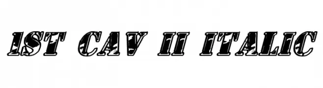
( Fonts by Daniel Zadorozny - www.iconian.com )
A bold, italicized font with thick outlines and a dynamic, retro-modern style.
![1st Cav II Italic font caratteri gratis]() Scaricare 1463 Downloads@WebFont
Scaricare 1463 Downloads@WebFont -
![pooplatter font caratteri gratis]() Scaricare 1463 Downloads@WebFont
Scaricare 1463 Downloads@WebFont
Quali sono i font più popolari adesso?
Poppins, Roboto, Montserrat, Open Sans e Lato sono molto usati per le forme pulite e l'ampia applicabilità — dall'identità di marca alle landing page e ai poster.
Quali font si usano spesso nei loghi?
Le sans serif geometriche (es. Poppins, famiglie in stile Gotham) sono scelte comuni per un branding pulito e scalabile. Per un tocco personale restano valide script e stili manoscritti. Abbina un display deciso per i titoli a un corpo testo neutro per riconoscibilità ed equilibrio.
Ogni quanto si aggiorna la lista?
Con regolarità, in base ai download e all'attività reale. Torna spesso per scoprire in anticipo le nuove preferite.
💡 Consiglio: aggiungi ai preferiti — le tendenze cambiano in fretta e i font top di oggi possono ispirare il rebranding di domani.