Benvenuto nelle Font Più Popolari — dove popolarità e qualità si incontrano. Qui trovi i font più scaricati e usati dell'anno. Se cerchi scelte sicure per logo, web o social, inizia da qui.
Ogni font top si distingue per equilibrio, leggibilità e versatilità. Troverai sans serif moderne, script eleganti, serif vintage e display minimalisti.
-
 Scaricare 298 Downloads@WebFont
 -
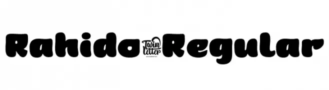
( Fonts by twinletter )
A bold, playful font with rounded edges and a chunky appearance.
![Rahido-Regular font caratteri gratis]() Scaricare 298 Downloads@WebFont
Scaricare 298 Downloads@WebFont -
![Sixty font caratteri gratis]() Scaricare 298 Downloads@WebFont
Scaricare 298 Downloads@WebFont -
( Typia Nesia - www.myfonts.com/foundry/Typia_Nesia/ )
A bold, dynamic brush script with a hand-painted, textured appearance.
![DABRUSH font caratteri gratis]() Scaricare 298 Downloads@WebFont
Scaricare 298 Downloads@WebFont -
( Fonts by Misti`s Fonts - mistifonts.com - Personal-use only. For commercial use please contact owner. )
An elegant script font with flowing, ornate strokes and graceful curves.
![TheIllusionofBeauty font caratteri gratis]() Scaricare 298 Downloads@WebFont
Scaricare 298 Downloads@WebFont -
-
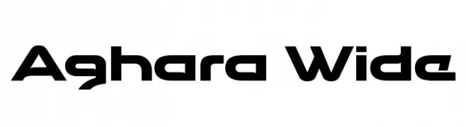
( Typopey - Reand Aghara - facebook.com/typopey )
A bold, futuristic font with wide, angular letterforms and a sleek, modern aesthetic.
![Aghara Wide font caratteri gratis]() Scaricare 298 Downloads@WebFont
Scaricare 298 Downloads@WebFont -
![SF Juggernaut Bold Italic font caratteri gratis]() Scaricare 298 Downloads@WebFont
Scaricare 298 Downloads@WebFont -
( Fonts by Zetafonts - Personal-use only. For commercial use please contact owner. )
A modern, rounded sans-serif font with uniform stroke width.
![Aristotelica Display Trial Light font caratteri gratis]() Scaricare 298 Downloads@WebFont
Scaricare 298 Downloads@WebFont -
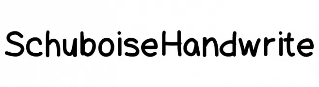
( Harry Schlender )
A playful, casual handwritten font with rounded, consistent strokes.
![SchuboiseHandwrite font caratteri gratis]() Scaricare 298 Downloads@WebFont
Scaricare 298 Downloads@WebFont -
( Fonts by Daniel Zadorozny - www.iconian.com - Free for personal use )
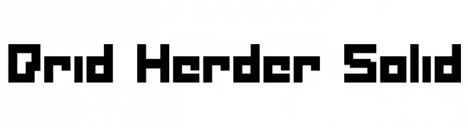
A bold, pixelated font with a retro digital aesthetic.
![Drid Herder Solid font caratteri gratis]() Scaricare 298 Downloads@WebFont
Scaricare 298 Downloads@WebFont -
( Fonts by Novan Esthi Bimo Santosa - Personal-use only. For commercial use please contact owner. )
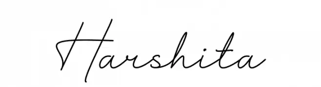
An elegant, flowing script font with a handwritten appearance.
![Harshita font caratteri gratis]() Scaricare 298 Downloads@WebFont
Scaricare 298 Downloads@WebFont -
( Aldus )
An ornate, decorative font with intricate floral embellishments, ideal for elegant and sophisticated designs.
![Regal font caratteri gratis]() Scaricare 298 Downloads@WebFont
Scaricare 298 Downloads@WebFont -
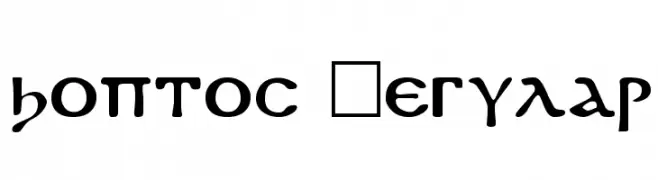
![Koptos Regular font caratteri gratis]() Scaricare 298 Downloads@WebFont
Scaricare 298 Downloads@WebFont -
( Fonts by Daniel Zadorozny - www.iconian.com )
A futuristic, geometric font with bold, angular letterforms.
![New Mars Expanded font caratteri gratis]() Scaricare 298 Downloads@WebFont
Scaricare 298 Downloads@WebFont -
( Fonts by Mans Greback - www.mawns.com )
A modern, geometric font with thin lines and a minimalist design.
![Ringer Light font caratteri gratis]() Scaricare 298 Downloads@WebFont
Scaricare 298 Downloads@WebFont -
( Fonts by www.woodcutter.es - woodcutter Manero - Personal-use only. For commercial use please contact owner. )
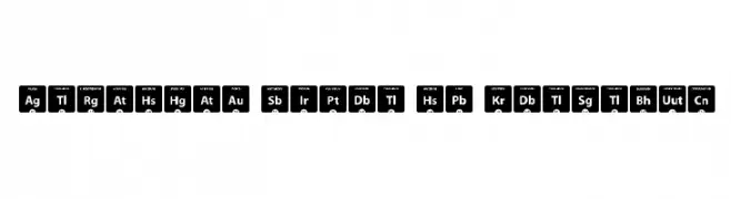
Bold, geometric sans-serif font with rounded corners and modern style.
![Periodic Table of Elements font caratteri gratis]() Scaricare 298 Downloads@WebFont
Scaricare 298 Downloads@WebFont -
( Fonts by Four Lines )
A bold, playful font with rounded edges and a slightly condensed style.
![OWLY BARN font caratteri gratis]() Scaricare 298 Downloads@WebFont
Scaricare 298 Downloads@WebFont -
( Fonts by Peax Webdesign - www.peax-webdesign.com. Personal-use only. For commercial use please contact owner. )
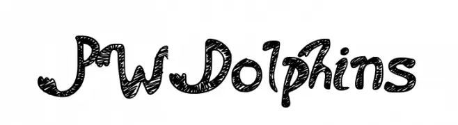
A playful, hand-drawn font with intricate patterns and a whimsical style.
![PWDolphins font caratteri gratis]() Scaricare 298 Downloads@WebFont
Scaricare 298 Downloads@WebFont -
( Roland Huse Design - Roland Huse - rolandhuse.com )
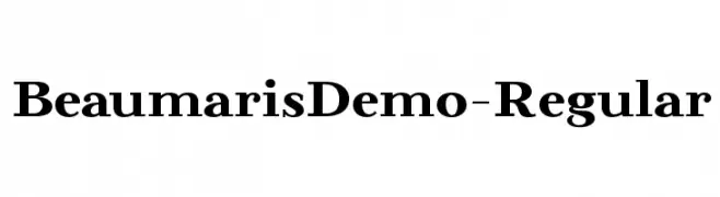
A classic serif font with bold strokes and a traditional, elegant appearance.
![BeaumarisDemo-Regular font caratteri gratis]() Scaricare 298 Downloads@WebFont
Scaricare 298 Downloads@WebFont -
![Peggy font caratteri gratis]() Scaricare 298 Downloads@WebFont
Scaricare 298 Downloads@WebFont -
( Livin Hell - www.geocities.com/crizcrack666/fonts.html )
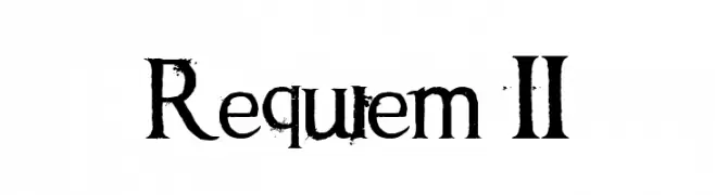
A distressed serif font with a grunge, vintage aesthetic.
![Requiem II font caratteri gratis]() Scaricare 298 Downloads@WebFont
Scaricare 298 Downloads@WebFont -
( Fonts by Bree Gorton )
A bold, playful font with rounded edges and a whimsical style.
![Sphericals font caratteri gratis]() Scaricare 298 Downloads@WebFont
Scaricare 298 Downloads@WebFont -
( Fonts by Andrew McCluskey - nalgames.com )
A bold, distressed font with a rugged, grunge-like texture.
![Eride font caratteri gratis]() Scaricare 298 Downloads@WebFont
Scaricare 298 Downloads@WebFont -
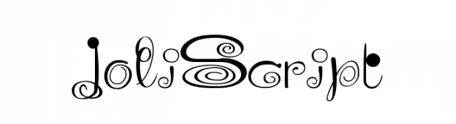
![JoliScript font caratteri gratis]() Scaricare 298 Downloads@WebFont
Scaricare 298 Downloads@WebFont -
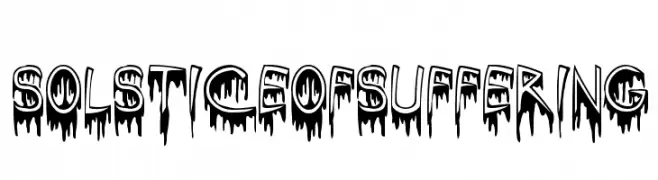
![SolsticeOfSuffering font caratteri gratis]() Scaricare 298 Downloads@WebFont
Scaricare 298 Downloads@WebFont -
( Fonts by Chank Co. - www.chank.com )
A bold, 3D font with a playful and dynamic style.
![BrokenDreamsPreview font caratteri gratis]() Scaricare 298 Downloads@WebFont
Scaricare 298 Downloads@WebFont -
( Fonts by http://perso.calixo.net/~uzim/ )
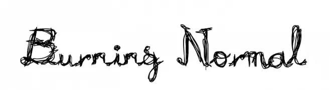
A chaotic, flame-like decorative font with swirling, jagged lines.
![Burning Normal font caratteri gratis]() Scaricare 298 Downloads@WebFont
Scaricare 298 Downloads@WebFont -
( Fonts by Hendrick Rolandez - Personal-use only. For commercial use please contact owner. )
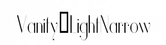
A sleek, narrow font with high contrast and modern elegance.
![Vanity-LightNarrow font caratteri gratis]() Scaricare 298 Downloads@WebFont
Scaricare 298 Downloads@WebFont -
( Fonts by Gilang Ternadho )
A playful, rounded font with smooth curves and a friendly appearance.
![Andak font caratteri gratis]() Scaricare 298 Downloads@WebFont
Scaricare 298 Downloads@WebFont -
( Craft Supply Co. - creativemarket.com/craftsupplyco )
A bold, outlined uppercase font with a modern, geometric style.
![Bondie-Outline font caratteri gratis]() Scaricare 298 Downloads@WebFont
Scaricare 298 Downloads@WebFont -
( Fonts by Figuree Studio - Icep Fadhil - Personal-use only. For commercial use please contact owner. )
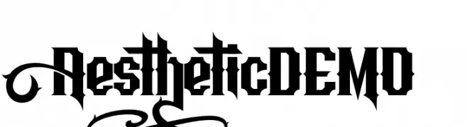
A bold, Gothic-inspired font with sharp, angular edges.
![Aesthetic DEMO font caratteri gratis]() Scaricare 298 Downloads@WebFont
Scaricare 298 Downloads@WebFont -
![MobyMonospace font caratteri gratis]() Scaricare 298 Downloads@WebFont
Scaricare 298 Downloads@WebFont -
( Fonts by www.crudfactory.com )
An elegant serif italic font with a refined and sophisticated style.
![Linden Hill TT Italic font caratteri gratis]() Scaricare 298 Downloads@WebFont
Scaricare 298 Downloads@WebFont -
( Fonts by www.sweeep.fr - Damien Gosset )
A bold, distressed font with a rugged, grunge aesthetic.
![Fucked Plate font caratteri gratis]() Scaricare 298 Downloads@WebFont
Scaricare 298 Downloads@WebFont -
( Fonts by Impallari Type - Personal-use only. For commercial use please contact owner. )
A clean, modern sans-serif typeface with excellent legibility.
![Encode Sans Normal font caratteri gratis]() Scaricare 298 Downloads@WebFont
Scaricare 298 Downloads@WebFont


Quali sono i font più popolari adesso?
Poppins, Roboto, Montserrat, Open Sans e Lato sono molto usati per le forme pulite e l'ampia applicabilità — dall'identità di marca alle landing page e ai poster.
Quali font si usano spesso nei loghi?
Le sans serif geometriche (es. Poppins, famiglie in stile Gotham) sono scelte comuni per un branding pulito e scalabile. Per un tocco personale restano valide script e stili manoscritti. Abbina un display deciso per i titoli a un corpo testo neutro per riconoscibilità ed equilibrio.
Ogni quanto si aggiorna la lista?
Con regolarità, in base ai download e all'attività reale. Torna spesso per scoprire in anticipo le nuove preferite.
💡 Consiglio: aggiungi ai preferiti — le tendenze cambiano in fretta e i font top di oggi possono ispirare il rebranding di domani.