Benvenuto nelle Font Più Popolari — dove popolarità e qualità si incontrano. Qui trovi i font più scaricati e usati dell'anno. Se cerchi scelte sicure per logo, web o social, inizia da qui.
Ogni font top si distingue per equilibrio, leggibilità e versatilità. Troverai sans serif moderne, script eleganti, serif vintage e display minimalisti.
-
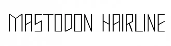
( Fonts by Apostrophic Lab )
A geometric, angular font with thin, hairline strokes and a modern, minimalist style.
 Scaricare 299 Downloads@WebFont
 -
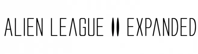
( Fonts by Daniel Zadorozny - www.iconian.com )
A futuristic, narrow font with a sleek, modern design and expanded width.
![Alien League II Expanded font caratteri gratis]() Scaricare 299 Downloads@WebFont
Scaricare 299 Downloads@WebFont -
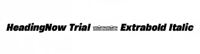
( Fonts by Zetafonts - Personal-use only. For commercial use please contact owner. )
A bold, italic font with a dynamic and modern style.
![HeadingNow Trial 67 Extrabold Italic font caratteri gratis]() Scaricare 299 Downloads@WebFont
Scaricare 299 Downloads@WebFont -
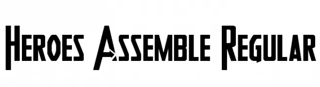
( Fonts by Daniel Zadorozny - www.iconian.com )
A bold, geometric font with sharp angles and dynamic style.
![Heroes Assemble Regular font caratteri gratis]() Scaricare 299 Downloads@WebFont
Scaricare 299 Downloads@WebFont -
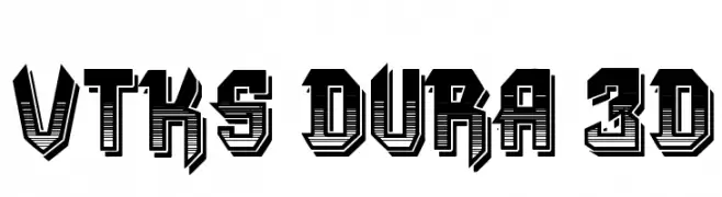
( Fonts by Douglas Vitkauskas - www.vtksdesign.com. Personal-use only. For commercial use please contact owner. )
A bold, 3D geometric font with a retro-futuristic style.
![VTKS DURA 3D font caratteri gratis]() Scaricare 299 Downloads@WebFont
Scaricare 299 Downloads@WebFont -
-
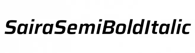
( Fonts by Omnibus Type )
A sleek, semi-bold italic font with a modern and dynamic style.
![Saira SemiBold Italic font caratteri gratis]() Scaricare 299 Downloads@WebFont
Scaricare 299 Downloads@WebFont -
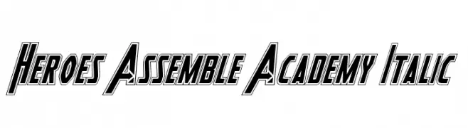
( Fonts by Daniel Zadorozny - www.iconian.com )
A bold, italicized font with strong geometric shapes and outlined characters.
![Heroes Assemble Academy Italic font caratteri gratis]() Scaricare 299 Downloads@WebFont
Scaricare 299 Downloads@WebFont -
( Fonts by www.fontalicious.com )
A decorative and playful font filled with unique patterns and shapes.
![BorderMon Series 1 font caratteri gratis]() Scaricare 299 Downloads@WebFont
Scaricare 299 Downloads@WebFont -
( Roulette Studios - www.roulettestudios.com )
A bold, decorative font with intricate curves and flourishes.
![Caribbean Caps font caratteri gratis]() Scaricare 299 Downloads@WebFont
Scaricare 299 Downloads@WebFont -
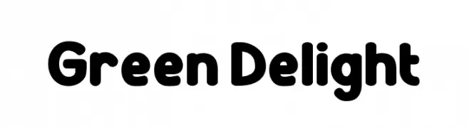
( Fonts by PutraCetol Studio )
A bold, rounded font with smooth curves and a playful style.
![Green Delight font caratteri gratis]() Scaricare 299 Downloads@WebFont
Scaricare 299 Downloads@WebFont -
( Fonts by Jeri Ingalls - littlehouse.homestead.com )
Ornamental dingbat font with kaleidoscopic and mandala motifs.
![JI Kaleidoscope Bats 2 font caratteri gratis]() Scaricare 299 Downloads@WebFont
Scaricare 299 Downloads@WebFont -
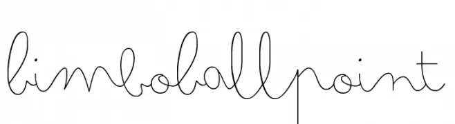
( Zetafonts - www.zetafonts.com )
A playful, cursive handwritten font with a whimsical, fluid style.
![Bimbo Ballpoint font caratteri gratis]() Scaricare 299 Downloads@WebFont
Scaricare 299 Downloads@WebFont -
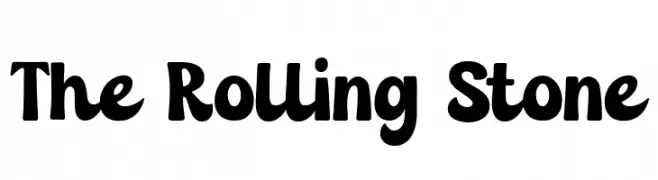
( Fonts by Cat.B )
A bold, playful font with rounded edges and a whimsical touch.
![The Rolling Stone font caratteri gratis]() Scaricare 299 Downloads@WebFont
Scaricare 299 Downloads@WebFont -
( Fonts by junkohanhero )
A thin, hand-drawn font with a playful and informal style.
![Thin king font caratteri gratis]() Scaricare 299 Downloads@WebFont
Scaricare 299 Downloads@WebFont -
( Fonts by Miss Tiina at www.misstiina.com (please check the website before use) )
A playful, hand-drawn font with a festive, cheerful vibe.
![MTF Dear Santa font caratteri gratis]() Scaricare 299 Downloads@WebFont
Scaricare 299 Downloads@WebFont -
( Fonts by Bumbayo Font Fabrik )
A tall, narrow font with a distressed, vintage texture.
![TallierstGrustampa font caratteri gratis]() Scaricare 299 Downloads@WebFont
Scaricare 299 Downloads@WebFont -
( Fonts by FONTS BY LYAJKA - Personal-use only. For commercial use please contact owner. )
A bold, playful font with irregular, jagged edges and a dynamic style.
![Super Mario 286(RUS BY LYAJKA) font caratteri gratis]() Scaricare 299 Downloads@WebFont
Scaricare 299 Downloads@WebFont -
( Fonts by Misti`s Fonts - mistifonts.com - Personal-use only. For commercial use please contact owner. )
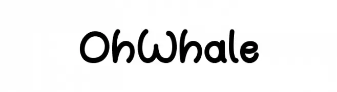
A playful, hand-drawn font with rounded, bold characters and a whimsical style.
![OhWhale font caratteri gratis]() Scaricare 299 Downloads@WebFont
Scaricare 299 Downloads@WebFont -
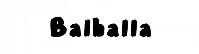
![Balballa font caratteri gratis]() Scaricare 299 Downloads@WebFont
Scaricare 299 Downloads@WebFont -
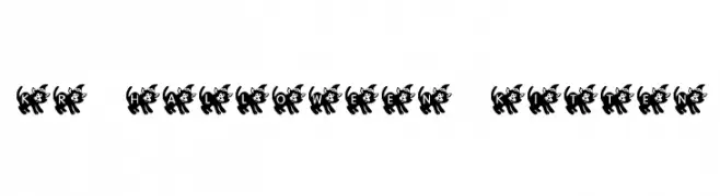
( Fonts by Kat`s Fun Fonts - Personal-use only. For commercial use please contact owner. )
A playful font with letters inside black cat silhouettes, perfect for Halloween themes.
![KR Halloween Kitten font caratteri gratis]() Scaricare 299 Downloads@WebFont
Scaricare 299 Downloads@WebFont -
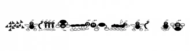
( Fonts by Jeff Levine. FREEWARE )
A playful, cartoonish font with ant characters forming each letter and number.
![X---terminate! JL font caratteri gratis]() Scaricare 299 Downloads@WebFont
Scaricare 299 Downloads@WebFont -
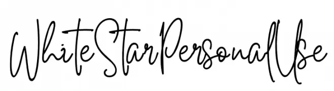
( Fonts by Din Studio - Donis Miftahudin - Personal-use only. For commercial use please contact owner. )
A dynamic and expressive handwritten font with fluid strokes.
![White Star Personal Use font caratteri gratis]() Scaricare 299 Downloads@WebFont
Scaricare 299 Downloads@WebFont -
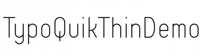
( Fonts by www.studiotypo.com - Personal-use only. For commercial use please contact owner. )
A clean, modern sans-serif font with thin, uniform strokes and a minimalist design.
![Typo Quik Thin Demo font caratteri gratis]() Scaricare 299 Downloads@WebFont
Scaricare 299 Downloads@WebFont -
![Sepet font caratteri gratis]() Scaricare 299 Downloads@WebFont
Scaricare 299 Downloads@WebFont -
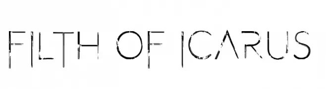
( Fonts by Chris Vile )
A distressed, modern font with a grunge aesthetic and geometric design.
![Filth of Icarus 2 font caratteri gratis]() Scaricare 299 Downloads@WebFont
Scaricare 299 Downloads@WebFont -
![Eppy Evans Round font caratteri gratis]() Scaricare 299 Downloads@WebFont
Scaricare 299 Downloads@WebFont -
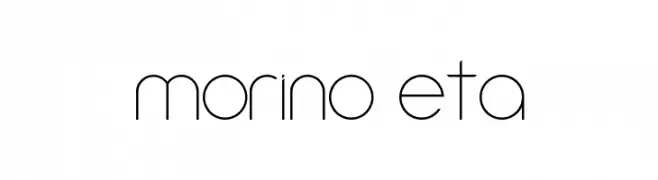
( Daniel Augusto - www.danieaugusto.net )
A sleek, modern font with thin lines and geometric shapes.
![Amorino Beta font caratteri gratis]() Scaricare 299 Downloads@WebFont
Scaricare 299 Downloads@WebFont -
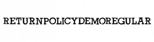
( Hanoded - David Kerkhoff - www.hanodedfonts.com )
A distressed, grunge-style font with a bold, stencil-like appearance.
![Return Policy DEMO Regular font caratteri gratis]() Scaricare 299 Downloads@WebFont
Scaricare 299 Downloads@WebFont -
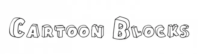
( Fonts by Galdino Otten - galdinootten.com )
A playful, 3D block-style font with bold outlines and a cartoonish flair.
![Cartoon Blocks font caratteri gratis]() Scaricare 299 Downloads@WebFont
Scaricare 299 Downloads@WebFont -
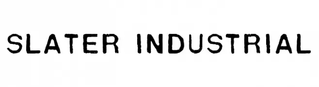
( Fonts by jeffsalisbury - Personal-use only. For commercial use please contact owner. )
A bold, industrial-style font with a stencil-like, vintage appearance.
![Slater Industrial font caratteri gratis]() Scaricare 299 Downloads@WebFont
Scaricare 299 Downloads@WebFont -
( Fonts by www.fontmesa.com )
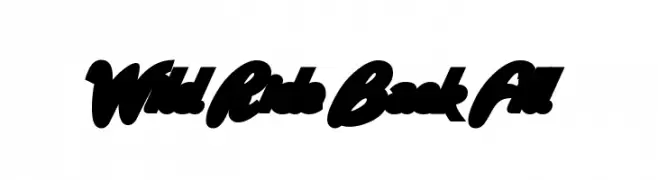
A bold, dynamic script font with interconnected characters and a modern, handwritten style.
![Wild Ride Back Fill font caratteri gratis]() Scaricare 299 Downloads@WebFont
Scaricare 299 Downloads@WebFont -
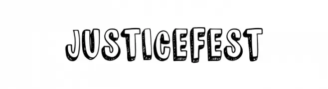
( Fonts by The Docallisme )
A bold, playful font with a comic book style and dotted interiors.
![JUSTICE FEST font caratteri gratis]() Scaricare 299 Downloads@WebFont
Scaricare 299 Downloads@WebFont -
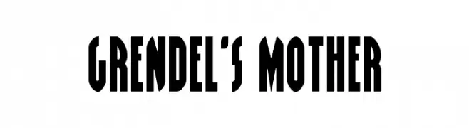
( Fonts by Daniel Zadorozny - www.iconian.com - Free for personal use )
A bold, geometric font with a vintage poster style.
![Grendel's Mother font caratteri gratis]() Scaricare 299 Downloads@WebFont
Scaricare 299 Downloads@WebFont -
( Fonts by Zeenesia Studio )
A bold, playful font with a hand-drawn, whimsical style.
![Fresh Pineapple font caratteri gratis]() Scaricare 299 Downloads@WebFont
Scaricare 299 Downloads@WebFont -
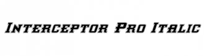
( Fonts by Daniel Zadorozny - www.iconian.com )
A bold, italicized font with a three-dimensional outline effect.
![Interceptor Pro Italic font caratteri gratis]() Scaricare 299 Downloads@WebFont
Scaricare 299 Downloads@WebFont


Quali sono i font più popolari adesso?
Poppins, Roboto, Montserrat, Open Sans e Lato sono molto usati per le forme pulite e l'ampia applicabilità — dall'identità di marca alle landing page e ai poster.
Quali font si usano spesso nei loghi?
Le sans serif geometriche (es. Poppins, famiglie in stile Gotham) sono scelte comuni per un branding pulito e scalabile. Per un tocco personale restano valide script e stili manoscritti. Abbina un display deciso per i titoli a un corpo testo neutro per riconoscibilità ed equilibrio.
Ogni quanto si aggiorna la lista?
Con regolarità, in base ai download e all'attività reale. Torna spesso per scoprire in anticipo le nuove preferite.
💡 Consiglio: aggiungi ai preferiti — le tendenze cambiano in fretta e i font top di oggi possono ispirare il rebranding di domani.