Benvenuto nelle Font Più Popolari — dove popolarità e qualità si incontrano. Qui trovi i font più scaricati e usati dell'anno. Se cerchi scelte sicure per logo, web o social, inizia da qui.
Ogni font top si distingue per equilibrio, leggibilità e versatilità. Troverai sans serif moderne, script eleganti, serif vintage e display minimalisti.
-
 Scaricare 275 Downloads@WebFont
 -
( Fonts by Mans Greback - www.mawns.com )
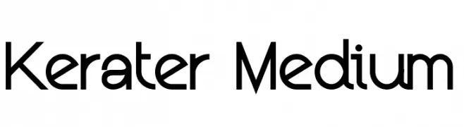
A modern, geometric font with consistent stroke width and clear readability.
![Kerater Medium font caratteri gratis]() Scaricare 275 Downloads@WebFont
Scaricare 275 Downloads@WebFont -
( Fonts by Edric Studio www.creativefabrica.com/designer/edricstudio/ - Personal-use only. For commercial use please contact owner. )
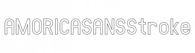
A modern sans-serif outline font with geometric and minimalistic design.
![AMORICA SANS Stroke font caratteri gratis]() Scaricare 275 Downloads@WebFont
Scaricare 275 Downloads@WebFont -
![Gesture Sans font caratteri gratis]() Scaricare 275 Downloads@WebFont
Scaricare 275 Downloads@WebFont -
( Fonts by Natalie Wood )
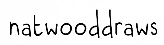
A playful, handwritten font with rounded, casual letterforms.
![natwooddraws font caratteri gratis]() Scaricare 275 Downloads@WebFont
Scaricare 275 Downloads@WebFont -
-
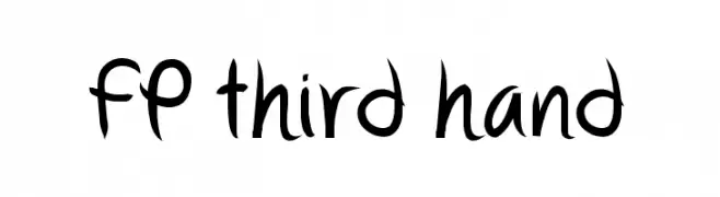
( Fonts by Pia Hed Aspell - www.piah.se )
A lively handwritten font with fluid strokes and dynamic character.
![FP third hand font caratteri gratis]() Scaricare 275 Downloads@WebFont
Scaricare 275 Downloads@WebFont -
( Fonts by Octotype - www.foundmyfont.com - Personal-use only. For commercial use please contact owner. )
A bold, cursive font with dynamic and fluid strokes, perfect for creative projects.
![Quicksilver font caratteri gratis]() Scaricare 275 Downloads@WebFont
Scaricare 275 Downloads@WebFont -
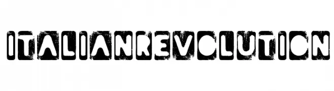
( www.woodcutter.es )
A bold, distressed font with a grunge texture and rugged, rebellious style.
![Italian Revolution font caratteri gratis]() Scaricare 275 Downloads@WebFont
Scaricare 275 Downloads@WebFont -
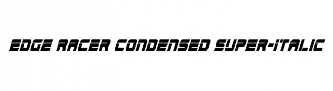
( Fonts by www.iconian.com - Personal-use only. For commercial use please contact owner. )
A dynamic, condensed, and italicized font with a futuristic design.
![Edge Racer Condensed Super-Italic font caratteri gratis]() Scaricare 275 Downloads@WebFont
Scaricare 275 Downloads@WebFont -
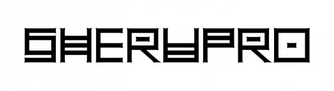
( Fonts by Aleksander Shevchuk - www.aleksandershevchuk.ru )
A bold, geometric font with a futuristic and angular design.
![SheruPro font caratteri gratis]() Scaricare 275 Downloads@WebFont
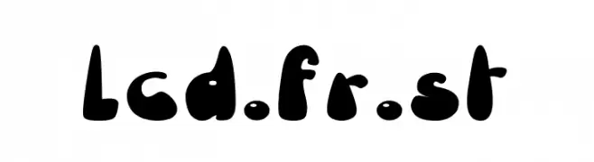
Scaricare 275 Downloads@WebFont -
![lcd.fr.st font caratteri gratis]() Scaricare 275 Downloads@WebFont
Scaricare 275 Downloads@WebFont -
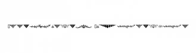
( Fonts by www.houseoflime.com )
Highly decorative ornamental motifs for embellishment.
![Ornamental Decoration font caratteri gratis]() Scaricare 275 Downloads@WebFont
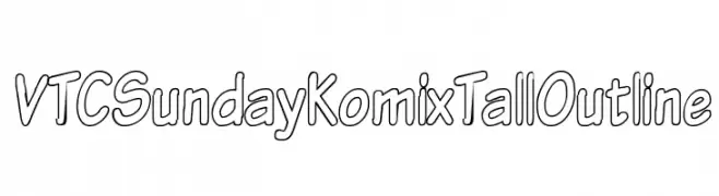
Scaricare 275 Downloads@WebFont -
![VTCSundayKomixTallOutline font caratteri gratis]() Scaricare 275 Downloads@WebFont
Scaricare 275 Downloads@WebFont -
( Dikas Studio - Andika Setiawan - creativemarket.com/?u=DikasStudio )
A bold, brush script font with a dynamic and artistic style.
![Outistyle Free Personal Use font caratteri gratis]() Scaricare 275 Downloads@WebFont
Scaricare 275 Downloads@WebFont -
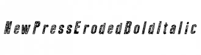
( Fonts by Galdino Otten Fonts - www.galdinootten.com - Personal-use only. For commercial use please contact owner. )
A bold, italicized font with an eroded texture, ideal for vintage or industrial designs.
![New Press Eroded Bold Italic font caratteri gratis]() Scaricare 275 Downloads@WebFont
Scaricare 275 Downloads@WebFont -
( Fonts by a Max Infeld - XEROGRAPHER FONTS - xerographer.blogspot.com . Personal-use only. For commercial use please contact owner. )
A sophisticated cursive script with flowing, intricate loops and swashes.
![AboveStars font caratteri gratis]() Scaricare 275 Downloads@WebFont
Scaricare 275 Downloads@WebFont -
( Fonts by Darcy Baldwin - darcybaldwin.com. Free for personal use only )
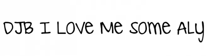
A playful handwritten font with a casual and friendly vibe.
![DJB I Love Me Some Aly font caratteri gratis]() Scaricare 274 Downloads@WebFont
Scaricare 274 Downloads@WebFont -
( Fonts by Daniel Zadorozny - www.iconian.com - Free for personal use )
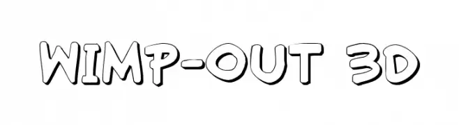
A bold, playful 3D font with thick outlines and a comic book style.
![Wimp-Out 3D font caratteri gratis]() Scaricare 274 Downloads@WebFont
Scaricare 274 Downloads@WebFont -
![Disco Dork font caratteri gratis]() Scaricare 274 Downloads@WebFont
Scaricare 274 Downloads@WebFont -
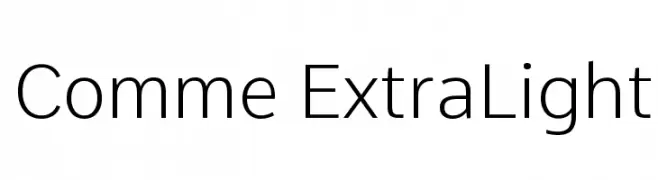
( Fonts by Vernon Adams - Personal-use only. For commercial use please contact owner. )
A clean, modern typeface with consistent stroke width and balanced proportions.
![Comme ExtraLight font caratteri gratis]() Scaricare 274 Downloads@WebFont
Scaricare 274 Downloads@WebFont -
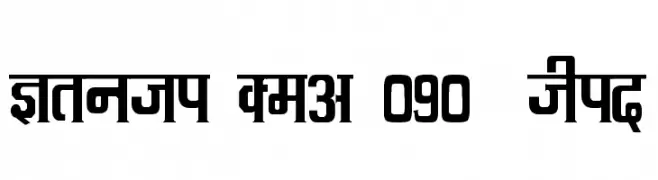
![Kruti Dev 090 Thin font caratteri gratis]() Scaricare 274 Downloads@WebFont
Scaricare 274 Downloads@WebFont -
( Fonts by ShyFonts )
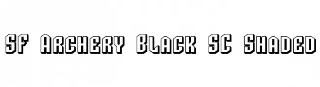
Bold, geometric font with a 3D shaded effect for impactful designs.
![SF Archery Black SC Shaded font caratteri gratis]() Scaricare 274 Downloads@WebFont
Scaricare 274 Downloads@WebFont -
Caratteri di defharo. For commercial use please contact the owner.
![Tabaiba wild ffp Italic font caratteri gratis]() Scaricare 274 Downloads@WebFont
Scaricare 274 Downloads@WebFont -
( Fonts by Billy Argel Fonts - www.billyargel.com - Personal-use only. For commercial use please contact owner. )
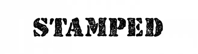
A bold, distressed font with a vintage, stamped appearance.
![STAMPED font caratteri gratis]() Scaricare 274 Downloads@WebFont
Scaricare 274 Downloads@WebFont -
( Fonts by Vanessa Bays - bythebutterfly.com )
A playful, hollow, and rounded font with a casual vibe.
![The Urban Way Hollow font caratteri gratis]() Scaricare 274 Downloads@WebFont
Scaricare 274 Downloads@WebFont -
( Fonts by a Max Infeld - XEROGRAPHER FONTS - xerographer.blogspot.com . Personal-use only. For commercial use please contact owner. )
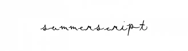
A playful, handwritten script font with fluid, connected letters and dynamic strokes.
![SummerScript font caratteri gratis]() Scaricare 274 Downloads@WebFont
Scaricare 274 Downloads@WebFont -
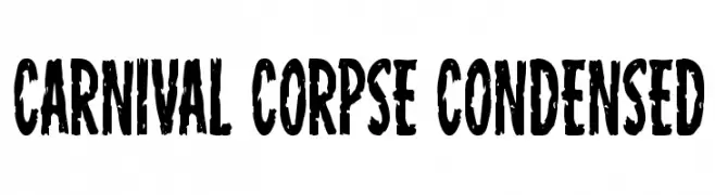
( Fonts by Iconian Fonts )
A bold, condensed, distressed font with a vintage, grunge aesthetic.
![Carnival Corpse Condensed font caratteri gratis]() Scaricare 274 Downloads@WebFont
Scaricare 274 Downloads@WebFont -
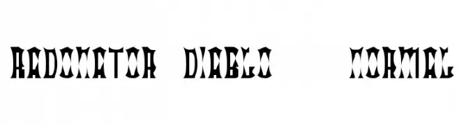
![Radonator Diablo Normal font caratteri gratis]() Scaricare 274 Downloads@WebFont
Scaricare 274 Downloads@WebFont -
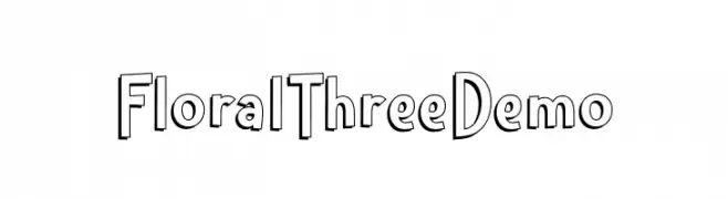
( Fonts by Toko Laris Djaja )
A playful, decorative font with a three-dimensional effect and bold outlines.
![Floral Three Demo font caratteri gratis]() Scaricare 274 Downloads@WebFont
Scaricare 274 Downloads@WebFont -
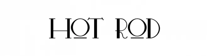
( Tano Veron - www.be.net/tanoveron )
A bold, high-contrast font with sharp angles and modern geometric elements.
![Hot Rod font caratteri gratis]() Scaricare 274 Downloads@WebFont
Scaricare 274 Downloads@WebFont -
( Fonts by Daniel Zadorozny - www.iconian.com - Free for personal use )
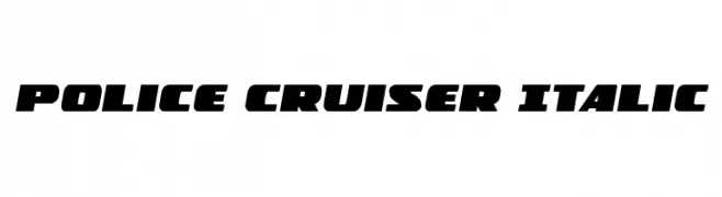
A bold, italic font with a dynamic and robust style, ideal for impactful designs.
![Police Cruiser Italic font caratteri gratis]() Scaricare 274 Downloads@WebFont
Scaricare 274 Downloads@WebFont -
( Linux Libertine - www.linuxlibertine.org )
A classic serif typeface with semi-bold weight and italic style, offering elegance and readability.
![Linux Libertine Semibold Italic font caratteri gratis]() Scaricare 274 Downloads@WebFont
Scaricare 274 Downloads@WebFont -
![Brainy font caratteri gratis]() Scaricare 274 Downloads@WebFont
Scaricare 274 Downloads@WebFont -
( Fonts by Namara Creative Studio - Personal-use only. For commercial use please contact owner. )
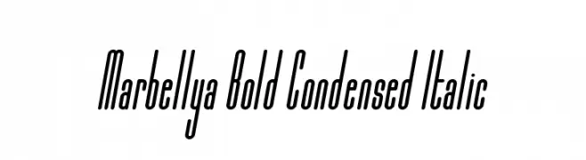
A bold, condensed, and italic font with a modern and dynamic style.
![Marbellya Bold Condensed Italic font caratteri gratis]() Scaricare 274 Downloads@WebFont
Scaricare 274 Downloads@WebFont -
( Fonts by Google - Personal-use only. For commercial use please contact owner. )
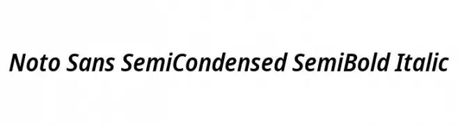
A modern, semi-condensed sans-serif font with semi-bold weight and italic style.
![Noto Sans SemiCondensed SemiBold Italic font caratteri gratis]() Scaricare 274 Downloads@WebFont
Scaricare 274 Downloads@WebFont


Quali sono i font più popolari adesso?
Poppins, Roboto, Montserrat, Open Sans e Lato sono molto usati per le forme pulite e l'ampia applicabilità — dall'identità di marca alle landing page e ai poster.
Quali font si usano spesso nei loghi?
Le sans serif geometriche (es. Poppins, famiglie in stile Gotham) sono scelte comuni per un branding pulito e scalabile. Per un tocco personale restano valide script e stili manoscritti. Abbina un display deciso per i titoli a un corpo testo neutro per riconoscibilità ed equilibrio.
Ogni quanto si aggiorna la lista?
Con regolarità, in base ai download e all'attività reale. Torna spesso per scoprire in anticipo le nuove preferite.
💡 Consiglio: aggiungi ai preferiti — le tendenze cambiano in fretta e i font top di oggi possono ispirare il rebranding di domani.