Benvenuto nelle Font Più Popolari — dove popolarità e qualità si incontrano. Qui trovi i font più scaricati e usati dell'anno. Se cerchi scelte sicure per logo, web o social, inizia da qui.
Ogni font top si distingue per equilibrio, leggibilità e versatilità. Troverai sans serif moderne, script eleganti, serif vintage e display minimalisti.
-
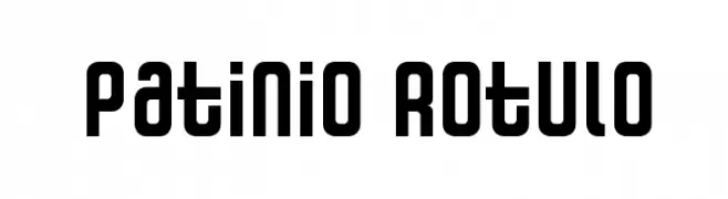
( Fonts by Factor Vector - elfactorvector.blogspot.com )
A bold, modern font with a geometric and industrial style.
 Scaricare 269 Downloads@WebFont
 -
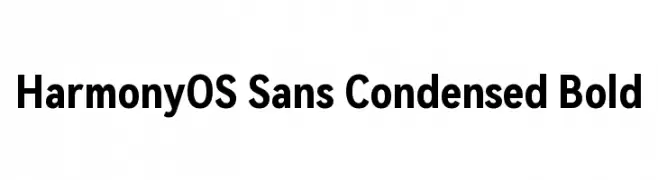
( Fonts by huawei.com - Personal-use only. For commercial use please contact owner. )
A modern, bold, and condensed sans-serif typeface with excellent readability.
![HarmonyOS Sans Condensed Bold font caratteri gratis]() Scaricare 269 Downloads@WebFont
Scaricare 269 Downloads@WebFont -
![KR Silly Art People font caratteri gratis]() Scaricare 269 Downloads@WebFont
Scaricare 269 Downloads@WebFont -
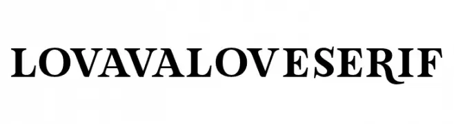
( Fonts by Situjuh Nazara - 7ntypes.com - Personal-use only. For commercial use please contact owner. )
A bold serif typeface with classic elegance and pronounced strokes.
![LovaValoveSerif font caratteri gratis]() Scaricare 269 Downloads@WebFont
Scaricare 269 Downloads@WebFont -
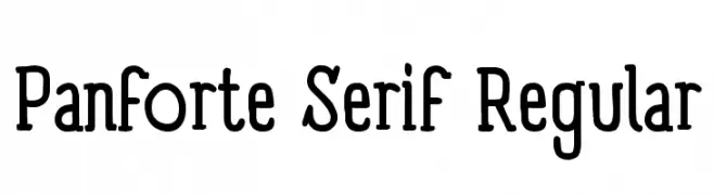
( Fonts by a kmzero font foundry - www.zetafonts.com. Personal-use only. For commercial use please contact owner. )
A bold, modern serif font with a classic touch, perfect for versatile design applications.
![Panforte Serif Regular font caratteri gratis]() Scaricare 269 Downloads@WebFont
Scaricare 269 Downloads@WebFont -
-
![Kanji C font caratteri gratis]() Scaricare 269 Downloads@WebFont
Scaricare 269 Downloads@WebFont -
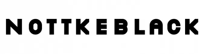
![NottkeBlack font caratteri gratis]() Scaricare 269 Downloads@WebFont
Scaricare 269 Downloads@WebFont -
![UltraLine font caratteri gratis]() Scaricare 269 Downloads
Scaricare 269 Downloads -
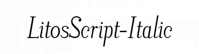
![LitosScript-Italic font caratteri gratis]() Scaricare 269 Downloads@WebFont
Scaricare 269 Downloads@WebFont -
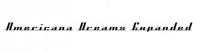
![Americana Dreams Expanded font caratteri gratis]() Scaricare 269 Downloads@WebFont
Scaricare 269 Downloads@WebFont -
( Fonts by http://perso.calixo.net/~uzim/ )
A chaotic, jagged font with a grunge-inspired aesthetic.
![AcidIII font caratteri gratis]() Scaricare 269 Downloads@WebFont
Scaricare 269 Downloads@WebFont -
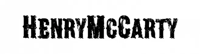
( Fonts by Woodcutter Manero - www.woodcutter.es - Personal-use only. For commercial use please contact owner. )
A rugged, distressed font with a vintage, handcrafted appearance.
![Henry McCarty font caratteri gratis]() Scaricare 269 Downloads@WebFont
Scaricare 269 Downloads@WebFont -
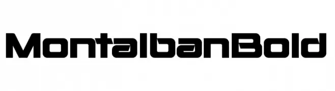
( Fonts by Pixel Sagas - Neale and Shayna Davidson - Personal-use only. For commercial use please contact owner. )
A bold, modern font with geometric shapes and consistent stroke thickness.
![Montalban Bold font caratteri gratis]() Scaricare 269 Downloads@WebFont
Scaricare 269 Downloads@WebFont -
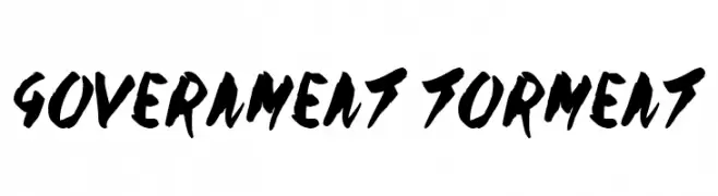
( Fonts by Jonathan S. Harris - www.tattoowoo.com. Personal-use only. For commercial use please contact owner. )
A bold, hand-painted style font with expressive, dynamic strokes.
![Government Torment font caratteri gratis]() Scaricare 269 Downloads@WebFont
Scaricare 269 Downloads@WebFont -
( Noto is a trademark of Google Inc. Noto fonts are open source. All Noto fonts are published under the SIL Open Font License, Version 1.1 )
No valid font is visible; only placeholder glyphs are shown.
![Noto Serif Myanmar Bold font caratteri gratis]() Scaricare 269 Downloads@WebFont
Scaricare 269 Downloads@WebFont -
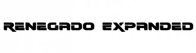
( Fonts by Daniel Zadorozny - www.iconian.com - Free for personal use )
A bold, futuristic font with wide, angular characters and a geometric style.
![Renegado Expanded font caratteri gratis]() Scaricare 269 Downloads@WebFont
Scaricare 269 Downloads@WebFont -
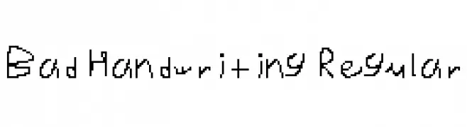
![Bad Handwriting Regular font caratteri gratis]() Scaricare 269 Downloads@WebFont
Scaricare 269 Downloads@WebFont -
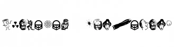
![Glamocon RetroBats font caratteri gratis]() Scaricare 269 Downloads@WebFont
Scaricare 269 Downloads@WebFont -
( Fonts by Jayde Garrow - GarrowGlitch - http://jaydegarrow.wix.com/jaydefonts. Personal-use only. For commercial use please contact owner. )
A bold, modern font with strong, uniform strokes and high legibility.
![SURVIVOR SERIES font caratteri gratis]() Scaricare 269 Downloads@WebFont
Scaricare 269 Downloads@WebFont -
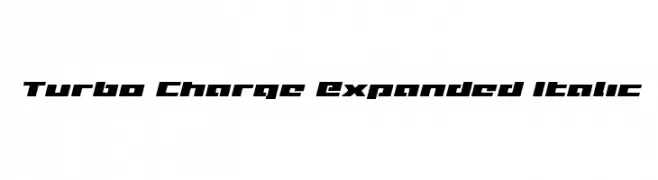
( Fonts by Iconian Fonts )
A bold, italic, and expanded font with a dynamic and futuristic style.
![Turbo Charge Expanded Italic font caratteri gratis]() Scaricare 269 Downloads@WebFont
Scaricare 269 Downloads@WebFont -
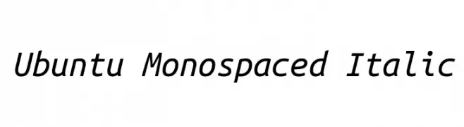
( Google Web Fonts )
A modern, italic monospaced font with equal character width.
![Ubuntu Monospaced Italic font caratteri gratis]() Scaricare 269 Downloads@WebFont
Scaricare 269 Downloads@WebFont -
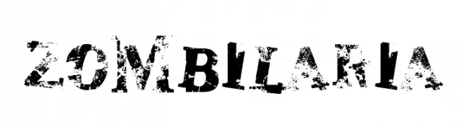
![zombilaria font caratteri gratis]() Scaricare 269 Downloads@WebFont
Scaricare 269 Downloads@WebFont -
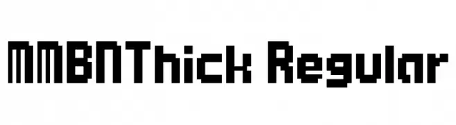
![MMBNThick Regular font caratteri gratis]() Scaricare 269 Downloads@WebFont
Scaricare 269 Downloads@WebFont -
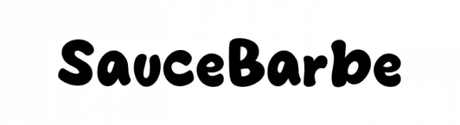
( Fonts by MJType )
A playful, bold font with rounded edges and consistent stroke width.
![Sauce Barbe font caratteri gratis]() Scaricare 269 Downloads@WebFont
Scaricare 269 Downloads@WebFont -
( Personal-use only. For commercial use please contact owner. )
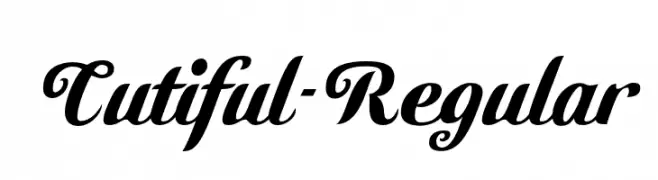
A bold, decorative script font with elegant swashes and playful curves.
![Cutiful-Regular font caratteri gratis]() Scaricare 269 Downloads@WebFont
Scaricare 269 Downloads@WebFont -
( Fonts by Wahyu Eka Prasetya - wepfont.com - Personal-use only. For commercial use please contact owner. )
A dynamic handwritten font with fluid strokes and artistic flair.
![Fastea font caratteri gratis]() Scaricare 269 Downloads@WebFont
Scaricare 269 Downloads@WebFont -
( Fonts by Fontles.com )
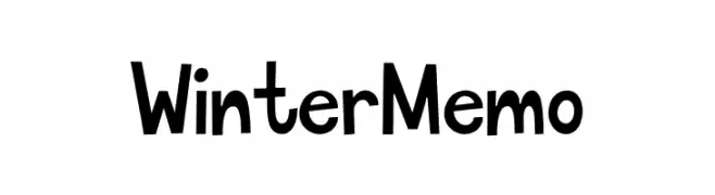
A playful, hand-drawn font with a whimsical and friendly style.
![Winter Memo font caratteri gratis]() Scaricare 269 Downloads@WebFont
Scaricare 269 Downloads@WebFont -
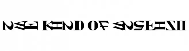
![NEW KIND OF ENGLISH font caratteri gratis]() Scaricare 269 Downloads@WebFont
Scaricare 269 Downloads@WebFont -
( Fonts by Manfred Klein. Free for private and charity use. Free for commercial with donation to organizations )
A bold, rugged font with a chiseled, ancient inscription style.
![Stoneage font caratteri gratis]() Scaricare 269 Downloads@WebFont
Scaricare 269 Downloads@WebFont -
( Fonts by www.woodcutter.es - woodcutter Manero - Personal-use only. For commercial use please contact owner. )
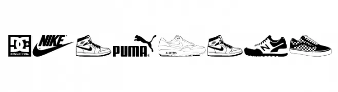
A display font made from sneaker and athletic shoe illustrations.
![Sneakers font caratteri gratis]() Scaricare 269 Downloads@WebFont
Scaricare 269 Downloads@WebFont -
![SnareDrum Zero NBP font caratteri gratis]() Scaricare 269 Downloads@WebFont
Scaricare 269 Downloads@WebFont -
![Stratenarow font caratteri gratis]() Scaricare 269 Downloads@WebFont
Scaricare 269 Downloads@WebFont -
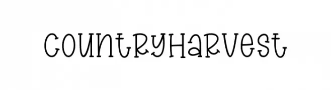
( Fonts by Graphix Line Studio )
A whimsical, hand-drawn serif font with playful curls and rounded edges.
![Country Harvest font caratteri gratis]() Scaricare 269 Downloads@WebFont
Scaricare 269 Downloads@WebFont -
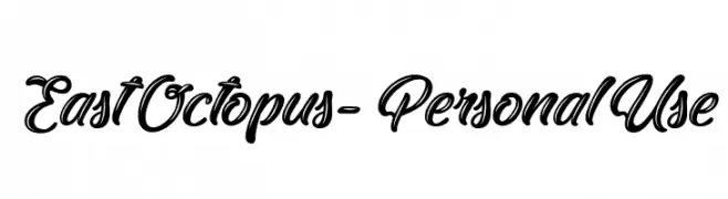
( Fonts by Typhoon Type - Suthi Srisopha - www.typhoontype.net - Personal-use only. For commercial use please contact owner. )
A bold, dynamic script font with flowing, interconnected characters.
![EastOctopus-PersonalUse font caratteri gratis]() Scaricare 269 Downloads@WebFont
Scaricare 269 Downloads@WebFont -
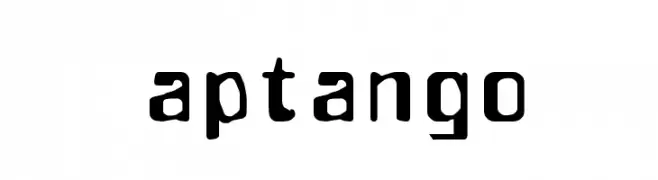
( Fonts by TarmSaft Font Factory - http://www.aska.nu/tarmsaft/ )
A bold, distressed font with a grunge aesthetic and uneven edges.
![aptango font caratteri gratis]() Scaricare 269 Downloads@WebFont
Scaricare 269 Downloads@WebFont


Quali sono i font più popolari adesso?
Poppins, Roboto, Montserrat, Open Sans e Lato sono molto usati per le forme pulite e l'ampia applicabilità — dall'identità di marca alle landing page e ai poster.
Quali font si usano spesso nei loghi?
Le sans serif geometriche (es. Poppins, famiglie in stile Gotham) sono scelte comuni per un branding pulito e scalabile. Per un tocco personale restano valide script e stili manoscritti. Abbina un display deciso per i titoli a un corpo testo neutro per riconoscibilità ed equilibrio.
Ogni quanto si aggiorna la lista?
Con regolarità, in base ai download e all'attività reale. Torna spesso per scoprire in anticipo le nuove preferite.
💡 Consiglio: aggiungi ai preferiti — le tendenze cambiano in fretta e i font top di oggi possono ispirare il rebranding di domani.