Benvenuto nelle Font Più Popolari — dove popolarità e qualità si incontrano. Qui trovi i font più scaricati e usati dell'anno. Se cerchi scelte sicure per logo, web o social, inizia da qui.
Ogni font top si distingue per equilibrio, leggibilità e versatilità. Troverai sans serif moderne, script eleganti, serif vintage e display minimalisti.
-
( Fonts by Neoqueto - Personal-use only. For commercial use please contact owner. )
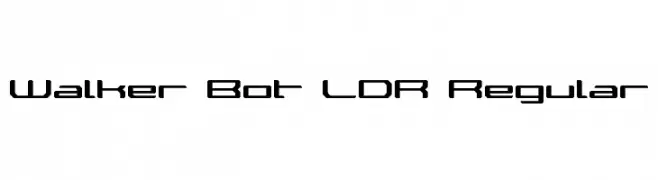
A futuristic, geometric font with angular, block-like letterforms.
 Scaricare 267 Downloads@WebFont
 -
( Free for a personal use. For a commercial use please visit www.kevinandamanda.com )
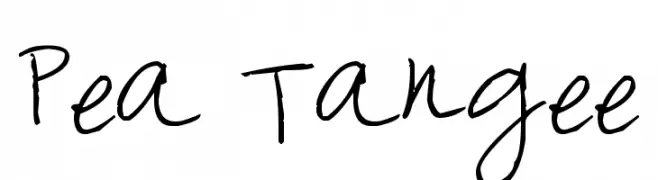
A playful, handwritten font with a casual and informal style.
![Pea Tangee font caratteri gratis]() Scaricare 267 Downloads@WebFont
Scaricare 267 Downloads@WebFont -
( Fonts by Alvaro Thomaz - alvarothomaz.com )
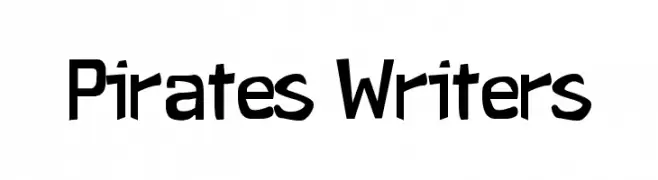
A bold, modern font with sharp angles and a slightly condensed style.
![Pirates Writers font caratteri gratis]() Scaricare 267 Downloads@WebFont
Scaricare 267 Downloads@WebFont -
( Fonts by Style-7 - www.styleseven.com - Personal-use only. For commercial use please contact owner. )
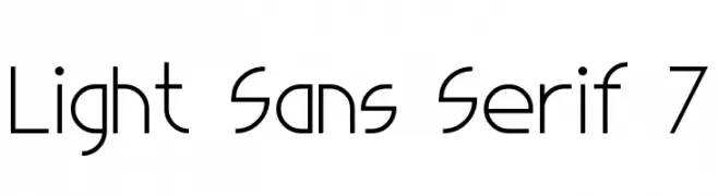
A modern, light sans-serif font with geometric precision and minimalist design.
![Light Sans Serif 7 font caratteri gratis]() Scaricare 267 Downloads@WebFont
Scaricare 267 Downloads@WebFont -
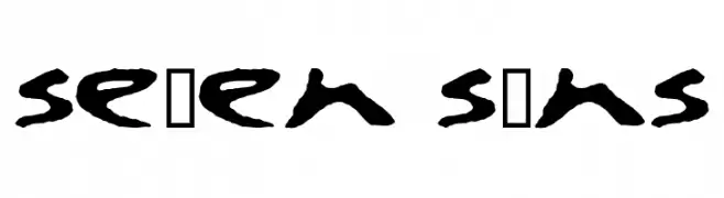
![se7en sins font caratteri gratis]() Scaricare 267 Downloads@WebFont
Scaricare 267 Downloads@WebFont -
-
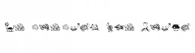
![KR Turtles For Julie font caratteri gratis]() Scaricare 267 Downloads@WebFont
Scaricare 267 Downloads@WebFont -
( Free for a personal use. For a commercial use please visit www.kevinandamanda.com )
A bold, expressive handwritten font with thick, uneven strokes and a playful style.
![Landie font caratteri gratis]() Scaricare 267 Downloads@WebFont
Scaricare 267 Downloads@WebFont -
( Fonts by Febryl Arully - Personal-use only. For commercial use please contact owner. )
A bold, flowing script font with a modern, playful aesthetic.
![Love font caratteri gratis]() Scaricare 267 Downloads@WebFont
Scaricare 267 Downloads@WebFont -
( weknow - Wino S Kadir - www.creativefabrica.com/designer/weknow/ )
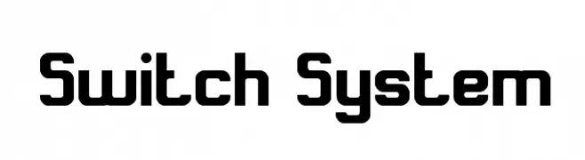
A bold, geometric font with a modern and futuristic style.
![Switch System font caratteri gratis]() Scaricare 267 Downloads@WebFont
Scaricare 267 Downloads@WebFont -
( Fonts by Alde Saputro - aldedesign - https://www.creativefabrica.com/product/the-crafty-holiday-font-bundle/ref/125925/ - Personal-use only. For commercial use please contact owner. )
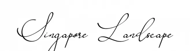
A sophisticated script font with elegant, flowing strokes and artistic flourishes.
![Singapore Landscape font caratteri gratis]() Scaricare 267 Downloads@WebFont
Scaricare 267 Downloads@WebFont -
( Fonts by dcoxy )
A bold, flowing script font with a playful, handwritten style.
![Magic Club_PersonalUseOnly font caratteri gratis]() Scaricare 267 Downloads@WebFont
Scaricare 267 Downloads@WebFont -
![BOMBORA font caratteri gratis]() Scaricare 267 Downloads@WebFont
Scaricare 267 Downloads@WebFont -
( Fonts by Arkandis Digital Foundry )
A bold, italic serif font with a classic and elegant style.
![VenturisOldADF-BoldItalic font caratteri gratis]() Scaricare 267 Downloads@WebFont
Scaricare 267 Downloads@WebFont -
( www.edu.xunta.es/centros/cepcarreira/ )
A modern dotted font with geometric uppercase and cursive lowercase letters.
![ColeCarreira1 font caratteri gratis]() Scaricare 267 Downloads@WebFont
Scaricare 267 Downloads@WebFont -
( Fonts by Andrew Hart - dirt2.com )
A bold, distressed font with a vintage, grunge aesthetic.
![GoodPeace font caratteri gratis]() Scaricare 267 Downloads@WebFont
Scaricare 267 Downloads@WebFont -
( Fonts by Fontfabric - Svetoslav Simov - Personal-use only. For commercial use please contact owner. )
A bold, narrow, and italicized modern font with strong visual impact.
![Panton Narrow-Trial Heavy Italic font caratteri gratis]() Scaricare 267 Downloads@WebFont
Scaricare 267 Downloads@WebFont -
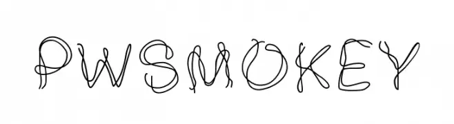
( Fonts by Peax Webdesign - www.peax-webdesign.com. Personal-use only. For commercial use please contact owner. )
A whimsical, hand-drawn font with looping, interconnected strokes.
![PWSmokey font caratteri gratis]() Scaricare 267 Downloads@WebFont
Scaricare 267 Downloads@WebFont -
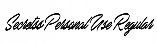
( Fonts by Billy Argel - Personal-use only. For commercial use please contact owner. )
A flowing, cursive font with elegant, sweeping strokes and a handwritten appearance.
![Secretss Personal Use Regular font caratteri gratis]() Scaricare 267 Downloads@WebFont
Scaricare 267 Downloads@WebFont -
![pirates pw font caratteri gratis]() Scaricare 267 Downloads@WebFont
Scaricare 267 Downloads@WebFont -
( Fonts by Tan Zuha N - Personal-use only. For commercial use please contact owner. )
A playful, bold handwritten font with rounded, irregular letterforms.
![samble font caratteri gratis]() Scaricare 267 Downloads@WebFont
Scaricare 267 Downloads@WebFont -
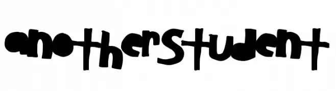
( Fonts by a Max Infeld - XEROGRAPHER FONTS - xerographer.blogspot.com . Personal-use only. For commercial use please contact owner. )
A bold, playful, and hand-drawn font with a friendly and decorative style.
![AnotherStudent font caratteri gratis]() Scaricare 267 Downloads@WebFont
Scaricare 267 Downloads@WebFont -
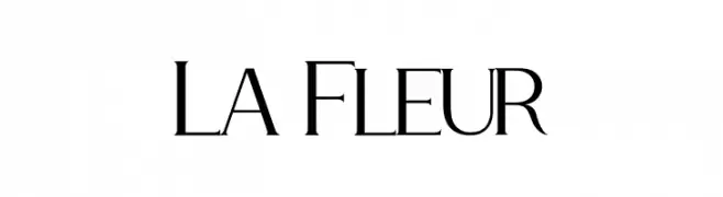
( Fonts by Kong Font - Personal-use only. For commercial use please contact owner. )
A sophisticated, high-contrast serif font with elegant, condensed characters.
![La Fleur font caratteri gratis]() Scaricare 267 Downloads@WebFont
Scaricare 267 Downloads@WebFont -
( Fonts by a Max Infeld - XEROGRAPHER FONTS - xerographer.blogspot.com . Personal-use only. For commercial use please contact owner. )
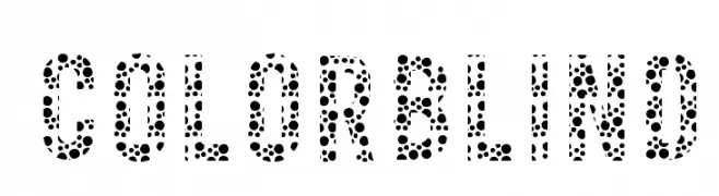
A bold, dotted pattern font ideal for creative projects.
![ColorBlind font caratteri gratis]() Scaricare 267 Downloads@WebFont
Scaricare 267 Downloads@WebFont -
( Fonts by Julia Holdnack )
A whimsical, decorative font with nature-inspired embellishments and modern elements.
![Kalopsia} font caratteri gratis]() Scaricare 267 Downloads@WebFont
Scaricare 267 Downloads@WebFont -
( Fonts by LyonsType - Daniel Lyons - Personal-use only. For commercial use please contact owner. )
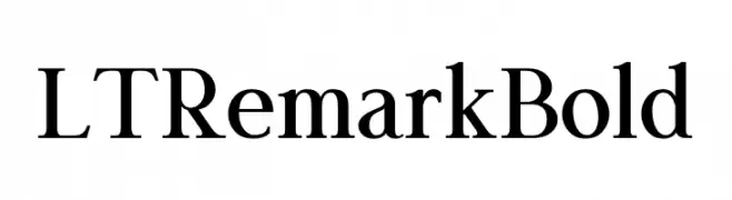
A bold, classic serif typeface with strong, authoritative strokes.
![LT Remark Bold font caratteri gratis]() Scaricare 267 Downloads@WebFont
Scaricare 267 Downloads@WebFont -
( Fonts by AEnigma - www.aenigmafonts.com )
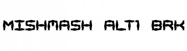
A bold, angular font with a jagged, fragmented design.
![Mishmash ALT1 BRK font caratteri gratis]() Scaricare 267 Downloads@WebFont
Scaricare 267 Downloads@WebFont -
( Fonts by Manfred Klein. Free for private and charity use. Free for commercial with donation to organizations )
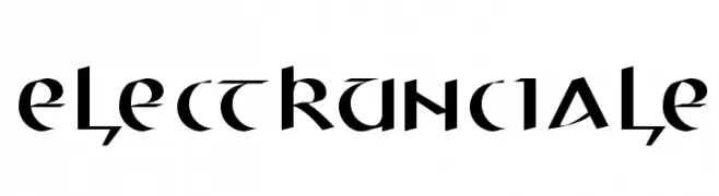
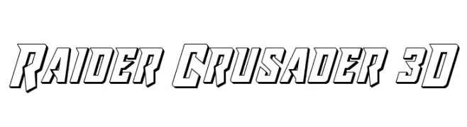
A bold, angular font with medieval influences and modern appeal.
![ElectrUnciale font caratteri gratis]() Scaricare 267 Downloads@WebFont
Scaricare 267 Downloads@WebFont -
![Raider Crusader 3D font caratteri gratis]() Scaricare 267 Downloads@WebFont
Scaricare 267 Downloads@WebFont -
( Fonts by Iconian Fonts )
A futuristic, geometric font with rounded edges and a sleek, modern style.
![Planet N Compact Expanded font caratteri gratis]() Scaricare 267 Downloads@WebFont
Scaricare 267 Downloads@WebFont -
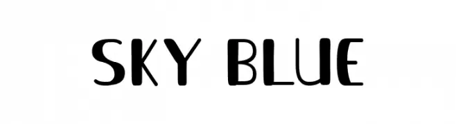
( Fonts by Faris Graphic Art )
A playful and modern font with dynamic strokes and a versatile style.
![Sky Blue font caratteri gratis]() Scaricare 267 Downloads@WebFont
Scaricare 267 Downloads@WebFont -
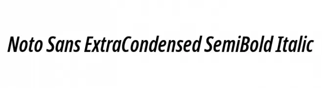
( Fonts by Google - Personal-use only. For commercial use please contact owner. )
A modern, extra condensed, semi-bold italic sans-serif typeface with tight spacing.
![Noto Sans ExtraCondensed SemiBold Italic font caratteri gratis]() Scaricare 267 Downloads@WebFont
Scaricare 267 Downloads@WebFont -
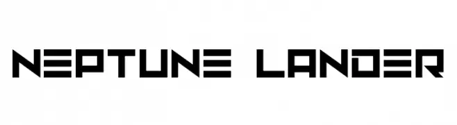
( Fonts by Darrell Flood - Personal-use only. For commercial use please contact owner. )
A bold, geometric font with a futuristic and digital style.
![Neptune Lander font caratteri gratis]() Scaricare 267 Downloads@WebFont
Scaricare 267 Downloads@WebFont -
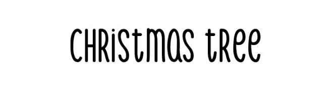
( Fonts by Md Shohail Bhuian - Personal-use only. For commercial use please contact owner. )
A playful, rounded font with a hand-drawn feel.
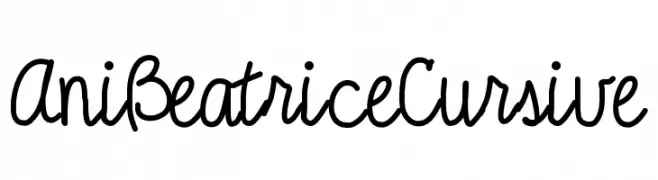
![Christmas Tree font caratteri gratis]() Scaricare 267 Downloads@WebFont
Scaricare 267 Downloads@WebFont -
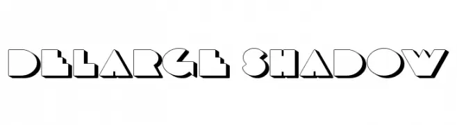
![AniBeatriceCursive font caratteri gratis]() Scaricare 267 Downloads@WebFont
Scaricare 267 Downloads@WebFont -
![DeLarge Shadow font caratteri gratis]() Scaricare 267 Downloads@WebFont
Scaricare 267 Downloads@WebFont


Quali sono i font più popolari adesso?
Poppins, Roboto, Montserrat, Open Sans e Lato sono molto usati per le forme pulite e l'ampia applicabilità — dall'identità di marca alle landing page e ai poster.
Quali font si usano spesso nei loghi?
Le sans serif geometriche (es. Poppins, famiglie in stile Gotham) sono scelte comuni per un branding pulito e scalabile. Per un tocco personale restano valide script e stili manoscritti. Abbina un display deciso per i titoli a un corpo testo neutro per riconoscibilità ed equilibrio.
Ogni quanto si aggiorna la lista?
Con regolarità, in base ai download e all'attività reale. Torna spesso per scoprire in anticipo le nuove preferite.
💡 Consiglio: aggiungi ai preferiti — le tendenze cambiano in fretta e i font top di oggi possono ispirare il rebranding di domani.