Benvenuto nelle Font Più Popolari — dove popolarità e qualità si incontrano. Qui trovi i font più scaricati e usati dell'anno. Se cerchi scelte sicure per logo, web o social, inizia da qui.
Ogni font top si distingue per equilibrio, leggibilità e versatilità. Troverai sans serif moderne, script eleganti, serif vintage e display minimalisti.
-
( Family Font Mart - www.h2o.or.jp/~orihikao/ )
A sleek, modern font with geometric and futuristic design elements.
 Scaricare 234 Downloads@WebFont
 -
( Fonts by Muhammad Sirojuddin - lettersiro.com - Personal-use only. For commercial use please contact owner. )
A chaotic, textured font with jagged strokes, ideal for eerie or mysterious themes.
![Darkside font caratteri gratis]() Scaricare 234 Downloads@WebFont
Scaricare 234 Downloads@WebFont -
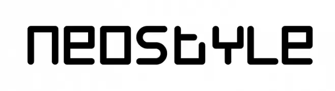
![Neostyle font caratteri gratis]() Scaricare 234 Downloads@WebFont
Scaricare 234 Downloads@WebFont -
![Bit Folder15 [sRB] font caratteri gratis]() Scaricare 234 Downloads@WebFont
Scaricare 234 Downloads@WebFont -
( Jayvee Enaguas )
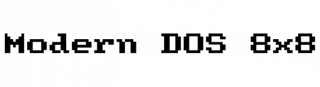
A pixelated, monospaced font inspired by classic DOS interfaces.
![Modern DOS 8x8 font caratteri gratis]() Scaricare 234 Downloads@WebFont
Scaricare 234 Downloads@WebFont -
-
![FarHat-Quintas font caratteri gratis]() Scaricare 234 Downloads@WebFont
Scaricare 234 Downloads@WebFont -
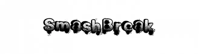
( Fonts by a Max Infeld - XEROGRAPHER FONTS - xerographer.blogspot.com . Personal-use only. For commercial use please contact owner. )
A bold, distressed font with a comic book and graffiti-inspired style.
![SmashBreak font caratteri gratis]() Scaricare 234 Downloads@WebFont
Scaricare 234 Downloads@WebFont -
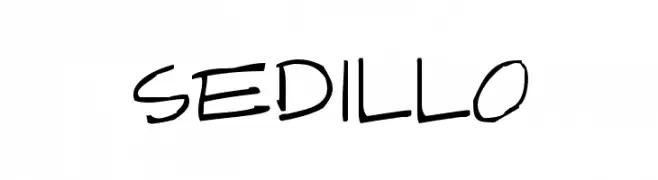
( Fonts by Apostrophic Lab )
A bold, expressive handwritten font with dynamic strokes and a playful appearance.
![Sedillo font caratteri gratis]() Scaricare 234 Downloads@WebFont
Scaricare 234 Downloads@WebFont -
( Fonts by dartcanada.tripod.com - Darren Rigby )
A bold, modern take on traditional blackletter styles with sharp angles and strong lines.
![IntruderAlert font caratteri gratis]() Scaricare 234 Downloads@WebFont
Scaricare 234 Downloads@WebFont -
( Fonts by www.aenigmafonts.com )
A bold, decorative font with an ink-like, hand-drawn appearance.
![Ink Tank [BRK] font caratteri gratis]() Scaricare 234 Downloads@WebFont
Scaricare 234 Downloads@WebFont -
( Fonts by appligraphe )
A playful, bold font with screw-like design elements and rounded edges.
![screwround font caratteri gratis]() Scaricare 234 Downloads@WebFont
Scaricare 234 Downloads@WebFont -
( Fonts by Kat`s Fun Fonts - Personal-use only. For commercial use please contact owner. )
A bold, dynamic font with thick strokes and a slight slant, perfect for impactful statements.
![KR Gunz font caratteri gratis]() Scaricare 234 Downloads@WebFont
Scaricare 234 Downloads@WebFont -
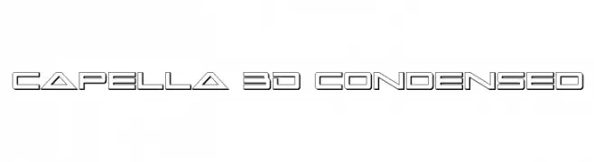
( Fonts by Daniel Zadorozny - www.iconian.com )
A 3D geometric font with a condensed, futuristic style.
![Capella 3D Condensed font caratteri gratis]() Scaricare 234 Downloads@WebFont
Scaricare 234 Downloads@WebFont -
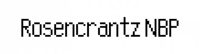
![Rosencrantz NBP font caratteri gratis]() Scaricare 234 Downloads@WebFont
Scaricare 234 Downloads@WebFont -
( Fonts by Daniel Zadorozny - www.iconian.com - Free for personal use )
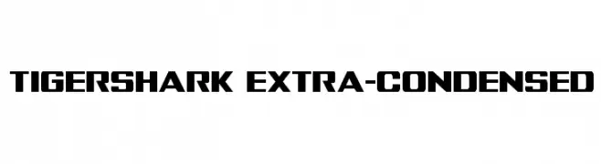
A bold, extra-condensed font with geometric, modern design.
![Tigershark Extra-Condensed font caratteri gratis]() Scaricare 234 Downloads@WebFont
Scaricare 234 Downloads@WebFont -
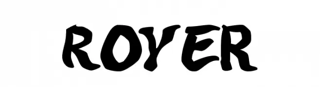
![Royer font caratteri gratis]() Scaricare 234 Downloads@WebFont
Scaricare 234 Downloads@WebFont -
( Fonts by Pennyzine - www.thedevilinjasonramirez.com - Free for personal use )
A bold, distressed font with a vintage, textured appearance.
![Stank font caratteri gratis]() Scaricare 234 Downloads@WebFont
Scaricare 234 Downloads@WebFont -
( Fonts by Guillem Castro )
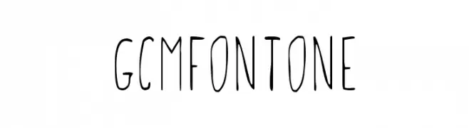
A playful, handwritten font with tall, narrow letters and a casual style.
![GCMFontone font caratteri gratis]() Scaricare 234 Downloads@WebFont
Scaricare 234 Downloads@WebFont -
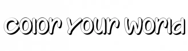
![Color Your World font caratteri gratis]() Scaricare 234 Downloads@WebFont
Scaricare 234 Downloads@WebFont -
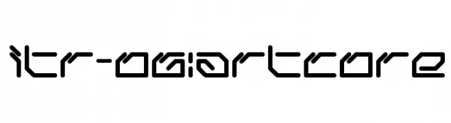
![ltr-06:artcore font caratteri gratis]() Scaricare 234 Downloads@WebFont
Scaricare 234 Downloads@WebFont -
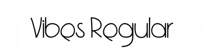
( Copyright 2019 The Vibes Project Authors (https://github.com/bluemix/vibes-typeface) )
A playful, modern font with clean, geometric lines and a whimsical touch.
![Vibes Regular font caratteri gratis]() Scaricare 234 Downloads@WebFont
Scaricare 234 Downloads@WebFont -
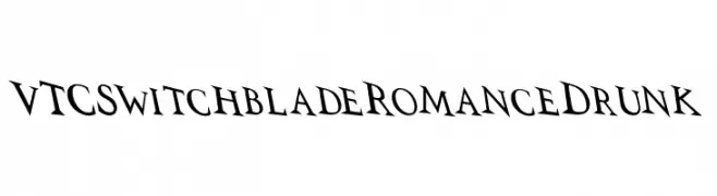
![VTCSwitchbladeRomanceDrunk font caratteri gratis]() Scaricare 234 Downloads@WebFont
Scaricare 234 Downloads@WebFont -
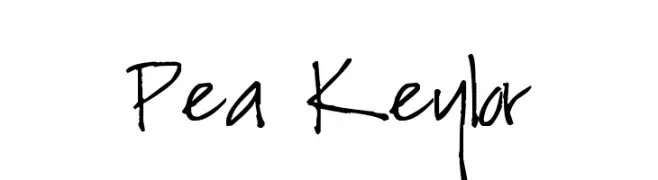
( Free for a personal use. For a commercial use please visit www.kevinandamanda.com )
A casual, handwritten font with a playful and informal style.
![Pea Keylor font caratteri gratis]() Scaricare 234 Downloads@WebFont
Scaricare 234 Downloads@WebFont -
( Vladimir Nikolic - www.coroflot.com/vladimirnikolic )
A bold, 3D marquee font with decorative bulb embellishments.
![Casino 3D Marquee Regular font caratteri gratis]() Scaricare 234 Downloads@WebFont
Scaricare 234 Downloads@WebFont -
![SANSI font caratteri gratis]() Scaricare 234 Downloads@WebFont
Scaricare 234 Downloads@WebFont -
( Fonts by Daniel Zadorozny - www.iconian.com - Personal-use only. For commercial use please contact owner. )
A bold, geometric font with a futuristic and robust design.
![Mandalore font caratteri gratis]() Scaricare 234 Downloads@WebFont
Scaricare 234 Downloads@WebFont -
![pixellife small cap font caratteri gratis]() Scaricare 234 Downloads@WebFont
Scaricare 234 Downloads@WebFont -
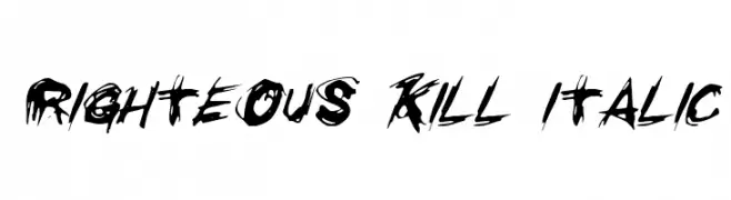
( Fonts by Daniel Zadorozny - www.iconian.com - Free for personal use )
A bold, brush-style font with a distressed, grunge effect.
![Righteous Kill Italic font caratteri gratis]() Scaricare 234 Downloads@WebFont
Scaricare 234 Downloads@WebFont -
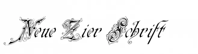
( Fonts by www.peter-wiegel.de. Personal-use only. For commercial use please contact owner. )
An ornate and decorative font with intricate swirls and embellishments.
![Neue Zier Schrift font caratteri gratis]() Scaricare 234 Downloads@WebFont
Scaricare 234 Downloads@WebFont -
![Beigly font caratteri gratis]() Scaricare 234 Downloads@WebFont
Scaricare 234 Downloads@WebFont -
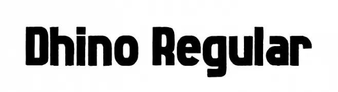
( Fonts by Almaz Studio )
A bold, geometric font with a strong, modern appearance.
![Dhino Regular font caratteri gratis]() Scaricare 234 Downloads@WebFont
Scaricare 234 Downloads@WebFont -
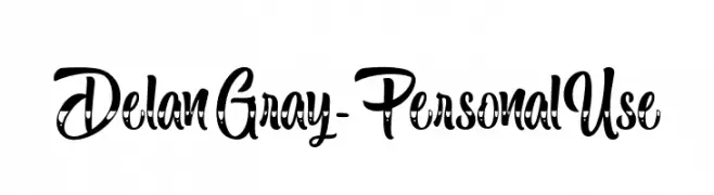
( Fonts by Typhoon Type - Suthi Srisopha - www.typhoontype.net - Personal-use only. For commercial use please contact owner. )
A playful, decorative font with a whimsical, handwritten style.
![DelanGray-PersonalUse font caratteri gratis]() Scaricare 234 Downloads@WebFont
Scaricare 234 Downloads@WebFont -
( Fonts by HansCo - Burhan Afif - Personal-use only. For commercial use please contact owner. )
A bold, heart-themed decorative font perfect for romantic and playful designs.
![Lover font caratteri gratis]() Scaricare 234 Downloads@WebFont
Scaricare 234 Downloads@WebFont -
( Shareware - new.myfonts.com/foundry/Intellecta_Design/?refby=paulow )
An elegant, cursive script font with flowing, connected strokes.
![ClosetoYou font caratteri gratis]() Scaricare 234 Downloads@WebFont
Scaricare 234 Downloads@WebFont -
![ColesFont font caratteri gratis]() Scaricare 234 Downloads@WebFont
Scaricare 234 Downloads@WebFont

![Bit Folder15 [sRB] font caratteri gratis](https://d144mzi0q5mijx.cloudfront.net/img/B/I/Bit-Folder15-sRB.webp)

![Ink Tank [BRK] font caratteri gratis](https://d144mzi0q5mijx.cloudfront.net/img/I/N/Ink-Tank-BRK.webp)


Quali sono i font più popolari adesso?
Poppins, Roboto, Montserrat, Open Sans e Lato sono molto usati per le forme pulite e l'ampia applicabilità — dall'identità di marca alle landing page e ai poster.
Quali font si usano spesso nei loghi?
Le sans serif geometriche (es. Poppins, famiglie in stile Gotham) sono scelte comuni per un branding pulito e scalabile. Per un tocco personale restano valide script e stili manoscritti. Abbina un display deciso per i titoli a un corpo testo neutro per riconoscibilità ed equilibrio.
Ogni quanto si aggiorna la lista?
Con regolarità, in base ai download e all'attività reale. Torna spesso per scoprire in anticipo le nuove preferite.
💡 Consiglio: aggiungi ai preferiti — le tendenze cambiano in fretta e i font top di oggi possono ispirare il rebranding di domani.