Benvenuto nelle Font Più Popolari — dove popolarità e qualità si incontrano. Qui trovi i font più scaricati e usati dell'anno. Se cerchi scelte sicure per logo, web o social, inizia da qui.
Ogni font top si distingue per equilibrio, leggibilità e versatilità. Troverai sans serif moderne, script eleganti, serif vintage e display minimalisti.
-
( Fonts by www.Fontfabric.com )
A modern, rounded sans-serif font with a clean and approachable design.
 Scaricare 3313 Downloads@WebFont
 -
![Tuffy Infant Regular font caratteri gratis]() Scaricare 3313 Downloads@WebFont
Scaricare 3313 Downloads@WebFont -
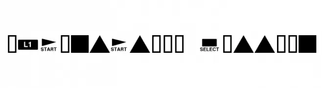
![Playstation Buttons font caratteri gratis]() Scaricare 3313 Downloads@WebFont
Scaricare 3313 Downloads@WebFont -
![101! Love Garden font caratteri gratis]() Scaricare 3313 Downloads@WebFont
Scaricare 3313 Downloads@WebFont -
( Fonts by Ten by Twenty - tenbytwenty.com )
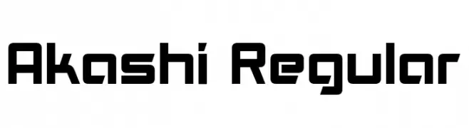
A bold, geometric font with a modern and technical style.
![Akashi Regular font caratteri gratis]() Scaricare 3312 Downloads@WebFont
Scaricare 3312 Downloads@WebFont -
-
( Fonts by Daniel Zadorozny - www.iconian.com )
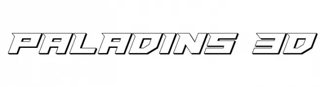
A bold, 3D geometric font with a futuristic and dynamic style.
![Paladins 3D font caratteri gratis]() Scaricare 3311 Downloads@WebFont
Scaricare 3311 Downloads@WebFont -
( Fonts by Julieta Ulanovsky - Personal-use only. For commercial use please contact owner. )
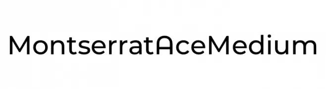
A modern, geometric sans-serif font with clean lines and balanced proportions.
![Montserrat Ace Medium font caratteri gratis]() Scaricare 3310 Downloads@WebFont
Scaricare 3310 Downloads@WebFont -
( Fonts by CannotIntoSpaceFonts - KineticPlasma Fonts - Personal-use only. For commercial use please contact owner. )
A bold, thick font with rounded edges and strong visual impact.
![Asimov Print E font caratteri gratis]() Scaricare 3310 Downloads@WebFont
Scaricare 3310 Downloads@WebFont -
![mohammed font caratteri gratis]() Scaricare 3310 Downloads@WebFont
Scaricare 3310 Downloads@WebFont -
![Iron & Brine font caratteri gratis]() Scaricare 3309 Downloads@WebFont
Scaricare 3309 Downloads@WebFont -
( Fonts by Luke Owens - Personal-use only. For commercial use please contact owner. )
A bold, extended sans-serif font with a modern and clean design.
![Waukegan LDO Extended Bold font caratteri gratis]() Scaricare 3308 Downloads@WebFont
Scaricare 3308 Downloads@WebFont -
![Porter Regular font caratteri gratis]() Scaricare 3308 Downloads@WebFont
Scaricare 3308 Downloads@WebFont -
![Intrique Script Personal Use font caratteri gratis]() Scaricare 3307 Downloads@WebFont
Scaricare 3307 Downloads@WebFont -
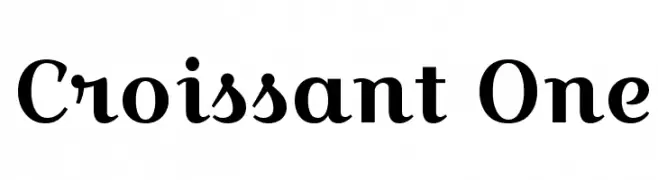
( Copyright (c) 2012, Eduardo Tunni (http://www.tipo.net.ar), with Reserved Font Name 'Croissant' )
A playful and whimsical font with bold curves and sharp edges.
![Croissant One font caratteri gratis]() Scaricare 3307 Downloads@WebFont
Scaricare 3307 Downloads@WebFont -
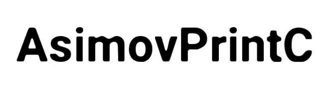
( Fonts by CannotIntoSpaceFonts - KineticPlasma Fonts - Personal-use only. For commercial use please contact owner. )
A bold, modern sans-serif font with a clean and uniform appearance.
![Asimov Print C font caratteri gratis]() Scaricare 3306 Downloads@WebFont
Scaricare 3306 Downloads@WebFont -
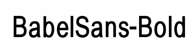
( Fonts by Manfred Klein - manfred-klein.ina-mar.com )
A bold, modern sans-serif font with clean lines and uniform stroke width.
![BabelSans-Bold font caratteri gratis]() Scaricare 3306 Downloads@WebFont
Scaricare 3306 Downloads@WebFont -
( Fonts by Graphix Line Studio )
A playful, bold, hand-drawn font with rounded characters.
![Kids Zona font caratteri gratis]() Scaricare 3305 Downloads@WebFont
Scaricare 3305 Downloads@WebFont -
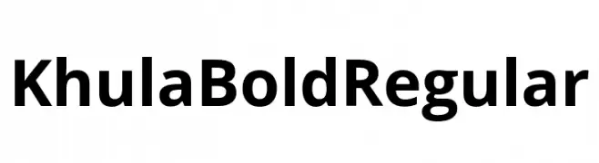
( Fonts by Erin McLaughlin )
A bold, modern sans-serif font with a clean and slightly condensed style.
![Khula Bold Regular font caratteri gratis]() Scaricare 3305 Downloads@WebFont
Scaricare 3305 Downloads@WebFont -
( Copyright (c) 2012-2015, The Mozilla Foundation and Telefonica S.A. )
A bold, italicized font with a modern and dynamic style.
![Fira Sans Black Italic font caratteri gratis]() Scaricare 3305 Downloads@WebFont
Scaricare 3305 Downloads@WebFont -
![AvalonQuest font caratteri gratis]() Scaricare 3305 Downloads@WebFont
Scaricare 3305 Downloads@WebFont -
( Fonts by dot colon - Personal-use only. For commercial use please contact owner. )
A modern, geometric sans-serif font with clean lines and excellent readability.
![Aileron font caratteri gratis]() Scaricare 3304 Downloads@WebFont
Scaricare 3304 Downloads@WebFont -
( Fonts by Jamie Place [FontBlast Design] - Personal-use only. For commercial use please contact owner. )
A bold, geometric font with high contrast and decorative elements.
![Metric Regular font caratteri gratis]() Scaricare 3304 Downloads@WebFont
Scaricare 3304 Downloads@WebFont -
( Fonts by Billy Argel - www.billyargel.com - Personal-use only. For commercial use please contact owner. )
An elegant, flowing script font with ornate, cursive strokes.
![Blessed Personal Use font caratteri gratis]() Scaricare 3304 Downloads@WebFont
Scaricare 3304 Downloads@WebFont -
![GurbaniKalmi font caratteri gratis]() Scaricare 3304 Downloads@WebFont
Scaricare 3304 Downloads@WebFont -
( Fonts by www.twopeasinabucket.com )
A bold, expressive script font with flowing, cursive letterforms.
![2Peas Platform Shoes font caratteri gratis]() Scaricare 3304 Downloads@WebFont
Scaricare 3304 Downloads@WebFont -
( Fonts by Vanessa Bays - bythebutterfly.com )
A playful and flowing script font with smooth, rounded curves.
![Always In My Heart font caratteri gratis]() Scaricare 3303 Downloads@WebFont
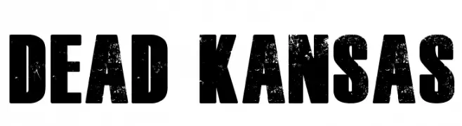
Scaricare 3303 Downloads@WebFont -
![Dead Kansas font caratteri gratis]() Scaricare 3303 Downloads@WebFont
Scaricare 3303 Downloads@WebFont -
( Copyright (c) 2010-2012, Sai Zin Di Di Zone (www.yunghkio.com/unicode|saiddzone@gmail.com), with Reserved Font Name 'Yunghkio'. )
A modern, clean sans-serif typeface with balanced proportions.
![TharLon font caratteri gratis]() Scaricare 3301 Downloads@WebFont
Scaricare 3301 Downloads@WebFont -
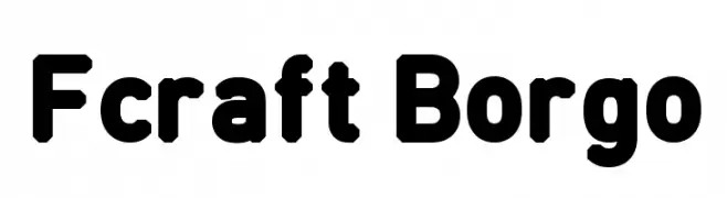
![Fcraft Borgo font caratteri gratis]() Scaricare 3301 Downloads@WebFont
Scaricare 3301 Downloads@WebFont -
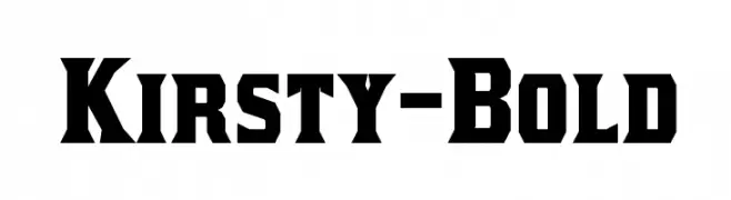
( Fonts by www.typodermicfonts.com - Ray Larabie )
A bold, angular font with a vintage, geometric style.
![Kirsty-Bold font caratteri gratis]() Scaricare 3301 Downloads@WebFont
Scaricare 3301 Downloads@WebFont -
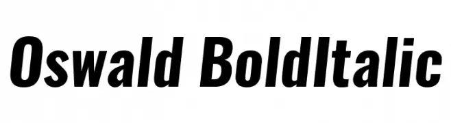
( Fonts by Vernon Adams )
A bold, italicized sans-serif font with a modern and dynamic style.
![Oswald BoldItalic font caratteri gratis]() Scaricare 3300 Downloads@WebFont
Scaricare 3300 Downloads@WebFont -
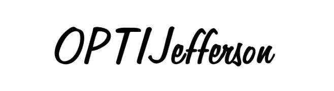
( Fonts by Castcraft Software - opti.netii.net - check the website before use )
A dynamic, fluid handwritten font with smooth curves and a slightly slanted style.
![OPTIJefferson font caratteri gratis]() Scaricare 3300 Downloads@WebFont
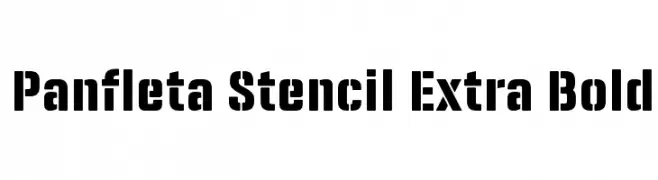
Scaricare 3300 Downloads@WebFont -
![Panfleta Stencil Extra Bold font caratteri gratis]() Scaricare 3299 Downloads@WebFont
Scaricare 3299 Downloads@WebFont -
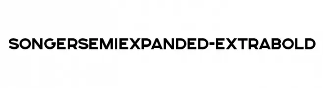
( Alexander Pravdin )
A bold, semi-expanded typeface with a modern and geometric design.
![SONGERSemiExpanded-ExtraBold font caratteri gratis]() Scaricare 3299 Downloads@WebFont
Scaricare 3299 Downloads@WebFont -
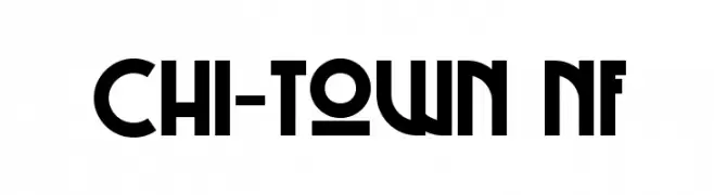
( Fonts by Nick Curtis - www.nicksfonts.com )
A bold, geometric font with Art Deco influences, ideal for striking designs.
![Chi-Town NF font caratteri gratis]() Scaricare 3298 Downloads@WebFont
Scaricare 3298 Downloads@WebFont


Quali sono i font più popolari adesso?
Poppins, Roboto, Montserrat, Open Sans e Lato sono molto usati per le forme pulite e l'ampia applicabilità — dall'identità di marca alle landing page e ai poster.
Quali font si usano spesso nei loghi?
Le sans serif geometriche (es. Poppins, famiglie in stile Gotham) sono scelte comuni per un branding pulito e scalabile. Per un tocco personale restano valide script e stili manoscritti. Abbina un display deciso per i titoli a un corpo testo neutro per riconoscibilità ed equilibrio.
Ogni quanto si aggiorna la lista?
Con regolarità, in base ai download e all'attività reale. Torna spesso per scoprire in anticipo le nuove preferite.
💡 Consiglio: aggiungi ai preferiti — le tendenze cambiano in fretta e i font top di oggi possono ispirare il rebranding di domani.