Benvenuto nelle Font Più Popolari — dove popolarità e qualità si incontrano. Qui trovi i font più scaricati e usati dell'anno. Se cerchi scelte sicure per logo, web o social, inizia da qui.
Ogni font top si distingue per equilibrio, leggibilità e versatilità. Troverai sans serif moderne, script eleganti, serif vintage e display minimalisti.
-
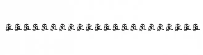
( Fonts by Daniel Zadorozny - www.iconian.com )
A decorative font featuring silhouette figures in various poses.
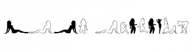 Scaricare 3389 Downloads
 -
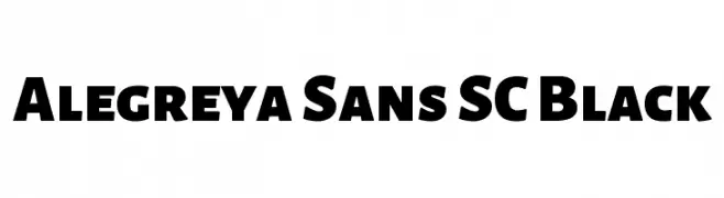
( Copyright 2013 The Alegreya Sans Project Authors (https://github.com/huertatipografica/Alegreya-Sans) )
A bold, modern sans-serif font with strong geometric shapes.
![Alegreya Sans SC Black font caratteri gratis]() Scaricare 3388 Downloads@WebFont
Scaricare 3388 Downloads@WebFont -
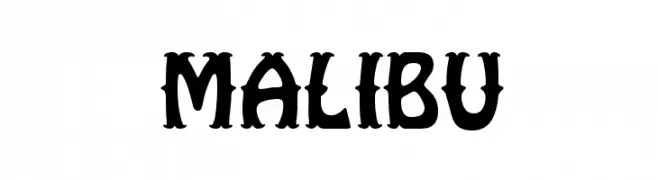
( Fonts by www.fontalicious.com )
A bold, decorative font with a playful, vintage flair.
![Malibu font caratteri gratis]() Scaricare 3388 Downloads@WebFont
Scaricare 3388 Downloads@WebFont -
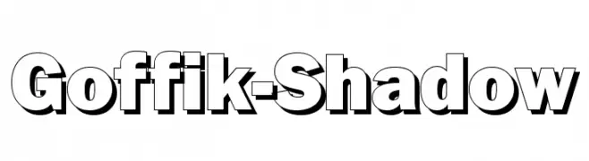
( Fonts by Bree Gorton )
A bold, shadowed sans-serif font with a modern, three-dimensional look.
![Goffik-Shadow font caratteri gratis]() Scaricare 3388 Downloads@WebFont
Scaricare 3388 Downloads@WebFont -
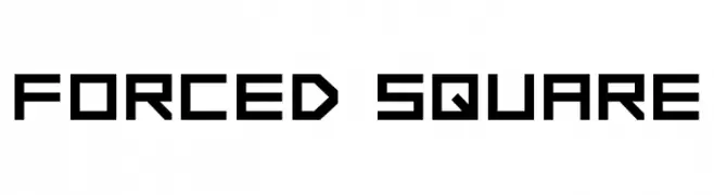
( www.drawperfect.com/ )
A geometric, angular font with a modern, blocky style.
![FORCED SQUARE font caratteri gratis]() Scaricare 3387 Downloads@WebFont
Scaricare 3387 Downloads@WebFont -
-
![NBA SuperSonics font caratteri gratis]() Scaricare 3387 Downloads@WebFont
Scaricare 3387 Downloads@WebFont -
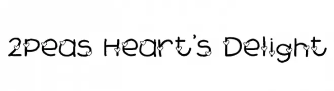
( Fonts by www.twopeasinabucket.com )
A playful, heart-adorned font with a hand-drawn, whimsical style.
![2Peas Heart's Delight font caratteri gratis]() Scaricare 3387 Downloads@WebFont
Scaricare 3387 Downloads@WebFont -
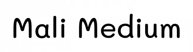
( Copyright 2018 The Mali Project Authors (https://github.com/cadsondemak/Mali) )
A playful, rounded font with smooth curves and a friendly appearance.
![Mali Medium font caratteri gratis]() Scaricare 3385 Downloads@WebFont
Scaricare 3385 Downloads@WebFont -
![TeXGyreHerosCondensed-Regular font caratteri gratis]() Scaricare 3385 Downloads@WebFont
Scaricare 3385 Downloads@WebFont -
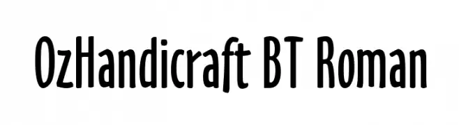
Caratteri di NicholasJudy456. For commercial use please contact the owner.
![OzHandicraft BT Roman font caratteri gratis]() Scaricare 3384 Downloads@WebFont
Scaricare 3384 Downloads@WebFont -
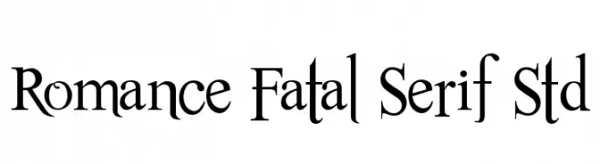
Caratteri di JuanCasco. For commercial use please contact the owner.
( Fonts by Juan Casco - www.juancasco.net )
A classic serif font with elegant, elongated strokes and a sophisticated appearance.
![Romance Fatal Serif Std font caratteri gratis]() Scaricare 3384 Downloads@WebFont
Scaricare 3384 Downloads@WebFont -
![Xilo Cordel Literature font caratteri gratis]() Scaricare 3384 Downloads@WebFont
Scaricare 3384 Downloads@WebFont -
( Fonts by Pelle Piano - hem.passagen.se/spsweet/index3.html )
A modern, geometric font with a futuristic style and clean lines.
![PP_Hip20s font caratteri gratis]() Scaricare 3384 Downloads@WebFont
Scaricare 3384 Downloads@WebFont -
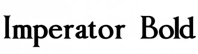
( Fonts by Paul Lloyd )
A bold serif font with high contrast and a classic, authoritative style.
![Imperator Bold font caratteri gratis]() Scaricare 3384 Downloads@WebFont
Scaricare 3384 Downloads@WebFont -
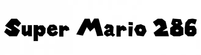
![Super Mario 286 font caratteri gratis]() Scaricare 3382 Downloads@WebFont
Scaricare 3382 Downloads@WebFont -
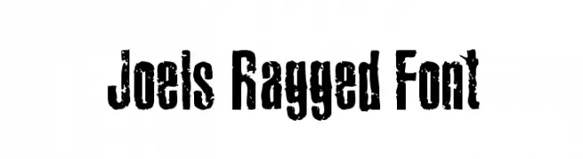
( Fonts by Joel Merritt )
A rugged, distressed font with a bold, impactful style and textured appearance.
![Joels Ragged Font font caratteri gratis]() Scaricare 3382 Downloads@WebFont
Scaricare 3382 Downloads@WebFont -
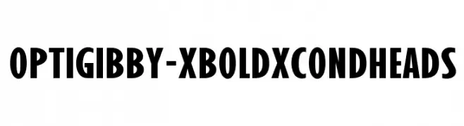
( Fonts by Castcraft Software - opti.netii.net - check the website before use )
A bold, condensed font with uniform strokes for strong visual impact.
![OPTIGibby-XBoldXCondHeads font caratteri gratis]() Scaricare 3382 Downloads@WebFont
Scaricare 3382 Downloads@WebFont -
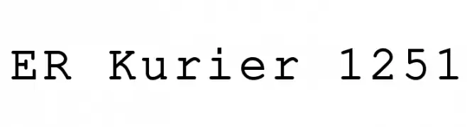
![ER Kurier 1251 font caratteri gratis]() Scaricare 3382 Downloads@WebFont
Scaricare 3382 Downloads@WebFont -
( Copyright 2019 The Big Shoulders Project Authors (https://github.com/xotypeco/big_shoulders) )
A bold, modern typeface with tall, narrow letterforms and strong vertical emphasis.
![Big Shoulders Display Bold font caratteri gratis]() Scaricare 3381 Downloads@WebFont
Scaricare 3381 Downloads@WebFont -
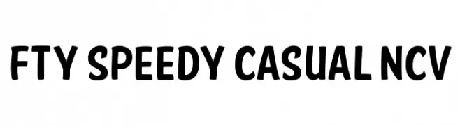
![FTY SPEEDY CASUAL NCV font caratteri gratis]() Scaricare 3381 Downloads@WebFont
Scaricare 3381 Downloads@WebFont -
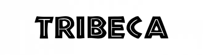
( Fonts by Dieter Steffmann )
A bold, geometric font with art deco influences, perfect for impactful designs.
![Tribeca font caratteri gratis]() Scaricare 3381 Downloads@WebFont
Scaricare 3381 Downloads@WebFont -
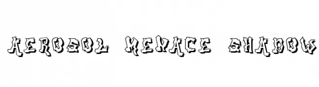
![aerosol menace shadow font caratteri gratis]() Scaricare 3381 Downloads@WebFont
Scaricare 3381 Downloads@WebFont -
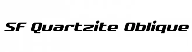
( Fonts by ShyFonts )
A modern, oblique font with bold, condensed characters and a sleek design.
![SF Quartzite Oblique font caratteri gratis]() Scaricare 3381 Downloads@WebFont
Scaricare 3381 Downloads@WebFont -
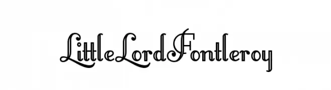
( Fonts by Nick Curtis - www.nicksfonts.com )
An ornate and decorative font with vintage-inspired flourishes.
![LittleLordFontleroy font caratteri gratis]() Scaricare 3380 Downloads@WebFont
Scaricare 3380 Downloads@WebFont -
![Arcade R font caratteri gratis]() Scaricare 3380 Downloads@WebFont
Scaricare 3380 Downloads@WebFont -
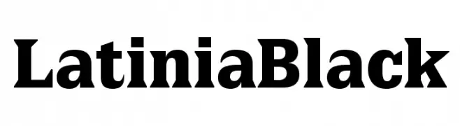
( Fonts by Manfred Klein - manfred-klein.ina-mar.com )
A bold, high-contrast serif font with strong, authoritative strokes.
![LatiniaBlack font caratteri gratis]() Scaricare 3379 Downloads@WebFont
Scaricare 3379 Downloads@WebFont -
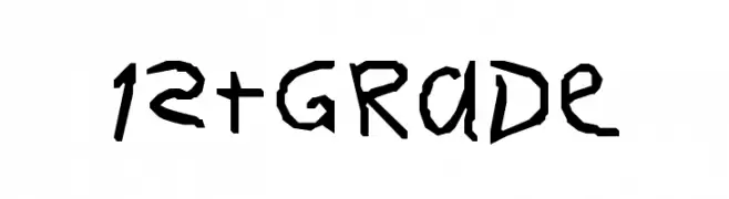
![1stGrade font caratteri gratis]() Scaricare 3379 Downloads
Scaricare 3379 Downloads -
( Fonts by Studio Floris Voorveld . Personal-use only. For commercial use please contact owner. )
A modern, rounded sans-serif font with uniform strokes and a friendly appearance.
![FV Almelo font caratteri gratis]() Scaricare 3378 Downloads@WebFont
Scaricare 3378 Downloads@WebFont -
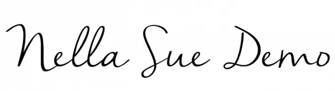
( www.jennasuedesign.com )
A flowing, cursive script font with elegant, handwritten characteristics.
![Nella Sue Demo font caratteri gratis]() Scaricare 3378 Downloads@WebFont
Scaricare 3378 Downloads@WebFont -
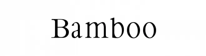
( Fonts by Manfred Klein. Free for private and charity use. Free for commercial with donation to organizations )
A classic serif font with elegant strokes and moderate contrast.
![Bamboo font caratteri gratis]() Scaricare 3378 Downloads@WebFont
Scaricare 3378 Downloads@WebFont -
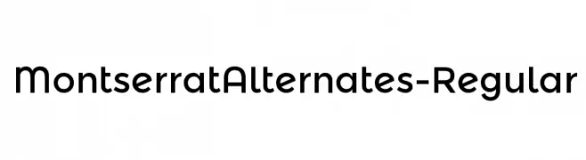
( Copyright (c) 2011-2012, Julieta Ulanovsky (julieta.ulanovsky@gmail.com), with Reserved Font Names 'Montserrat' )
A modern, geometric font with clean lines and rounded edges.
![MontserratAlternates-Regular font caratteri gratis]() Scaricare 3377 Downloads@WebFont
Scaricare 3377 Downloads@WebFont -
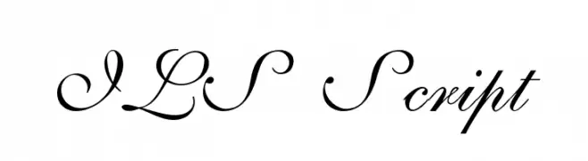
( Fonts by Digital Graphics Labs - www.digitalgraphiclabs.com )
An elegant script font with flowing, cursive characters and intricate flourishes.
![ILS Script font caratteri gratis]() Scaricare 3377 Downloads@WebFont
Scaricare 3377 Downloads@WebFont -
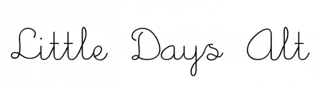
![Little Days Alt font caratteri gratis]() Scaricare 3376 Downloads@WebFont
Scaricare 3376 Downloads@WebFont -
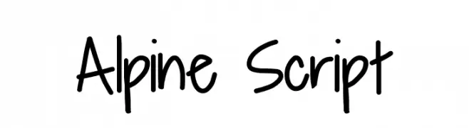
![Alpine Script font caratteri gratis]() Scaricare 3375 Downloads@WebFont
Scaricare 3375 Downloads@WebFont -
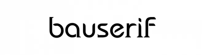
( Fonts by Ayelen Arpini )
A bold serif font with a modern twist, featuring elegant curves and strong vertical lines.
![bauserif font caratteri gratis]() Scaricare 3374 Downloads@WebFont
Scaricare 3374 Downloads@WebFont


Quali sono i font più popolari adesso?
Poppins, Roboto, Montserrat, Open Sans e Lato sono molto usati per le forme pulite e l'ampia applicabilità — dall'identità di marca alle landing page e ai poster.
Quali font si usano spesso nei loghi?
Le sans serif geometriche (es. Poppins, famiglie in stile Gotham) sono scelte comuni per un branding pulito e scalabile. Per un tocco personale restano valide script e stili manoscritti. Abbina un display deciso per i titoli a un corpo testo neutro per riconoscibilità ed equilibrio.
Ogni quanto si aggiorna la lista?
Con regolarità, in base ai download e all'attività reale. Torna spesso per scoprire in anticipo le nuove preferite.
💡 Consiglio: aggiungi ai preferiti — le tendenze cambiano in fretta e i font top di oggi possono ispirare il rebranding di domani.