Benvenuto nelle Font Più Popolari — dove popolarità e qualità si incontrano. Qui trovi i font più scaricati e usati dell'anno. Se cerchi scelte sicure per logo, web o social, inizia da qui.
Ogni font top si distingue per equilibrio, leggibilità e versatilità. Troverai sans serif moderne, script eleganti, serif vintage e display minimalisti.
-
 Scaricare 227 Downloads@WebFont
 -
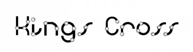
![Kings Cross font caratteri gratis]() Scaricare 227 Downloads@WebFont
Scaricare 227 Downloads@WebFont -
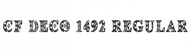
( Fonts by Steve Cloutier - www.cloutierfontes.ca )
An ornate and decorative font with intricate patterns within each character.
![CF Deco 1492 Regular font caratteri gratis]() Scaricare 227 Downloads@WebFont
Scaricare 227 Downloads@WebFont -
( Fonts by Eknoji Studio - www.eknojistudio.com - Personal-use only. For commercial use please contact owner. )
A playful and elegant handwritten script font with fluid strokes.
![Korian font caratteri gratis]() Scaricare 227 Downloads@WebFont
Scaricare 227 Downloads@WebFont -
( Graphix Line Studio )
A playful, handwritten font with smooth, rounded strokes and a casual style.
![Beach Free font caratteri gratis]() Scaricare 227 Downloads@WebFont
Scaricare 227 Downloads@WebFont -
-
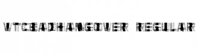
![VTCBadHangover Regular font caratteri gratis]() Scaricare 227 Downloads@WebFont
Scaricare 227 Downloads@WebFont -
( Fonts by Graham Meade - GemFonts )
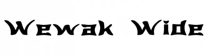
A bold, angular font with a modern geometric style.
![Wewak Wide font caratteri gratis]() Scaricare 227 Downloads@WebFont
Scaricare 227 Downloads@WebFont -
( Fonts by Daniel Zadorozny - www.iconian.com - Free for personal use )
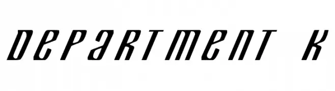
A bold, italicized font with a modern, dynamic style and high contrast.
![Department K font caratteri gratis]() Scaricare 227 Downloads
Scaricare 227 Downloads -
( Dom )
A modern, light slab serif font with a clean and elegant design.
![Twentytwelve Slab Light font caratteri gratis]() Scaricare 227 Downloads@WebFont
Scaricare 227 Downloads@WebFont -
![GrandFunkRR font caratteri gratis]() Scaricare 227 Downloads@WebFont
Scaricare 227 Downloads@WebFont -
( Fonts by CannotIntoSpaceFonts - KineticPlasma Fonts - Personal-use only. For commercial use please contact owner. )
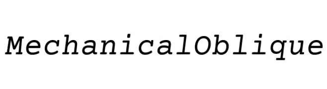
A modern, oblique font with a mechanical style and consistent stroke width.
![Mechanical Oblique font caratteri gratis]() Scaricare 227 Downloads@WebFont
Scaricare 227 Downloads@WebFont -
( Fonts by Typesgal - Personal-use only. For commercial use please contact owner. )
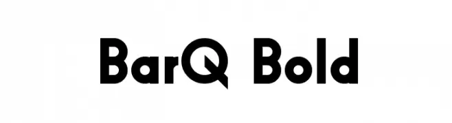
A bold, geometric font with strong, clean lines and excellent legibility.
![BarQ Bold font caratteri gratis]() Scaricare 227 Downloads@WebFont
Scaricare 227 Downloads@WebFont -
![Wanax Demo font caratteri gratis]() Scaricare 227 Downloads@WebFont
Scaricare 227 Downloads@WebFont -
( Fonts by ShyFonts )
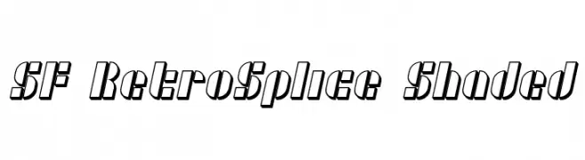
A retro-styled font with a shaded, three-dimensional effect and bold, slanted characters.
![SF RetroSplice Shaded font caratteri gratis]() Scaricare 227 Downloads@WebFont
Scaricare 227 Downloads@WebFont -
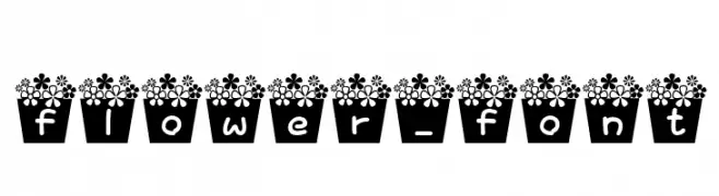
![flower_font font caratteri gratis]() Scaricare 227 Downloads@WebFont
Scaricare 227 Downloads@WebFont -
( Fonts by Dirtyline Studio )
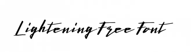
A bold, energetic script font with sweeping strokes and dynamic movement.
![LighteningFreeFont font caratteri gratis]() Scaricare 227 Downloads@WebFont
Scaricare 227 Downloads@WebFont -
( Fonts by andfonts - Andrii Shevchyk - Personal-use only. For commercial use please contact owner. )
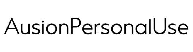
A modern, geometric sans-serif font with clean lines and balanced characters.
![Ausion Personal Use font caratteri gratis]() Scaricare 227 Downloads@WebFont
Scaricare 227 Downloads@WebFont -
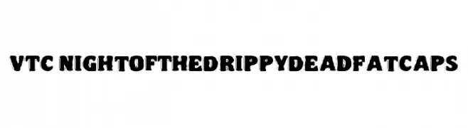
![VTC NightOfTheDrippyDeadFatCaps font caratteri gratis]() Scaricare 227 Downloads@WebFont
Scaricare 227 Downloads@WebFont -
( Måns Grebäck - www.mansgreback.com )
An elegant, flowing script font with high contrast and graceful swashes.
![Conture Script PERSONAL USE font caratteri gratis]() Scaricare 227 Downloads@WebFont
Scaricare 227 Downloads@WebFont -
( Fonts by www.woodcutter.es - woodcutter Manero - Personal-use only. For commercial use please contact owner. )
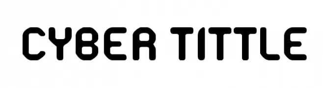
A bold, futuristic font with rounded edges and a geometric design.
![Cyber Tittle font caratteri gratis]() Scaricare 227 Downloads@WebFont
Scaricare 227 Downloads@WebFont -
![JordFont font caratteri gratis]() Scaricare 227 Downloads@WebFont
Scaricare 227 Downloads@WebFont -
( Fonts by Situjuh Nazara - 7ntypes.com - Personal-use only. For commercial use please contact owner. )
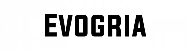
A bold, modern font with geometric shapes and strong visual impact.
![Evogria font caratteri gratis]() Scaricare 227 Downloads@WebFont
Scaricare 227 Downloads@WebFont -
Caratteri di typotopia. For commercial use please contact the owner.
( Fonts by Typotopia - Typotopia.co - Personal Use Only, for Commercial Use, please contact us )
A bold, friendly handwritten script with smooth, connected strokes.
![Mahalo font caratteri gratis]() Scaricare 227 Downloads
Scaricare 227 Downloads -
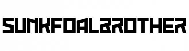
![Sunk Foal Brother font caratteri gratis]() Scaricare 227 Downloads@WebFont
Scaricare 227 Downloads@WebFont -
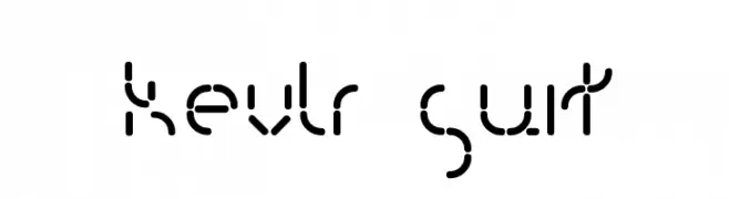
![Kevlr Suit font caratteri gratis]() Scaricare 227 Downloads@WebFont
Scaricare 227 Downloads@WebFont -
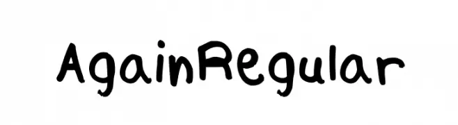
![Again Regular font caratteri gratis]() Scaricare 227 Downloads@WebFont
Scaricare 227 Downloads@WebFont -
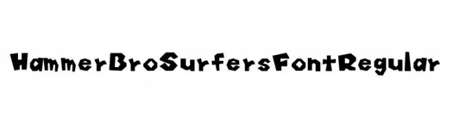
Caratteri di HammerBro101. For commercial use please contact the owner.
![Hammer Bro Surfers Font Regular font caratteri gratis]() Scaricare 227 Downloads@WebFont
Scaricare 227 Downloads@WebFont -
( Fonts by www.fontpanda.com. Personal-use only. For commercial use please contact owner. )
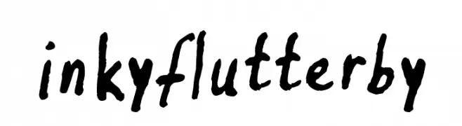
A bold, hand-drawn font with a playful and artistic style.
![inkyflutterby font caratteri gratis]() Scaricare 227 Downloads@WebFont
Scaricare 227 Downloads@WebFont -
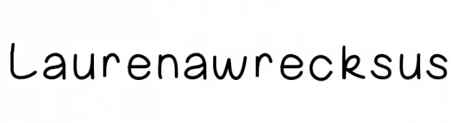
![Laurenawrecksus font caratteri gratis]() Scaricare 227 Downloads@WebFont
Scaricare 227 Downloads@WebFont -
![FUNKY CHUNKY font caratteri gratis]() Scaricare 227 Downloads@WebFont
Scaricare 227 Downloads@WebFont -
![CJM Kh 001 font caratteri gratis]() Scaricare 227 Downloads@WebFont
Scaricare 227 Downloads@WebFont -
( Fonts by Jonathan S. Harris - www.tattoowoo.com - Personal-use only. For commercial use please contact owner. )
An elegant and flowing script font with ornate uppercase letters and delicate embellishments.
![Cheese Cake] font caratteri gratis]() Scaricare 227 Downloads@WebFont
Scaricare 227 Downloads@WebFont -
Caratteri di letterhanna. For commercial use please contact the owner.
( Free for personal use only. With only $13 You can purchase the basic desktop license: https://letterhanna.com/ )
A playful and whimsical font with smooth, rounded letterforms.
![Seashell Paradise free Regular font caratteri gratis]() Scaricare 227 Downloads@WebFont
Scaricare 227 Downloads@WebFont -
( Fonts by Almaz Studio )
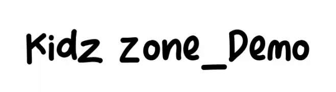
Playful handwritten font ideal for kids' content.
![Kidz Zone_Demo font caratteri gratis]() Scaricare 227 Downloads@WebFont
Scaricare 227 Downloads@WebFont -
( Fonts by www.junkohanhero.com - Personal-use only. For commercial use please contact owner. )
A bold, hand-drawn font with a rough, textured, graffiti-like style.
![Trash! More trash! font caratteri gratis]() Scaricare 227 Downloads@WebFont
Scaricare 227 Downloads@WebFont


![Cheese Cake] font caratteri gratis](https://d144mzi0q5mijx.cloudfront.net/img/C/H/Cheese-Cake12.webp)


Quali sono i font più popolari adesso?
Poppins, Roboto, Montserrat, Open Sans e Lato sono molto usati per le forme pulite e l'ampia applicabilità — dall'identità di marca alle landing page e ai poster.
Quali font si usano spesso nei loghi?
Le sans serif geometriche (es. Poppins, famiglie in stile Gotham) sono scelte comuni per un branding pulito e scalabile. Per un tocco personale restano valide script e stili manoscritti. Abbina un display deciso per i titoli a un corpo testo neutro per riconoscibilità ed equilibrio.
Ogni quanto si aggiorna la lista?
Con regolarità, in base ai download e all'attività reale. Torna spesso per scoprire in anticipo le nuove preferite.
💡 Consiglio: aggiungi ai preferiti — le tendenze cambiano in fretta e i font top di oggi possono ispirare il rebranding di domani.