Benvenuto nelle Font Più Popolari — dove popolarità e qualità si incontrano. Qui trovi i font più scaricati e usati dell'anno. Se cerchi scelte sicure per logo, web o social, inizia da qui.
Ogni font top si distingue per equilibrio, leggibilità e versatilità. Troverai sans serif moderne, script eleganti, serif vintage e display minimalisti.
-
 Scaricare 227 Downloads@WebFont
 -
( Fonts by PressGang Studios )
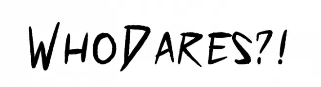
A bold, hand-drawn font with sharp, angular strokes and a dynamic, energetic style.
![Who Dares?! font caratteri gratis]() Scaricare 227 Downloads@WebFont
Scaricare 227 Downloads@WebFont -
( Fonts by www.junkohanhero.com - Personal-use only. For commercial use please contact owner. )
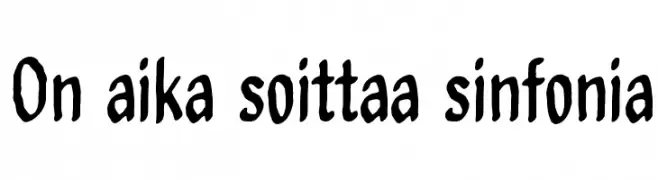
A playful, hand-drawn font with uneven strokes and a casual style.
![On aika soittaa sinfonia font caratteri gratis]() Scaricare 227 Downloads@WebFont
Scaricare 227 Downloads@WebFont -
( Fonts by Prioritype Co - Prio Nurokhim Aji - Personal-use only. For commercial use please contact owner. )
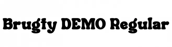
A bold, playful font with thick, rounded strokes and whimsical curves.
![Brugty DEMO Regular font caratteri gratis]() Scaricare 227 Downloads@WebFont
Scaricare 227 Downloads@WebFont -
![PaintingWithChocolate font caratteri gratis]() Scaricare 227 Downloads@WebFont
Scaricare 227 Downloads@WebFont -
-
![Easy 3D font caratteri gratis]() Scaricare 227 Downloads@WebFont
Scaricare 227 Downloads@WebFont -
( Fonts by Jayden Marrero - Personal-use only. For commercial use please contact owner. )
A bold, geometric font with a modern, tech-inspired design.
![Respawn Pro Regular font caratteri gratis]() Scaricare 227 Downloads@WebFont
Scaricare 227 Downloads@WebFont -
![Capitals font caratteri gratis]() Scaricare 227 Downloads@WebFont
Scaricare 227 Downloads@WebFont -
( Fonts by Apostrophic Lab )
A sleek, modern font with elongated, italicized characters and a light, airy appearance.
![Lady Ice - Extra Light Italic font caratteri gratis]() Scaricare 227 Downloads@WebFont
Scaricare 227 Downloads@WebFont -
( Fonts by james kilfiger - Personal-use only. For commercial use please contact owner. )
A chess-themed icon font with bold, geometric piece designs.
![Chess font caratteri gratis]() Scaricare 227 Downloads@WebFont
Scaricare 227 Downloads@WebFont -
( Fonts by Daniel Zadorozny - www.iconian.com - Free for personal use )
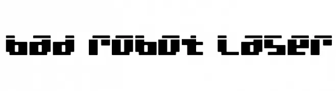
A bold, geometric font with a futuristic, digital aesthetic.
![bad robot laser font caratteri gratis]() Scaricare 227 Downloads@WebFont
Scaricare 227 Downloads@WebFont -
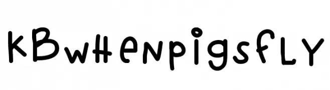
![KBwhenpigsfly font caratteri gratis]() Scaricare 227 Downloads@WebFont
Scaricare 227 Downloads@WebFont -
( dcoxy - Greg Medina - www.dcoxy.com/ )
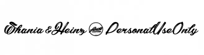
A bold, dynamic script font with elegant curves and flourishes.
![Shania&Heinz_PersonalUseOnly font caratteri gratis]() Scaricare 227 Downloads@WebFont
Scaricare 227 Downloads@WebFont -
( Fonts by Abo Daniel Studio )
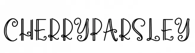
A playful and whimsical font with curly, decorative strokes.
![Cherry Parsley font caratteri gratis]() Scaricare 227 Downloads@WebFont
Scaricare 227 Downloads@WebFont -
( Fonts by www.aenigmafonts.com )
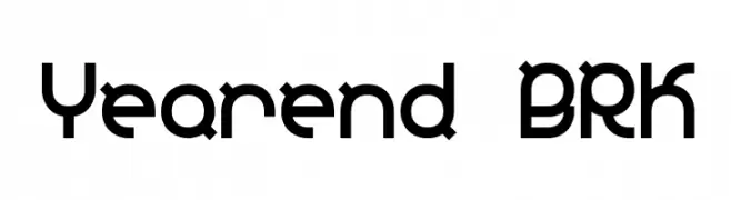
A bold, geometric font with a modern, tech-inspired design.
![Yearend BRK font caratteri gratis]() Scaricare 227 Downloads@WebFont
Scaricare 227 Downloads@WebFont -
( Fonts by Blue Vinyl - Jess Latham - www.bvfonts.com )
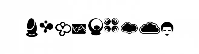
Decorative icon font with retro-futuristic and space motifs.
![Geronauts font caratteri gratis]() Scaricare 227 Downloads@WebFont
Scaricare 227 Downloads@WebFont -
( Fonts by weknow )
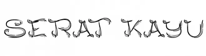
An artistic, hand-drawn font with swirling, dynamic strokes.
![SERAT KAYU font caratteri gratis]() Scaricare 227 Downloads@WebFont
Scaricare 227 Downloads@WebFont -
( Fonts by Ezza Adhreza )
A tall, condensed font with bold, geometric letterforms and a modern industrial style.
![Zaun font caratteri gratis]() Scaricare 227 Downloads@WebFont
Scaricare 227 Downloads@WebFont -
( Fonts by a Des Gomez. Personal-use only. For commercial use please contact owner. )
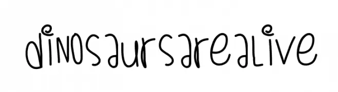
A playful, handwritten font with quirky dinosaur illustrations.
![DinosaursAreAlive font caratteri gratis]() Scaricare 227 Downloads@WebFont
Scaricare 227 Downloads@WebFont -
( Fonts by Steve Deffeyes - www.deffeyes.com )
A bold, italicized font with a futuristic and angular design.
![Futurex Arthur Bold Italic font caratteri gratis]() Scaricare 227 Downloads@WebFont
Scaricare 227 Downloads@WebFont -
( Fonts by Muthia Fajrijannah )
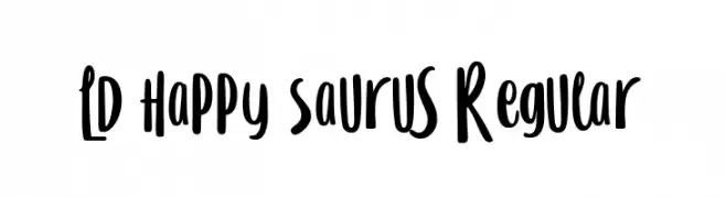
A playful, handwritten font with bold, rounded strokes and a whimsical style.
![LD Happy Saurus Regular font caratteri gratis]() Scaricare 227 Downloads@WebFont
Scaricare 227 Downloads@WebFont -
![Iglook font caratteri gratis]() Scaricare 227 Downloads@WebFont
Scaricare 227 Downloads@WebFont -
( Roger White - web.archive.org/web/20120416090521/www.rogersfonts.org.uk/ )
A clean, elegant font with a modern yet timeless appeal.
![Lydian font caratteri gratis]() Scaricare 227 Downloads@WebFont
Scaricare 227 Downloads@WebFont -
( Fonts by Iconian Fonts )
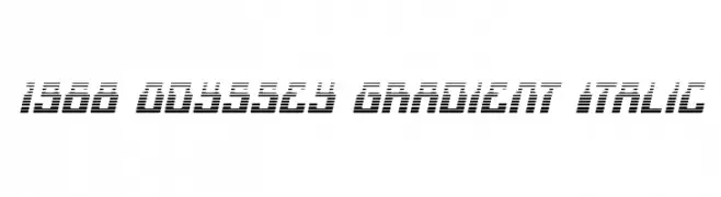
A futuristic, italicized font with gradient-like horizontal lines for a dynamic look.
![1968 Odyssey Gradient Italic font caratteri gratis]() Scaricare 227 Downloads@WebFont
Scaricare 227 Downloads@WebFont -
( Fonts by Woodcutter Manero - www.woodcutter.es - Personal-use only. For commercial use please contact owner. )
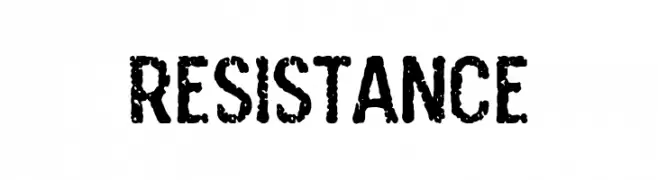
A bold, distressed font with a rugged, industrial texture.
![Resistance font caratteri gratis]() Scaricare 227 Downloads@WebFont
Scaricare 227 Downloads@WebFont -
( Fonts by Manuel Ramos - www.infinitismo.com - Personal-use only. For commercial use please contact owner. )
An ultra-thin, elegant font with elongated ascenders and a modern, minimalistic style.
![Fantastica font caratteri gratis]() Scaricare 227 Downloads@WebFont
Scaricare 227 Downloads@WebFont -
( www.qkila.com )
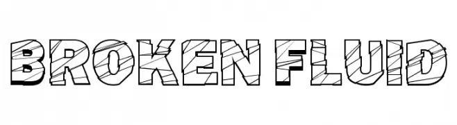
A bold, geometric font with a broken, fluid pattern and a three-dimensional look.
![Broken Fluid font caratteri gratis]() Scaricare 227 Downloads@WebFont
Scaricare 227 Downloads@WebFont -
( Fonts by Brittney Murphy Design )
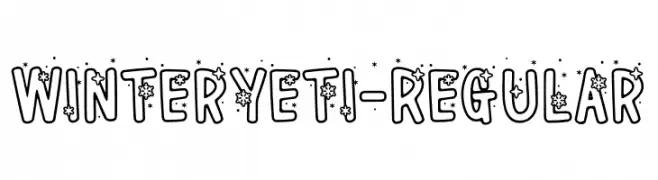
A playful, winter-themed decorative font with snowflakes and stars.
![WinterYeti-Regular font caratteri gratis]() Scaricare 227 Downloads@WebFont
Scaricare 227 Downloads@WebFont -
( Fonts by Graphix Line Studio - Personal-use only. For commercial use please contact owner. )
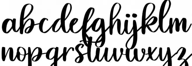
A playful and elegant script font with decorative swirls and loops.
![Nadine font caratteri gratis]() Scaricare 227 Downloads@WebFont
Scaricare 227 Downloads@WebFont -
( Nurf Designs )
A bold, modern font with geometric influences, ideal for impactful designs.
![First Job font caratteri gratis]() Scaricare 227 Downloads@WebFont
Scaricare 227 Downloads@WebFont -
![TicTacToe font caratteri gratis]() Scaricare 227 Downloads@WebFont
Scaricare 227 Downloads@WebFont -
( Fonts by NDISCOVER )
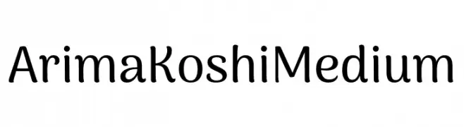
A playful and friendly typeface with rounded edges and a modern vibe.
![Arima Koshi Medium font caratteri gratis]() Scaricare 227 Downloads@WebFont
Scaricare 227 Downloads@WebFont -
( HypeForType.com - Alex Haigh - www.hypefortype.com )
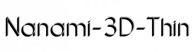
A sleek, modern 3D font with clean lines and a dynamic, futuristic appearance.
![Nanami-3D-Thin font caratteri gratis]() Scaricare 227 Downloads@WebFont
Scaricare 227 Downloads@WebFont -
![Class of '74 font caratteri gratis]() Scaricare 227 Downloads@WebFont
Scaricare 227 Downloads@WebFont -
( Fonts by Daniel Gauthier )
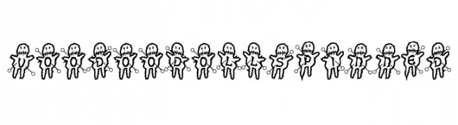
A playful, voodoo doll-themed decorative font with a whimsical style.
![VoodooDollsPinned font caratteri gratis]() Scaricare 227 Downloads@WebFont
Scaricare 227 Downloads@WebFont


Quali sono i font più popolari adesso?
Poppins, Roboto, Montserrat, Open Sans e Lato sono molto usati per le forme pulite e l'ampia applicabilità — dall'identità di marca alle landing page e ai poster.
Quali font si usano spesso nei loghi?
Le sans serif geometriche (es. Poppins, famiglie in stile Gotham) sono scelte comuni per un branding pulito e scalabile. Per un tocco personale restano valide script e stili manoscritti. Abbina un display deciso per i titoli a un corpo testo neutro per riconoscibilità ed equilibrio.
Ogni quanto si aggiorna la lista?
Con regolarità, in base ai download e all'attività reale. Torna spesso per scoprire in anticipo le nuove preferite.
💡 Consiglio: aggiungi ai preferiti — le tendenze cambiano in fretta e i font top di oggi possono ispirare il rebranding di domani.