Benvenuto nelle Font Più Popolari — dove popolarità e qualità si incontrano. Qui trovi i font più scaricati e usati dell'anno. Se cerchi scelte sicure per logo, web o social, inizia da qui.
Ogni font top si distingue per equilibrio, leggibilità e versatilità. Troverai sans serif moderne, script eleganti, serif vintage e display minimalisti.
-
( Fonts by Steve Cloutier - www.cloutierfontes.ca )
An intricate, decorative font with a wireframe design and artistic flair.
 Scaricare 226 Downloads@WebFont
 -
( Fonts by Edric Studio www.creativefabrica.com/designer/edricstudio/ - Personal-use only. For commercial use please contact owner. )
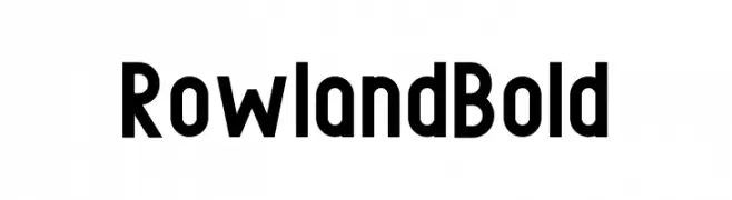
A bold, modern typeface with thick, uniform strokes and clean lines.
![Rowland Bold font caratteri gratis]() Scaricare 226 Downloads@WebFont
Scaricare 226 Downloads@WebFont -
( Fonts by www.junkohanhero.com - Personal-use only. For commercial use please contact owner. )
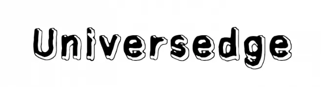
A bold, playful font with a 3D shadow effect and rounded, irregular characters.
![Universedge font caratteri gratis]() Scaricare 226 Downloads@WebFont
Scaricare 226 Downloads@WebFont -
![SF DecoTechno font caratteri gratis]() Scaricare 226 Downloads@WebFont
Scaricare 226 Downloads@WebFont -
( Fonts by Kong Font - Personal-use only. For commercial use please contact owner. )
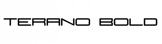
A futuristic, geometric font with clean lines and rounded edges.
![Terano Bold font caratteri gratis]() Scaricare 226 Downloads@WebFont
Scaricare 226 Downloads@WebFont -
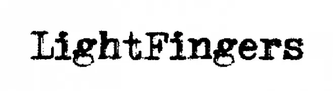
( Fonts by a Max Infeld - XEROGRAPHER FONTS - xerographer.blogspot.com . Personal-use only. For commercial use please contact owner. )
A bold, distressed font with a grunge, textured style.
![LightFingers font caratteri gratis]() Scaricare 226 Downloads@WebFont
Scaricare 226 Downloads@WebFont -
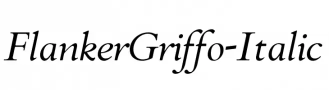
( Fonts by Flanker - Personal-use only. For commercial use please contact owner. )
An elegant italic serif font with moderate contrast and refined serifs.
![FlankerGriffo-Italic font caratteri gratis]() Scaricare 226 Downloads@WebFont
Scaricare 226 Downloads@WebFont -
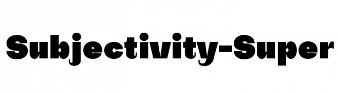
( Fonts by Alex Slobzheninov - Personal-use only. For commercial use please contact owner. )
A bold, geometric font with strong visual impact and high contrast.
![Subjectivity-Super font caratteri gratis]() Scaricare 226 Downloads@WebFont
Scaricare 226 Downloads@WebFont -
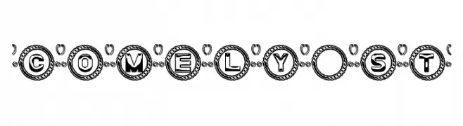
( Fonts by Southype )
A decorative font with characters enclosed in ornate circular emblems.
![Comely St font caratteri gratis]() Scaricare 226 Downloads@WebFont
Scaricare 226 Downloads@WebFont -
( ingoFonts - Ingo Zimmermann - www.ingofonts.com )
A classic serif font with medium contrast and elegant style.
![Charpentier Renaissance Demi Re font caratteri gratis]() Scaricare 226 Downloads@WebFont
Scaricare 226 Downloads@WebFont -
( Fonts by Linafis Studio - Ahmad Fashihullisan - Personal-use only. For commercial use please contact owner. )
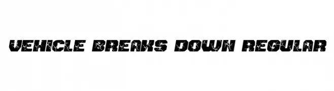
A bold, cracked font with a rugged, distressed look.
![Vehicle Breaks Down Regular font caratteri gratis]() Scaricare 226 Downloads@WebFont
Scaricare 226 Downloads@WebFont -
( Paul Lloyd Fonts )
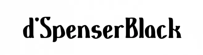
A bold, hand-drawn style font with expressive, uneven strokes.
![d'SpenserBlack font caratteri gratis]() Scaricare 226 Downloads
Scaricare 226 Downloads -
( Fonts by Daniel Zadorozny - www.iconian.com - Free for personal use )
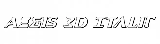
A bold, 3D italic font with a futuristic and geometric style.
![Aegis 3D Italic font caratteri gratis]() Scaricare 226 Downloads@WebFont
Scaricare 226 Downloads@WebFont -
( Fonts by Phantom Studio )
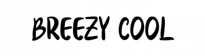
A playful, bold, and hand-drawn style font with a dynamic and informal appearance.
![Breezy Cool font caratteri gratis]() Scaricare 226 Downloads@WebFont
Scaricare 226 Downloads@WebFont -
( Fonts by www.kimberlygeswein.com - Kimberly Geswein )
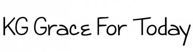
A playful, casual handwritten font with rounded, irregular letterforms.
![KG Grace For Today font caratteri gratis]() Scaricare 226 Downloads@WebFont
Scaricare 226 Downloads@WebFont -
![star_font font caratteri gratis]() Scaricare 226 Downloads@WebFont
Scaricare 226 Downloads@WebFont -
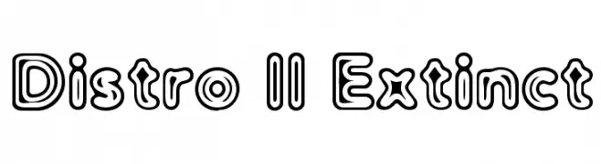
![Distro II Extinct font caratteri gratis]() Scaricare 226 Downloads@WebFont
Scaricare 226 Downloads@WebFont -
( THESE ARE SHAREWARE FONTS ! NOT FREEWARE ! PLEASE VISIT www.fuelfonts.com )
A playful, bold font with interconnected, rounded characters and high contrast.
![Stoopid font caratteri gratis]() Scaricare 226 Downloads@WebFont
Scaricare 226 Downloads@WebFont -
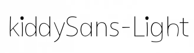
( Fonts by Manuel Viergutz - Typo Graphic Design - www.typographicdesign.de )
A clean, minimalist font with a light weight and friendly roundness.
![kiddySans-Light font caratteri gratis]() Scaricare 226 Downloads@WebFont
Scaricare 226 Downloads@WebFont -
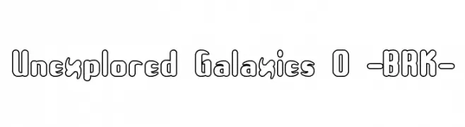
( Fonts by www.aenigmafonts.com )
A bold, outlined font with a playful, futuristic style and rounded, bubble-like characters.
![Unexplored Galaxies O -BRK- font caratteri gratis]() Scaricare 226 Downloads@WebFont
Scaricare 226 Downloads@WebFont -
( Fonts by Xerographer Fonts )
A playful, cloud-textured font with a hand-drawn, whimsical style.
![Cloudier font caratteri gratis]() Scaricare 226 Downloads@WebFont
Scaricare 226 Downloads@WebFont -
( Fonts by Daniel Zadorozny - www.iconian.com - Free for personal use )
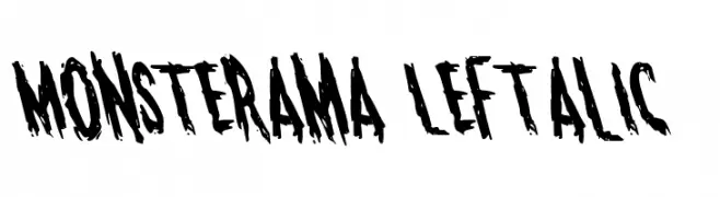
A bold, jagged font with a horror-themed, distressed appearance.
![Monsterama Leftalic font caratteri gratis]() Scaricare 226 Downloads@WebFont
Scaricare 226 Downloads@WebFont -
Caratteri di typotopia. For commercial use please contact the owner.
( Fonts by Typotopia - Typotopia.co - Personal Use Only, for Commercial Use, please contact us )
A bold, blackletter-style font with angular, sharp characters.
![Bewear Regular font caratteri gratis]() Scaricare 226 Downloads@WebFont
Scaricare 226 Downloads@WebFont -
( Fonts by www.fontpanda.com. Personal-use only. For commercial use please contact owner. )
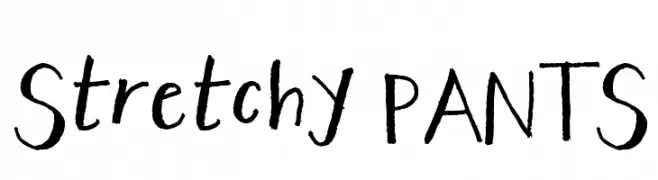
A playful, handwritten font with uneven strokes and a casual style.
![Stretchy PANTS font caratteri gratis]() Scaricare 226 Downloads@WebFont
Scaricare 226 Downloads@WebFont -
( Fonts by Daniel Zadorozny - www.iconian.com )
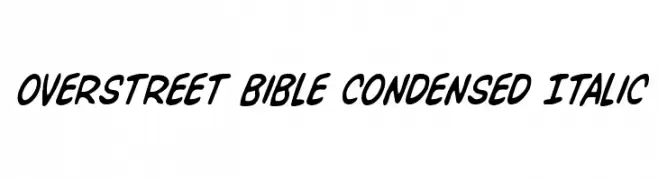
A bold, condensed, and italicized font with a dynamic and energetic style.
![Overstreet Bible Condensed Italic font caratteri gratis]() Scaricare 226 Downloads@WebFont
Scaricare 226 Downloads@WebFont -
( Fonts by Vladimir Nikolic )
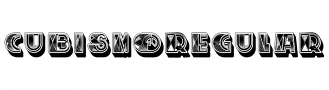
A bold, geometric font with a three-dimensional, cubist-inspired design.
![Cubismo Regular font caratteri gratis]() Scaricare 226 Downloads@WebFont
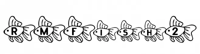
Scaricare 226 Downloads@WebFont -
![RMFish2 font caratteri gratis]() Scaricare 226 Downloads@WebFont
Scaricare 226 Downloads@WebFont -
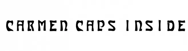
( Fonts by www.haroldsfonts.com )
A bold, decorative font with sharp angles and a modern flair.
![Carmen Caps Inside font caratteri gratis]() Scaricare 226 Downloads@WebFont
Scaricare 226 Downloads@WebFont -
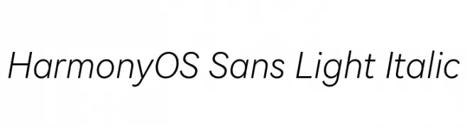
( Fonts by huawei.com - Personal-use only. For commercial use please contact owner. )
A modern, light, italic sans-serif font with clean lines and a dynamic slant.
![HarmonyOS Sans Light Italic font caratteri gratis]() Scaricare 226 Downloads@WebFont
Scaricare 226 Downloads@WebFont -
( Fonts by Farul Arjianto - creativemarket.com/typefar - Personal-use only. For commercial use please contact owner. )
A bold, expressive handwritten font with fluid curves and thick strokes.
![LilyWhite font caratteri gratis]() Scaricare 226 Downloads@WebFont
Scaricare 226 Downloads@WebFont -
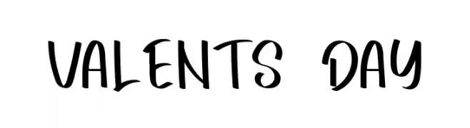
( Fonts by FreshtypeINK )
Playful and bold handwritten font.
![VALENTS DAY font caratteri gratis]() Scaricare 226 Downloads@WebFont
Scaricare 226 Downloads@WebFont -
( Fonts by Alex Tomlinson - Skyhaven Fonts - shfonts.com )
A bold, retro font with a three-dimensional outline and vintage flair.
![Retro-Supermarket font caratteri gratis]() Scaricare 226 Downloads@WebFont
Scaricare 226 Downloads@WebFont -
( Fonts by Daniel Zadorozny - www.iconian.com - Free for personal use )
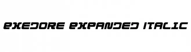
A bold, expanded, and italicized font with a futuristic style.
![Exedore Expanded Italic font caratteri gratis]() Scaricare 226 Downloads@WebFont
Scaricare 226 Downloads@WebFont -
( Fonts by Kat`s Fun Fonts - Personal-use only. For commercial use please contact owner. )
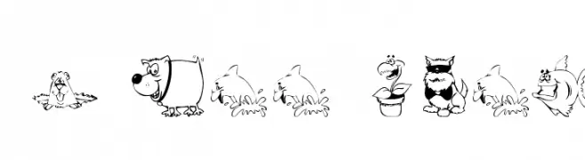
A whimsical decorative font with cartoon-style characters and animals.
![KR All Smiles font caratteri gratis]() Scaricare 226 Downloads@WebFont
Scaricare 226 Downloads@WebFont -
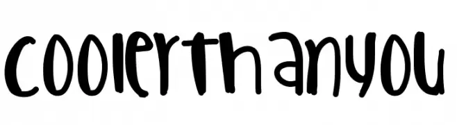
![CoolerThanYou font caratteri gratis]() Scaricare 226 Downloads@WebFont
Scaricare 226 Downloads@WebFont


Quali sono i font più popolari adesso?
Poppins, Roboto, Montserrat, Open Sans e Lato sono molto usati per le forme pulite e l'ampia applicabilità — dall'identità di marca alle landing page e ai poster.
Quali font si usano spesso nei loghi?
Le sans serif geometriche (es. Poppins, famiglie in stile Gotham) sono scelte comuni per un branding pulito e scalabile. Per un tocco personale restano valide script e stili manoscritti. Abbina un display deciso per i titoli a un corpo testo neutro per riconoscibilità ed equilibrio.
Ogni quanto si aggiorna la lista?
Con regolarità, in base ai download e all'attività reale. Torna spesso per scoprire in anticipo le nuove preferite.
💡 Consiglio: aggiungi ai preferiti — le tendenze cambiano in fretta e i font top di oggi possono ispirare il rebranding di domani.