Benvenuto nelle Font Più Popolari — dove popolarità e qualità si incontrano. Qui trovi i font più scaricati e usati dell'anno. Se cerchi scelte sicure per logo, web o social, inizia da qui.
Ogni font top si distingue per equilibrio, leggibilità e versatilità. Troverai sans serif moderne, script eleganti, serif vintage e display minimalisti.
-
( Fadhil Aqsa - creativemarket.com/Meutuwah )
A playful, whimsical script font with elegant loops and a handwritten feel.
 Scaricare 227 Downloads@WebFont
 -
( Fonts by Octotype - www.foundmyfont.com - Personal-use only. For commercial use please contact owner. )
A bold, flowing script font with dynamic and elegant connections.
![Original Factory font caratteri gratis]() Scaricare 227 Downloads@WebFont
Scaricare 227 Downloads@WebFont -
( Fonts by Sinister Fonts )
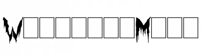
A horror-themed, dripping font perfect for spooky designs.
![Werewolf Moon font caratteri gratis]() Scaricare 227 Downloads@WebFont
Scaricare 227 Downloads@WebFont -
( Fonts by www.houseoflime.com )
Outlined, boxy decorative font ideal for icon overlays.
![Around the house font caratteri gratis]() Scaricare 227 Downloads@WebFont
Scaricare 227 Downloads@WebFont -
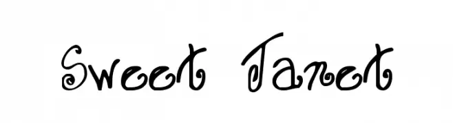
![Sweet Janet font caratteri gratis]() Scaricare 227 Downloads@WebFont
Scaricare 227 Downloads@WebFont -
( Fonts by Daniel Zadorozny - www.iconian.com - Free for personal use )
A bold, 3D geometric font with a futuristic and outlined style.
![Free Agent Bold 3D font caratteri gratis]() Scaricare 226 Downloads@WebFont
Scaricare 226 Downloads@WebFont -
( Fonts by www.aenigmafonts.com )
A bold, geometric font with a futuristic, stencil-like design.
![Pseudo BRK font caratteri gratis]() Scaricare 226 Downloads@WebFont
Scaricare 226 Downloads@WebFont -
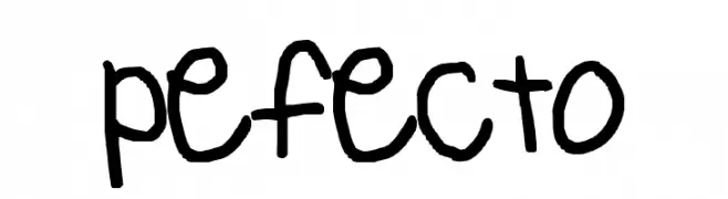
![pefecto font caratteri gratis]() Scaricare 226 Downloads@WebFont
Scaricare 226 Downloads@WebFont -
( Fonts by Christopher Young - Personal-use only. For commercial use please contact owner. )
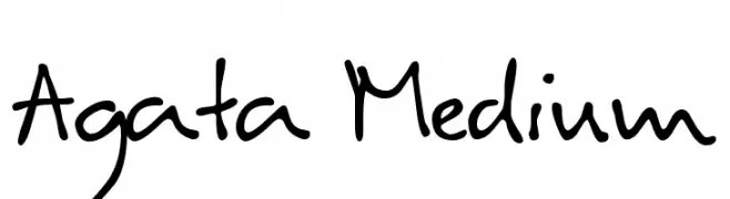
A casual, handwritten font with a playful and informal style.
![Agata Medium font caratteri gratis]() Scaricare 226 Downloads@WebFont
Scaricare 226 Downloads@WebFont -
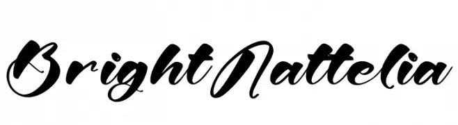
( Fonts by Letterena Studios )
Bold, decorative script font with high contrast.
![Bright Nattelia font caratteri gratis]() Scaricare 226 Downloads@WebFont
Scaricare 226 Downloads@WebFont -
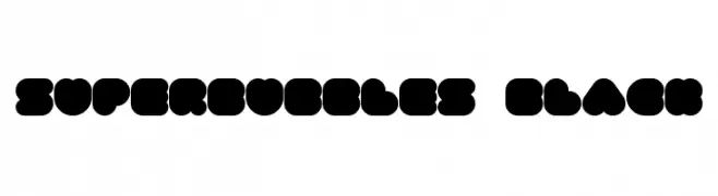
( Font by Sven Stuber - www.superlooper.de )
A bold, playful font with rounded, bubble-like characters and a whimsical style.
![superbubbles Black font caratteri gratis]() Scaricare 226 Downloads@WebFont
Scaricare 226 Downloads@WebFont -
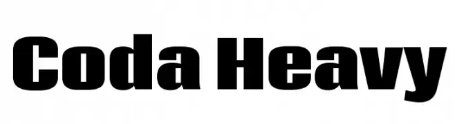
( Fonts by New Typography - Vernon Adams. Personal-use only. For commercial use please contact owner. )
A bold, modern font with thick, uniform strokes and high readability.
![Coda Heavy font caratteri gratis]() Scaricare 226 Downloads@WebFont
Scaricare 226 Downloads@WebFont -
![anupam handwriting font caratteri gratis]() Scaricare 226 Downloads@WebFont
Scaricare 226 Downloads@WebFont -
![IwonaCondMedium-Italic font caratteri gratis]() Scaricare 226 Downloads@WebFont
Scaricare 226 Downloads@WebFont -
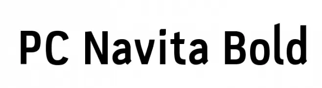
( Parker Creative - Alan Parker - fontbundles.net/parker-creative )
A bold, modern sans-serif font with strong, clean lines.
![PC Navita Bold font caratteri gratis]() Scaricare 226 Downloads@WebFont
Scaricare 226 Downloads@WebFont -
![Klondike-Seven font caratteri gratis]() Scaricare 226 Downloads@WebFont
Scaricare 226 Downloads@WebFont -
( Fonts by Typegoals Labs )
A bold, playful font with rounded, hand-drawn characters.
![Los felis font caratteri gratis]() Scaricare 226 Downloads@WebFont
Scaricare 226 Downloads@WebFont -
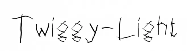
![Twiggy-Light font caratteri gratis]() Scaricare 226 Downloads@WebFont
Scaricare 226 Downloads@WebFont -
( Fonts by Muhammad Akbar - Personal-use only. For commercial use please contact owner. )
A dynamic and elegant script font with fluid, cursive strokes.
![madani font caratteri gratis]() Scaricare 226 Downloads@WebFont
Scaricare 226 Downloads@WebFont -
( Copyright (c) 2014, The Fira Code Project Authors (https://github.com/tonsky/FiraCode) )
A clean, modern monospaced font ideal for coding and technical documentation.
![Fira Code Light font caratteri gratis]() Scaricare 226 Downloads@WebFont
Scaricare 226 Downloads@WebFont -
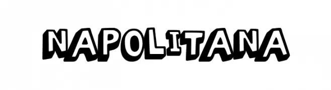
( Fonts by Woodcutter )
A bold, playful font with a cartoonish, hand-drawn style.
![Napolitana font caratteri gratis]() Scaricare 226 Downloads@WebFont
Scaricare 226 Downloads@WebFont -
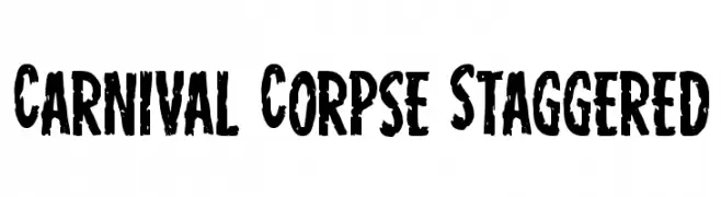
( Fonts by Iconian Fonts )
A bold, distressed font with a grunge aesthetic, perfect for dramatic displays.
![Carnival Corpse Staggered font caratteri gratis]() Scaricare 226 Downloads@WebFont
Scaricare 226 Downloads@WebFont -
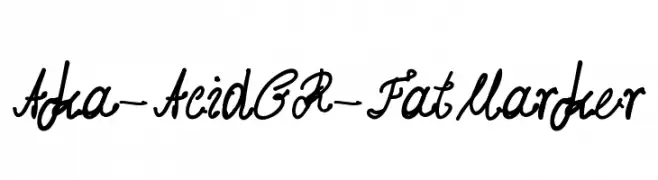
( Fonts by www.aka-acid.com )
A bold, cursive font with a playful and dynamic handwritten style.
![Aka-AcidGR-FatMarker font caratteri gratis]() Scaricare 226 Downloads@WebFont
Scaricare 226 Downloads@WebFont -
( Fonts by Apostrophic Lab )
A modern, geometric font with clean lines and a slightly condensed style.
![Ritalin font caratteri gratis]() Scaricare 226 Downloads@WebFont
Scaricare 226 Downloads@WebFont -
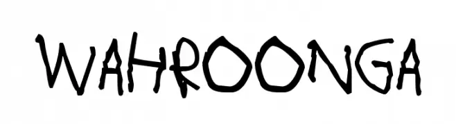
( Fonts by www.junkohanhero.com )
A playful, hand-drawn font with bold, irregular strokes.
![Wahroonga font caratteri gratis]() Scaricare 226 Downloads@WebFont
Scaricare 226 Downloads@WebFont -
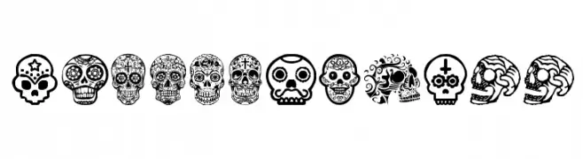
( Fonts by Woodcutter )
Ornate skull-themed decorative display font inspired by Mexican folk art.
![Mexican Skull font caratteri gratis]() Scaricare 226 Downloads@WebFont
Scaricare 226 Downloads@WebFont -
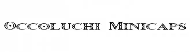
( Fonts by Graham Meade - GemFonts )
A bold, decorative font with intricate patterns and geometric shapes.
![Occoluchi Minicaps font caratteri gratis]() Scaricare 226 Downloads@WebFont
Scaricare 226 Downloads@WebFont -
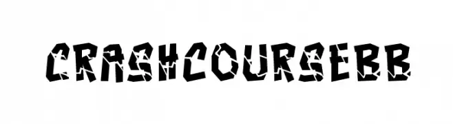
( Fonts by www.blambot.com )
A bold, fragmented font with a chaotic and dynamic appearance.
![CrashcourseBB font caratteri gratis]() Scaricare 226 Downloads@WebFont
Scaricare 226 Downloads@WebFont -
( Fonts by www.peter-wiegel.de - Personal-use only. For commercial use please contact owner. )
A bold, playful script font with high contrast and decorative swashes.
![Flubby font caratteri gratis]() Scaricare 226 Downloads@WebFont
Scaricare 226 Downloads@WebFont -
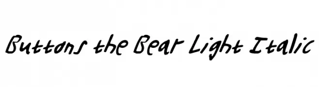
( Fonts by Daniel Zadorozny - www.iconian.com - Free for personal use )
A playful, light italic handwritten font with fluid strokes.
![Buttons the Bear Light Italic font caratteri gratis]() Scaricare 226 Downloads@WebFont
Scaricare 226 Downloads@WebFont -
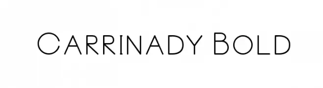
( Fonts by madeDeduk - Personal-use only. For commercial use please contact owner. )
A modern, geometric font with clean lines and a minimalist style.
![Carrinady Bold font caratteri gratis]() Scaricare 226 Downloads@WebFont
Scaricare 226 Downloads@WebFont -
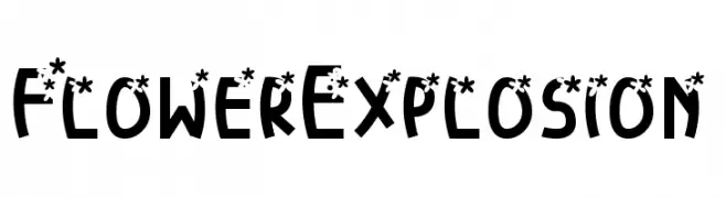
( Fonts by Michela Ferretti )
A playful, decorative font with floral accents on bold, rounded characters.
![FlowerExplosion font caratteri gratis]() Scaricare 226 Downloads@WebFont
Scaricare 226 Downloads@WebFont -
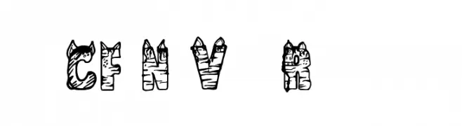
( Fonts by Steve Cloutier - www.cloutierfontes.ca )
A playful, cartoonish font with bold, textured letters.
![CF NaVia Regular font caratteri gratis]() Scaricare 226 Downloads@WebFont
Scaricare 226 Downloads@WebFont -
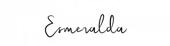
( Fonts by Ahargun Art - https://www.creativefabrica.com/designer/ahargun-art/ - Personal-use only. For commercial use please contact owner. )
A lively, expressive handwritten font with dynamic strokes and playful characteristics.
![Esmeralda font caratteri gratis]() Scaricare 226 Downloads@WebFont
Scaricare 226 Downloads@WebFont -
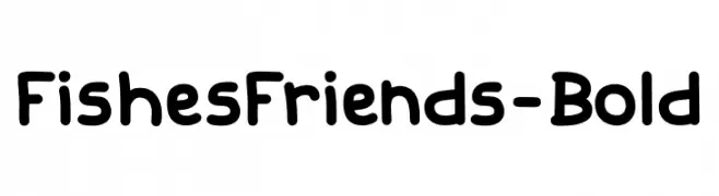
( Fonts by Youssef Habchi )
A playful, bold font with rounded, friendly characters.
![FishesFriends-Bold font caratteri gratis]() Scaricare 226 Downloads@WebFont
Scaricare 226 Downloads@WebFont


Quali sono i font più popolari adesso?
Poppins, Roboto, Montserrat, Open Sans e Lato sono molto usati per le forme pulite e l'ampia applicabilità — dall'identità di marca alle landing page e ai poster.
Quali font si usano spesso nei loghi?
Le sans serif geometriche (es. Poppins, famiglie in stile Gotham) sono scelte comuni per un branding pulito e scalabile. Per un tocco personale restano valide script e stili manoscritti. Abbina un display deciso per i titoli a un corpo testo neutro per riconoscibilità ed equilibrio.
Ogni quanto si aggiorna la lista?
Con regolarità, in base ai download e all'attività reale. Torna spesso per scoprire in anticipo le nuove preferite.
💡 Consiglio: aggiungi ai preferiti — le tendenze cambiano in fretta e i font top di oggi possono ispirare il rebranding di domani.