Benvenuto nelle Font Più Popolari — dove popolarità e qualità si incontrano. Qui trovi i font più scaricati e usati dell'anno. Se cerchi scelte sicure per logo, web o social, inizia da qui.
Ogni font top si distingue per equilibrio, leggibilità e versatilità. Troverai sans serif moderne, script eleganti, serif vintage e display minimalisti.
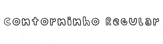
-
( Fonts by dw0z3 mk )
A playful, hand-drawn font with bold, rounded outlines and a whimsical style.
 Scaricare 215 Downloads@WebFont
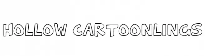
 -
![Hollow Cartoonlings font caratteri gratis]() Scaricare 215 Downloads@WebFont
Scaricare 215 Downloads@WebFont -
( Fonts by Manfred Klein. Free for private and charity use. Free for commercial with donation to organizations )
A bold, hand-carved font with a linocut print aesthetic.
![BrokenLinoCut font caratteri gratis]() Scaricare 215 Downloads@WebFont
Scaricare 215 Downloads@WebFont -
( Fonts by Rachel Harrop )
A playful, bold handwritten font with smooth, flowing strokes.
![Rachelhand font caratteri gratis]() Scaricare 215 Downloads@WebFont
Scaricare 215 Downloads@WebFont -
![Halo font caratteri gratis]() Scaricare 215 Downloads@WebFont
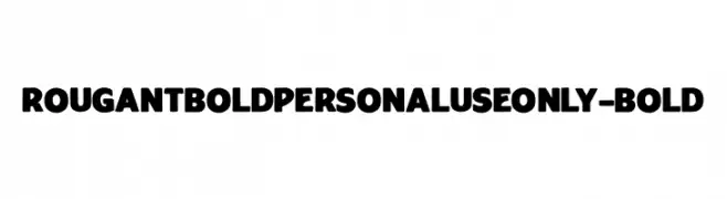
Scaricare 215 Downloads@WebFont -
( Fonts by Mans Greback - Personal-use only. For commercial use please contact owner. )
A bold, rounded font with a modern and impactful style.
![RougantBoldPERSONALUSEONLY-Bold font caratteri gratis]() Scaricare 215 Downloads@WebFont
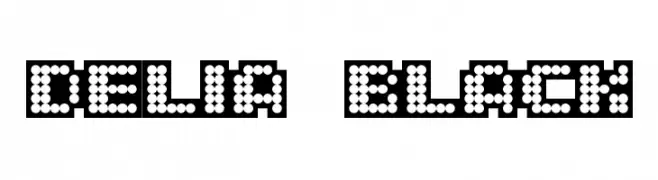
Scaricare 215 Downloads@WebFont -
![delia Black font caratteri gratis]() Scaricare 215 Downloads@WebFont
Scaricare 215 Downloads@WebFont -
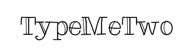
( Fonts by Karin McCombes. Personal-use only. For commercial use please contact owner. )
A playful, whimsical serif font with curly serifs and a friendly appearance.
![TypeMeTwo font caratteri gratis]() Scaricare 215 Downloads@WebFont
Scaricare 215 Downloads@WebFont -
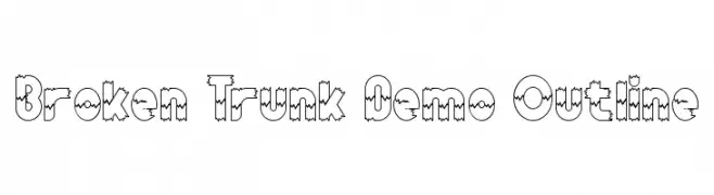
( Fonts by RaisProject )
A playful, jagged outline font with a rugged, dynamic appearance.
![Broken Trunk Demo Outline font caratteri gratis]() Scaricare 215 Downloads@WebFont
Scaricare 215 Downloads@WebFont -
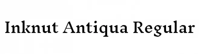
( Copyright (c) 2014 Claus Eggers Sørensen (es@forthehearts.net) )
A classic serif typeface with elegant serifs and moderate contrast.
![Inknut Antiqua Regular font caratteri gratis]() Scaricare 215 Downloads@WebFont
Scaricare 215 Downloads@WebFont -
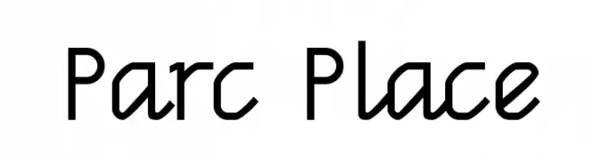
( Fonts by Kreative Korporation - www.kreativekorp.com )
A modern, geometric font with clean lines and a structured appearance.
![Parc Place font caratteri gratis]() Scaricare 215 Downloads@WebFont
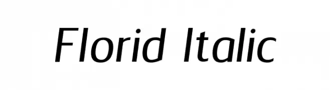
Scaricare 215 Downloads@WebFont -
![Florid Italic font caratteri gratis]() Scaricare 215 Downloads@WebFont
Scaricare 215 Downloads@WebFont -
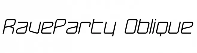
( Fonts by Graham Meade - GemFonts )
A sleek, futuristic oblique font with clean lines and sharp angles.
![RaveParty Oblique font caratteri gratis]() Scaricare 215 Downloads@WebFont
Scaricare 215 Downloads@WebFont -
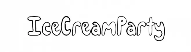
( Fonts by a Max Infeld - XEROGRAPHER FONTS - xerographer.blogspot.com . Personal-use only. For commercial use please contact owner. )
A playful, hand-drawn font with a bubbly, whimsical style.
![IceCreamParty font caratteri gratis]() Scaricare 215 Downloads@WebFont
Scaricare 215 Downloads@WebFont -
![RADIATION font caratteri gratis]() Scaricare 215 Downloads@WebFont
Scaricare 215 Downloads@WebFont -
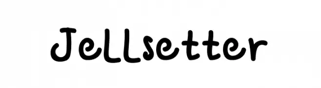
( Fonts by Denny Sutanto )
A playful, hand-drawn font with rounded, bold characters and a casual style.
![Jellsetter font caratteri gratis]() Scaricare 215 Downloads@WebFont
Scaricare 215 Downloads@WebFont -
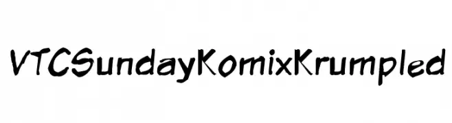
![VTCSundayKomixKrumpled font caratteri gratis]() Scaricare 215 Downloads@WebFont
Scaricare 215 Downloads@WebFont -
( Fonts by Vladimir Nikolic )
A bold, geometric font with a three-dimensional, futuristic style.
![Leverkusen Regular font caratteri gratis]() Scaricare 215 Downloads@WebFont
Scaricare 215 Downloads@WebFont -
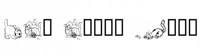
![LCR Cat's Meow font caratteri gratis]() Scaricare 215 Downloads@WebFont
Scaricare 215 Downloads@WebFont -
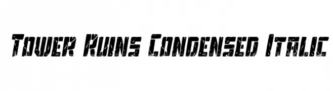
( Fonts by Daniel Zadorozny - www.iconian.com - Free for personal use )
A bold, condensed, and distressed italic font with a gritty, industrial look.
![Tower Ruins Condensed Italic font caratteri gratis]() Scaricare 215 Downloads@WebFont
Scaricare 215 Downloads@WebFont -
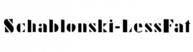
( Fonts by Manfred Klein. Free for private and charity use. Free for commercial with donation to organizations )
A bold, stencil-like font with high contrast and geometric precision.
![Schablonski-LessFat font caratteri gratis]() Scaricare 215 Downloads@WebFont
Scaricare 215 Downloads@WebFont -
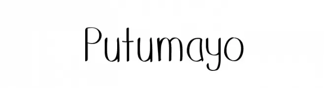
![Putumayo font caratteri gratis]() Scaricare 215 Downloads@WebFont
Scaricare 215 Downloads@WebFont -
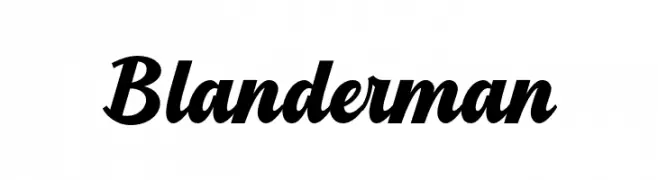
( Fonts by Kong Font - fontkong.com - Personal-use only. For commercial use please contact owner. )
A bold, dynamic script font with elegant, flowing letterforms.
![Blanderman font caratteri gratis]() Scaricare 215 Downloads@WebFont
Scaricare 215 Downloads@WebFont -
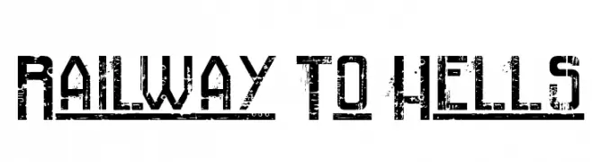
( imagex - www.imagex-fonts.com )
A bold, distressed font with a rugged, industrial style.
![Railway To Hells font caratteri gratis]() Scaricare 215 Downloads@WebFont
Scaricare 215 Downloads@WebFont -
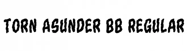
( Fonts by Blambot Comic Fonts - Personal-use only. For commercial use please contact owner. )
A rugged, distressed font with a bold, torn appearance.
![Torn Asunder BB Regular font caratteri gratis]() Scaricare 215 Downloads@WebFont
Scaricare 215 Downloads@WebFont -
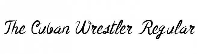
( Fonts by Jeremy Dixon - Personal-use only. For commercial use please contact owner. )
A dynamic and expressive script font with fluid, cursive letterforms.
![The Cuban Wrestler Regular font caratteri gratis]() Scaricare 215 Downloads@WebFont
Scaricare 215 Downloads@WebFont -
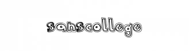
( Fonts by a Max Infeld - XEROGRAPHER FONTS - xerographer.blogspot.com . Personal-use only. For commercial use please contact owner. )
A playful, bold outline font with a hand-drawn, whimsical style.
![SansCollege font caratteri gratis]() Scaricare 215 Downloads@WebFont
Scaricare 215 Downloads@WebFont -
![Buster font caratteri gratis]() Scaricare 215 Downloads@WebFont
Scaricare 215 Downloads@WebFont -
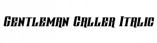
( Fonts by Daniel Zadorozny - www.iconian.com - Free for personal use )
A bold, italic font with angular edges and a dynamic style.
![Gentleman Caller Italic font caratteri gratis]() Scaricare 215 Downloads@WebFont
Scaricare 215 Downloads@WebFont -
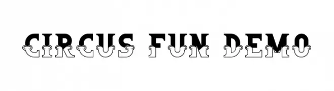
( Fonts by RaisProject )
A bold, decorative font with playful, vintage circus-inspired elements.
![Circus Fun Demo font caratteri gratis]() Scaricare 215 Downloads@WebFont
Scaricare 215 Downloads@WebFont -
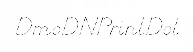
( Demo font. To purchase the full version, you can order it online at www.schoolhousefonts.com )
A dotted, script-like font with a playful and elegant style.
![DmoDNPrintDot font caratteri gratis]() Scaricare 215 Downloads@WebFont
Scaricare 215 Downloads@WebFont -
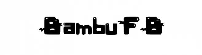
![BambuFB font caratteri gratis]() Scaricare 215 Downloads@WebFont
Scaricare 215 Downloads@WebFont -
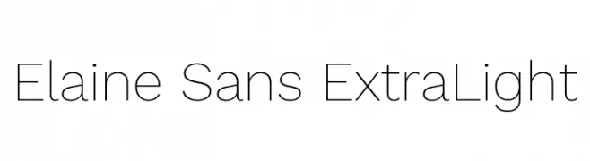
( Fonts by Wei Huang - Personal-use only. For commercial use please contact owner. )
A clean, minimalist sans-serif font with an airy and open design.
![Elaine Sans ExtraLight font caratteri gratis]() Scaricare 215 Downloads@WebFont
Scaricare 215 Downloads@WebFont -
( Levi Szekeres - www.loremipsum.ro )
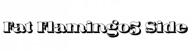
A bold, three-dimensional font with a retro shadow effect.
![Fat Flamingo5 Side font caratteri gratis]() Scaricare 215 Downloads@WebFont
Scaricare 215 Downloads@WebFont -
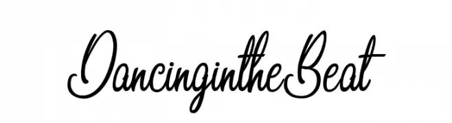
( Octotype - www.foundmyfont.com/ )
A lively, handwritten script font with fluid, connected letters.
![DancingintheBeat font caratteri gratis]() Scaricare 215 Downloads@WebFont
Scaricare 215 Downloads@WebFont


Quali sono i font più popolari adesso?
Poppins, Roboto, Montserrat, Open Sans e Lato sono molto usati per le forme pulite e l'ampia applicabilità — dall'identità di marca alle landing page e ai poster.
Quali font si usano spesso nei loghi?
Le sans serif geometriche (es. Poppins, famiglie in stile Gotham) sono scelte comuni per un branding pulito e scalabile. Per un tocco personale restano valide script e stili manoscritti. Abbina un display deciso per i titoli a un corpo testo neutro per riconoscibilità ed equilibrio.
Ogni quanto si aggiorna la lista?
Con regolarità, in base ai download e all'attività reale. Torna spesso per scoprire in anticipo le nuove preferite.
💡 Consiglio: aggiungi ai preferiti — le tendenze cambiano in fretta e i font top di oggi possono ispirare il rebranding di domani.