Benvenuto nelle Font Più Popolari — dove popolarità e qualità si incontrano. Qui trovi i font più scaricati e usati dell'anno. Se cerchi scelte sicure per logo, web o social, inizia da qui.
Ogni font top si distingue per equilibrio, leggibilità e versatilità. Troverai sans serif moderne, script eleganti, serif vintage e display minimalisti.
-
( Copyright 2016 The Archivo Project Authors (omnibus.type@gmail.com) )
A modern, italic sans-serif font with clean lines and a professional appearance.
 Scaricare 214 Downloads@WebFont
 -
![PfefferSimpelgotisch font caratteri gratis]() Scaricare 214 Downloads@WebFont
Scaricare 214 Downloads@WebFont -
( Fonts by a Neale Davidson - www.pixelsagas.com. Personal-use only. For commercial use please contact owner. )
A bold, italicized font with a futuristic and angular design.
![Jefferies Italic font caratteri gratis]() Scaricare 214 Downloads@WebFont
Scaricare 214 Downloads@WebFont -
( HackFonts - hackfonts.blogspot.com.co/ )
A bold, rounded font with a playful, retro style.
![Home Movie Font Normal font caratteri gratis]() Scaricare 214 Downloads@WebFont
Scaricare 214 Downloads@WebFont -
![Russia Five font caratteri gratis]() Scaricare 214 Downloads@WebFont
Scaricare 214 Downloads@WebFont -
( Fonts by ShyFonts )
A lively, cursive script font with smooth, interconnected strokes.
![SF Burlington Script SC font caratteri gratis]() Scaricare 214 Downloads@WebFont
Scaricare 214 Downloads@WebFont -
( Fonts by Pilaster Davy )
A bold blackletter font with sharp, angular lines and high contrast.
![TheNovice font caratteri gratis]() Scaricare 214 Downloads@WebFont
Scaricare 214 Downloads@WebFont -
( Fonts by wep - Wahyu Eka Prasetya - Personal-use only. For commercial use please contact owner. )
A bold, angular font with high contrast and an edgy, dynamic style.
![Asian Ninja font caratteri gratis]() Scaricare 214 Downloads@WebFont
Scaricare 214 Downloads@WebFont -
( Fonts by Paul - viciousink.net )
A horror-themed font with dripping, jagged edges and a chaotic style.
![Pauls Bloody Font font caratteri gratis]() Scaricare 214 Downloads@WebFont
Scaricare 214 Downloads@WebFont -
( Fonts by EvasUniqueFonts )
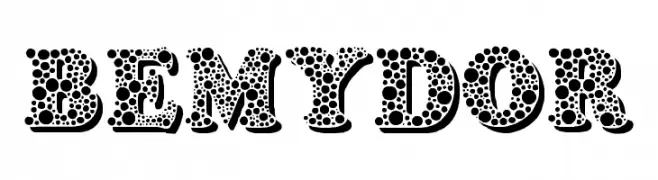
A playful, polka dot patterned decorative font with bold, rounded characters.
![Bemydor font caratteri gratis]() Scaricare 214 Downloads@WebFont
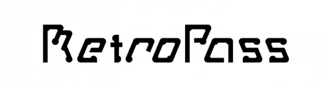
Scaricare 214 Downloads@WebFont -
![MetroPass font caratteri gratis]() Scaricare 214 Downloads@WebFont
Scaricare 214 Downloads@WebFont -
( FontGrube AH - Andreas Höfeld - www.fontgrube.de/en/ )
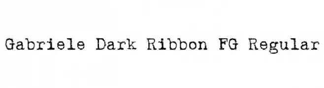
A bold, distressed font with a vintage, textured appearance.
![Gabriele Dark Ribbon FG Regular font caratteri gratis]() Scaricare 214 Downloads@WebFont
Scaricare 214 Downloads@WebFont -
( Fonts by MCKL )
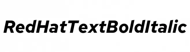
A bold, italicized font with a modern and clean design.
![Red Hat Text Bold Italic font caratteri gratis]() Scaricare 214 Downloads@WebFont
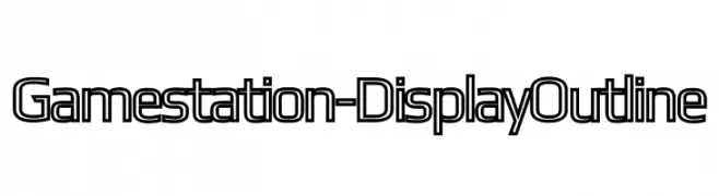
Scaricare 214 Downloads@WebFont -
![Gamestation-DisplayOutline font caratteri gratis]() Scaricare 214 Downloads@WebFont
Scaricare 214 Downloads@WebFont -
( Fonts by dustBUST )
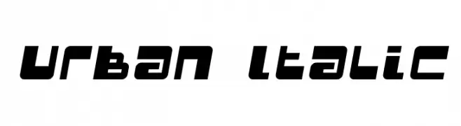
A bold, italicized font with a modern, urban style.
![Urban Italic font caratteri gratis]() Scaricare 214 Downloads@WebFont
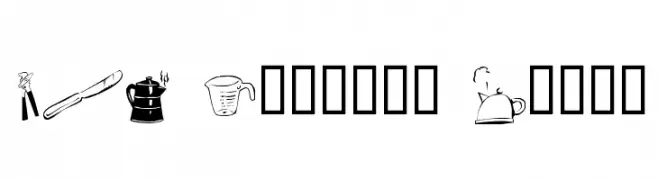
Scaricare 214 Downloads@WebFont -
![LCR Kitchen Dings font caratteri gratis]() Scaricare 214 Downloads@WebFont
Scaricare 214 Downloads@WebFont -
( Fonts by Graham Meade - GemFonts )
A bold, striped font with a dynamic, sliced appearance.
![Chefs Slice Novice font caratteri gratis]() Scaricare 214 Downloads@WebFont
Scaricare 214 Downloads@WebFont -
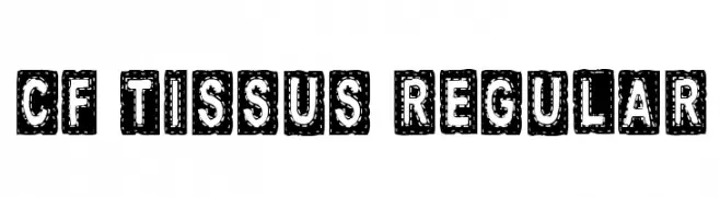
( Fonts by Steve Cloutier - www.cloutierfontes.ca )
A bold, decorative font with a stitched, patchwork design.
![CF Tissus Regular font caratteri gratis]() Scaricare 214 Downloads@WebFont
Scaricare 214 Downloads@WebFont -
![SuperLovelyN font caratteri gratis]() Scaricare 214 Downloads@WebFont
Scaricare 214 Downloads@WebFont -
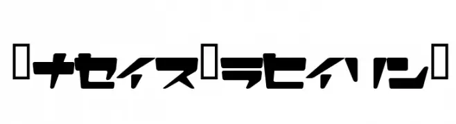
![Kanji A font caratteri gratis]() Scaricare 214 Downloads@WebFont
Scaricare 214 Downloads@WebFont -
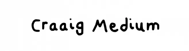
( Fonts by Craaig )
A playful, handwritten font with rounded, consistent strokes and a casual style.
![Craaig Medium font caratteri gratis]() Scaricare 214 Downloads@WebFont
Scaricare 214 Downloads@WebFont -
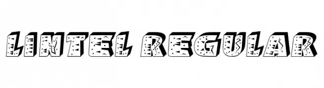
( Fonts by Vladimir Nikolic )
A bold, decorative font with intricate patterns and a playful, dynamic style.
![Lintel Regular font caratteri gratis]() Scaricare 214 Downloads@WebFont
Scaricare 214 Downloads@WebFont -
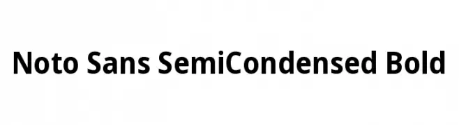
( Fonts by Google )
A bold, semi-condensed sans-serif font with clean, modern lines.
![Noto Sans SemiCondensed Bold font caratteri gratis]() Scaricare 214 Downloads@WebFont
Scaricare 214 Downloads@WebFont -
( Fonts by Chris Vile - fontmonger.com - Personal-use only. For commercial use please contact owner. )
A bold, futuristic font with sharp, angular lines and a techno-inspired design.
![Techno Wanker font caratteri gratis]() Scaricare 214 Downloads@WebFont
Scaricare 214 Downloads@WebFont -
![Eggshell Mosaic font caratteri gratis]() Scaricare 214 Downloads@WebFont
Scaricare 214 Downloads@WebFont -
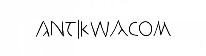
( Fonts by Manfred Klein. Free for private and charity use. Free for commercial with donation to organizations )
An artistic, hand-drawn font with angular, whimsical characters.
![AntikWaCom font caratteri gratis]() Scaricare 214 Downloads@WebFont
Scaricare 214 Downloads@WebFont -
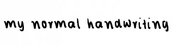
![my normal handwriting font caratteri gratis]() Scaricare 214 Downloads@WebFont
Scaricare 214 Downloads@WebFont -
( Fonts by Daniel Zadorozny - www.iconian.com - Free for personal use )
A bold, expanded, and italicized font with a modern and futuristic style.
![Universal Jack Expanded Italic font caratteri gratis]() Scaricare 214 Downloads@WebFont
Scaricare 214 Downloads@WebFont -
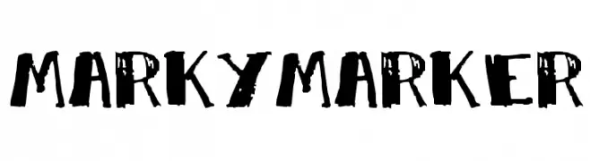
![MarkyMarker font caratteri gratis]() Scaricare 214 Downloads@WebFont
Scaricare 214 Downloads@WebFont -
( Fonts by Skiiller Studio )
A bold, playful font with rounded edges and consistent stroke width.
![Deurne font caratteri gratis]() Scaricare 214 Downloads@WebFont
Scaricare 214 Downloads@WebFont -
( Fonts by Mans Greback - Personal-use only. For commercial use please contact owner. )
A bold, modern sans-serif font with clean lines and strong presence.
![Famiar PERSONAL USE ONLY SemiBold font caratteri gratis]() Scaricare 214 Downloads@WebFont
Scaricare 214 Downloads@WebFont -
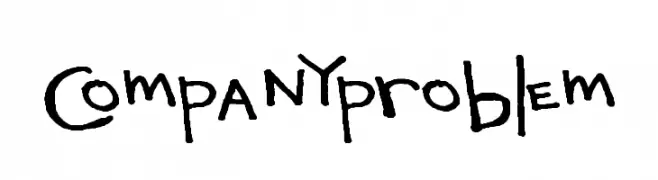
( Fonts by a Max Infeld - XEROGRAPHER FONTS - xerographer.blogspot.com . Personal-use only. For commercial use please contact owner. )
A playful, hand-drawn font with a casual and whimsical style.
![CompanyProblem font caratteri gratis]() Scaricare 214 Downloads@WebFont
Scaricare 214 Downloads@WebFont -
![Johnny Long font caratteri gratis]() Scaricare 214 Downloads@WebFont
Scaricare 214 Downloads@WebFont -
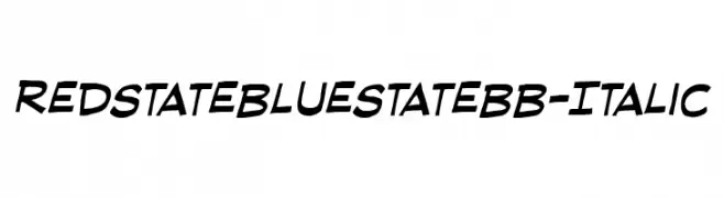
( Fonts by www.blambot.com )
A dynamic italic font with playful, slanted letterforms and a modern, informal style.
![RedStateBlueStateBB-Italic font caratteri gratis]() Scaricare 214 Downloads@WebFont
Scaricare 214 Downloads@WebFont -
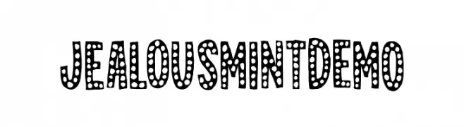
( Fonts by Pizzadude )
A playful, bold font with a dotted pattern inside each character, offering a whimsical and decorative style.
![JealousMintDEMO font caratteri gratis]() Scaricare 214 Downloads@WebFont
Scaricare 214 Downloads@WebFont


Quali sono i font più popolari adesso?
Poppins, Roboto, Montserrat, Open Sans e Lato sono molto usati per le forme pulite e l'ampia applicabilità — dall'identità di marca alle landing page e ai poster.
Quali font si usano spesso nei loghi?
Le sans serif geometriche (es. Poppins, famiglie in stile Gotham) sono scelte comuni per un branding pulito e scalabile. Per un tocco personale restano valide script e stili manoscritti. Abbina un display deciso per i titoli a un corpo testo neutro per riconoscibilità ed equilibrio.
Ogni quanto si aggiorna la lista?
Con regolarità, in base ai download e all'attività reale. Torna spesso per scoprire in anticipo le nuove preferite.
💡 Consiglio: aggiungi ai preferiti — le tendenze cambiano in fretta e i font top di oggi possono ispirare il rebranding di domani.