Benvenuto nelle Font Più Popolari — dove popolarità e qualità si incontrano. Qui trovi i font più scaricati e usati dell'anno. Se cerchi scelte sicure per logo, web o social, inizia da qui.
Ogni font top si distingue per equilibrio, leggibilità e versatilità. Troverai sans serif moderne, script eleganti, serif vintage e display minimalisti.
-
 Scaricare 1033 Downloads@WebFont
 -
( Fonts by Press Gang Studios - Andeh Pinkard - www.pressgang-studios.com )
A bold, handwritten-style font with a dynamic and energetic appearance.
![Adam Warren pro Bold font caratteri gratis]() Scaricare 1033 Downloads@WebFont
Scaricare 1033 Downloads@WebFont -
( Fonts by Apostrophic Lab )
Elegant serif font with a slight italic slant, perfect for formal and creative uses.
![Devroye font caratteri gratis]() Scaricare 1033 Downloads@WebFont
Scaricare 1033 Downloads@WebFont -
( Fonts by www.neogrey.com - Neogrey Creative )
A bold, geometric font with a strong, industrial aesthetic.
![Red October font caratteri gratis]() Scaricare 1033 Downloads@WebFont
Scaricare 1033 Downloads@WebFont -
( Fonts by www.blambot.com )
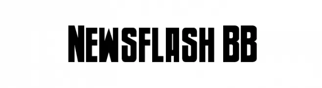
A bold, condensed font with strong geometric shapes and high contrast.
![Newsflash BB font caratteri gratis]() Scaricare 1033 Downloads@WebFont
Scaricare 1033 Downloads@WebFont -
-
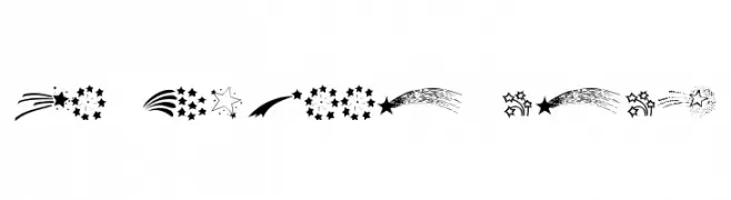
![KR Starry Eyed font caratteri gratis]() Scaricare 1033 Downloads@WebFont
Scaricare 1033 Downloads@WebFont -
( Fonts by Pelle Piano - hem.passagen.se/spsweet/index3.html )
A bold, handwritten font with a casual and energetic style.
![PP Handwriting Normal font caratteri gratis]() Scaricare 1033 Downloads@WebFont
Scaricare 1033 Downloads@WebFont -
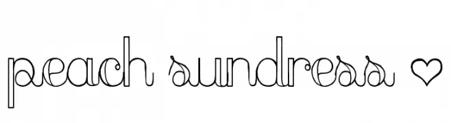
![peach sundress ~ font caratteri gratis]() Scaricare 1033 Downloads@WebFont
Scaricare 1033 Downloads@WebFont -
( Fonts by Jacob Fisher - www.pizzadude.dk )
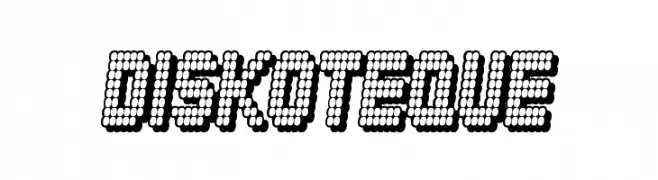
A playful, dotted font with a retro digital feel, ideal for creative and attention-grabbing designs.
![Diskoteque font caratteri gratis]() Scaricare 1033 Downloads@WebFont
Scaricare 1033 Downloads@WebFont -
( Fonts by Nirmala Creative )
A playful, hand-drawn font with a whimsical and friendly style.
![Twister Candy font caratteri gratis]() Scaricare 1032 Downloads@WebFont
Scaricare 1032 Downloads@WebFont

Quali sono i font più popolari adesso?
Poppins, Roboto, Montserrat, Open Sans e Lato sono molto usati per le forme pulite e l'ampia applicabilità — dall'identità di marca alle landing page e ai poster.
Quali font si usano spesso nei loghi?
Le sans serif geometriche (es. Poppins, famiglie in stile Gotham) sono scelte comuni per un branding pulito e scalabile. Per un tocco personale restano valide script e stili manoscritti. Abbina un display deciso per i titoli a un corpo testo neutro per riconoscibilità ed equilibrio.
Ogni quanto si aggiorna la lista?
Con regolarità, in base ai download e all'attività reale. Torna spesso per scoprire in anticipo le nuove preferite.
💡 Consiglio: aggiungi ai preferiti — le tendenze cambiano in fretta e i font top di oggi possono ispirare il rebranding di domani.