Benvenuto nelle Font Più Popolari — dove popolarità e qualità si incontrano. Qui trovi i font più scaricati e usati dell'anno. Se cerchi scelte sicure per logo, web o social, inizia da qui.
Ogni font top si distingue per equilibrio, leggibilità e versatilità. Troverai sans serif moderne, script eleganti, serif vintage e display minimalisti.
-
 Scaricare 3108 Downloads@WebFont
 -
( Fonts by or from www.graffitifonts.net )
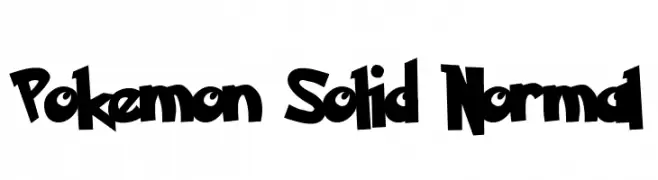
A bold, playful font with a whimsical and energetic style.
![Pokemon Solid Normal font caratteri gratis]() Scaricare 3108 Downloads
Scaricare 3108 Downloads -
( Fonts by www.hindson.com.au )
A classic serif font with high contrast and elegant curves, featuring unique musical symbols.
![Tempo Indications Lite font caratteri gratis]() Scaricare 3107 Downloads@WebFont
Scaricare 3107 Downloads@WebFont -
![Feldicouth Norm font caratteri gratis]() Scaricare 3107 Downloads@WebFont
Scaricare 3107 Downloads@WebFont -
![Tulasi Normal font caratteri gratis]() Scaricare 3107 Downloads@WebFont
Scaricare 3107 Downloads@WebFont -
-
( Fonts by Digital Graphics Labs - www.digitalgraphiclabs.com )
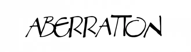
A bold, hand-drawn font with irregular strokes and dynamic, artistic flair.
![Aberration font caratteri gratis]() Scaricare 3107 Downloads@WebFont
Scaricare 3107 Downloads@WebFont -
![ALPHA Bold font caratteri gratis]() Scaricare 3106 Downloads@WebFont
Scaricare 3106 Downloads@WebFont -
( Fonts by Benoit Sjoholm - www.benoitsjoholm.com - All my fonts are for sale )
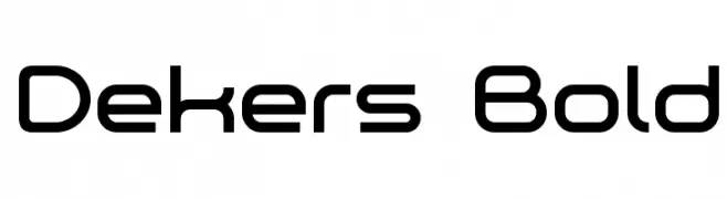
A modern, geometric font with clean lines and rounded edges.
![Dekers_Bold font caratteri gratis]() Scaricare 3106 Downloads@WebFont
Scaricare 3106 Downloads@WebFont -
( Fonts by Nick Curtis - www.nicksfonts.com )
A bold, modern font with thick strokes and strong visual impact.
![Unicorn font caratteri gratis]() Scaricare 3106 Downloads
Scaricare 3106 Downloads -
![Lane Narrow Light font caratteri gratis]() Scaricare 3106 Downloads@WebFont
Scaricare 3106 Downloads@WebFont -
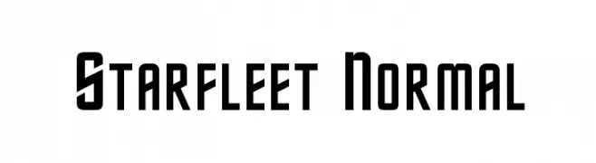
![Starfleet Normal font caratteri gratis]() Scaricare 3105 Downloads@WebFont
Scaricare 3105 Downloads@WebFont -
![Mucha font caratteri gratis]() Scaricare 3104 Downloads@WebFont
Scaricare 3104 Downloads@WebFont -
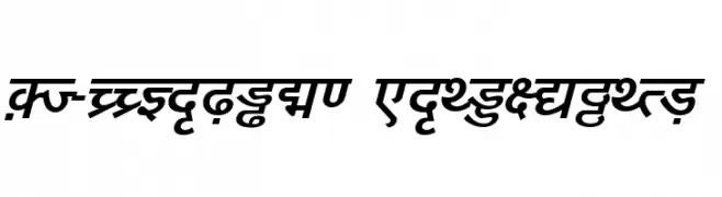
![DV-TTYogesh BoldItalic font caratteri gratis]() Scaricare 3104 Downloads@WebFont
Scaricare 3104 Downloads@WebFont -
![FetteFraktur font caratteri gratis]() Scaricare 3104 Downloads@WebFont
Scaricare 3104 Downloads@WebFont -
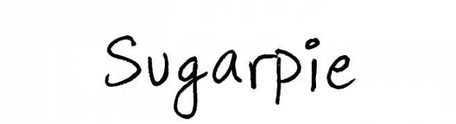
( Fonts by www.fontpanda.com. Personal-use only. For commercial use please contact owner. )
A playful, casual handwritten font with an organic and friendly appearance.
![Sugarpie font caratteri gratis]() Scaricare 3103 Downloads@WebFont
Scaricare 3103 Downloads@WebFont -
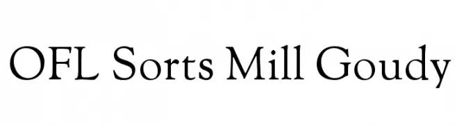
( Fonts by The League of Moveable Type - theleagueofmoveabletype.com )
A classic serif font with elegant lines and medium contrast, perfect for traditional designs.
![OFL Sorts Mill Goudy font caratteri gratis]() Scaricare 3103 Downloads@WebFont
Scaricare 3103 Downloads@WebFont -
![--flak-- font caratteri gratis]() Scaricare 3103 Downloads@WebFont
Scaricare 3103 Downloads@WebFont -
![Charming Font font caratteri gratis]() Scaricare 3103 Downloads@WebFont
Scaricare 3103 Downloads@WebFont -
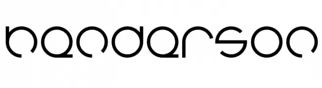
( Fonts by weknow - Wino S Kadir )
A modern, futuristic font with smooth lines and geometric shapes.
![henderson font caratteri gratis]() Scaricare 3102 Downloads@WebFont
Scaricare 3102 Downloads@WebFont -
![NewtonCTT Bold font caratteri gratis]() Scaricare 3102 Downloads@WebFont
Scaricare 3102 Downloads@WebFont -
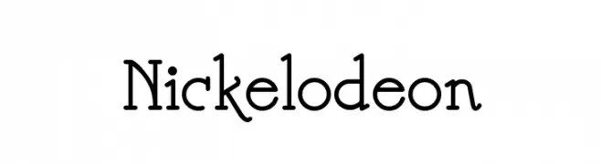
( Fonts by Nick`s Fonts )
A playful and whimsical font with decorative swirls and curls.
![Nickelodeon font caratteri gratis]() Scaricare 3102 Downloads@WebFont
Scaricare 3102 Downloads@WebFont -
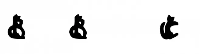
![Bad Black Cat font caratteri gratis]() Scaricare 3102 Downloads@WebFont
Scaricare 3102 Downloads@WebFont -
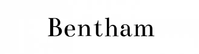
( Copyright (c) 2010, Ben Weiner (ben@readingtype.org.uk) )
A classic serif font with elegant strokes and refined details.
![Bentham font caratteri gratis]() Scaricare 3101 Downloads@WebFont
Scaricare 3101 Downloads@WebFont -
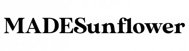
( Fonts by MadeType - Personal-use only. For commercial use please contact owner. )
A bold, high-contrast serif font with a classic yet modern style.
![MADESunflower font caratteri gratis]() Scaricare 3100 Downloads@WebFont
Scaricare 3100 Downloads@WebFont -
( Fonts by Plamen Motev - www.fontfabric.com - Personal-use only. For commercial use please contact owner. )
A thin, modern sans-serif font with a sleek and minimalist design.
![Akrobat Thin font caratteri gratis]() Scaricare 3100 Downloads@WebFont
Scaricare 3100 Downloads@WebFont -
Caratteri di tomtor. For commercial use please contact the owner.
![Enso font caratteri gratis]() Scaricare 3100 Downloads@WebFont
Scaricare 3100 Downloads@WebFont -
![Mondo font caratteri gratis]() Scaricare 3100 Downloads@WebFont
Scaricare 3100 Downloads@WebFont -
![C39HrP48DhTt font caratteri gratis]() Scaricare 3100 Downloads@WebFont
Scaricare 3100 Downloads@WebFont -
( Fonts by David Jonathan Ross - Personal-use only. For commercial use please contact owner. )
A bold, playful font with rounded, geometric characters.
![Bungee Layers Outline Regular font caratteri gratis]() Scaricare 3099 Downloads@WebFont
Scaricare 3099 Downloads@WebFont -
( Fonts by Castcraft Software - opti.netii.net - check the website before use )
A bold, high-contrast serif font with pronounced serifs and elegant style.
![OPTICrawModern-Bold font caratteri gratis]() Scaricare 3099 Downloads@WebFont
Scaricare 3099 Downloads@WebFont -
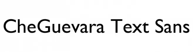
![CheGuevara Text Sans font caratteri gratis]() Scaricare 3098 Downloads@WebFont
Scaricare 3098 Downloads@WebFont -
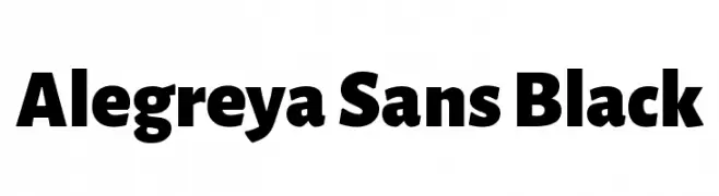
( Copyright 2013 The Alegreya Sans Project Authors (https://github.com/huertatipografica/Alegreya-Sans) )
A bold, modern sans-serif font with strong geometric shapes and thick strokes.
![Alegreya Sans Black font caratteri gratis]() Scaricare 3098 Downloads@WebFont
Scaricare 3098 Downloads@WebFont -
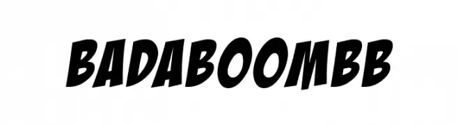
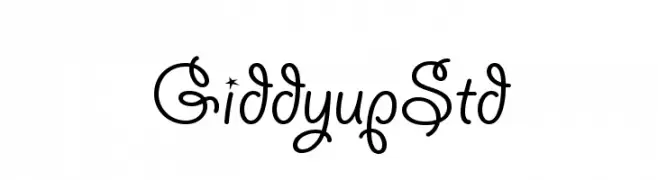
( Fonts by www.blambot.com )
A bold, dynamic font with thick strokes and a slightly slanted style.
![BadaBoomBB font caratteri gratis]() Scaricare 3097 Downloads@WebFont
Scaricare 3097 Downloads@WebFont -
![GiddyupStd font caratteri gratis]() Scaricare 3097 Downloads@WebFont
Scaricare 3097 Downloads@WebFont -
( Copyright 2008 The Sunflower Project Authors )
A bold, modern sans-serif font with clean lines and rounded edges.
![Sunflower Bold font caratteri gratis]() Scaricare 3096 Downloads@WebFont
Scaricare 3096 Downloads@WebFont


Quali sono i font più popolari adesso?
Poppins, Roboto, Montserrat, Open Sans e Lato sono molto usati per le forme pulite e l'ampia applicabilità — dall'identità di marca alle landing page e ai poster.
Quali font si usano spesso nei loghi?
Le sans serif geometriche (es. Poppins, famiglie in stile Gotham) sono scelte comuni per un branding pulito e scalabile. Per un tocco personale restano valide script e stili manoscritti. Abbina un display deciso per i titoli a un corpo testo neutro per riconoscibilità ed equilibrio.
Ogni quanto si aggiorna la lista?
Con regolarità, in base ai download e all'attività reale. Torna spesso per scoprire in anticipo le nuove preferite.
💡 Consiglio: aggiungi ai preferiti — le tendenze cambiano in fretta e i font top di oggi possono ispirare il rebranding di domani.