Benvenuto nelle Font Più Popolari — dove popolarità e qualità si incontrano. Qui trovi i font più scaricati e usati dell'anno. Se cerchi scelte sicure per logo, web o social, inizia da qui.
Ogni font top si distingue per equilibrio, leggibilità e versatilità. Troverai sans serif moderne, script eleganti, serif vintage e display minimalisti.
-
 Scaricare 3149 Downloads@WebFont
 -
( Fonts by Andrew McCluskey - nalgames.com. Personal-use only. For commercial use please contact owner. )
A bold, modern font with a geometric and condensed style.
![Guilty Treasure font caratteri gratis]() Scaricare 3148 Downloads@WebFont
Scaricare 3148 Downloads@WebFont -
![DejaVu Serif Condensed Bold font caratteri gratis]() Scaricare 3148 Downloads@WebFont
Scaricare 3148 Downloads@WebFont -
![101! Heart Deco font caratteri gratis]() Scaricare 3148 Downloads@WebFont
Scaricare 3148 Downloads@WebFont -
( Fonts by Paul Lloyd )
A bold, ornate blackletter font with intricate details and a dramatic presence.
![Dampfplatz Solid Black font caratteri gratis]() Scaricare 3148 Downloads@WebFont
Scaricare 3148 Downloads@WebFont -
-
( Fonts by Dieter Steffmann )
A bold, decorative font with vintage flair and intricate detailing.
![QuentinCaps font caratteri gratis]() Scaricare 3148 Downloads@WebFont
Scaricare 3148 Downloads@WebFont -
( Fonts by Arkandis Digital Foundry )
A modern, clean sans-serif typeface with balanced proportions and uniform stroke width.
![VeranaSansMedium-Regular font caratteri gratis]() Scaricare 3147 Downloads@WebFont
Scaricare 3147 Downloads@WebFont -
![EucrosiaUPC Bold font caratteri gratis]() Scaricare 3146 Downloads@WebFont
Scaricare 3146 Downloads@WebFont -
( Fonts by Hendra Pratama - HPTypework - https://hptypework.com - Personal-use only. For commercial use please contact owner. )
A modern, cursive font with a smooth, connected style and moderate stroke thickness.
![Michland font caratteri gratis]() Scaricare 3145 Downloads@WebFont
Scaricare 3145 Downloads@WebFont -
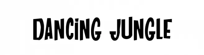
![DANCING JUNGLE font caratteri gratis]() Scaricare 3145 Downloads@WebFont
Scaricare 3145 Downloads@WebFont -
Caratteri di mortimermcmirestinks. For commercial use please contact the owner.
![Bowser font caratteri gratis]() Scaricare 3145 Downloads@WebFont
Scaricare 3145 Downloads@WebFont -
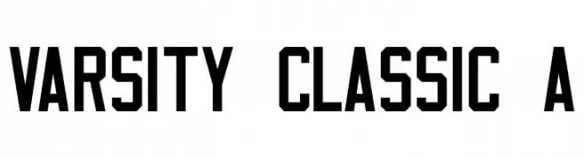
![Varsity Classic A font caratteri gratis]() Scaricare 3145 Downloads@WebFont
Scaricare 3145 Downloads@WebFont -
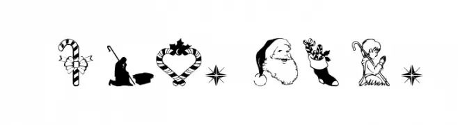
![Christmas3 font caratteri gratis]() Scaricare 3145 Downloads@WebFont
Scaricare 3145 Downloads@WebFont -
( Fonts by a www.fontfabric.com. Personal-use only. For commercial use please contact owner. )
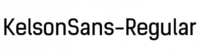
A modern, geometric sans-serif font with clean lines and uniform strokes.
![KelsonSans-Regular font caratteri gratis]() Scaricare 3144 Downloads@WebFont
Scaricare 3144 Downloads@WebFont -
( Fonts by Nick Matavka - Personal-use only. For commercial use please contact owner. )
Geometric sans-serif font with clean lines and modern style.
![Station font caratteri gratis]() Scaricare 3143 Downloads@WebFont
Scaricare 3143 Downloads@WebFont -
( Fonts by Andrew McCluskey - nalgames.com. Personal-use only. For commercial use please contact owner. )
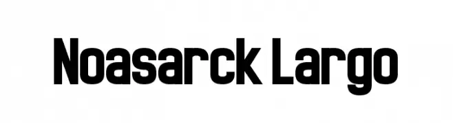
A bold, geometric font with a modern and impactful style.
![Noasarck Largo font caratteri gratis]() Scaricare 3143 Downloads@WebFont
Scaricare 3143 Downloads@WebFont -
( Copyright (c) 2010-2012, Alejandro Inler (alejandroinler@gmail.com), with Reserved Font Name 'Elsie' )
A classic serif font with elegant curves and decorative flourishes.
![Elsie font caratteri gratis]() Scaricare 3143 Downloads@WebFont
Scaricare 3143 Downloads@WebFont -
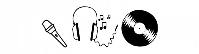
( Fonts by Blue Vinyl - Jess Latham - www.bvfonts.com )
A collection of music-themed icons in a clean, modern line art style.
![Rock Star font caratteri gratis]() Scaricare 3143 Downloads@WebFont
Scaricare 3143 Downloads@WebFont -
( Fonts by Fabrika De Typos - Marcio Hirosse - fabrikadetypos.blogspot.com )
A bold, italicized font with strong, angular lines and high contrast.
![Crash font caratteri gratis]() Scaricare 3143 Downloads@WebFont
Scaricare 3143 Downloads@WebFont -
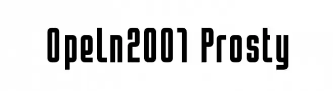
( Fonts by Bartek Nowak - www.nowak.tv/fontoholic/ )
A bold, geometric font with a modern, condensed style.
![Opeln2001 Prosty font caratteri gratis]() Scaricare 3142 Downloads@WebFont
Scaricare 3142 Downloads@WebFont -
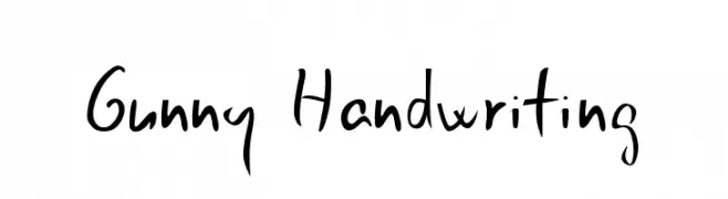
![Gunny Handwriting font caratteri gratis]() Scaricare 3142 Downloads@WebFont
Scaricare 3142 Downloads@WebFont -
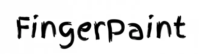
( Copyright (c) 2011 by Ralph du Carrois, with Reserved Font Name 'Finger Paint' )
A playful, brush-stroke style font with a creative and artistic flair.
![FingerPaint font caratteri gratis]() Scaricare 3142 Downloads@WebFont
Scaricare 3142 Downloads@WebFont -
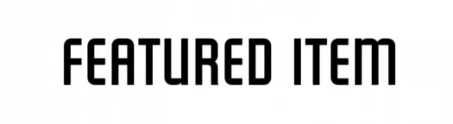
( Fonts by www.fontdiner.com )
A bold, geometric font with a modern and impactful design.
![Featured Item font caratteri gratis]() Scaricare 3141 Downloads@WebFont
Scaricare 3141 Downloads@WebFont -
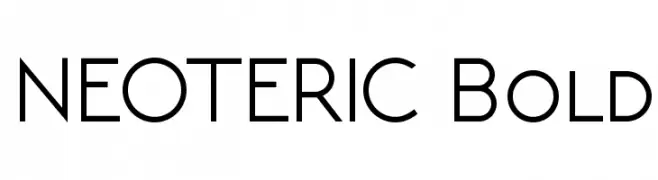
![NEOTERIC Bold font caratteri gratis]() Scaricare 3140 Downloads@WebFont
Scaricare 3140 Downloads@WebFont -
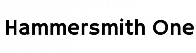
( Copyright (c) 2011 by Sorkin Type Co (www.sorkintype.com) )
A modern, bold sans-serif font with geometric influences and uniform stroke width.
![Hammersmith One font caratteri gratis]() Scaricare 3140 Downloads@WebFont
Scaricare 3140 Downloads@WebFont -
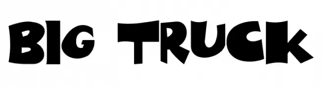
![Big Truck font caratteri gratis]() Scaricare 3140 Downloads@WebFont
Scaricare 3140 Downloads@WebFont -
( Fonts by www.impallari.com )
A bold, cursive font with elegant, flowing lines.
![Lobster1.1 font caratteri gratis]() Scaricare 3139 Downloads@WebFont
Scaricare 3139 Downloads@WebFont -
( Fonts by Altsys Metamorphosis )
A playful, handwritten font with a casual and friendly style.
![FanciHand Regular font caratteri gratis]() Scaricare 3139 Downloads@WebFont
Scaricare 3139 Downloads@WebFont -
( Fonts by Apostrophic Lab )
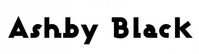
A bold, geometric font with sharp angles and minimal contrast.
![Ashby Black font caratteri gratis]() Scaricare 3138 Downloads@WebFont
Scaricare 3138 Downloads@WebFont -
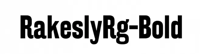
![RakeslyRg-Bold font caratteri gratis]() Scaricare 3137 Downloads@WebFont
Scaricare 3137 Downloads@WebFont -
( Font by Jayvee D. Enaguas - grandchaos9000.deviantart.com )
A bold, modern sans-serif font with clean lines and strong geometric shapes.
![Dyno Bold font caratteri gratis]() Scaricare 3137 Downloads@WebFont
Scaricare 3137 Downloads@WebFont -
![Justus Roman font caratteri gratis]() Scaricare 3137 Downloads@WebFont
Scaricare 3137 Downloads@WebFont -
( Fonts by Graham Meade - GemFonts )
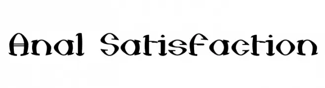
A bold, medieval-inspired font with sharp serifs and dramatic curves.
![Anal Satisfaction font caratteri gratis]() Scaricare 3137 Downloads@WebFont
Scaricare 3137 Downloads@WebFont -
( Fonts by Zetafonts - Personal-use only. For commercial use please contact owner. )
A bold, heavy font ideal for impactful headlines and titles.
![Heading Now Trial 58 Heavy font caratteri gratis]() Scaricare 3136 Downloads@WebFont
Scaricare 3136 Downloads@WebFont -
( Free for a personal use. For a commercial use please visit www.kevinandamanda.com )
A playful, handwritten font with a dynamic, cursive style.
![Susie's Hand font caratteri gratis]() Scaricare 3136 Downloads@WebFont
Scaricare 3136 Downloads@WebFont


Quali sono i font più popolari adesso?
Poppins, Roboto, Montserrat, Open Sans e Lato sono molto usati per le forme pulite e l'ampia applicabilità — dall'identità di marca alle landing page e ai poster.
Quali font si usano spesso nei loghi?
Le sans serif geometriche (es. Poppins, famiglie in stile Gotham) sono scelte comuni per un branding pulito e scalabile. Per un tocco personale restano valide script e stili manoscritti. Abbina un display deciso per i titoli a un corpo testo neutro per riconoscibilità ed equilibrio.
Ogni quanto si aggiorna la lista?
Con regolarità, in base ai download e all'attività reale. Torna spesso per scoprire in anticipo le nuove preferite.
💡 Consiglio: aggiungi ai preferiti — le tendenze cambiano in fretta e i font top di oggi possono ispirare il rebranding di domani.