Benvenuto nelle Font Più Popolari — dove popolarità e qualità si incontrano. Qui trovi i font più scaricati e usati dell'anno. Se cerchi scelte sicure per logo, web o social, inizia da qui.
Ogni font top si distingue per equilibrio, leggibilità e versatilità. Troverai sans serif moderne, script eleganti, serif vintage e display minimalisti.
-
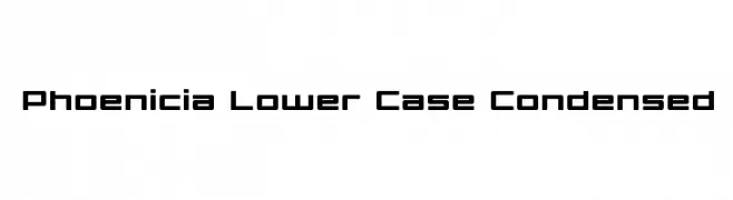
( Iconian Fonts - Daniel Zadorozny - www.iconian.com )
A modern, geometric, and condensed font with a sleek design.
 Scaricare 994 Downloads@WebFont
 -
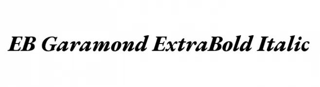
( Copyright 2017 The EB Garamond Project Authors (https://github.com/octaviopardo/EBGaramond12) )
A bold, italic serif font with classic elegance and strong presence.
![EB Garamond ExtraBold Italic font caratteri gratis]() Scaricare 994 Downloads@WebFont
Scaricare 994 Downloads@WebFont -
( Fonts by Tamavocks )
A bold, angular font with a futuristic and industrial style.
![ClobotFree font caratteri gratis]() Scaricare 994 Downloads@WebFont
Scaricare 994 Downloads@WebFont -
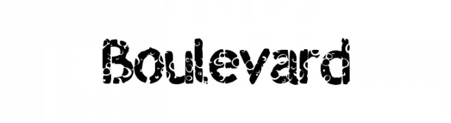
( Fonts by a Max Infeld - XEROGRAPHER FONTS - xerographer.blogspot.com . Personal-use only. For commercial use please contact owner. )
A bold, decorative font with circular cutout patterns for a playful, artistic look.
![Boulevard font caratteri gratis]() Scaricare 994 Downloads@WebFont
Scaricare 994 Downloads@WebFont -
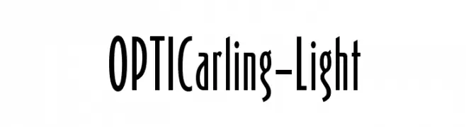
( Fonts by Castcraft Software - opti.netii.net - check the website before use )
A tall, narrow font with a modern and elegant style.
![OPTICarling-Light font caratteri gratis]() Scaricare 994 Downloads@WebFont
Scaricare 994 Downloads@WebFont -
-
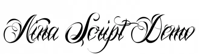
( Fonts by Mans Greback - www.mawns.com )
An elegant script font with intricate swashes and a calligraphic style.
![Nina Script Demo font caratteri gratis]() Scaricare 994 Downloads@WebFont
Scaricare 994 Downloads@WebFont -
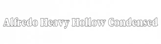
![Alfredo Heavy Hollow Condensed font caratteri gratis]() Scaricare 994 Downloads
Scaricare 994 Downloads -
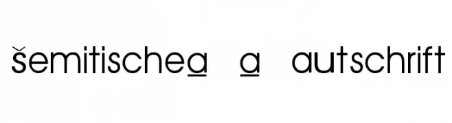
![Semitische-Lautschrift font caratteri gratis]() Scaricare 994 Downloads@WebFont
Scaricare 994 Downloads@WebFont -
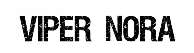
( Fonts by pOPdOG fONTS - Dimitris Kolyris - popdog_fonts.tripod.com Commerciali Caratteri )
A bold, distressed font with a rugged, vintage texture.
![VIPER NORA font caratteri gratis]() Scaricare 994 Downloads
Scaricare 994 Downloads -
( Fonts by Graham Meade - GemFonts )
A modern, geometric font with consistent stroke width and clear readability.
![Elfar Normal G98 font caratteri gratis]() Scaricare 994 Downloads@WebFont
Scaricare 994 Downloads@WebFont

Quali sono i font più popolari adesso?
Poppins, Roboto, Montserrat, Open Sans e Lato sono molto usati per le forme pulite e l'ampia applicabilità — dall'identità di marca alle landing page e ai poster.
Quali font si usano spesso nei loghi?
Le sans serif geometriche (es. Poppins, famiglie in stile Gotham) sono scelte comuni per un branding pulito e scalabile. Per un tocco personale restano valide script e stili manoscritti. Abbina un display deciso per i titoli a un corpo testo neutro per riconoscibilità ed equilibrio.
Ogni quanto si aggiorna la lista?
Con regolarità, in base ai download e all'attività reale. Torna spesso per scoprire in anticipo le nuove preferite.
💡 Consiglio: aggiungi ai preferiti — le tendenze cambiano in fretta e i font top di oggi possono ispirare il rebranding di domani.