Benvenuto nelle Font Più Popolari — dove popolarità e qualità si incontrano. Qui trovi i font più scaricati e usati dell'anno. Se cerchi scelte sicure per logo, web o social, inizia da qui.
Ogni font top si distingue per equilibrio, leggibilità e versatilità. Troverai sans serif moderne, script eleganti, serif vintage e display minimalisti.
-
( Fonts by Dieter Steffmann )
A bold serif font with a distinctive shadow effect, offering depth and a classic yet playful style.
 Scaricare 981 Downloads@WebFont
 -
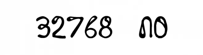
( Fonts by Divide By Zero! - fonts.tom7.com )
A playful, handwritten font with bold, rounded characters and a whimsical style.
![32768 NO font caratteri gratis]() Scaricare 981 Downloads@WebFont
Scaricare 981 Downloads@WebFont -
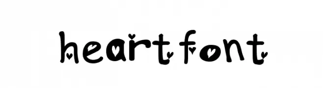
![heartfont font caratteri gratis]() Scaricare 981 Downloads@WebFont
Scaricare 981 Downloads@WebFont -
( Fonts by Mocha Frappuccino - Personal-use only. For commercial use please contact owner. )
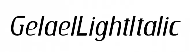
A sleek, modern italic font with smooth, light strokes and excellent readability.
![GelaelLightItalic font caratteri gratis]() Scaricare 980 Downloads@WebFont
Scaricare 980 Downloads@WebFont -
( Fonts by Patria Ari Typestudio - Patria Ari - Personal-use only. For commercial use please contact owner. )
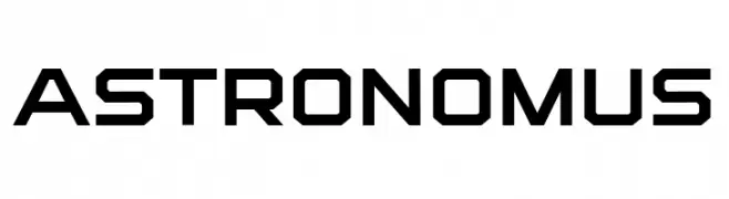
A bold, geometric font with a futuristic and technical style.
![Astronomus font caratteri gratis]() Scaricare 980 Downloads@WebFont
Scaricare 980 Downloads@WebFont -
-
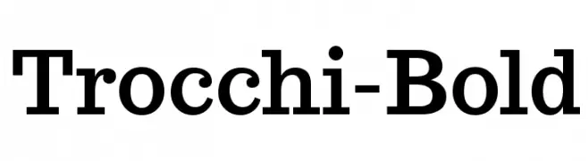
( Fonts by Vernon Adams - Personal-use only. For commercial use please contact owner. )
A bold serif font with strong vertical strokes and slightly curved serifs.
![Trocchi-Bold font caratteri gratis]() Scaricare 980 Downloads@WebFont
Scaricare 980 Downloads@WebFont -
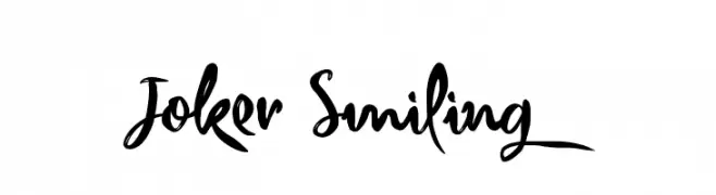
( Typhoon Type - Suthi Srisopha - www.typhoontype.net )
A bold, expressive script font with a hand-drawn calligraphic style.
![Joker Smiling font caratteri gratis]() Scaricare 980 Downloads@WebFont
Scaricare 980 Downloads@WebFont -
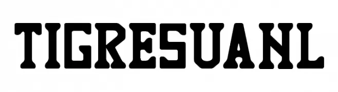
( Jaime Rangel Castro )
A bold, athletic font with a vintage slab serif style.
![TIGRES UANL font caratteri gratis]() Scaricare 980 Downloads@WebFont
Scaricare 980 Downloads@WebFont -
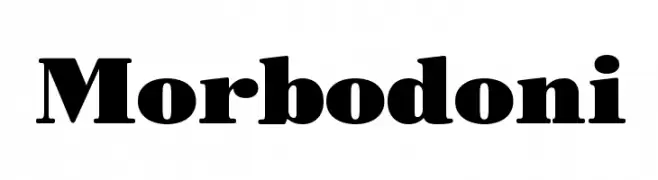
( Fonts by Zetafonts )
A bold, high-contrast serif font with strong, elegant strokes.
![Morbodoni font caratteri gratis]() Scaricare 980 Downloads@WebFont
Scaricare 980 Downloads@WebFont -
( Fonts by Sergei Godovalov - www.iomaio.ru - Personal-use only. For commercial use please contact owner. )
A bold slab serif font with a modern yet classic appeal.
![IkraSlab font caratteri gratis]() Scaricare 980 Downloads@WebFont
Scaricare 980 Downloads@WebFont
Quali sono i font più popolari adesso?
Poppins, Roboto, Montserrat, Open Sans e Lato sono molto usati per le forme pulite e l'ampia applicabilità — dall'identità di marca alle landing page e ai poster.
Quali font si usano spesso nei loghi?
Le sans serif geometriche (es. Poppins, famiglie in stile Gotham) sono scelte comuni per un branding pulito e scalabile. Per un tocco personale restano valide script e stili manoscritti. Abbina un display deciso per i titoli a un corpo testo neutro per riconoscibilità ed equilibrio.
Ogni quanto si aggiorna la lista?
Con regolarità, in base ai download e all'attività reale. Torna spesso per scoprire in anticipo le nuove preferite.
💡 Consiglio: aggiungi ai preferiti — le tendenze cambiano in fretta e i font top di oggi possono ispirare il rebranding di domani.