Benvenuto nelle Font Più Popolari — dove popolarità e qualità si incontrano. Qui trovi i font più scaricati e usati dell'anno. Se cerchi scelte sicure per logo, web o social, inizia da qui.
Ogni font top si distingue per equilibrio, leggibilità e versatilità. Troverai sans serif moderne, script eleganti, serif vintage e display minimalisti.
-
 Scaricare 962 Downloads@WebFont
 -
![Hrom font caratteri gratis]() Scaricare 962 Downloads
Scaricare 962 Downloads -
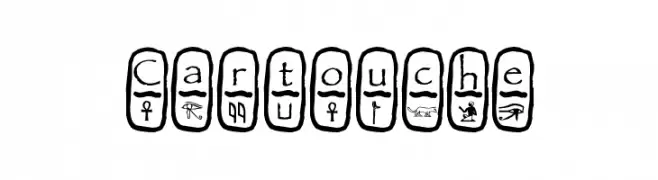
![Cartouche font caratteri gratis]() Scaricare 962 Downloads@WebFont
Scaricare 962 Downloads@WebFont -
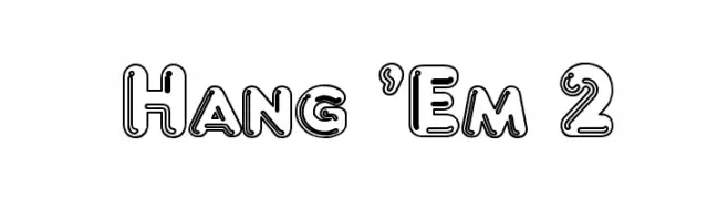
![Hang 'Em 2 font caratteri gratis]() Scaricare 962 Downloads@WebFont
Scaricare 962 Downloads@WebFont -
( Fonts by Typodermic Fonts - Raymond Larabie - Personal-use only. For commercial use please contact owner. )
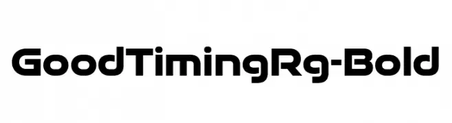
A bold, modern sans-serif font with geometric influences and consistent stroke weight.
![GoodTimingRg-Bold font caratteri gratis]() Scaricare 961 Downloads@WebFont
Scaricare 961 Downloads@WebFont -
-
( Fonts by Pustudio )
A playful, hand-drawn font with bold, rounded strokes and a whimsical style.
![BlueBucket font caratteri gratis]() Scaricare 961 Downloads@WebFont
Scaricare 961 Downloads@WebFont -
( Personal-use only. For commercial use please contact owner. )
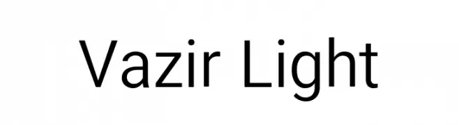
A clean, modern sans-serif font with excellent readability and a geometric touch.
![Vazir Light font caratteri gratis]() Scaricare 961 Downloads@WebFont
Scaricare 961 Downloads@WebFont -
( Fonts by Fonts by Rasmus Andersson / Changes by Cristiano Sobral with parts from Marc Monis - Personal-use only. For commercial use please contact owner. )
A modern, light sans-serif font with clean lines and balanced spacing.
![LinikSans-Light font caratteri gratis]() Scaricare 961 Downloads@WebFont
Scaricare 961 Downloads@WebFont -
( Fonts by Peter Wiegel - www.peter-wiegel.de - Personal-use only. For commercial use please contact owner. )
A bold, distressed typewriter-style font with a vintage, textured appearance.
![ErikasBuero-Bold font caratteri gratis]() Scaricare 961 Downloads@WebFont
Scaricare 961 Downloads@WebFont -
( Fonts by dpsd beyond - Personal-use only. For commercial use please contact owner. )
A modern, geometric font with rounded edges and high legibility.
![DPSDbeyond font caratteri gratis]() Scaricare 961 Downloads@WebFont
Scaricare 961 Downloads@WebFont


Quali sono i font più popolari adesso?
Poppins, Roboto, Montserrat, Open Sans e Lato sono molto usati per le forme pulite e l'ampia applicabilità — dall'identità di marca alle landing page e ai poster.
Quali font si usano spesso nei loghi?
Le sans serif geometriche (es. Poppins, famiglie in stile Gotham) sono scelte comuni per un branding pulito e scalabile. Per un tocco personale restano valide script e stili manoscritti. Abbina un display deciso per i titoli a un corpo testo neutro per riconoscibilità ed equilibrio.
Ogni quanto si aggiorna la lista?
Con regolarità, in base ai download e all'attività reale. Torna spesso per scoprire in anticipo le nuove preferite.
💡 Consiglio: aggiungi ai preferiti — le tendenze cambiano in fretta e i font top di oggi possono ispirare il rebranding di domani.