Benvenuto nelle Font Più Popolari — dove popolarità e qualità si incontrano. Qui trovi i font più scaricati e usati dell'anno. Se cerchi scelte sicure per logo, web o social, inizia da qui.
Ogni font top si distingue per equilibrio, leggibilità e versatilità. Troverai sans serif moderne, script eleganti, serif vintage e display minimalisti.
-
 Scaricare 2889 Downloads
 -
![BA Wet Paint 1980 font caratteri gratis]() Scaricare 2889 Downloads@WebFont
Scaricare 2889 Downloads@WebFont -
![Old Republic font caratteri gratis]() Scaricare 2889 Downloads@WebFont
Scaricare 2889 Downloads@WebFont -
( TheReconLegend - Esteban Muñoz )
A bold, classic serif font with high contrast and elegant curves.
![The Soul Of Vodka font caratteri gratis]() Scaricare 2888 Downloads@WebFont
Scaricare 2888 Downloads@WebFont -
![Mechalock font caratteri gratis]() Scaricare 2888 Downloads@WebFont
Scaricare 2888 Downloads@WebFont -
![SF Alien Encounters Solid font caratteri gratis]() Scaricare 2888 Downloads@WebFont
Scaricare 2888 Downloads@WebFont -
Caratteri di letterhanna. For commercial use please contact the owner.
( THIS FONT is Free for personal, Paid for commercial use By installing or using this font, you are hereby agree to this Product Usage Agreement: 1. This font is ONLY FOR PERSONAL USE 2. You are REQUIRES A LICENSE for PROMOTIONAL or COMMERCIAL USE 3. You )
A graceful script font with fluid, interconnected strokes and elegant flourishes.
![Majestic Wisteria Free Regular font caratteri gratis]() Scaricare 2887 Downloads@WebFont
Scaricare 2887 Downloads@WebFont -
( Fonts by iamjoshuabrooks.co.uk - Joshua Brooks. Personal-use only. For commercial use please contact owner. )
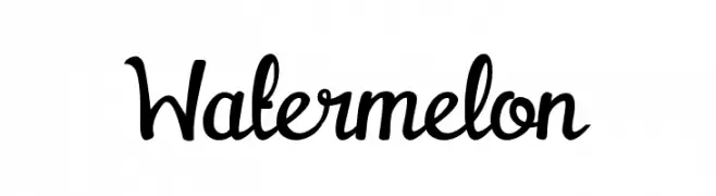
A playful, bold script font with flowing, cursive letterforms.
![Watermelon font caratteri gratis]() Scaricare 2887 Downloads@WebFont
Scaricare 2887 Downloads@WebFont -
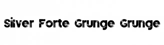
![Silver Forte Grunge Grunge font caratteri gratis]() Scaricare 2887 Downloads@WebFont
Scaricare 2887 Downloads@WebFont -
( Fonts by Steve Deffeyes - www.deffeyes.com )
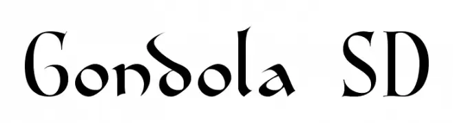
A classic, calligraphic font with elegant serifs and ornate lowercase letters.
![Gondola SD font caratteri gratis]() Scaricare 2887 Downloads@WebFont
Scaricare 2887 Downloads@WebFont -
( Fonts by Graham Meade - GemFonts )
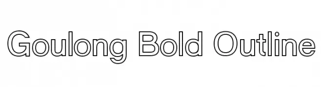
A bold outlined sans-serif font with a modern and clean design.
![Goulong Bold Outline font caratteri gratis]() Scaricare 2886 Downloads@WebFont
Scaricare 2886 Downloads@WebFont -
![Buckingham Regular font caratteri gratis]() Scaricare 2885 Downloads@WebFont
Scaricare 2885 Downloads@WebFont -
( 7NTypes - Situjuh Nazara - 7ntypes.com )
A bold, playful script font with a handwritten style.
![Misses font caratteri gratis]() Scaricare 2884 Downloads@WebFont
Scaricare 2884 Downloads@WebFont -
( Copyright (c) 2015, Christian Thalmann and the Cormorant Project Authors (github.com/CatharsisFonts/Cormorant) )
A classic serif font with high contrast and elegant strokes.
![Cormorant Bold font caratteri gratis]() Scaricare 2884 Downloads@WebFont
Scaricare 2884 Downloads@WebFont -
( Copyright (c) 2011 Alejandro Paul (sudtipos@sudtipos.com) )
An elegant script font with ornate uppercase letters and smooth, flowing lowercase characters.
![MonsieurLaDoulaise-Regular font caratteri gratis]() Scaricare 2884 Downloads@WebFont
Scaricare 2884 Downloads@WebFont -
![Fireye GF 3 Headline font caratteri gratis]() Scaricare 2884 Downloads@WebFont
Scaricare 2884 Downloads@WebFont -
![Fashion Fetish font caratteri gratis]() Scaricare 2883 Downloads@WebFont
Scaricare 2883 Downloads@WebFont -
![Kuriero Esperanto Normala font caratteri gratis]() Scaricare 2883 Downloads
Scaricare 2883 Downloads -
![Raider Crusader Straight font caratteri gratis]() Scaricare 2882 Downloads@WebFont
Scaricare 2882 Downloads@WebFont -
![Heather Regular font caratteri gratis]() Scaricare 2882 Downloads@WebFont
Scaricare 2882 Downloads@WebFont -
( Fonts by Alit Suarnegara - Alit Design - www.alitdesign.net - Personal-use only. For commercial use please contact owner. )
A bold, modern font with a geometric and angular design.
![SHARY Bold font caratteri gratis]() Scaricare 2880 Downloads@WebFont
Scaricare 2880 Downloads@WebFont -
( Copyright (c) 2012-2015, The Mozilla Foundation and Telefonica S.A. )
A modern, geometric sans-serif typeface with excellent readability.
![Fira Sans Regular font caratteri gratis]() Scaricare 2880 Downloads@WebFont
Scaricare 2880 Downloads@WebFont -
![KNU-Karen Normal Unique font caratteri gratis]() Scaricare 2880 Downloads@WebFont
Scaricare 2880 Downloads@WebFont -
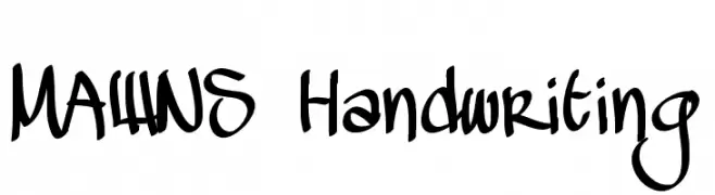
( Fonts by Mans Greback - www.mawns.com )
A dynamic and expressive handwritten font with fluid strokes and a creative flair.
![MAWNS Handwriting font caratteri gratis]() Scaricare 2880 Downloads@WebFont
Scaricare 2880 Downloads@WebFont -
![NHL Edge Los Angeles font caratteri gratis]() Scaricare 2880 Downloads@WebFont
Scaricare 2880 Downloads@WebFont -
( Fonts by www.woodcutter.es - woodcutter Manero - Personal-use only. For commercial use please contact owner. )
A bold, blocky font with uniform stroke width, ideal for impactful designs.
![Crochet font caratteri gratis]() Scaricare 2879 Downloads@WebFont
Scaricare 2879 Downloads@WebFont -
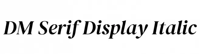
( Copyright 2014-2018 Adobe (http://www.adobe.com/), with Reserved Font Name 'Source'. All Rights Reserved. Source is a trademark of Adobe in the United States and/or other countries. )
An elegant serif typeface with a classic italic style, perfect for sophisticated designs.
![DM Serif Display Italic font caratteri gratis]() Scaricare 2878 Downloads@WebFont
Scaricare 2878 Downloads@WebFont -
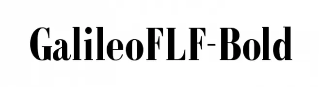
( Fonts by Casady & Greene )
A bold, classic serif font with strong contrast and formal elegance.
![GalileoFLF-Bold font caratteri gratis]() Scaricare 2877 Downloads@WebFont
Scaricare 2877 Downloads@WebFont -
( Fonts by Apostrophic Lab )
An elegant and flowing script font with ornate swashes and high contrast.
![Freebooter Script - Alts font caratteri gratis]() Scaricare 2877 Downloads@WebFont
Scaricare 2877 Downloads@WebFont -
( Fonts by deFharo - Personal-use only. For commercial use please contact owner. )
A bold, angular, and slanted font with a modern, geometric style.
![Octuple max Solid font caratteri gratis]() Scaricare 2876 Downloads@WebFont
Scaricare 2876 Downloads@WebFont -
![DKKaikoura font caratteri gratis]() Scaricare 2876 Downloads@WebFont
Scaricare 2876 Downloads@WebFont -
( Copyright 2015 by Andres Torresi. All rights reserved. )
A bold, modern sans-serif font with clean lines and excellent readability.
![Sarala Bold font caratteri gratis]() Scaricare 2876 Downloads@WebFont
Scaricare 2876 Downloads@WebFont -
![NFL Oilers Vintage font caratteri gratis]() Scaricare 2876 Downloads@WebFont
Scaricare 2876 Downloads@WebFont -
Caratteri di HammerBro101. For commercial use please contact the owner.
![SpongeBob Advance Regular font caratteri gratis]() Scaricare 2875 Downloads@WebFont
Scaricare 2875 Downloads@WebFont -
( Copyright (c) 2012-2015, Omnibus-Type (www.omnibus-type.com|omnibus.type@gmail.com) )
A clean, modern sans-serif typeface with consistent stroke width and excellent readability.
![Jaldi font caratteri gratis]() Scaricare 2875 Downloads@WebFont
Scaricare 2875 Downloads@WebFont


Quali sono i font più popolari adesso?
Poppins, Roboto, Montserrat, Open Sans e Lato sono molto usati per le forme pulite e l'ampia applicabilità — dall'identità di marca alle landing page e ai poster.
Quali font si usano spesso nei loghi?
Le sans serif geometriche (es. Poppins, famiglie in stile Gotham) sono scelte comuni per un branding pulito e scalabile. Per un tocco personale restano valide script e stili manoscritti. Abbina un display deciso per i titoli a un corpo testo neutro per riconoscibilità ed equilibrio.
Ogni quanto si aggiorna la lista?
Con regolarità, in base ai download e all'attività reale. Torna spesso per scoprire in anticipo le nuove preferite.
💡 Consiglio: aggiungi ai preferiti — le tendenze cambiano in fretta e i font top di oggi possono ispirare il rebranding di domani.