Benvenuto nelle Font Più Popolari — dove popolarità e qualità si incontrano. Qui trovi i font più scaricati e usati dell'anno. Se cerchi scelte sicure per logo, web o social, inizia da qui.
Ogni font top si distingue per equilibrio, leggibilità e versatilità. Troverai sans serif moderne, script eleganti, serif vintage e display minimalisti.
-
 Scaricare 2825 Downloads
 -
( Fonts by MadeType - Personal-use only. For commercial use please contact owner. )
A bold, modern sans-serif font with strong geometric shapes.
![MADETOMMY-Black font caratteri gratis]() Scaricare 2824 Downloads@WebFont
Scaricare 2824 Downloads@WebFont -
( Fonts by Diogene - Claude Pelletier )
A bold, geometric font with strong strokes and modern appeal.
![Bold font caratteri gratis]() Scaricare 2824 Downloads@WebFont
Scaricare 2824 Downloads@WebFont -
![Balker font caratteri gratis]() Scaricare 2824 Downloads@WebFont
Scaricare 2824 Downloads@WebFont -
( Fonts by Kurnia Setyadi )
A playful, bold font with rounded edges and a hand-drawn feel.
![Coconut Cookies font caratteri gratis]() Scaricare 2823 Downloads@WebFont
Scaricare 2823 Downloads@WebFont -
-
( Fonts by Billy Argel )
A bold, distressed font with a rugged, vintage texture.
![Cross Town font caratteri gratis]() Scaricare 2823 Downloads@WebFont
Scaricare 2823 Downloads@WebFont -
![PokerHunters font caratteri gratis]() Scaricare 2823 Downloads@WebFont
Scaricare 2823 Downloads@WebFont -
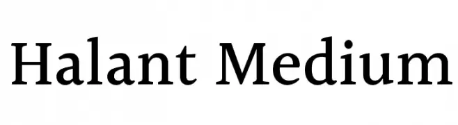
( Copyright (c) 2014, Indian Type Foundry (info@indiantypefoundry.com). )
A modern serif font with medium weight and balanced proportions.
![Halant Medium font caratteri gratis]() Scaricare 2823 Downloads@WebFont
Scaricare 2823 Downloads@WebFont -
![Bou Collegiate font caratteri gratis]() Scaricare 2823 Downloads@WebFont
Scaricare 2823 Downloads@WebFont -
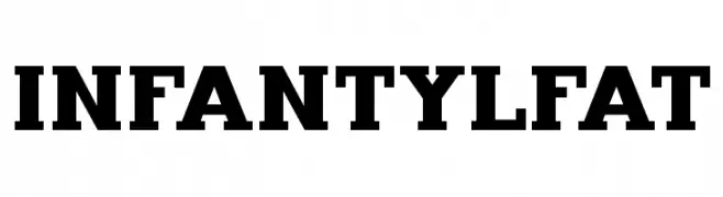
( Fonts by Bartek Nowak - www.nowak.tv/fontoholic/ )
A bold and impactful font with thick strokes, ideal for headlines.
![InfantylFat font caratteri gratis]() Scaricare 2823 Downloads@WebFont
Scaricare 2823 Downloads@WebFont -
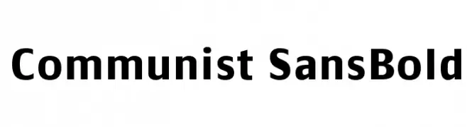
![Communist SansBold font caratteri gratis]() Scaricare 2822 Downloads@WebFont
Scaricare 2822 Downloads@WebFont -
( Fonts by Everything Burns - www.everythingburns.com )
A bold, playful font with rounded, cartoonish characters.
![ToonishRegular font caratteri gratis]() Scaricare 2821 Downloads@WebFont
Scaricare 2821 Downloads@WebFont -
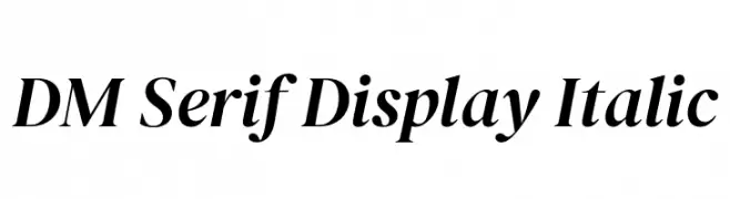
( Copyright 2014-2018 Adobe (http://www.adobe.com/), with Reserved Font Name 'Source'. All Rights Reserved. Source is a trademark of Adobe in the United States and/or other countries. )
An elegant serif typeface with a classic italic style, perfect for sophisticated designs.
![DM Serif Display Italic font caratteri gratis]() Scaricare 2820 Downloads@WebFont
Scaricare 2820 Downloads@WebFont -
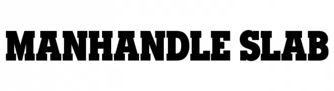
( HENRIavecunK - Henrik )
A bold slab serif font with thick serifs and a strong, impactful presence.
![Manhandle Slab font caratteri gratis]() Scaricare 2819 Downloads@WebFont
Scaricare 2819 Downloads@WebFont -
![Albatross Bold font caratteri gratis]() Scaricare 2819 Downloads@WebFont
Scaricare 2819 Downloads@WebFont -
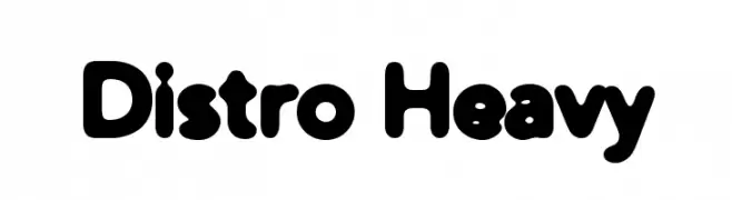
( Fonts by Apostrophic Lab )
A bold, rounded font with a playful and friendly appearance.
![Distro Heavy font caratteri gratis]() Scaricare 2819 Downloads@WebFont
Scaricare 2819 Downloads@WebFont -
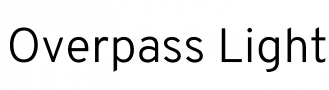
( Copyright (c) 2016 by Red Hat, Inc. All rights reserved. )
A clean, modern sans-serif font with geometric letterforms and uniform stroke width.
![Overpass Light font caratteri gratis]() Scaricare 2818 Downloads@WebFont
Scaricare 2818 Downloads@WebFont -
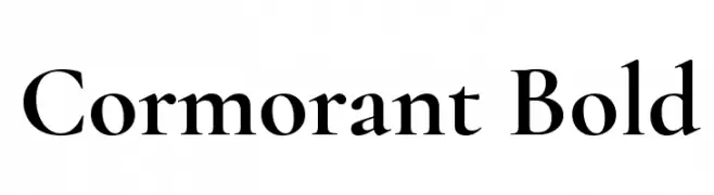
( Copyright (c) 2015, Christian Thalmann and the Cormorant Project Authors (github.com/CatharsisFonts/Cormorant) )
A classic serif font with high contrast and elegant strokes.
![Cormorant Bold font caratteri gratis]() Scaricare 2818 Downloads@WebFont
Scaricare 2818 Downloads@WebFont -
( Fonts by Kreative Korporation - www.kreativekorp.com )
A playful, hand-drawn font with whimsical stick figure illustrations integrated into the letters.
![Kaileen font caratteri gratis]() Scaricare 2818 Downloads@WebFont
Scaricare 2818 Downloads@WebFont -
![Cicle Semi font caratteri gratis]() Scaricare 2818 Downloads@WebFont
Scaricare 2818 Downloads@WebFont -
( Fonts by Pennyzine - www.thedevilinjasonramirez.com - Free for personal use )
A bold, distressed font with a vintage, textured appearance.
![Hotel Coral Essex font caratteri gratis]() Scaricare 2818 Downloads@WebFont
Scaricare 2818 Downloads@WebFont -
![Roboto Mono font caratteri gratis]() Scaricare 2817 Downloads@WebFont
Scaricare 2817 Downloads@WebFont -
( Fonts by Geronimo Fonts - Personal-use only. For commercial use please contact owner. )
A bold, geometric font with an industrial, mechanical aesthetic.
![Crash Test Regular font caratteri gratis]() Scaricare 2817 Downloads@WebFont
Scaricare 2817 Downloads@WebFont -
![Wizard World Simplified font caratteri gratis]() Scaricare 2816 Downloads@WebFont
Scaricare 2816 Downloads@WebFont -
( Fonts by www.fontbundles.net - Personal-use only. For commercial use please contact owner. )
A classic serif font with elegant, well-proportioned characters and refined serifs.
![The Queen Regular font caratteri gratis]() Scaricare 2816 Downloads@WebFont
Scaricare 2816 Downloads@WebFont -
( Fonts by Billy Argel - www.billyargel.com - Personal-use only. For commercial use please contact owner. )
A bold, cursive font with a smooth, flowing style.
![Sunset Clouds Personal Use font caratteri gratis]() Scaricare 2816 Downloads@WebFont
Scaricare 2816 Downloads@WebFont -
( Fonts by Nick Curtis - www.nicksfonts.com )
A tall, narrow font with rounded edges, blending modern and vintage styles.
![Bittersweet NF font caratteri gratis]() Scaricare 2816 Downloads@WebFont
Scaricare 2816 Downloads@WebFont -
( Fonts by Zetafonts - Personal-use only. For commercial use please contact owner. )
A bold, sans-serif font with a strong, modern presence.
![Heading Now Trial 56 Bold font caratteri gratis]() Scaricare 2815 Downloads@WebFont
Scaricare 2815 Downloads@WebFont -
![Raider Crusader Straight font caratteri gratis]() Scaricare 2815 Downloads@WebFont
Scaricare 2815 Downloads@WebFont -
![Pokemon Unown GB font caratteri gratis]() Scaricare 2815 Downloads@WebFont
Scaricare 2815 Downloads@WebFont -
![Blue Highway D Type font caratteri gratis]() Scaricare 2815 Downloads@WebFont
Scaricare 2815 Downloads@WebFont -
( Fonts by Graham Meade - GemFonts )
A modern, geometric font with smooth, rounded edges and consistent structure.
![FortuneCity font caratteri gratis]() Scaricare 2815 Downloads@WebFont
Scaricare 2815 Downloads@WebFont -
( Fonts by www.studiotypo.com - Personal-use only. For commercial use please contact owner. )
A bold, geometric font with a modern, futuristic style.
![E-SQUARE font caratteri gratis]() Scaricare 2814 Downloads@WebFont
Scaricare 2814 Downloads@WebFont -
( Copyright (c) 2011 by Sorkin Type Co (www.sorkintype.com) )
A bold, shadowed decorative font with a modern and vintage appeal.
![VastShadow-Regular font caratteri gratis]() Scaricare 2814 Downloads@WebFont
Scaricare 2814 Downloads@WebFont -
![Milford font caratteri gratis]() Scaricare 2814 Downloads@WebFont
Scaricare 2814 Downloads@WebFont


Quali sono i font più popolari adesso?
Poppins, Roboto, Montserrat, Open Sans e Lato sono molto usati per le forme pulite e l'ampia applicabilità — dall'identità di marca alle landing page e ai poster.
Quali font si usano spesso nei loghi?
Le sans serif geometriche (es. Poppins, famiglie in stile Gotham) sono scelte comuni per un branding pulito e scalabile. Per un tocco personale restano valide script e stili manoscritti. Abbina un display deciso per i titoli a un corpo testo neutro per riconoscibilità ed equilibrio.
Ogni quanto si aggiorna la lista?
Con regolarità, in base ai download e all'attività reale. Torna spesso per scoprire in anticipo le nuove preferite.
💡 Consiglio: aggiungi ai preferiti — le tendenze cambiano in fretta e i font top di oggi possono ispirare il rebranding di domani.