Benvenuto nelle Font Più Popolari — dove popolarità e qualità si incontrano. Qui trovi i font più scaricati e usati dell'anno. Se cerchi scelte sicure per logo, web o social, inizia da qui.
Ogni font top si distingue per equilibrio, leggibilità e versatilità. Troverai sans serif moderne, script eleganti, serif vintage e display minimalisti.
-
 Scaricare 864 Downloads@WebFont
 -
![AIDino-Heavy font caratteri gratis]() Scaricare 864 Downloads@WebFont
Scaricare 864 Downloads@WebFont -
( Fonts by www.TomzWeb.com - Thomas E. Harvey - NOT free - Commercial use requires license )
A bold, dynamic font with thick strokes and sharp angles, perfect for impactful designs.
![Fettash Normal font caratteri gratis]() Scaricare 864 Downloads@WebFont
Scaricare 864 Downloads@WebFont -
( Fonts by Attype Studio )
A playful, bubbly font with a hand-drawn, patchy texture.
![Cutey Patchy Display font caratteri gratis]() Scaricare 863 Downloads@WebFont
Scaricare 863 Downloads@WebFont -
Caratteri di defharo. For commercial use please contact the owner.
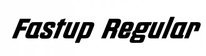
( Fastup Regular and Small Caps is available in two weights (Regular and Bold), geometric design fonts, with a rounded finish on the vertices that provides warmth, with short ascenders and descenders offers a more compact set of letters, the 22° inclination )
A bold, italicized font with a dynamic and sporty style.
![Fastup Regular font caratteri gratis]() Scaricare 863 Downloads@WebFont
Scaricare 863 Downloads@WebFont -
-
( Igor Kosinsky - www.behance.net/Pj154 )
A modern, geometric sans-serif font with clean lines and balanced proportions.
![ft anima Regular font caratteri gratis]() Scaricare 863 Downloads@WebFont
Scaricare 863 Downloads@WebFont -
( Fonts by Nils Cordes )
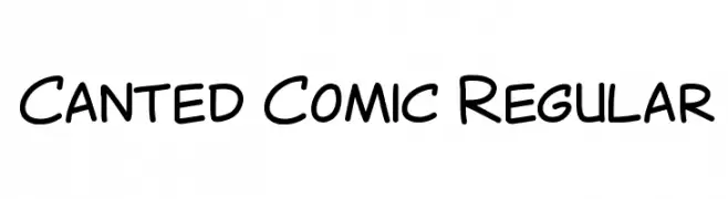
A playful, comic-style handwritten font with rounded, dynamic strokes.
![Canted Comic Regular font caratteri gratis]() Scaricare 863 Downloads@WebFont
Scaricare 863 Downloads@WebFont -
( Fonts by a Neale Davidson - www.pixelsagas.com. Personal-use only. For commercial use please contact owner. )
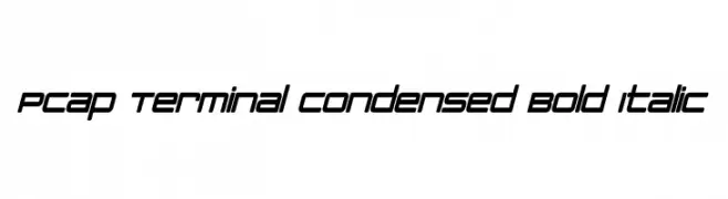
A modern, condensed, bold italic font with a sleek and technical design.
![PCap Terminal Condensed Bold Italic font caratteri gratis]() Scaricare 863 Downloads@WebFont
Scaricare 863 Downloads@WebFont -
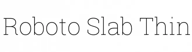
![Roboto Slab Thin font caratteri gratis]() Scaricare 863 Downloads@WebFont
Scaricare 863 Downloads@WebFont -
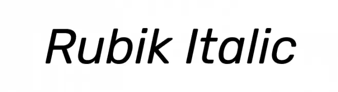
( Copyright 2015 The Rubik Project Authors (https://github.com/googlefonts/rubik) )
A modern, italic sans-serif font with clean lines and medium contrast.
![Rubik Italic font caratteri gratis]() Scaricare 863 Downloads@WebFont
Scaricare 863 Downloads@WebFont


Quali sono i font più popolari adesso?
Poppins, Roboto, Montserrat, Open Sans e Lato sono molto usati per le forme pulite e l'ampia applicabilità — dall'identità di marca alle landing page e ai poster.
Quali font si usano spesso nei loghi?
Le sans serif geometriche (es. Poppins, famiglie in stile Gotham) sono scelte comuni per un branding pulito e scalabile. Per un tocco personale restano valide script e stili manoscritti. Abbina un display deciso per i titoli a un corpo testo neutro per riconoscibilità ed equilibrio.
Ogni quanto si aggiorna la lista?
Con regolarità, in base ai download e all'attività reale. Torna spesso per scoprire in anticipo le nuove preferite.
💡 Consiglio: aggiungi ai preferiti — le tendenze cambiano in fretta e i font top di oggi possono ispirare il rebranding di domani.