Benvenuto nelle Font Più Popolari — dove popolarità e qualità si incontrano. Qui trovi i font più scaricati e usati dell'anno. Se cerchi scelte sicure per logo, web o social, inizia da qui.
Ogni font top si distingue per equilibrio, leggibilità e versatilità. Troverai sans serif moderne, script eleganti, serif vintage e display minimalisti.
-
( Fonts by Four Lines )
A bold, handwritten font with smooth, rounded edges and a playful style.
 Scaricare 866 Downloads@WebFont
 -
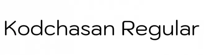
( Copyright 2018 The Kodchasan Project Authors (https://github.com/cadsondemak/Kodchasan) )
A modern, rounded sans-serif font with a clean and friendly appearance.
![Kodchasan Regular font caratteri gratis]() Scaricare 866 Downloads@WebFont
Scaricare 866 Downloads@WebFont -
( Fonts by BLKBK - https://blkbk.ink - Personal-use only. For commercial use please contact owner. Commerciali Caratteri )
A bold, dynamic script font with brush-like strokes and a lively, handwritten feel.
![Live Source font caratteri gratis]() Scaricare 866 Downloads
Scaricare 866 Downloads -
( Fonts by Typesgal - Personal-use only. For commercial use please contact owner. )
A classic serif font with pronounced serifs and a timeless, elegant style.
![Litoland font caratteri gratis]() Scaricare 866 Downloads@WebFont
Scaricare 866 Downloads@WebFont -
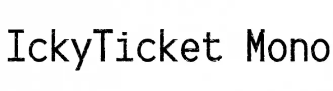
![IckyTicket Mono font caratteri gratis]() Scaricare 866 Downloads@WebFont
Scaricare 866 Downloads@WebFont -
-
( Fonts by Joanne Blanco )
A playful, handwritten-style font with a casual and friendly vibe.
![Joanne's Freehand font caratteri gratis]() Scaricare 866 Downloads@WebFont
Scaricare 866 Downloads@WebFont -
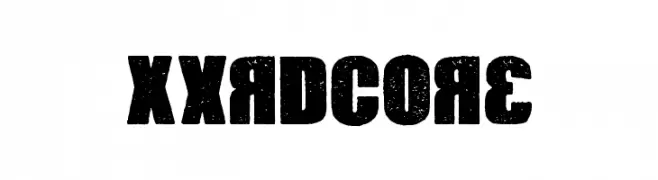
( Fonts by Chequered Ink )
A bold, distressed font with a rugged, textured appearance.
![Xxrdcore font caratteri gratis]() Scaricare 866 Downloads@WebFont
Scaricare 866 Downloads@WebFont -
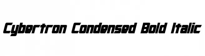
![Cybertron Condensed Bold Italic font caratteri gratis]() Scaricare 866 Downloads@WebFont
Scaricare 866 Downloads@WebFont -
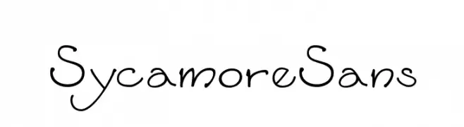
( Fonts by Sam Wang )
A playful and whimsical font with unique, irregular strokes and a script-like appearance.
![SycamoreSans font caratteri gratis]() Scaricare 866 Downloads@WebFont
Scaricare 866 Downloads@WebFont -
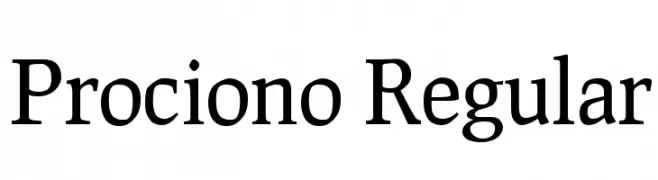
( Fonts by The League of Moveable Type - theleagueofmoveabletype.com )
A classic serif font with a refined and elegant appearance.
![Prociono Regular font caratteri gratis]() Scaricare 866 Downloads@WebFont
Scaricare 866 Downloads@WebFont


Quali sono i font più popolari adesso?
Poppins, Roboto, Montserrat, Open Sans e Lato sono molto usati per le forme pulite e l'ampia applicabilità — dall'identità di marca alle landing page e ai poster.
Quali font si usano spesso nei loghi?
Le sans serif geometriche (es. Poppins, famiglie in stile Gotham) sono scelte comuni per un branding pulito e scalabile. Per un tocco personale restano valide script e stili manoscritti. Abbina un display deciso per i titoli a un corpo testo neutro per riconoscibilità ed equilibrio.
Ogni quanto si aggiorna la lista?
Con regolarità, in base ai download e all'attività reale. Torna spesso per scoprire in anticipo le nuove preferite.
💡 Consiglio: aggiungi ai preferiti — le tendenze cambiano in fretta e i font top di oggi possono ispirare il rebranding di domani.