Benvenuto nelle Font Più Popolari — dove popolarità e qualità si incontrano. Qui trovi i font più scaricati e usati dell'anno. Se cerchi scelte sicure per logo, web o social, inizia da qui.
Ogni font top si distingue per equilibrio, leggibilità e versatilità. Troverai sans serif moderne, script eleganti, serif vintage e display minimalisti.
-
 Scaricare 2627 Downloads@WebFont
 -
![Little Days font caratteri gratis]() Scaricare 2627 Downloads@WebFont
Scaricare 2627 Downloads@WebFont -
![Almagro Regular font caratteri gratis]() Scaricare 2627 Downloads@WebFont
Scaricare 2627 Downloads@WebFont -
( Fonts by Alan Carr )
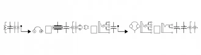
A comprehensive set of electronic component symbols for technical diagrams.
![Carr Electronic Dingbats font caratteri gratis]() Scaricare 2627 Downloads@WebFont
Scaricare 2627 Downloads@WebFont -
( Fonts by www.gliphmaker.com. Personal-use only. For commercial use please contact owner. )
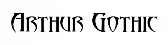
A bold, Gothic-inspired font with sharp, angular lines and high contrast.
![Arthur Gothic font caratteri gratis]() Scaricare 2626 Downloads@WebFont
Scaricare 2626 Downloads@WebFont -
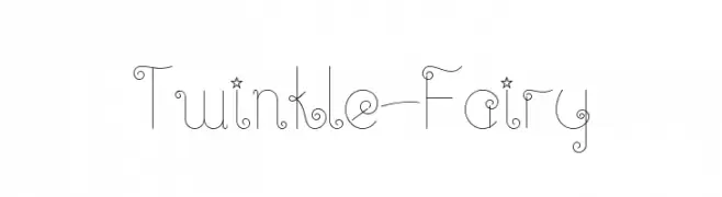
![Twinkle-Fairy font caratteri gratis]() Scaricare 2626 Downloads@WebFont
Scaricare 2626 Downloads@WebFont -
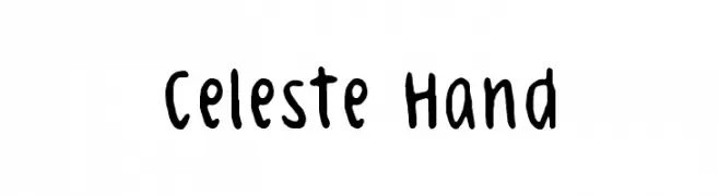
( Fonts by Pi Luo Chiu - thisisallenchiu.tumblr.com )
A playful, handwritten font with bold, rounded strokes and a casual, friendly style.
![Celeste Hand font caratteri gratis]() Scaricare 2626 Downloads@WebFont
Scaricare 2626 Downloads@WebFont -
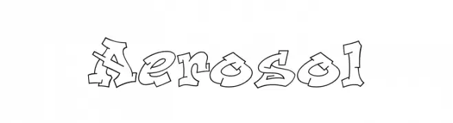
( Fonts by Bright Ideas )
A bold, graffiti-style font with angular, dynamic forms and a three-dimensional effect.
![Aerosol font caratteri gratis]() Scaricare 2626 Downloads@WebFont
Scaricare 2626 Downloads@WebFont -
( Copyright 2013 Seoul Metropolitan Government (gonabis@seoul.go.kr) )
A modern serif font with elegant curves and balanced proportions.
![SeoulHangang B font caratteri gratis]() Scaricare 2625 Downloads@WebFont
Scaricare 2625 Downloads@WebFont -
( Copyright (c) 2011 by vernon adams (vern@newtypography.co.uk) )
A bold, playful font with thick, rounded strokes.
![Rammetto One Regular font caratteri gratis]() Scaricare 2625 Downloads@WebFont
Scaricare 2625 Downloads@WebFont -
( Fonts by Mike Wolf )
A bold, urban font with a 3D graffiti-inspired style.
![inner city font caratteri gratis]() Scaricare 2625 Downloads@WebFont
Scaricare 2625 Downloads@WebFont -
( Fonts by Castcraft Software - opti.netii.net - check the website before use )
A bold, geometric font with clean lines and modern style.
![OPTIBuffer-Bold font caratteri gratis]() Scaricare 2624 Downloads@WebFont
Scaricare 2624 Downloads@WebFont -
( Copyright 2010 The Neuton Project Authors (http://www.21326.info/), with Reserved Font Name "Neuton". )
A modern serif font with elegant italic styling and sharp serifs.
![Neuton Italic font caratteri gratis]() Scaricare 2624 Downloads@WebFont
Scaricare 2624 Downloads@WebFont -
![Name This Font Normal font caratteri gratis]() Scaricare 2624 Downloads@WebFont
Scaricare 2624 Downloads@WebFont -
( Shara Weber - sharasfonts.com )
A modern sans-serif font with geometric shapes and uniform strokes.
![CameronSans font caratteri gratis]() Scaricare 2623 Downloads@WebFont
Scaricare 2623 Downloads@WebFont -
![NHL NY Rangers font caratteri gratis]() Scaricare 2623 Downloads@WebFont
Scaricare 2623 Downloads@WebFont -
![Miriam font caratteri gratis]() Scaricare 2623 Downloads@WebFont
Scaricare 2623 Downloads@WebFont -
( Fonts by Castcraft Software - opti.netii.net - check the website before use )
A vintage serif font with an antique, textured style.
![OPTICaslon-Antique font caratteri gratis]() Scaricare 2622 Downloads@WebFont
Scaricare 2622 Downloads@WebFont -
( Google Web Fonts )
A modern, semi-bold italic sans-serif font with excellent readability.
![Open Sans Semibold Italic font caratteri gratis]() Scaricare 2622 Downloads@WebFont
Scaricare 2622 Downloads@WebFont -
![Fox Regular font caratteri gratis]() Scaricare 2622 Downloads@WebFont
Scaricare 2622 Downloads@WebFont -
( Fonts by Ospiro Enterprises - Personal-use only. For commercial use please contact owner. )
A modern, geometric sans-serif font with balanced proportions.
![Gontserrat Medium font caratteri gratis]() Scaricare 2621 Downloads@WebFont
Scaricare 2621 Downloads@WebFont -
![Clear Sans Medium font caratteri gratis]() Scaricare 2621 Downloads@WebFont
Scaricare 2621 Downloads@WebFont -
![Matchbox font caratteri gratis]() Scaricare 2620 Downloads@WebFont
Scaricare 2620 Downloads@WebFont -
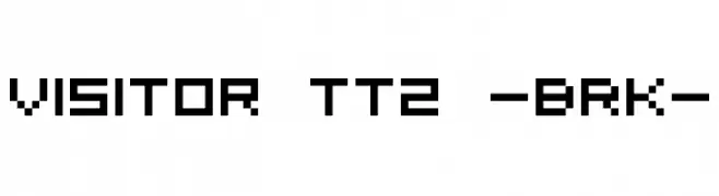
( Fonts by AEnigma - www.aenigmafonts.com )
A pixelated, blocky font with a retro digital aesthetic.
![Visitor TT2 -BRK- font caratteri gratis]() Scaricare 2620 Downloads@WebFont
Scaricare 2620 Downloads@WebFont -
![-banhart- ver 010 font caratteri gratis]() Scaricare 2619 Downloads@WebFont
Scaricare 2619 Downloads@WebFont -
![Pelham font caratteri gratis]() Scaricare 2618 Downloads@WebFont
Scaricare 2618 Downloads@WebFont -
( Fonts are free for a personal use only - www.cuttyfruty.com )
An artistic, cursive script with elaborate swirls and decorative flourishes.
![Jellyka Waterways Seafarers font caratteri gratis]() Scaricare 2618 Downloads@WebFont
Scaricare 2618 Downloads@WebFont -
![Sofachrome font caratteri gratis]() Scaricare 2618 Downloads@WebFont
Scaricare 2618 Downloads@WebFont -
![Angular font caratteri gratis]() Scaricare 2618 Downloads@WebFont
Scaricare 2618 Downloads@WebFont -
![Fatso Italic CS font caratteri gratis]() Scaricare 2617 Downloads@WebFont
Scaricare 2617 Downloads@WebFont -
( Fonts by Graham Meade - GemFonts )
A modern, clean sans-serif font with uniform strokes and rounded edges.
![Goulong font caratteri gratis]() Scaricare 2616 Downloads@WebFont
Scaricare 2616 Downloads@WebFont -
![VDub font caratteri gratis]() Scaricare 2616 Downloads@WebFont
Scaricare 2616 Downloads@WebFont -
( Fonts by BLKBK - https://blkbk.ink - Personal-use only. For commercial use please contact owner. Commerciali Caratteri )
A flowing, elegant script font with smooth, connected strokes.
![Red Vevet font caratteri gratis]() Scaricare 2615 Downloads
Scaricare 2615 Downloads -
( Fonts by Tom Lowe )
A bold, hand-drawn font with a rugged and dynamic style.
![Ripple font caratteri gratis]() Scaricare 2615 Downloads@WebFont
Scaricare 2615 Downloads@WebFont -
![Acid Medium Italic font caratteri gratis]() Scaricare 2615 Downloads@WebFont
Scaricare 2615 Downloads@WebFont


Quali sono i font più popolari adesso?
Poppins, Roboto, Montserrat, Open Sans e Lato sono molto usati per le forme pulite e l'ampia applicabilità — dall'identità di marca alle landing page e ai poster.
Quali font si usano spesso nei loghi?
Le sans serif geometriche (es. Poppins, famiglie in stile Gotham) sono scelte comuni per un branding pulito e scalabile. Per un tocco personale restano valide script e stili manoscritti. Abbina un display deciso per i titoli a un corpo testo neutro per riconoscibilità ed equilibrio.
Ogni quanto si aggiorna la lista?
Con regolarità, in base ai download e all'attività reale. Torna spesso per scoprire in anticipo le nuove preferite.
💡 Consiglio: aggiungi ai preferiti — le tendenze cambiano in fretta e i font top di oggi possono ispirare il rebranding di domani.