Benvenuto nelle Font Più Popolari — dove popolarità e qualità si incontrano. Qui trovi i font più scaricati e usati dell'anno. Se cerchi scelte sicure per logo, web o social, inizia da qui.
Ogni font top si distingue per equilibrio, leggibilità e versatilità. Troverai sans serif moderne, script eleganti, serif vintage e display minimalisti.
-
( Fonts by Dieter Steffmann )
A bold, outlined font with a dynamic and playful style.
 Scaricare 2555 Downloads@WebFont
 -
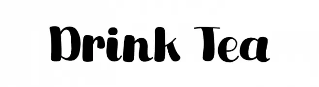
( Fonts by Khurasan )
A bold, playful font with rounded characters and a whimsical style.
![Drink Tea font caratteri gratis]() Scaricare 2554 Downloads@WebFont
Scaricare 2554 Downloads@WebFont -
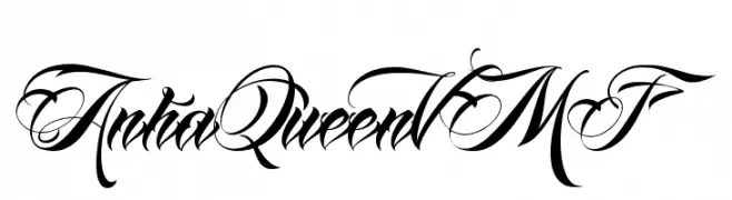
![AnhaQueenVMF font caratteri gratis]() Scaricare 2554 Downloads@WebFont
Scaricare 2554 Downloads@WebFont -
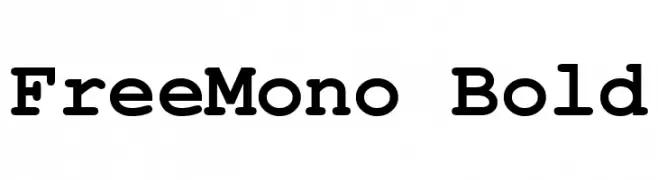
( Fonts by GNU )
A bold, monospaced font with uniform stroke width and rounded edges, ideal for technical use.
![FreeMono Bold font caratteri gratis]() Scaricare 2552 Downloads@WebFont
Scaricare 2552 Downloads@WebFont -
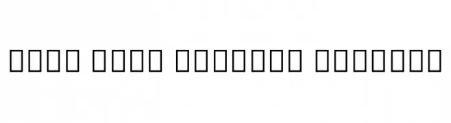
( Noto is a trademark of Google Inc. Noto fonts are open source. All Noto fonts are published under the SIL Open Font License, Version 1.1 )
A clean, modern font supporting the Myanmar script with balanced proportions.
![Noto Sans Myanmar Regular font caratteri gratis]() Scaricare 2552 Downloads@WebFont
Scaricare 2552 Downloads@WebFont -
-
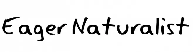
( Fonts by www.tepidmonkey.net )
A playful, handwritten font with bold strokes and a casual, organic feel.
![Eager Naturalist font caratteri gratis]() Scaricare 2552 Downloads@WebFont
Scaricare 2552 Downloads@WebFont -
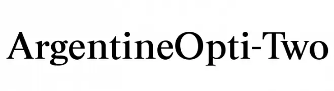
( Fonts by Castcraft Software - opti.netii.net - check the website before use )
A classic serif font with high contrast and elegant design.
![ArgentineOpti-Two font caratteri gratis]() Scaricare 2551 Downloads@WebFont
Scaricare 2551 Downloads@WebFont -
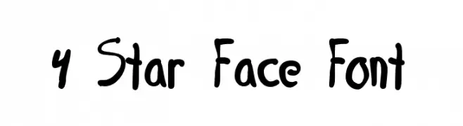
![4 Star Face Font font caratteri gratis]() Scaricare 2551 Downloads@WebFont
Scaricare 2551 Downloads@WebFont -
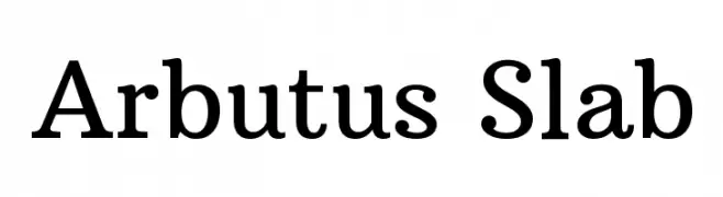
( Copyright (c) 2012 by Sorkin Type Co (www.sorkintype.com) )
A robust slab serif font with medium contrast and strong serifs.
![Arbutus Slab font caratteri gratis]() Scaricare 2550 Downloads@WebFont
Scaricare 2550 Downloads@WebFont -
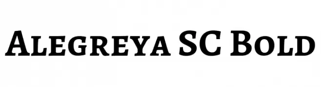
( Copyright 2011 The Alegreya Project Authors (https://github.com/huertatipografica/Alegreya) )
A bold serif typeface with strong serifs and a classic, elegant style.
![Alegreya SC Bold font caratteri gratis]() Scaricare 2549 Downloads@WebFont
Scaricare 2549 Downloads@WebFont -
( Fonts by Mans Greback - www.mawns.com )
Graffiti-inspired font with bold, dripping letters and an urban aesthetic.
![Ruthless Drippin ONE font caratteri gratis]() Scaricare 2549 Downloads@WebFont
Scaricare 2549 Downloads@WebFont -
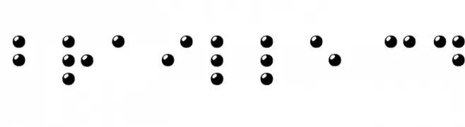
( Fonts by Philippe BLONDEL www.philing.net )
A 3D visual representation of Braille characters using raised spherical dots.
![Braille 3D font caratteri gratis]() Scaricare 2549 Downloads@WebFont
Scaricare 2549 Downloads@WebFont -
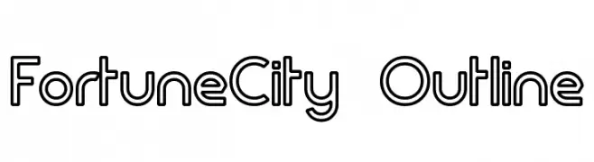
( Fonts by Graham Meade - GemFonts )
A modern, geometric outline font with consistent line thickness.
![FortuneCity Outline font caratteri gratis]() Scaricare 2548 Downloads@WebFont
Scaricare 2548 Downloads@WebFont -
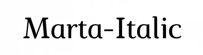
( Fonts by a www.fontfabric.com. Personal-use only. For commercial use please contact owner. )
A classic serif font with elegant curves and a slight italic slant.
![Marta-Italic font caratteri gratis]() Scaricare 2547 Downloads@WebFont
Scaricare 2547 Downloads@WebFont -
( Copyright (c) 2010, Kimberly Geswein (kimberlygeswein.com) )
A playful, handwritten font with a casual and friendly style.
![Gloria Hallelujah font caratteri gratis]() Scaricare 2546 Downloads@WebFont
Scaricare 2546 Downloads@WebFont -
![01tama font caratteri gratis]() Scaricare 2546 Downloads@WebFont
Scaricare 2546 Downloads@WebFont -
( Copyright 2015 The Arima Project Authors (info@ndiscovered.com) )
A bold, playful font with rounded edges and a friendly appearance.
![Arima Madurai Black font caratteri gratis]() Scaricare 2545 Downloads@WebFont
Scaricare 2545 Downloads@WebFont -
( Fonts by Alvaro Thomaz - alvarothomaz.com )
A modern sans-serif font with clean lines and balanced spacing.
![Sheep Sans font caratteri gratis]() Scaricare 2544 Downloads@WebFont
Scaricare 2544 Downloads@WebFont -
( Fonts by Manfred Klein. Free for private and charity use. Free for commercial with donation to organizations )
A modern, tall, and narrow sans-serif font with a clean and minimalistic design.
![MKSansserifLightTallX font caratteri gratis]() Scaricare 2544 Downloads@WebFont
Scaricare 2544 Downloads@WebFont -
( Copyright (c) 2015 Dan Reynolds. )
A bold, modern sans-serif font with clean lines and strong presence.
![Biryani ExtraBold font caratteri gratis]() Scaricare 2543 Downloads@WebFont
Scaricare 2543 Downloads@WebFont -
( Fonts by Nick Curtis - www.nicksfonts.com )
A bold, geometric font with Art Deco influences, featuring tall, narrow characters.
![Dubba Dubba NF font caratteri gratis]() Scaricare 2543 Downloads@WebFont
Scaricare 2543 Downloads@WebFont -
( Zetafonts - www.zetafonts.com )
A modern, geometric sans-serif font with a clean and balanced design.
![Coco Gothic font caratteri gratis]() Scaricare 2542 Downloads@WebFont
Scaricare 2542 Downloads@WebFont -
( Fonts by Darrell Flood - Personal-use only. For commercial use please contact owner. )
A bold, handwritten font with a playful and energetic style.
![Signboard font caratteri gratis]() Scaricare 2541 Downloads@WebFont
Scaricare 2541 Downloads@WebFont -
( Fonts by Aeryn www.draftlight.net/aeryn/ )
A gothic-inspired serif font with sharp, angular serifs and a dramatic flair.
![Evanescence Series B font caratteri gratis]() Scaricare 2541 Downloads@WebFont
Scaricare 2541 Downloads@WebFont -
( Fonts by Luke Owens - Personal-use only. For commercial use please contact owner. )
A modern, high-contrast font with a sleek and elegant design.
![Oregon LDO Light font caratteri gratis]() Scaricare 2540 Downloads@WebFont
Scaricare 2540 Downloads@WebFont -
( Fonts by Altsys Metamorphosis )
A modern, geometric font with bold, angular shapes and a futuristic aesthetic.
![Cupertino Regular font caratteri gratis]() Scaricare 2540 Downloads@WebFont
Scaricare 2540 Downloads@WebFont -
![Terminus font caratteri gratis]() Scaricare 2540 Downloads@WebFont
Scaricare 2540 Downloads@WebFont -
![DK Woolwich Regular font caratteri gratis]() Scaricare 2539 Downloads@WebFont
Scaricare 2539 Downloads@WebFont -
( Copyright 2016 The Cabin Project Authors (impallari@gmail.com) )
A clean, modern sans-serif typeface with balanced proportions and medium weight.
![Cabin Medium font caratteri gratis]() Scaricare 2539 Downloads@WebFont
Scaricare 2539 Downloads@WebFont -
( Fonts by Nick Curtis - www.nicksfonts.com )
A bold, angular font with a futuristic, space-age design.
![SpacePatrol font caratteri gratis]() Scaricare 2539 Downloads@WebFont
Scaricare 2539 Downloads@WebFont -
( Dominique Idiart - dominiqueidiart.myportfolio.com )
A playful, irregular handwritten font with quirky angles and uneven strokes.
![Naive font caratteri gratis]() Scaricare 2538 Downloads@WebFont
Scaricare 2538 Downloads@WebFont -
( Free for a personal use. For a commercial use please visit www.kevinandamanda.com )
A playful, handwritten font with dynamic strokes and a lively appearance.
![Charlie font caratteri gratis]() Scaricare 2538 Downloads@WebFont
Scaricare 2538 Downloads@WebFont -
![Carolingia [BigfooT] Normal font caratteri gratis]() Scaricare 2537 Downloads@WebFont
Scaricare 2537 Downloads@WebFont -
( Fonts by Pinisiart )
A bold, playful font with rounded edges and a bubbly appearance.
![Honey Barry font caratteri gratis]() Scaricare 2536 Downloads@WebFont
Scaricare 2536 Downloads@WebFont -
( Fonts by Szabina Korsos )
A bold, playful handwritten font with thick strokes and a whimsical style.
![Erlan font caratteri gratis]() Scaricare 2536 Downloads@WebFont
Scaricare 2536 Downloads@WebFont


![Carolingia [BigfooT] Normal font caratteri gratis](https://d144mzi0q5mijx.cloudfront.net/img/C/A/Carolingia-BigfooT-Normal.webp)

Quali sono i font più popolari adesso?
Poppins, Roboto, Montserrat, Open Sans e Lato sono molto usati per le forme pulite e l'ampia applicabilità — dall'identità di marca alle landing page e ai poster.
Quali font si usano spesso nei loghi?
Le sans serif geometriche (es. Poppins, famiglie in stile Gotham) sono scelte comuni per un branding pulito e scalabile. Per un tocco personale restano valide script e stili manoscritti. Abbina un display deciso per i titoli a un corpo testo neutro per riconoscibilità ed equilibrio.
Ogni quanto si aggiorna la lista?
Con regolarità, in base ai download e all'attività reale. Torna spesso per scoprire in anticipo le nuove preferite.
💡 Consiglio: aggiungi ai preferiti — le tendenze cambiano in fretta e i font top di oggi possono ispirare il rebranding di domani.