Benvenuto nelle Font Più Popolari — dove popolarità e qualità si incontrano. Qui trovi i font più scaricati e usati dell'anno. Se cerchi scelte sicure per logo, web o social, inizia da qui.
Ogni font top si distingue per equilibrio, leggibilità e versatilità. Troverai sans serif moderne, script eleganti, serif vintage e display minimalisti.
-
( Fonts by CannotIntoSpaceFonts - KineticPlasma Fonts - Personal-use only. For commercial use please contact owner. )
A clean, modern sans-serif font with geometric letterforms and uniform stroke width.
 Scaricare 820 Downloads@WebFont
 -
![Karolina-DEMO Regular font caratteri gratis]() Scaricare 820 Downloads@WebFont
Scaricare 820 Downloads@WebFont -
( Fonts by Ramiro Baldivieso - behance.net/baldivieso. Personal-use only. For commercial use please contact owner. )
A bold, geometric font with a modern, industrial style.
![Bolivia No Problem Regular font caratteri gratis]() Scaricare 820 Downloads@WebFont
Scaricare 820 Downloads@WebFont -
( Fonts by dcoxy | Greg Medina )
A bold, playful font with rounded, thick strokes and tight spacing.
![Vinegar Stroke font caratteri gratis]() Scaricare 820 Downloads@WebFont
Scaricare 820 Downloads@WebFont -
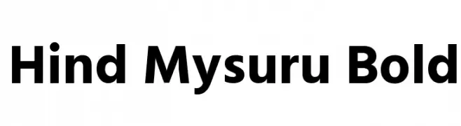
( Copyright (c) 2015 Indian Type Foundry (info@indiantypefoundry.com) )
A bold, modern sans-serif font with clean lines and uniform spacing.
![Hind Mysuru Bold font caratteri gratis]() Scaricare 820 Downloads@WebFont
Scaricare 820 Downloads@WebFont -
-
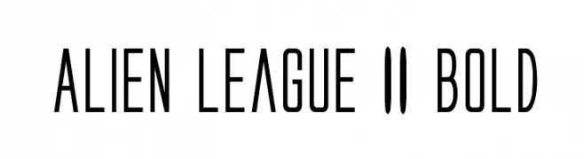
( Fonts by Daniel Zadorozny - www.iconian.com )
A futuristic, geometric font with tall, narrow characters and consistent stroke width.
![Alien League II Bold font caratteri gratis]() Scaricare 820 Downloads@WebFont
Scaricare 820 Downloads@WebFont -
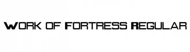
![Work of Fortress Regular font caratteri gratis]() Scaricare 820 Downloads@WebFont
Scaricare 820 Downloads@WebFont -
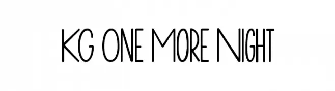
( Fonts by www.kimberlygeswein.com - Kimberly Geswein )
A playful, hand-drawn font with tall, narrow letters and a whimsical style.
![KG One More Night font caratteri gratis]() Scaricare 820 Downloads@WebFont
Scaricare 820 Downloads@WebFont -
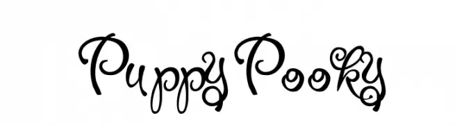
![PuppyPooky font caratteri gratis]() Scaricare 820 Downloads@WebFont
Scaricare 820 Downloads@WebFont -
( Fonts by Taylor Baybutt - ikon3.com - Free for personal use only )
A hand-crafted, calligraphic font with bold, irregular strokes.
![The Missus Hand Strong font caratteri gratis]() Scaricare 820 Downloads@WebFont
Scaricare 820 Downloads@WebFont

Quali sono i font più popolari adesso?
Poppins, Roboto, Montserrat, Open Sans e Lato sono molto usati per le forme pulite e l'ampia applicabilità — dall'identità di marca alle landing page e ai poster.
Quali font si usano spesso nei loghi?
Le sans serif geometriche (es. Poppins, famiglie in stile Gotham) sono scelte comuni per un branding pulito e scalabile. Per un tocco personale restano valide script e stili manoscritti. Abbina un display deciso per i titoli a un corpo testo neutro per riconoscibilità ed equilibrio.
Ogni quanto si aggiorna la lista?
Con regolarità, in base ai download e all'attività reale. Torna spesso per scoprire in anticipo le nuove preferite.
💡 Consiglio: aggiungi ai preferiti — le tendenze cambiano in fretta e i font top di oggi possono ispirare il rebranding di domani.