Benvenuto nelle Font Più Popolari — dove popolarità e qualità si incontrano. Qui trovi i font più scaricati e usati dell'anno. Se cerchi scelte sicure per logo, web o social, inizia da qui.
Ogni font top si distingue per equilibrio, leggibilità e versatilità. Troverai sans serif moderne, script eleganti, serif vintage e display minimalisti.
-
( Fonts by www.tepidmonkey.net )
A dynamic italic font with smooth, flowing curves and a modern, expressive style.
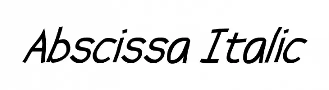 Scaricare 796 Downloads@WebFont
 -
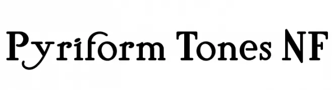
( Fonts by Nick Curtis - www.nicksfonts.com )
A classic serif font with elegant, bold characters and unique lowercase loops.
![Pyriform Tones NF font caratteri gratis]() Scaricare 796 Downloads@WebFont
Scaricare 796 Downloads@WebFont -
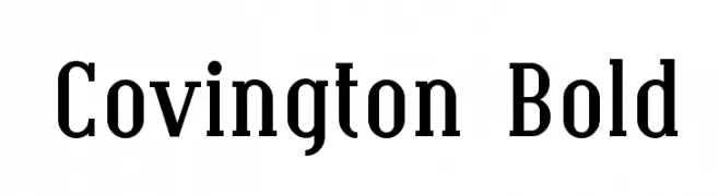
( Fonts by Apostrophic Lab )
A bold, classic serif font with strong vertical emphasis and pronounced serifs.
![Covington Bold font caratteri gratis]() Scaricare 796 Downloads@WebFont
Scaricare 796 Downloads@WebFont -
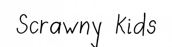
( Fonts by Bree Gorton )
A playful, handwritten font with thin, irregular strokes and a whimsical style.
![Scrawny Kids font caratteri gratis]() Scaricare 796 Downloads@WebFont
Scaricare 796 Downloads@WebFont -
![KR Trilobe font caratteri gratis]() Scaricare 796 Downloads@WebFont
Scaricare 796 Downloads@WebFont -
-
( Fonts by rsperberg - glyphery.com - Personal-use only. For commercial use please contact owner. )
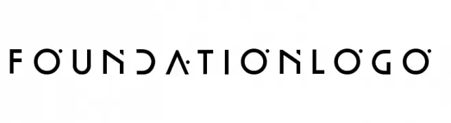
A modern, geometric font with a futuristic and minimalistic design.
![FoundationLogo font caratteri gratis]() Scaricare 795 Downloads@WebFont
Scaricare 795 Downloads@WebFont -
( Fonts by Perspectype Studio - Letterena.com - Personal-use only. For commercial use please contact owner. )
A playful, handwritten font with a casual and elegant style.
![Mergolla Beauty font caratteri gratis]() Scaricare 795 Downloads@WebFont
Scaricare 795 Downloads@WebFont -
( Fonts by fsuarez913 )
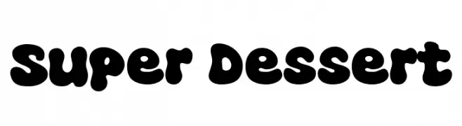
A bold, rounded font with a playful and whimsical style.
![Super Dessert font caratteri gratis]() Scaricare 795 Downloads@WebFont
Scaricare 795 Downloads@WebFont -
( Fonts by Omnibus Type )
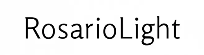
A modern, light-weight font with elegant curvature and excellent readability.
![Rosario Light font caratteri gratis]() Scaricare 795 Downloads@WebFont
Scaricare 795 Downloads@WebFont -
( Fonts by Omaikraf Studio )
A playful and modern font with tall, narrow uppercase letters and artistic special characters.
![Adelaide font caratteri gratis]() Scaricare 795 Downloads@WebFont
Scaricare 795 Downloads@WebFont


Quali sono i font più popolari adesso?
Poppins, Roboto, Montserrat, Open Sans e Lato sono molto usati per le forme pulite e l'ampia applicabilità — dall'identità di marca alle landing page e ai poster.
Quali font si usano spesso nei loghi?
Le sans serif geometriche (es. Poppins, famiglie in stile Gotham) sono scelte comuni per un branding pulito e scalabile. Per un tocco personale restano valide script e stili manoscritti. Abbina un display deciso per i titoli a un corpo testo neutro per riconoscibilità ed equilibrio.
Ogni quanto si aggiorna la lista?
Con regolarità, in base ai download e all'attività reale. Torna spesso per scoprire in anticipo le nuove preferite.
💡 Consiglio: aggiungi ai preferiti — le tendenze cambiano in fretta e i font top di oggi possono ispirare il rebranding di domani.