Benvenuto nelle Font Più Popolari — dove popolarità e qualità si incontrano. Qui trovi i font più scaricati e usati dell'anno. Se cerchi scelte sicure per logo, web o social, inizia da qui.
Ogni font top si distingue per equilibrio, leggibilità e versatilità. Troverai sans serif moderne, script eleganti, serif vintage e display minimalisti.
-
( Copyright (c) 2015 Ek Type (www.ektype.in) )
A playful, rounded font with a modern and friendly appearance.
 Scaricare 794 Downloads@WebFont
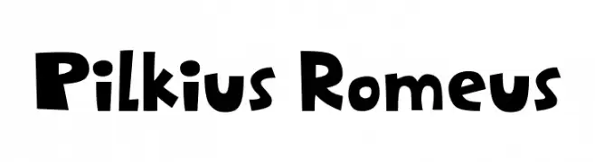
 -
![Pilkius Romeus font caratteri gratis]() Scaricare 794 Downloads@WebFont
Scaricare 794 Downloads@WebFont -
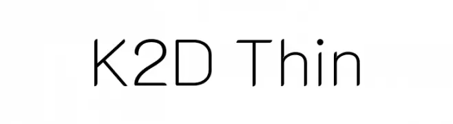
( Copyright 2018 The K2D Project Authors (https://github.com/cadsondemak/K2D) )
A modern, geometric typeface with thin strokes and balanced spacing.
![K2D Thin font caratteri gratis]() Scaricare 794 Downloads@WebFont
Scaricare 794 Downloads@WebFont -
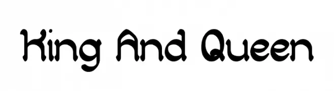
( weknow - Wino S Kadir - www.creativefabrica.com/designer/weknow/ )
A playful, rounded font with consistent stroke width and elegant curls.
![King And Queen font caratteri gratis]() Scaricare 794 Downloads@WebFont
Scaricare 794 Downloads@WebFont -
( Zetafonts - www.zetafonts.com )
A bold, high-contrast serif font with a modern touch, ideal for headlines.
![Florentia Fat font caratteri gratis]() Scaricare 794 Downloads@WebFont
Scaricare 794 Downloads@WebFont -
-
( Vladimir Nikolic - www.coroflot.com/vladimirnikolic )
A modern, geometric font with clean lines and a bold, futuristic aesthetic.
![Neighbor Light font caratteri gratis]() Scaricare 794 Downloads@WebFont
Scaricare 794 Downloads@WebFont -
![Twirrewyn DEMO Regular font caratteri gratis]() Scaricare 794 Downloads@WebFont
Scaricare 794 Downloads@WebFont -
( Copyright (c) 2012-2015, The Mozilla Foundation and Telefonica S.A. )
A modern, condensed sans-serif font with medium weight and italic style.
![Fira Sans Condensed Medium Italic font caratteri gratis]() Scaricare 794 Downloads@WebFont
Scaricare 794 Downloads@WebFont -
( Fonts by Hanoded )
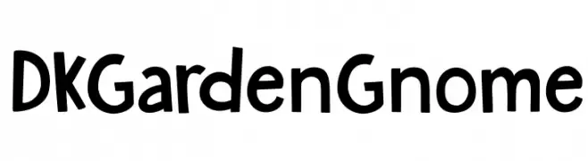
A playful, hand-drawn font with bold, rounded characters and whimsical gnome illustrations.
![DKGardenGnome font caratteri gratis]() Scaricare 794 Downloads@WebFont
Scaricare 794 Downloads@WebFont -
( Fonts by Castcraft Software - opti.netii.net - check the website before use )
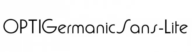
A clean, geometric font with a modern and minimalist aesthetic.
![OPTIGermanicSans-Lite font caratteri gratis]() Scaricare 794 Downloads@WebFont
Scaricare 794 Downloads@WebFont
Quali sono i font più popolari adesso?
Poppins, Roboto, Montserrat, Open Sans e Lato sono molto usati per le forme pulite e l'ampia applicabilità — dall'identità di marca alle landing page e ai poster.
Quali font si usano spesso nei loghi?
Le sans serif geometriche (es. Poppins, famiglie in stile Gotham) sono scelte comuni per un branding pulito e scalabile. Per un tocco personale restano valide script e stili manoscritti. Abbina un display deciso per i titoli a un corpo testo neutro per riconoscibilità ed equilibrio.
Ogni quanto si aggiorna la lista?
Con regolarità, in base ai download e all'attività reale. Torna spesso per scoprire in anticipo le nuove preferite.
💡 Consiglio: aggiungi ai preferiti — le tendenze cambiano in fretta e i font top di oggi possono ispirare il rebranding di domani.