Benvenuto nelle Font Più Popolari — dove popolarità e qualità si incontrano. Qui trovi i font più scaricati e usati dell'anno. Se cerchi scelte sicure per logo, web o social, inizia da qui.
Ogni font top si distingue per equilibrio, leggibilità e versatilità. Troverai sans serif moderne, script eleganti, serif vintage e display minimalisti.
-
 Scaricare 790 Downloads@WebFont
 -
( Fonts by Koczman Balint - magiquefonts.gportal.hu )
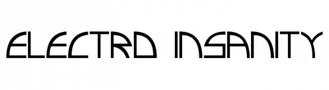
A futuristic, geometric font with sharp angles and clean lines.
![Electro insanity font caratteri gratis]() Scaricare 790 Downloads@WebFont
Scaricare 790 Downloads@WebFont -
( Fonts by www.typodermicfonts.com - Ray Larabie )
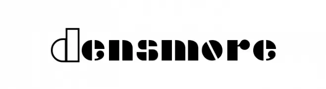
A bold, modern font with geometric shapes and contrasting solid and outlined segments.
![Densmore font caratteri gratis]() Scaricare 790 Downloads@WebFont
Scaricare 790 Downloads@WebFont -
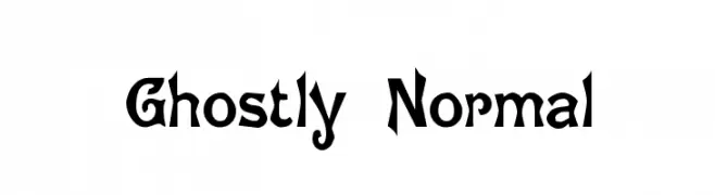
![Ghostly Normal font caratteri gratis]() Scaricare 790 Downloads@WebFont
Scaricare 790 Downloads@WebFont -
( Fonts by Gilang Ternadho )
A playful, bold font with rounded, hand-drawn characters.
![Begialo font caratteri gratis]() Scaricare 789 Downloads@WebFont
Scaricare 789 Downloads@WebFont -
-
( Fonts by Dan Steinbok - Out Of Step Font Company - outofstepfontco.com - Personal-use only. For commercial use please contact owner. )
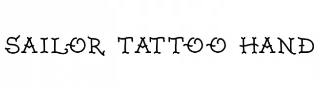
A decorative, hand-drawn font inspired by traditional sailor tattoos.
![Sailor Tattoo Hand font caratteri gratis]() Scaricare 789 Downloads@WebFont
Scaricare 789 Downloads@WebFont -
( Fonts by Bangkit Tri Setiadi )
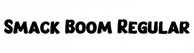
A bold, rounded font with a playful and cartoonish style.
![Smack Boom Regular font caratteri gratis]() Scaricare 789 Downloads@WebFont
Scaricare 789 Downloads@WebFont -
( Fonts by Variatype - Mukhlis Muhammad - Personal-use only. For commercial use please contact owner. )
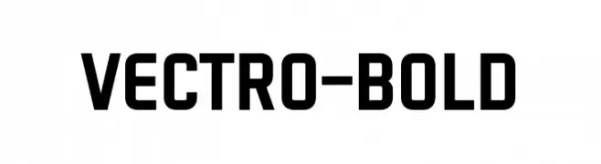
A bold, geometric sans-serif font with a modern, industrial style.
![VECTRO-Bold font caratteri gratis]() Scaricare 789 Downloads@WebFont
Scaricare 789 Downloads@WebFont -
( Fonts by Darrell Flood - Personal-use only. For commercial use please contact owner. )
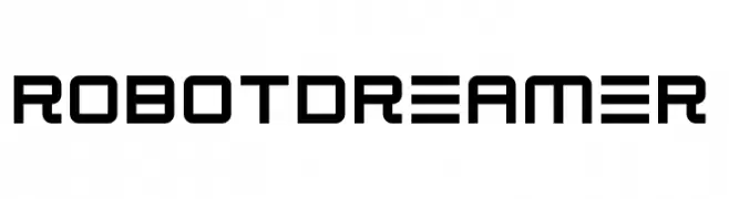
A futuristic, geometric font with clean lines and squared edges.
![Robot Dreamer font caratteri gratis]() Scaricare 789 Downloads@WebFont
Scaricare 789 Downloads@WebFont -
( Fonts by Fillo Graphic )
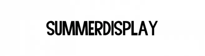
A bold, geometric font with a modern and versatile style.
![Summer Display font caratteri gratis]() Scaricare 789 Downloads@WebFont
Scaricare 789 Downloads@WebFont

Quali sono i font più popolari adesso?
Poppins, Roboto, Montserrat, Open Sans e Lato sono molto usati per le forme pulite e l'ampia applicabilità — dall'identità di marca alle landing page e ai poster.
Quali font si usano spesso nei loghi?
Le sans serif geometriche (es. Poppins, famiglie in stile Gotham) sono scelte comuni per un branding pulito e scalabile. Per un tocco personale restano valide script e stili manoscritti. Abbina un display deciso per i titoli a un corpo testo neutro per riconoscibilità ed equilibrio.
Ogni quanto si aggiorna la lista?
Con regolarità, in base ai download e all'attività reale. Torna spesso per scoprire in anticipo le nuove preferite.
💡 Consiglio: aggiungi ai preferiti — le tendenze cambiano in fretta e i font top di oggi possono ispirare il rebranding di domani.