Benvenuto nelle Font Più Popolari — dove popolarità e qualità si incontrano. Qui trovi i font più scaricati e usati dell'anno. Se cerchi scelte sicure per logo, web o social, inizia da qui.
Ogni font top si distingue per equilibrio, leggibilità e versatilità. Troverai sans serif moderne, script eleganti, serif vintage e display minimalisti.
-
 Scaricare 789 Downloads@WebFont
 -
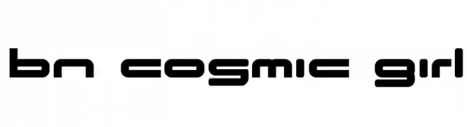
( Font by Ben Nathan - www.hafontia.com )
A futuristic, geometric font with bold, rounded letterforms and tight spacing.
![BN Cosmic Girl font caratteri gratis]() Scaricare 789 Downloads@WebFont
Scaricare 789 Downloads@WebFont -
![Anarchist Bible font caratteri gratis]() Scaricare 789 Downloads@WebFont
Scaricare 789 Downloads@WebFont -
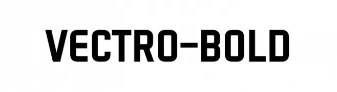
( Fonts by Variatype - Mukhlis Muhammad - Personal-use only. For commercial use please contact owner. )
A bold, geometric sans-serif font with a modern, industrial style.
![VECTRO-Bold font caratteri gratis]() Scaricare 788 Downloads@WebFont
Scaricare 788 Downloads@WebFont -
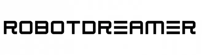
( Fonts by Darrell Flood - Personal-use only. For commercial use please contact owner. )
A futuristic, geometric font with clean lines and squared edges.
![Robot Dreamer font caratteri gratis]() Scaricare 788 Downloads@WebFont
Scaricare 788 Downloads@WebFont -
-
( Fonts by Cheapskate Fonts )
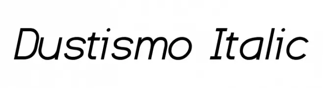
A sleek, modern italic font with a dynamic and stylish appearance.
![Dustismo Italic font caratteri gratis]() Scaricare 788 Downloads@WebFont
Scaricare 788 Downloads@WebFont -
( Fonts by Creatype Studio )
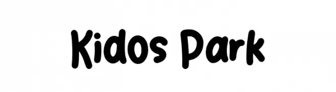
A playful, bold font with rounded, thick strokes and a whimsical style.
![Kidos Park font caratteri gratis]() Scaricare 788 Downloads@WebFont
Scaricare 788 Downloads@WebFont -
( Fonts by Woodcutter Manero - http://www.woodcutter.es - Personal-use only. For commercial use please contact owner. )
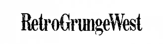
A bold, distressed font with a vintage, grunge aesthetic.
![Retro Grunge West font caratteri gratis]() Scaricare 788 Downloads@WebFont
Scaricare 788 Downloads@WebFont -
( Fonts by Ahmad Rofingi - AR Studio - Personal-use only. For commercial use please contact owner. )
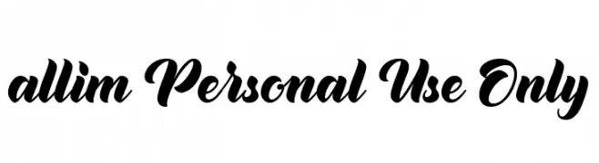
A bold, expressive script font with elegant, flowing cursive letters.
![allim Personal Use Only font caratteri gratis]() Scaricare 788 Downloads@WebFont
Scaricare 788 Downloads@WebFont -
( Fonts by Zetafonts - Personal-use only. For commercial use please contact owner. )
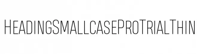
A sleek, modern font with tall, narrow letterforms and consistent thin strokes.
![Heading Smallcase Pro Trial Thin font caratteri gratis]() Scaricare 788 Downloads@WebFont
Scaricare 788 Downloads@WebFont

Quali sono i font più popolari adesso?
Poppins, Roboto, Montserrat, Open Sans e Lato sono molto usati per le forme pulite e l'ampia applicabilità — dall'identità di marca alle landing page e ai poster.
Quali font si usano spesso nei loghi?
Le sans serif geometriche (es. Poppins, famiglie in stile Gotham) sono scelte comuni per un branding pulito e scalabile. Per un tocco personale restano valide script e stili manoscritti. Abbina un display deciso per i titoli a un corpo testo neutro per riconoscibilità ed equilibrio.
Ogni quanto si aggiorna la lista?
Con regolarità, in base ai download e all'attività reale. Torna spesso per scoprire in anticipo le nuove preferite.
💡 Consiglio: aggiungi ai preferiti — le tendenze cambiano in fretta e i font top di oggi possono ispirare il rebranding di domani.