Benvenuto nelle Font Più Popolari — dove popolarità e qualità si incontrano. Qui trovi i font più scaricati e usati dell'anno. Se cerchi scelte sicure per logo, web o social, inizia da qui.
Ogni font top si distingue per equilibrio, leggibilità e versatilità. Troverai sans serif moderne, script eleganti, serif vintage e display minimalisti.
-
( Fonts by ShyFonts )
A bold, 3D oblique font with thick shadows and a playful, dynamic style.
 Scaricare 780 Downloads@WebFont
 -
( Fonts by imagex )
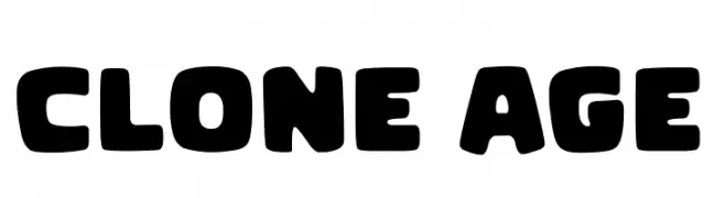
A bold, rounded font with a playful and chunky style.
![Clone Age font caratteri gratis]() Scaricare 779 Downloads@WebFont
Scaricare 779 Downloads@WebFont -
( Fonts by Ryan Rivaldo Vierra - Personal-use only. For commercial use please contact owner. )
A bold, modern sans-serif font with clean lines and a strong presence.
![Kinsans Bold font caratteri gratis]() Scaricare 779 Downloads@WebFont
Scaricare 779 Downloads@WebFont -
( Fonts by wep )
A bold, playful handwritten font with thick, rounded strokes.
![Decak font caratteri gratis]() Scaricare 779 Downloads@WebFont
Scaricare 779 Downloads@WebFont -
( Fonts by Typefactoryco )
A playful, bold font with a hand-drawn, whimsical style.
![Mighty Star Free Trial font caratteri gratis]() Scaricare 779 Downloads@WebFont
Scaricare 779 Downloads@WebFont -
-
( Noto is a trademark of Google Inc. Noto fonts are open source. All Noto fonts are published under the SIL Open Font License, Version 1.1 )
A bold, clean, and modern font with strong, uniform strokes and geometric shapes.
![Noto Sans Ethiopic Bold font caratteri gratis]() Scaricare 779 Downloads@WebFont
Scaricare 779 Downloads@WebFont -
![Jervinho font caratteri gratis]() Scaricare 779 Downloads@WebFont
Scaricare 779 Downloads@WebFont -
( Cropstudio - Crop Studio - creativemarket.com/Cropstudio )
An elegant, flowing script font with a sophisticated and graceful style.
![Robertortiz font caratteri gratis]() Scaricare 779 Downloads@WebFont
Scaricare 779 Downloads@WebFont -
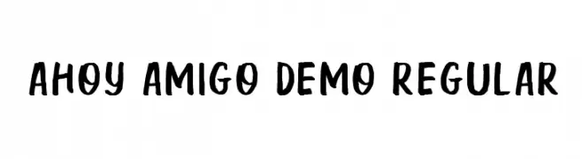
![Ahoy Amigo DEMO Regular font caratteri gratis]() Scaricare 779 Downloads@WebFont
Scaricare 779 Downloads@WebFont -
( Fonts by Dan P. Lyons - Personal-use only. For commercial use please contact owner. )
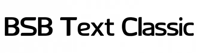
A modern sans-serif font with a clean, professional look and rounded edges.
![BSB Text Classic font caratteri gratis]() Scaricare 779 Downloads@WebFont
Scaricare 779 Downloads@WebFont


Quali sono i font più popolari adesso?
Poppins, Roboto, Montserrat, Open Sans e Lato sono molto usati per le forme pulite e l'ampia applicabilità — dall'identità di marca alle landing page e ai poster.
Quali font si usano spesso nei loghi?
Le sans serif geometriche (es. Poppins, famiglie in stile Gotham) sono scelte comuni per un branding pulito e scalabile. Per un tocco personale restano valide script e stili manoscritti. Abbina un display deciso per i titoli a un corpo testo neutro per riconoscibilità ed equilibrio.
Ogni quanto si aggiorna la lista?
Con regolarità, in base ai download e all'attività reale. Torna spesso per scoprire in anticipo le nuove preferite.
💡 Consiglio: aggiungi ai preferiti — le tendenze cambiano in fretta e i font top di oggi possono ispirare il rebranding di domani.