Benvenuto nelle Font Più Popolari — dove popolarità e qualità si incontrano. Qui trovi i font più scaricati e usati dell'anno. Se cerchi scelte sicure per logo, web o social, inizia da qui.
Ogni font top si distingue per equilibrio, leggibilità e versatilità. Troverai sans serif moderne, script eleganti, serif vintage e display minimalisti.
-
( imagex - www.imagex-fonts.com )
A futuristic, dynamic font with sleek, angular lines and high contrast.
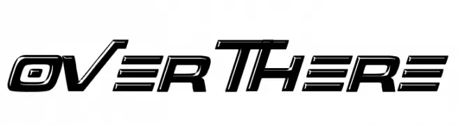 Scaricare 780 Downloads@WebFont
 -
( imagex - www.imagex-fonts.com )
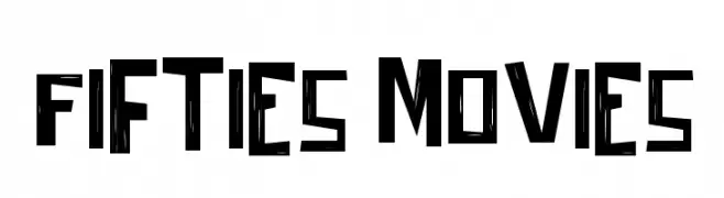
A bold, retro font with angular, geometric shapes and high contrast.
![Fifties Movies font caratteri gratis]() Scaricare 780 Downloads@WebFont
Scaricare 780 Downloads@WebFont -
( Typodermic Fonts - Ray Larabie - www.typodermicfonts.com/ )
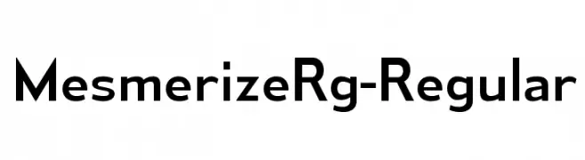
A modern, geometric sans-serif font with balanced proportions and a professional appearance.
![MesmerizeRg-Regular font caratteri gratis]() Scaricare 780 Downloads@WebFont
Scaricare 780 Downloads@WebFont -
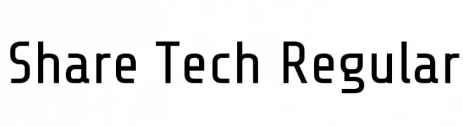
( Copyright 2012 The Share Tech Project Authors (post@carrois.com), with Reserved Font Name 'Share’. )
A modern, geometric sans-serif font with balanced spacing and clear characters.
![Share Tech Regular font caratteri gratis]() Scaricare 780 Downloads@WebFont
Scaricare 780 Downloads@WebFont -
( Fonts by Freddie Line - www.freddieline.com - Personal-use only. For commercial use please contact owner. )
A modern, geometric font with clean lines and angular shapes, perfect for tech and creative projects.
![DissolveRegular font caratteri gratis]() Scaricare 780 Downloads@WebFont
Scaricare 780 Downloads@WebFont -
-
![Tastysushi font caratteri gratis]() Scaricare 780 Downloads@WebFont
Scaricare 780 Downloads@WebFont -
Caratteri di gomez447. For commercial use please contact the owner.
![Tecnico Grueso font caratteri gratis]() Scaricare 780 Downloads@WebFont
Scaricare 780 Downloads@WebFont -
( Fonts by Greg Medina - www.dcoxy.com - Personal-use only. For commercial use please contact owner. )
A sophisticated script font with elegant, flowing letters and decorative uppercase characters.
![Raisin des Sables font caratteri gratis]() Scaricare 780 Downloads@WebFont
Scaricare 780 Downloads@WebFont -
( Fonts by www.peter-wiegel.de. Personal-use only. For commercial use please contact owner. )
A bold, medieval-inspired font with dramatic serifs and a Gothic flair.
![Teutonic font caratteri gratis]() Scaricare 780 Downloads@WebFont
Scaricare 780 Downloads@WebFont -
![DJB Stinky Marker font caratteri gratis]() Scaricare 780 Downloads@WebFont
Scaricare 780 Downloads@WebFont


Quali sono i font più popolari adesso?
Poppins, Roboto, Montserrat, Open Sans e Lato sono molto usati per le forme pulite e l'ampia applicabilità — dall'identità di marca alle landing page e ai poster.
Quali font si usano spesso nei loghi?
Le sans serif geometriche (es. Poppins, famiglie in stile Gotham) sono scelte comuni per un branding pulito e scalabile. Per un tocco personale restano valide script e stili manoscritti. Abbina un display deciso per i titoli a un corpo testo neutro per riconoscibilità ed equilibrio.
Ogni quanto si aggiorna la lista?
Con regolarità, in base ai download e all'attività reale. Torna spesso per scoprire in anticipo le nuove preferite.
💡 Consiglio: aggiungi ai preferiti — le tendenze cambiano in fretta e i font top di oggi possono ispirare il rebranding di domani.