Benvenuto nelle Font Più Popolari — dove popolarità e qualità si incontrano. Qui trovi i font più scaricati e usati dell'anno. Se cerchi scelte sicure per logo, web o social, inizia da qui.
Ogni font top si distingue per equilibrio, leggibilità e versatilità. Troverai sans serif moderne, script eleganti, serif vintage e display minimalisti.
-
( Fonts by Aryel Filipe )
A playful, hand-drawn font with quirky, irregular letterforms.
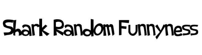 Scaricare 764 Downloads@WebFont
 -
( Please check the owner website: http://www.billie.grosse.is-a-geek.com )
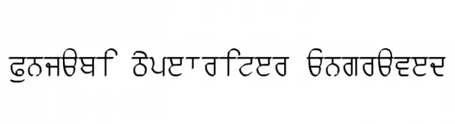
A bold, engraved Punjabi script with a typewriter aesthetic.
![Punjabi Typewriter Engraved font caratteri gratis]() Scaricare 764 Downloads@WebFont
Scaricare 764 Downloads@WebFont -
( Fonts by www.kiwi-media.com )
A bold, geometric font with a modern and futuristic style.
![Chyelovek font caratteri gratis]() Scaricare 764 Downloads@WebFont
Scaricare 764 Downloads@WebFont -
( Fonts by Edric Studio - Personal-use only. For commercial use please contact owner. )
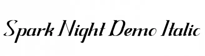
An elegant italic font with smooth curves and sharp angles.
![Spark Night Demo Italic font caratteri gratis]() Scaricare 763 Downloads@WebFont
Scaricare 763 Downloads@WebFont -
( Noto is a trademark of Google Inc. Noto fonts are open source. All Noto fonts are published under the SIL Open Font License, Version 1.1 )
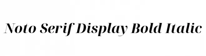
Elegant serif font with bold, italicized style and balanced contrast.
![Noto Serif Display Bold Italic font caratteri gratis]() Scaricare 763 Downloads@WebFont
Scaricare 763 Downloads@WebFont -
-
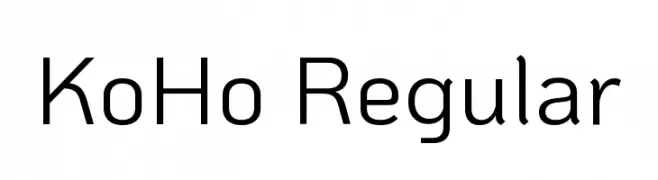
( Copyright 2018 The KoHo Project Authors (https://github.com/cadsondemak/Koho) )
A modern, geometric sans-serif typeface with clean lines and uniform strokes.
![KoHo Regular font caratteri gratis]() Scaricare 763 Downloads@WebFont
Scaricare 763 Downloads@WebFont -
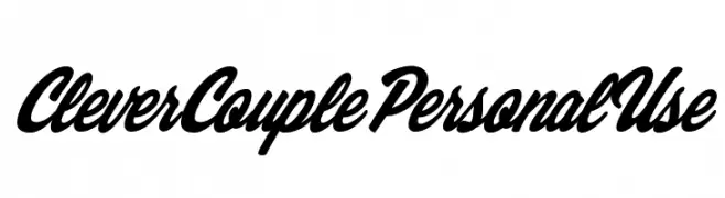
( Billy Argel - billyargel.com/ )
A bold, cursive font with interconnected letters and a modern script style.
![Clever Couple Personal Use font caratteri gratis]() Scaricare 763 Downloads@WebFont
Scaricare 763 Downloads@WebFont -
![Shrewdy font caratteri gratis]() Scaricare 763 Downloads@WebFont
Scaricare 763 Downloads@WebFont -
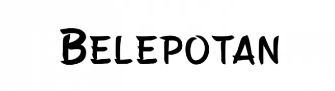
( Fonts by Arwan Sutanto www.locomotype.com - Personal-use only. For commercial use please contact owner. )
A playful, bold font with a hand-drawn, whimsical style.
![Belepotan font caratteri gratis]() Scaricare 763 Downloads@WebFont
Scaricare 763 Downloads@WebFont -
![IFoundMyValentine font caratteri gratis]() Scaricare 763 Downloads@WebFont
Scaricare 763 Downloads@WebFont


Quali sono i font più popolari adesso?
Poppins, Roboto, Montserrat, Open Sans e Lato sono molto usati per le forme pulite e l'ampia applicabilità — dall'identità di marca alle landing page e ai poster.
Quali font si usano spesso nei loghi?
Le sans serif geometriche (es. Poppins, famiglie in stile Gotham) sono scelte comuni per un branding pulito e scalabile. Per un tocco personale restano valide script e stili manoscritti. Abbina un display deciso per i titoli a un corpo testo neutro per riconoscibilità ed equilibrio.
Ogni quanto si aggiorna la lista?
Con regolarità, in base ai download e all'attività reale. Torna spesso per scoprire in anticipo le nuove preferite.
💡 Consiglio: aggiungi ai preferiti — le tendenze cambiano in fretta e i font top di oggi possono ispirare il rebranding di domani.