Benvenuto nelle Font Più Popolari — dove popolarità e qualità si incontrano. Qui trovi i font più scaricati e usati dell'anno. Se cerchi scelte sicure per logo, web o social, inizia da qui.
Ogni font top si distingue per equilibrio, leggibilità e versatilità. Troverai sans serif moderne, script eleganti, serif vintage e display minimalisti.
-
( Fonts by Subectype & Orenari )
A playful, hand-drawn font with bold, rounded characters.
 Scaricare 755 Downloads@WebFont
 -
( Fonts by Regulerstudio )
A playful, hand-drawn font with bold, rounded characters and a textured, artistic style.
![ART HISTORY BOOK font caratteri gratis]() Scaricare 755 Downloads@WebFont
Scaricare 755 Downloads@WebFont -
( Fonts by Rahagita Type )
A playful, rounded font with a hand-drawn, child-friendly style.
![ChildrenSans font caratteri gratis]() Scaricare 755 Downloads@WebFont
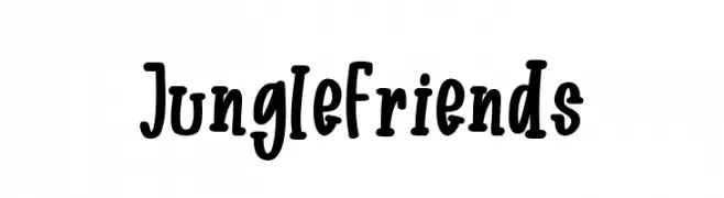
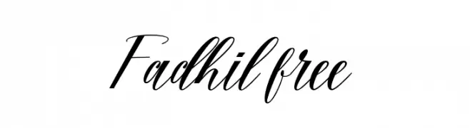
Scaricare 755 Downloads@WebFont -
![Fadhil free font caratteri gratis]() Scaricare 755 Downloads@WebFont
Scaricare 755 Downloads@WebFont -
( Pollem Studio - Muhammad Nur - www.creativefabrica.com/designer/polem/ref/2050/ )
An elegant script font with flowing, interconnected letters and ornate flourishes.
![Pugsley font caratteri gratis]() Scaricare 755 Downloads@WebFont
Scaricare 755 Downloads@WebFont -
-
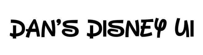
( Fonts by Dan P. Lyons - Personal-use only. For commercial use please contact owner. )
A playful, bold font with rounded characters and a whimsical style.
![Dan's Disney UI font caratteri gratis]() Scaricare 755 Downloads@WebFont
Scaricare 755 Downloads@WebFont -
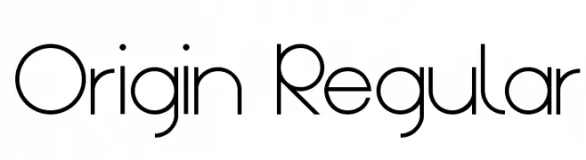
( Fonts by Nathan Towle. Personal-use only. For commercial use please contact owner )
A modern, geometric font with clean lines and a minimalist style.
![Origin Regular font caratteri gratis]() Scaricare 755 Downloads@WebFont
Scaricare 755 Downloads@WebFont -
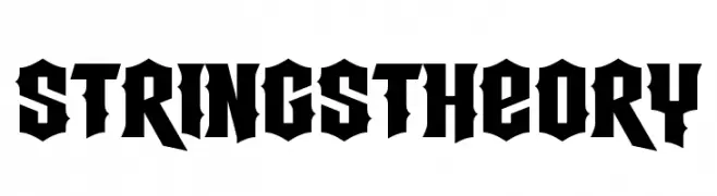
( Fonts by www.chequered.ink - Chequered Ink - Personal-use only. For commercial use please contact owner. )
A bold, gothic-inspired font with sharp, angular edges and high contrast.
![Strings Theory font caratteri gratis]() Scaricare 755 Downloads@WebFont
Scaricare 755 Downloads@WebFont -
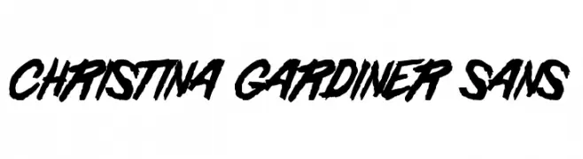
![Christina Gardiner Sans font caratteri gratis]() Scaricare 755 Downloads@WebFont
Scaricare 755 Downloads@WebFont -
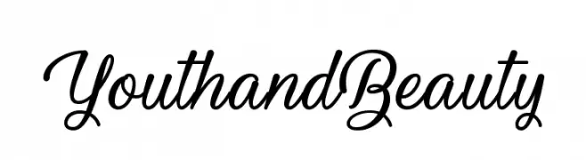
( Fonts by Misti`s Fonts - mistifonts.com - Personal-use only. For commercial use please contact owner. )
A graceful and elegant script font with flowing, connected strokes.
![YouthandBeauty font caratteri gratis]() Scaricare 755 Downloads@WebFont
Scaricare 755 Downloads@WebFont


Quali sono i font più popolari adesso?
Poppins, Roboto, Montserrat, Open Sans e Lato sono molto usati per le forme pulite e l'ampia applicabilità — dall'identità di marca alle landing page e ai poster.
Quali font si usano spesso nei loghi?
Le sans serif geometriche (es. Poppins, famiglie in stile Gotham) sono scelte comuni per un branding pulito e scalabile. Per un tocco personale restano valide script e stili manoscritti. Abbina un display deciso per i titoli a un corpo testo neutro per riconoscibilità ed equilibrio.
Ogni quanto si aggiorna la lista?
Con regolarità, in base ai download e all'attività reale. Torna spesso per scoprire in anticipo le nuove preferite.
💡 Consiglio: aggiungi ai preferiti — le tendenze cambiano in fretta e i font top di oggi possono ispirare il rebranding di domani.