Benvenuto nelle Font Più Popolari — dove popolarità e qualità si incontrano. Qui trovi i font più scaricati e usati dell'anno. Se cerchi scelte sicure per logo, web o social, inizia da qui.
Ogni font top si distingue per equilibrio, leggibilità e versatilità. Troverai sans serif moderne, script eleganti, serif vintage e display minimalisti.
-
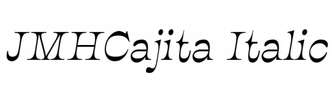
Caratteri di joorgemoron. For commercial use please contact the owner.
( Free for personal use. )
An elegant italic serif font with dynamic curves and sharp serifs.
 Scaricare 749 Downloads@WebFont
 -
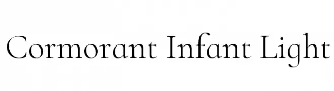
( Copyright (c) 2015, Christian Thalmann and the Cormorant Project Authors (github.com/CatharsisFonts/Cormorant) )
A refined serif font with elegant, thin strokes and classic proportions.
![Cormorant Infant Light font caratteri gratis]() Scaricare 749 Downloads@WebFont
Scaricare 749 Downloads@WebFont -
![Km Standard TT Bold font caratteri gratis]() Scaricare 749 Downloads@WebFont
Scaricare 749 Downloads@WebFont -
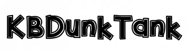
( Fonts by Khrys Bosland )
A bold, playful font with a three-dimensional shadow effect.
![KBDunkTank font caratteri gratis]() Scaricare 749 Downloads@WebFont
Scaricare 749 Downloads@WebFont -
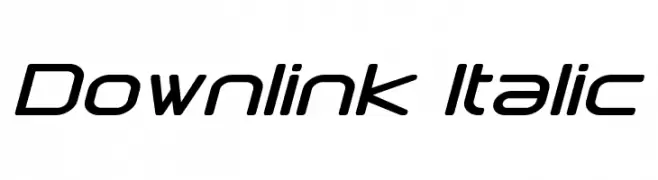
( Fonts by a Neale Davidson - www.pixelsagas.com. Personal-use only. For commercial use please contact owner. )
A modern, italic font with geometric precision and a futuristic aesthetic.
![Downlink Italic font caratteri gratis]() Scaricare 749 Downloads@WebFont
Scaricare 749 Downloads@WebFont -
-
( Fonts by Steve Cloutier - www.cloutierfontes.ca )
A distressed, grungy font with a hand-drawn, eerie appearance.
![CF Zombie Party Regular font caratteri gratis]() Scaricare 749 Downloads@WebFont
Scaricare 749 Downloads@WebFont -
![Maya font caratteri gratis]() Scaricare 749 Downloads@WebFont
Scaricare 749 Downloads@WebFont -
( Fonts by Mans Greback - www.mawns.com )
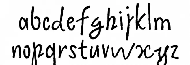
A bold and expressive script font with dynamic curves and strong visual impact.
![Clipper Script Fat [Personal Use] font caratteri gratis]() Scaricare 749 Downloads@WebFont
Scaricare 749 Downloads@WebFont -
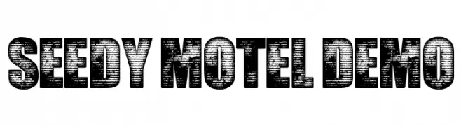
![Seedy Motel DEMO font caratteri gratis]() Scaricare 749 Downloads@WebFont
Scaricare 749 Downloads@WebFont -
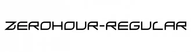
( Fonts by www.typodermicfonts.com - Ray Larabie )
A futuristic, geometric font with angular and sleek letterforms.
![ZeroHour-Regular font caratteri gratis]() Scaricare 749 Downloads@WebFont
Scaricare 749 Downloads@WebFont


![Clipper Script Fat [Personal Use] font caratteri gratis](https://d144mzi0q5mijx.cloudfront.net/img/C/L/Clipper-Script-Fat-Personal-Use.webp)
Quali sono i font più popolari adesso?
Poppins, Roboto, Montserrat, Open Sans e Lato sono molto usati per le forme pulite e l'ampia applicabilità — dall'identità di marca alle landing page e ai poster.
Quali font si usano spesso nei loghi?
Le sans serif geometriche (es. Poppins, famiglie in stile Gotham) sono scelte comuni per un branding pulito e scalabile. Per un tocco personale restano valide script e stili manoscritti. Abbina un display deciso per i titoli a un corpo testo neutro per riconoscibilità ed equilibrio.
Ogni quanto si aggiorna la lista?
Con regolarità, in base ai download e all'attività reale. Torna spesso per scoprire in anticipo le nuove preferite.
💡 Consiglio: aggiungi ai preferiti — le tendenze cambiano in fretta e i font top di oggi possono ispirare il rebranding di domani.