Benvenuto nelle Font Più Popolari — dove popolarità e qualità si incontrano. Qui trovi i font più scaricati e usati dell'anno. Se cerchi scelte sicure per logo, web o social, inizia da qui.
Ogni font top si distingue per equilibrio, leggibilità e versatilità. Troverai sans serif moderne, script eleganti, serif vintage e display minimalisti.
-
( Fonts by Manfred Klein - manfred-klein.ina-mar.com )
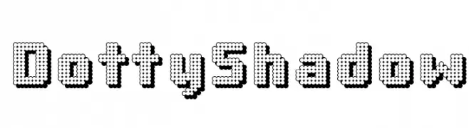
A playful, dotted font with a shadow effect and retro-modern appeal.
 Scaricare 741 Downloads@WebFont
 -
( Fonts by Derek Gomez )
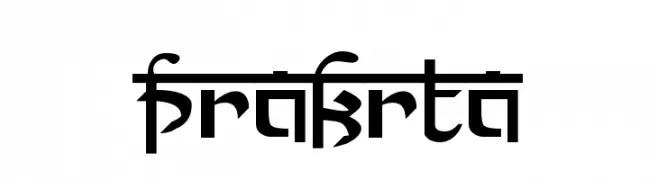
A bold, angular font with a futuristic and geometric style.
![Prakrta font caratteri gratis]() Scaricare 741 Downloads@WebFont
Scaricare 741 Downloads@WebFont -
( Fonts by uatype.faithweb.com - UnAuthorized Type )
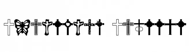
A decorative symbol font with diverse Christian cross designs.
![Christian Crosses font caratteri gratis]() Scaricare 741 Downloads@WebFont
Scaricare 741 Downloads@WebFont -
( Fonts by www.tepidmonkey.net )
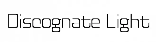
A modern, geometric font with clean lines and uniform stroke width.
![Discognate Light font caratteri gratis]() Scaricare 741 Downloads@WebFont
Scaricare 741 Downloads@WebFont -
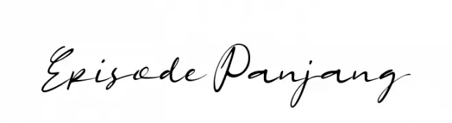
( Fonts by Wahyu Eka Prasetya - wepfont.com - Personal-use only. For commercial use please contact owner. )
A flowing, elegant script font with a natural handwritten style.
![Episode Panjang font caratteri gratis]() Scaricare 740 Downloads@WebFont
Scaricare 740 Downloads@WebFont -
-
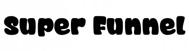
( Fonts by allsuperfont.com - Personal-use only. For commercial use please contact owner. )
A bold, playful font with rounded, bubbly characters and a retro-modern style.
![Super Funnel font caratteri gratis]() Scaricare 740 Downloads@WebFont
Scaricare 740 Downloads@WebFont -
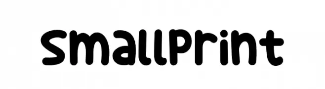
( Fonts by Khurasan )
A playful, rounded font with bold, bubbly letters and a friendly vibe.
![Small Print font caratteri gratis]() Scaricare 740 Downloads@WebFont
Scaricare 740 Downloads@WebFont -
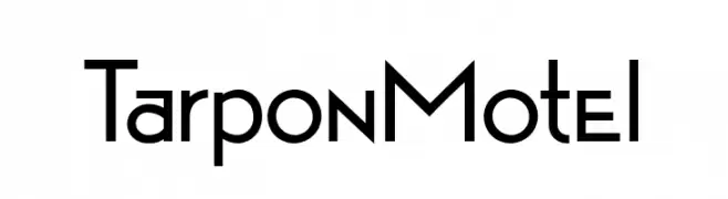
( Fonts by Barry Stock )
A modern, geometric sans-serif font with clean lines and balanced proportions.
![Tarpon Motel font caratteri gratis]() Scaricare 740 Downloads@WebFont
Scaricare 740 Downloads@WebFont -
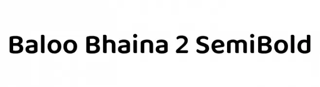
( Copyright (c) 2015 Ek Type (www.ektype.in) )
A playful, rounded font with smooth curves and a friendly appearance.
![Baloo Bhaina 2 SemiBold font caratteri gratis]() Scaricare 740 Downloads@WebFont
Scaricare 740 Downloads@WebFont -
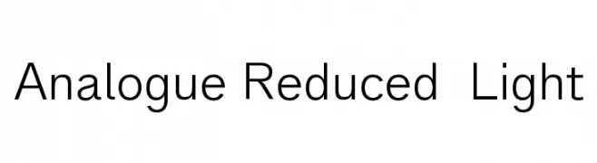
( ingoFonts - Ingo Zimmermann - www.ingofonts.com )
A modern, clean font with geometric shapes and a light weight, perfect for readability.
![Analogue Reduced 45 Light font caratteri gratis]() Scaricare 740 Downloads@WebFont
Scaricare 740 Downloads@WebFont
Quali sono i font più popolari adesso?
Poppins, Roboto, Montserrat, Open Sans e Lato sono molto usati per le forme pulite e l'ampia applicabilità — dall'identità di marca alle landing page e ai poster.
Quali font si usano spesso nei loghi?
Le sans serif geometriche (es. Poppins, famiglie in stile Gotham) sono scelte comuni per un branding pulito e scalabile. Per un tocco personale restano valide script e stili manoscritti. Abbina un display deciso per i titoli a un corpo testo neutro per riconoscibilità ed equilibrio.
Ogni quanto si aggiorna la lista?
Con regolarità, in base ai download e all'attività reale. Torna spesso per scoprire in anticipo le nuove preferite.
💡 Consiglio: aggiungi ai preferiti — le tendenze cambiano in fretta e i font top di oggi possono ispirare il rebranding di domani.