Benvenuto nelle Font Più Popolari — dove popolarità e qualità si incontrano. Qui trovi i font più scaricati e usati dell'anno. Se cerchi scelte sicure per logo, web o social, inizia da qui.
Ogni font top si distingue per equilibrio, leggibilità e versatilità. Troverai sans serif moderne, script eleganti, serif vintage e display minimalisti.
-
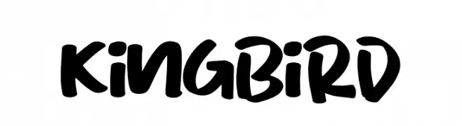
( Fonts by Letterena Studios )
A bold, handwritten font with a playful and energetic style.
 Scaricare 719 Downloads@WebFont
 -
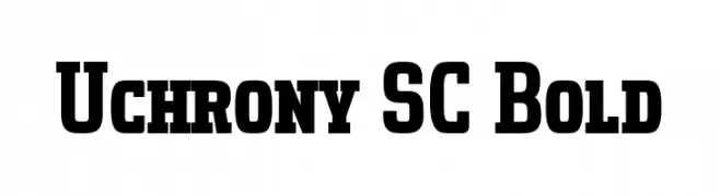
( Fonts by deFharo - Fernando Haro - Personal-use only. For commercial use please contact owner. )
A bold slab serif font with strong, block-like characters and wide spacing.
![Uchrony SC Bold font caratteri gratis]() Scaricare 719 Downloads@WebFont
Scaricare 719 Downloads@WebFont -
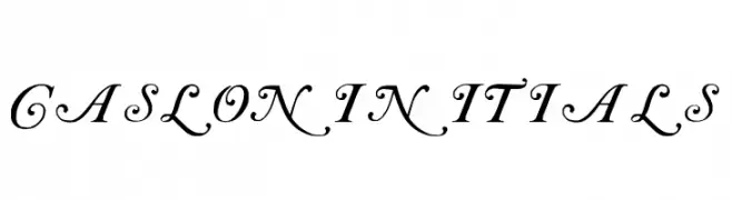
( Fonts by Paul Lloyd )
An ornate and elegant font with classic calligraphic flourishes.
![Caslon Initials font caratteri gratis]() Scaricare 719 Downloads
Scaricare 719 Downloads -
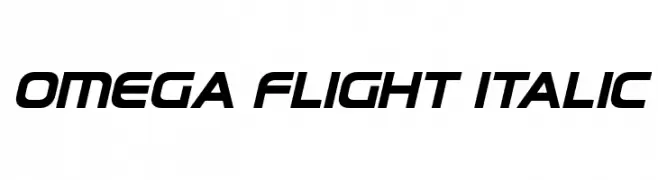
( Fonts by Daniel Zadorozny - www.iconian.com - Personal-use only. For commercial use please contact owner. )
A sleek, italicized font with a futuristic and dynamic design.
![Omega Flight Italic font caratteri gratis]() Scaricare 719 Downloads@WebFont
Scaricare 719 Downloads@WebFont -
( Fonts by UI Creative )
A bold, playful font with rounded edges and a friendly appearance.
![BUNCH BONARIE font caratteri gratis]() Scaricare 719 Downloads@WebFont
Scaricare 719 Downloads@WebFont -
-
( Fonts by Kong Font - https://fontkong.com/ - Personal-use only. For commercial use please contact owner. )
A cursive, handwritten font with elegant, flowing strokes and a consistent slant.
![Road Sunshine Italic font caratteri gratis]() Scaricare 719 Downloads@WebFont
Scaricare 719 Downloads@WebFont -
![Zeronero Black font caratteri gratis]() Scaricare 719 Downloads@WebFont
Scaricare 719 Downloads@WebFont -
( Noto is a trademark of Google Inc. Noto fonts are open source. All Noto fonts are published under the SIL Open Font License, Version 1.1 )
A modern, condensed sans-serif font with medium weight and excellent readability.
![Noto Sans Display Condensed Medium font caratteri gratis]() Scaricare 719 Downloads@WebFont
Scaricare 719 Downloads@WebFont -
![UVN Kieu font caratteri gratis]() Scaricare 719 Downloads@WebFont
Scaricare 719 Downloads@WebFont -
( Deffeyes Design - www.deffeyes.com/ )
A classic, high-contrast serif font with sharp, angular serifs.
![Roman Caps font caratteri gratis]() Scaricare 719 Downloads@WebFont
Scaricare 719 Downloads@WebFont


Quali sono i font più popolari adesso?
Poppins, Roboto, Montserrat, Open Sans e Lato sono molto usati per le forme pulite e l'ampia applicabilità — dall'identità di marca alle landing page e ai poster.
Quali font si usano spesso nei loghi?
Le sans serif geometriche (es. Poppins, famiglie in stile Gotham) sono scelte comuni per un branding pulito e scalabile. Per un tocco personale restano valide script e stili manoscritti. Abbina un display deciso per i titoli a un corpo testo neutro per riconoscibilità ed equilibrio.
Ogni quanto si aggiorna la lista?
Con regolarità, in base ai download e all'attività reale. Torna spesso per scoprire in anticipo le nuove preferite.
💡 Consiglio: aggiungi ai preferiti — le tendenze cambiano in fretta e i font top di oggi possono ispirare il rebranding di domani.