Benvenuto nelle Font Più Popolari — dove popolarità e qualità si incontrano. Qui trovi i font più scaricati e usati dell'anno. Se cerchi scelte sicure per logo, web o social, inizia da qui.
Ogni font top si distingue per equilibrio, leggibilità e versatilità. Troverai sans serif moderne, script eleganti, serif vintage e display minimalisti.
-
( Fonts by Mr Letters - https://www.creativefabrica.com/designer/mrletters/ - Personal-use only. For commercial use please contact owner. )
A bold, playful handwritten font with rounded, smooth letterforms.
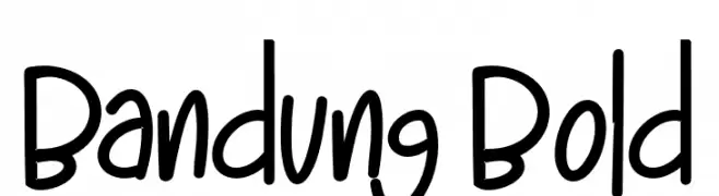 Scaricare 718 Downloads@WebFont
 -
( Personal-use only. For commercial use please contact owner. )
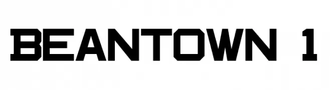
A bold, geometric font with a modern, blocky style.
![Beantown 1 font caratteri gratis]() Scaricare 718 Downloads@WebFont
Scaricare 718 Downloads@WebFont -
( Fonts by Kong Font - https://fontkong.com/ - Personal-use only. For commercial use please contact owner. )
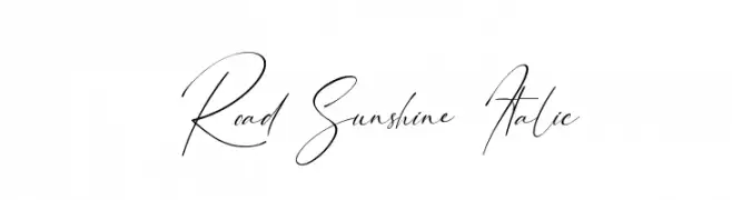
A cursive, handwritten font with elegant, flowing strokes and a consistent slant.
![Road Sunshine Italic font caratteri gratis]() Scaricare 718 Downloads@WebFont
Scaricare 718 Downloads@WebFont -
( Fonts by blue studio09 - Personal-use only. For commercial use please contact owner. )
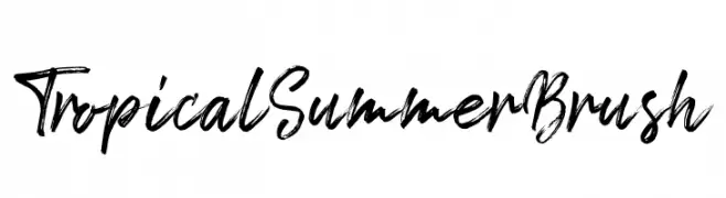
A bold and expressive brush-style font with dynamic strokes.
![Tropical Summer Brush font caratteri gratis]() Scaricare 718 Downloads@WebFont
Scaricare 718 Downloads@WebFont -
( Deffeyes Design - www.deffeyes.com/ )
A classic, high-contrast serif font with sharp, angular serifs.
![Roman Caps font caratteri gratis]() Scaricare 718 Downloads@WebFont
Scaricare 718 Downloads@WebFont -
-
![My Happy Ending Regular font caratteri gratis]() Scaricare 718 Downloads@WebFont
Scaricare 718 Downloads@WebFont -
![Cinqcent font caratteri gratis]() Scaricare 718 Downloads@WebFont
Scaricare 718 Downloads@WebFont -
( Fonts by Dmitry Astakhov - www.behance.net/adonis-abe1e - Personal-use only. For commercial use please contact owner. )
A bold, sans-serif font with a modern and impactful design.
![Astakhov First Simple F font caratteri gratis]() Scaricare 718 Downloads@WebFont
Scaricare 718 Downloads@WebFont -
![JMHLegajo-Bold font caratteri gratis]() Scaricare 718 Downloads@WebFont
Scaricare 718 Downloads@WebFont -
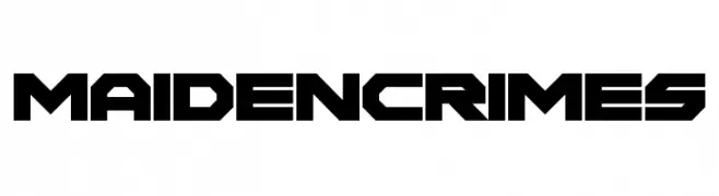
![Maiden Crimes font caratteri gratis]() Scaricare 718 Downloads@WebFont
Scaricare 718 Downloads@WebFont

Quali sono i font più popolari adesso?
Poppins, Roboto, Montserrat, Open Sans e Lato sono molto usati per le forme pulite e l'ampia applicabilità — dall'identità di marca alle landing page e ai poster.
Quali font si usano spesso nei loghi?
Le sans serif geometriche (es. Poppins, famiglie in stile Gotham) sono scelte comuni per un branding pulito e scalabile. Per un tocco personale restano valide script e stili manoscritti. Abbina un display deciso per i titoli a un corpo testo neutro per riconoscibilità ed equilibrio.
Ogni quanto si aggiorna la lista?
Con regolarità, in base ai download e all'attività reale. Torna spesso per scoprire in anticipo le nuove preferite.
💡 Consiglio: aggiungi ai preferiti — le tendenze cambiano in fretta e i font top di oggi possono ispirare il rebranding di domani.