Benvenuto nelle Font Più Popolari — dove popolarità e qualità si incontrano. Qui trovi i font più scaricati e usati dell'anno. Se cerchi scelte sicure per logo, web o social, inizia da qui.
Ogni font top si distingue per equilibrio, leggibilità e versatilità. Troverai sans serif moderne, script eleganti, serif vintage e display minimalisti.
-
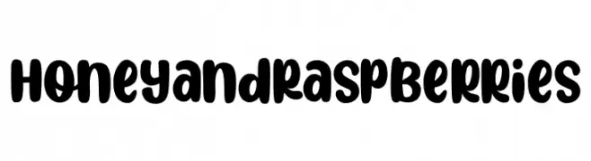
( Fonts by Kurnia Setyadi )
A playful, bold font with rounded strokes and smooth curves.
 Scaricare 711 Downloads@WebFont
 -
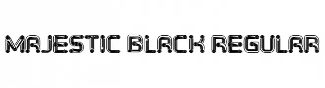
( Fonts by Vladimir Nikolic )
A bold, futuristic font with intricate geometric and mechanical elements.
![Majestic Black Regular font caratteri gratis]() Scaricare 711 Downloads@WebFont
Scaricare 711 Downloads@WebFont -
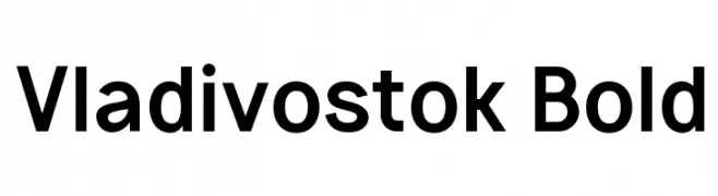
( Fonts by Michael Sharanda - Personal-use only. For commercial use please contact owner. )
A bold, modern sans-serif font with clean lines and strong presence.
![Vladivostok Bold font caratteri gratis]() Scaricare 711 Downloads@WebFont
Scaricare 711 Downloads@WebFont -
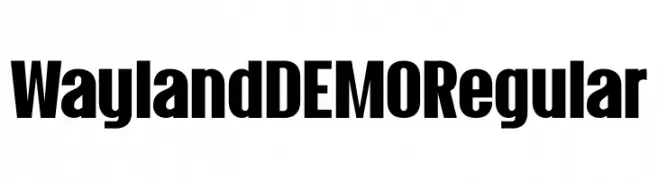
( Hanoded - David Kerkhoff - www.hanodedfonts.com )
A bold, modern typeface with a strong, impactful presence.
![Wayland DEMO Regular font caratteri gratis]() Scaricare 711 Downloads@WebFont
Scaricare 711 Downloads@WebFont -
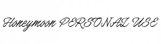
( Fonts by Måns Grebäck )
A graceful script font with flowing, interconnected letters and elegant flourishes.
![Honeymoon PERSONAL USE font caratteri gratis]() Scaricare 711 Downloads@WebFont
Scaricare 711 Downloads@WebFont -
-
Caratteri di joorgemoron. For commercial use please contact the owner.
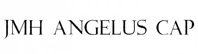
( Free for Personal Use Only )
A classic serif font with sharp serifs and elegant curves, offering a timeless and sophisticated look.
![JMH Angelus Cap font caratteri gratis]() Scaricare 711 Downloads@WebFont
Scaricare 711 Downloads@WebFont -
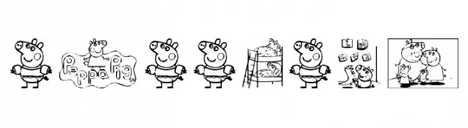
( Fonts by Ding Bang )
Cartoonish decorative font with character-based illustrations.
![Peppa Pig font caratteri gratis]() Scaricare 711 Downloads@WebFont
Scaricare 711 Downloads@WebFont -
![5Kreeper Regular font caratteri gratis]() Scaricare 711 Downloads@WebFont
Scaricare 711 Downloads@WebFont -
![Shamber font caratteri gratis]() Scaricare 711 Downloads@WebFont
Scaricare 711 Downloads@WebFont -
( Fonts by MuraKnockout Media + Design - muraknockout.com. Personal-use only. For commercial use please contact owner. )
A bold, geometric font with modern, clean lines and unique angular elements.
![Ciudad Nueva CAPS Bold font caratteri gratis]() Scaricare 711 Downloads@WebFont
Scaricare 711 Downloads@WebFont

Quali sono i font più popolari adesso?
Poppins, Roboto, Montserrat, Open Sans e Lato sono molto usati per le forme pulite e l'ampia applicabilità — dall'identità di marca alle landing page e ai poster.
Quali font si usano spesso nei loghi?
Le sans serif geometriche (es. Poppins, famiglie in stile Gotham) sono scelte comuni per un branding pulito e scalabile. Per un tocco personale restano valide script e stili manoscritti. Abbina un display deciso per i titoli a un corpo testo neutro per riconoscibilità ed equilibrio.
Ogni quanto si aggiorna la lista?
Con regolarità, in base ai download e all'attività reale. Torna spesso per scoprire in anticipo le nuove preferite.
💡 Consiglio: aggiungi ai preferiti — le tendenze cambiano in fretta e i font top di oggi possono ispirare il rebranding di domani.