Benvenuto nelle Font Più Popolari — dove popolarità e qualità si incontrano. Qui trovi i font più scaricati e usati dell'anno. Se cerchi scelte sicure per logo, web o social, inizia da qui.
Ogni font top si distingue per equilibrio, leggibilità e versatilità. Troverai sans serif moderne, script eleganti, serif vintage e display minimalisti.
-
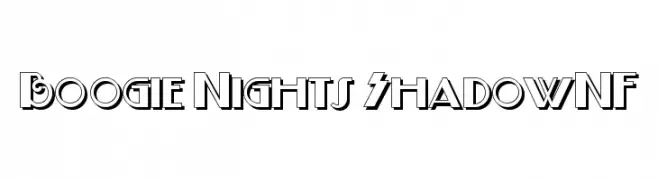
( Fonts by Nick Curtis - www.nicksfonts.com )
A bold, retro font with a shadow effect, perfect for vintage-themed designs.
 Scaricare 711 Downloads@WebFont
 -
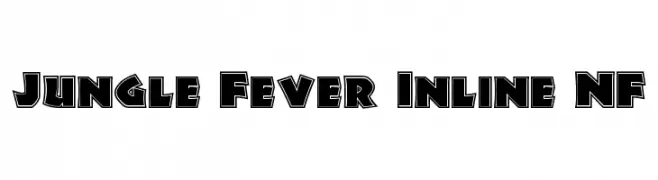
( Fonts by Nick Curtis - www.nicksfonts.com )
A bold, decorative font with a unique inline design, perfect for impactful headlines.
![Jungle Fever Inline NF font caratteri gratis]() Scaricare 711 Downloads@WebFont
Scaricare 711 Downloads@WebFont -
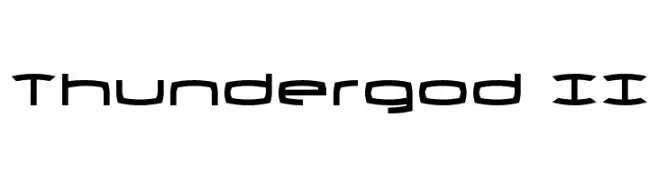
( Fonts by Daniel Zadorozny - www.iconian.com )
A futuristic, angular font with geometric shapes and consistent stroke thickness.
![Thundergod II font caratteri gratis]() Scaricare 711 Downloads@WebFont
Scaricare 711 Downloads@WebFont -
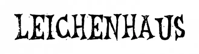
( Fonts by Tony O`Farrell )
A bold, distressed gothic-style font with a dramatic and textured appearance.
![Leichenhaus font caratteri gratis]() Scaricare 711 Downloads@WebFont
Scaricare 711 Downloads@WebFont -
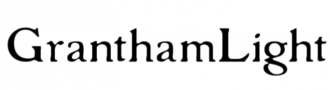
( Fonts by Paul Lloyd )
A classic serif font with elegant, flowing lines and medium contrast.
![GranthamLight font caratteri gratis]() Scaricare 711 Downloads
Scaricare 711 Downloads -
-
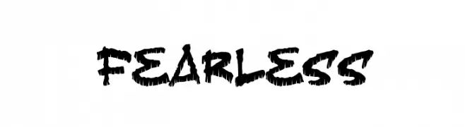
( Fonts by Jacob Fisher - www.pizzadude.dk )
A bold, brush-like font with jagged strokes and an adventurous, dynamic style.
![Fearless font caratteri gratis]() Scaricare 711 Downloads@WebFont
Scaricare 711 Downloads@WebFont -
( Fonts by www.aenigmafonts.com )
A futuristic, bold font with rounded, geometric letterforms and smooth curves.
![techno overload BRK font caratteri gratis]() Scaricare 711 Downloads@WebFont
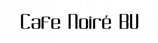
Scaricare 711 Downloads@WebFont -
![Cafe Noiré BV font caratteri gratis]() Scaricare 711 Downloads@WebFont
Scaricare 711 Downloads@WebFont -
( Fonts by Wahyu Eka Prasetya - wepfont.com - Personal-use only. For commercial use please contact owner. )
A bold, textured handwritten font with a dynamic and playful style.
![Gerak font caratteri gratis]() Scaricare 710 Downloads@WebFont
Scaricare 710 Downloads@WebFont -
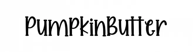
( Fonts by AM Designs )
A playful, handwritten font with a whimsical and elegant style.
![Pumpkin Butter font caratteri gratis]() Scaricare 710 Downloads@WebFont
Scaricare 710 Downloads@WebFont


Quali sono i font più popolari adesso?
Poppins, Roboto, Montserrat, Open Sans e Lato sono molto usati per le forme pulite e l'ampia applicabilità — dall'identità di marca alle landing page e ai poster.
Quali font si usano spesso nei loghi?
Le sans serif geometriche (es. Poppins, famiglie in stile Gotham) sono scelte comuni per un branding pulito e scalabile. Per un tocco personale restano valide script e stili manoscritti. Abbina un display deciso per i titoli a un corpo testo neutro per riconoscibilità ed equilibrio.
Ogni quanto si aggiorna la lista?
Con regolarità, in base ai download e all'attività reale. Torna spesso per scoprire in anticipo le nuove preferite.
💡 Consiglio: aggiungi ai preferiti — le tendenze cambiano in fretta e i font top di oggi possono ispirare il rebranding di domani.